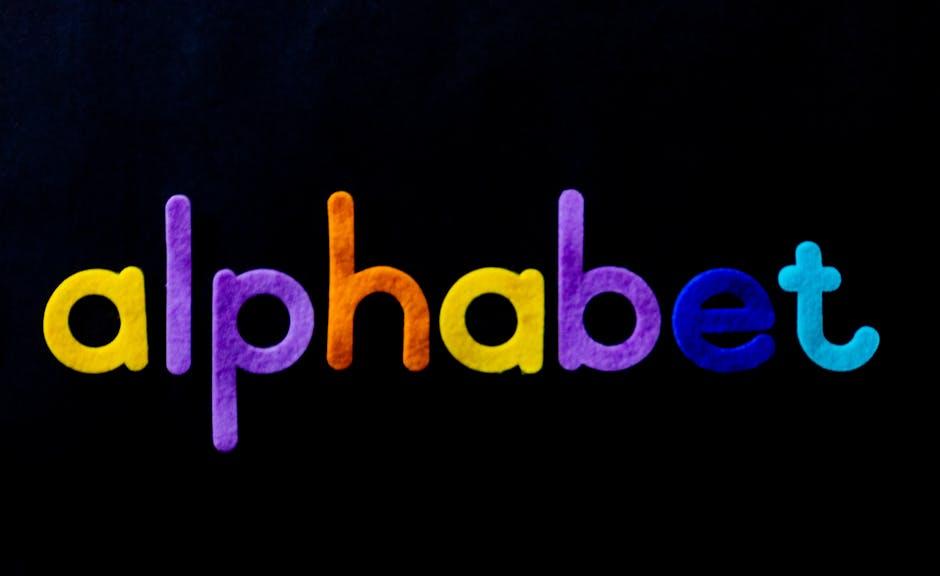
Are you tired of your logos looking like they were designed by someone who still thinks Comic Sans is a good font choice? Well, fear not my fellow typography enthusiasts, because today we are diving headfirst into the world of crafting logos with the finesse and flair of a seasoned graphic designer. Get ready to master the art of typography and create eye-catching designs that will make your clients say, “Wow, I never knew a font could look so good!” So grab your pens, pencils, and pixelated perfectionist attitude, because we’re about to embark on a typographic adventure like no other. Let’s get creative with crafting logos!
Understanding Typography in Logo Design
Typography plays a crucial role in logo design. It’s not just about picking a font and slapping it on a logo; it’s about creating a visual representation of a brand’s personality. Here’s a crash course in :
First things first, not all fonts are created equal. Some fonts scream “professional”, while others whisper “fun”. Choose wisely, for the fate of your logo depends on it. Go ahead and experiment with different fonts to find the one that best suits the personality of the brand you’re designing for.
Remember, size matters. The size of the text in a logo can make or break its impact. A font that looks amazing on a billboard might not translate well on a business card. Make sure to test different sizes to ensure your logo looks good no matter where it’s placed.
Lastly, don’t forget about spacing. The amount of white space around your text can greatly affect how it’s perceived. Too much space and your logo might look sparse, too little and it might look cramped. Find that sweet spot where the text is perfectly balanced with its surroundings.
Choosing the Right Fonts for Your Brand Identity
When it comes to , it’s important to remember that not all fonts are created equal. Just like picking out the perfect outfit for a first date, your fonts should convey the right message and leave a lasting impression.
First and foremost, consider the personality of your brand. Are you a fun and quirky start-up or a sleek and sophisticated luxury brand? Your fonts should reflect the vibe you’re going for. Comic Sans for a law firm? Probably not.
Next, think about readability. No one wants to strain their eyes trying to decipher your company name or slogan. Stick to fonts that are clear and easy to read, even from a distance. No one has time to squint at your billboard while driving 60 mph.
Lastly, don’t be afraid to mix and match fonts to create a unique identity for your brand. Pair a bold, attention-grabbing headline font with a more subtle and easy-to-read body font for a winning combination. Just like peanut butter and jelly, some fonts are better together.

Creating Harmony and Balance with Typography
Typography can make or break your design like a game of Jenga – one wrong move and it all comes crashing down! But fear not, dear reader, for I am here to guide you through the magical world of .
First things first, let’s talk about font pairing. Just like peanut butter and jelly, some fonts are meant to be together, while others should never be seen in the same room. Experiment with different combinations to find the perfect match made in typographic heaven.
Next up, let’s chat about hierarchy. Think of your text like a family tree – the most important information should be the head honcho (think big, bold headings), while the supporting details play the role of the quirky cousin twice removed (smaller, subtler fonts).
And let’s not forget about spacing. Just like giving your boss some breathing room after they’ve had one too many cups of coffee, proper spacing between letters and lines can make all the difference in creating a visually pleasing design. Remember, white space is your friend – don’t be afraid to let your text breathe!
So there you have it, my fellow typography enthusiasts – the key to is like baking a cake: mix the right ingredients, follow the recipe, and don’t forget to add a sprinkle of creativity!
Incorporating Creative Lettering Techniques
Want to take your lettering to the next level? Look no further! Here are some fun and creative techniques to incorporate into your designs:
- Flourishing: Add some fancy loops and swirls to your letters to give them that extra pizzazz. It’s like adding a little bow tie to your words!
- Shadowing: Make your letters pop off the page by adding a shadow effect. It’s like giving your words their own personal spotlight.
- Embossing: Take your lettering to new heights by adding a raised effect. It’s like giving your words a little lift!
Remember, the key to incorporating these techniques is to have fun and let your creativity shine. Don’t be afraid to experiment and try new things. Who knows, you might just discover your new signature style!
Utilizing Colors and Size for Maximum Impact
When it comes to making a statement with your designs, colors and size can play a huge role in grabbing attention and leaving a lasting impression. By strategically utilizing these elements, you can create eye-catching visuals that demand to be noticed.
One trick is to use bold, vibrant colors that pop off the page or screen. Think neon greens, electric blues, and fiery reds that scream “Look at me!” While muted tones have their place, there’s something about a bright burst of color that instantly draws the eye.
Similarly, playing with size can add an element of surprise and intrigue to your designs. Mix and match large elements with small ones to create a sense of balance and contrast that keeps the viewer engaged. Plus, **oversized** fonts or images can make a bold statement and show that you’re not afraid to think outside the box.
Remember, there’s no one-size-fits-all approach to design, so don’t be afraid to experiment and push the boundaries of what’s expected. By harnessing the power of colors and size, you can create visuals that pack a punch and stand out from the crowd.
Typography Tips and Tricks for Memorable Logos
When designing a memorable logo, typography plays a crucial role in conveying the right message to your audience. Here are some tips and tricks to help you create a killer logo that leaves a lasting impression:
- Keep it Simple: Stick to one or two font styles in your logo design. Too many fonts can make your logo look cluttered and unprofessional.
- Choose the Right Font: Select a font that reflects the personality of your brand. Whether you want to convey elegance, creativity, or boldness, there’s a font out there for you.
- Pay Attention to Spacing: Proper kerning and letter spacing can make a huge difference in the readability and aesthetics of your logo. Don’t be afraid to adjust the spacing to make your logo look polished.
Remember, your logo is often the first thing people see when they encounter your brand, so make sure it stands out for all the right reasons. Experiment with different typography styles, sizes, and placements to create a logo that is unique and memorable. With the right typography, your logo will be sure to leave a lasting impression on your audience.
FAQs
Why is typography important in logo design?
Well, imagine if the Nike swoosh was in Comic Sans. Yeah, it’s that important. Typography sets the tone, style, and personality of a logo. It’s like the font is the DJ of the design world - setting the mood for the party.
How can I choose the right font for my logo?
Consider the personality of your brand. Is it edgy and modern? Go for a sleek sans serif. Is it classic and elegant? Opt for a timeless serif font. Just remember, like a Tinder date, compatibility is key.
Should I use multiple fonts in my logo design?
Only if you want your logo to look like a bad 90s PowerPoint presentation. Stick to one font or a font family for a cohesive and polished look. Less is more, just like in your dating profile bio.
What are some common typography mistakes to avoid in logo design?
Avoid using trendy fonts that will be outdated faster than a TikTok dance craze. Also, watch out for illegible fonts that make your logo look like it’s whispering, “Help! I’ve been kidnapped by terrible design choices!”
How can I make my typography stand out in a crowded market?
Get creative! Mix up fonts, play with sizing and spacing, and don’t be afraid to break the rules. Think of your typography as the Beyoncé of your logo design - let it shine and steal the show.
Stay tuned for more typography tricks
Now that you’ve mastered the art of crafting logos with typography, get ready to elevate your designs to the next level! Keep an eye out for more tips and tricks to make your logos stand out in the crowd. Don’t be surprised if your friends start asking you to design their logos after seeing your eye-catching creations. Keep crafting, keep creating, and keep making typography magic!


