Are you tired of your logo blending in like a wallflower at a high school dance? Ready to make your brand stand out like the prom queen in a sea of tuxedos? Well buckle up, buttercup, because we’re about to dive into the wild and wacky world of color theory and how it can help you create logos that pop like champagne on New Year’s Eve. Say goodbye to boring designs and hello to a brand new era of logo excellence. Grab your color wheel and let’s get this party started! color psychology“>
Understanding color psychology
Have you ever wondered why certain colors make you feel happy, while others may make you feel anxious? Color psychology is the study of how colors can impact human emotions and behaviors. Let’s delve into this colorful world and unlock the mysteries of why we’re drawn to certain hues!
Colors can evoke specific emotions and reactions due to cultural associations, personal experiences, and even evolutionary factors. For example, the color red is often associated with passion and energy, while blue is linked to calmness and tranquility. Knowing how colors can influence our moods can help us make more informed decisions when choosing outfits, decorating our homes, or designing websites.
Here are some interesting tidbits about color psychology:
- Yellow is often associated with happiness and optimism, which is why it’s a popular choice for branding in industries like fast food and childcare.
- Green is commonly linked to nature and health, making it a soothing and refreshing color that’s often used in hospitals and spas.
- Black is often associated with sophistication and elegance, while also conveying authority and power. It’s no wonder why it’s a popular choice for formal wear and luxury brands.
So, next time you’re feeling blue, perhaps adding a splash of yellow or green to your day could lift your spirits. Remember, the world is your color palette – so paint it with intention and mindfulness!
Importance of choosing the right color palette
When it comes to choosing the right color palette for your project, it’s not just about picking your favorite colors or going with the trendiest shades. The colors you choose can have a huge impact on how your audience perceives your work, so it’s important to choose wisely!
Here are some reasons why choosing the right color palette is so crucial:
- Brand Consistency: Your color palette is a big part of your brand identity, so it’s important to choose colors that are in line with your brand’s image and values. Consistency is key!
- Mood Setting: Colors have the power to evoke different emotions and set the tone for your project. Whether you want to create a sense of calm or excitement, the right color palette can help you achieve your desired mood.
- Accessibility: Choosing colors that are easy to read and distinguish from each other is crucial for ensuring that your audience can engage with your work. Accessibility should always be a top priority!
So, the next time you’re choosing a color palette, take a moment to consider the impact your colors will have. A thoughtful choice can make all the difference!
Color symbolism in logo design
When it comes to logo design, color plays a crucial role in conveying messages and evoking emotions. Different colors have different meanings and associations, so it’s important to choose the right hues to accurately represent your brand. Here are some common colors and their symbolism in logo design:
- Red: This fiery color is often associated with passion, energy, and excitement. It can be a great choice for brands that want to make a bold statement and stand out from the competition.
- Blue: Known for its calming and trustworthy qualities, blue is a popular choice for corporate logos. It instills a sense of reliability and professionalism, making it perfect for financial institutions and technology companies.
- Yellow: Bright and cheerful, yellow symbolizes happiness, optimism, and creativity. It’s a great choice for brands that want to convey a sense of fun and playfulness.
It’s important to note that color symbolism can vary across cultures, so it’s essential to consider your target audience when choosing colors for your logo. For example, in Western cultures, white is often associated with purity and cleanliness, while in some Eastern cultures, it represents mourning and death. Make sure you do your research to avoid any unintentional missteps!
Ultimately, the colors you choose for your logo should align with your brand’s values and personality. Whether you opt for a classic black and white palette or a vibrant rainbow of colors, make sure your logo reflects who you are as a brand and resonates with your target audience. After all, a well-designed logo can speak volumes without saying a word!
Creating harmony and balance with colors
Are you feeling like your space is lacking that certain je ne sais quoi? Well, fear not my color-challenged friend! With just a few simple tricks, you can create harmony and balance with the power of colors.
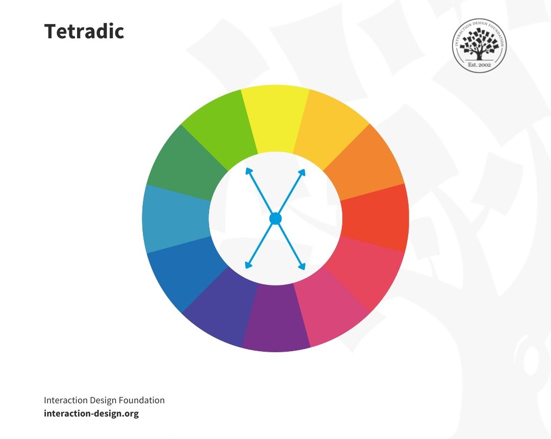
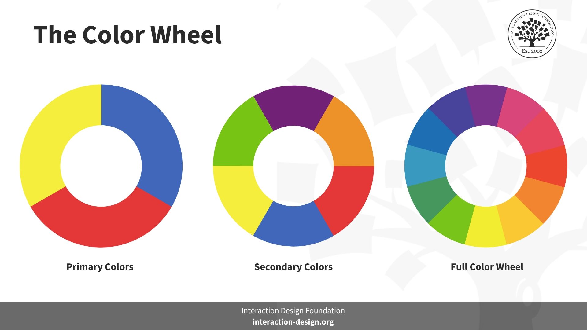
First things first, let’s talk about the color wheel. It’s not just a pretty rainbow for kids to learn their colors. No, my friends, it’s a magical tool that will guide you to color harmony nirvana. Remember those elementary school days when you were bored out of your mind learning about primary and secondary colors? Well, it’s time to put that knowledge to good use!
One of the easiest ways to create balance is by using complementary colors. What are complementary colors, you ask? Well, they’re like the yin and yang of the color world. They sit opposite each other on the color wheel and when paired together, they create a harmonious balance that’s pleasing to the eye. Think red and green, blue and orange, yellow and purple. It’s like a beautiful dance of colors that will make your space sing!
But wait, there’s more! If you’re feeling a little more adventurous, try using analogous colors. These are colors that sit next to each other on the color wheel and create a more subtle harmony. It’s like a cozy hug from your favorite blanket. So grab your paintbrushes and get ready to create a masterpiece that will make all your friends green with envy (pun intended).

Using contrast effectively in logo design
When it comes to logo design, contrast is your best friend! It adds interest, grabs attention, and makes your logo stand out from the crowd. But how do you use contrast effectively without going overboard? Let’s dive in!
Color: One way to create contrast in your logo is by using bold, contrasting colors. Think of famous logos like McDonald’s (red and yellow) or Pepsi (blue and red). The key is to choose colors that complement each other while still popping off the page.
Shape: Another way to incorporate contrast is through shape. Mix sharp angles with soft curves, or pair geometric shapes with organic ones. This can create a dynamic visual effect that draws the eye and leaves a lasting impression.
Size: Don’t be afraid to play around with varying sizes in your logo design. Experiment with scaling some elements larger than others to create a sense of hierarchy and emphasis. This can add depth and dimension to your logo, making it more visually engaging.
Mastering the art of color combinations
Color combinations can be a tricky thing to master, but fear not, for I am here to guide you through the colorful maze of creativity! With the right combinations, you’ll be painting the town red, blue, or any other color you desire in no time.
First things first, let’s talk about the color wheel. This magical circle of colors is like a roadmap to finding the perfect combinations. From complementary colors that are opposite each other on the wheel to analogous colors that are next to each other, the possibilities are endless! Embrace the wheel and let it be your colorful compass.
Don’t be afraid to experiment! Mix and match different colors until you find the perfect combination that speaks to your soul. Remember, there are no rules when it comes to color combinations, only possibilities waiting to be discovered.
So go forth, fearless color warrior, and conquer the art of color combinations with boldness and creativity. Let your imagination run wild and paint the world in a rainbow of hues that will leave everyone in awe of your colorful mastery!
Strategies for creating memorable logos through color choices
Color Psychology:
Color psychology plays a crucial role in creating memorable logos. Each color evokes different emotions and can convey various messages to your audience. Make sure you choose colors that align with your brand identity and the message you want to convey. Remember, you want to leave a lasting impression!
Contrast is Key:
Contrast is essential in creating a visually appealing logo. Make sure the colors you choose contrast well with each other to make your logo stand out. Consider using complementary colors or colors that are opposite on the color wheel. This will help your logo pop and grab the attention of your audience.
Keep it Simple, Yet Bold:
While it’s tempting to use a rainbow of colors in your logo, sometimes less is more. Keep your color choices simple and make sure they work well together. Bold, vibrant colors can make a logo memorable, but be careful not to go overboard. Stick to a few key colors that represent your brand effectively.
Test Your Colors:
Before finalizing your color choices, make sure to test them in different backgrounds and mediums. Colors can appear differently on various surfaces, so it’s essential to see how they look in different scenarios. This will help ensure that your logo remains memorable and recognizable across all platforms.
FAQs
Why is color theory important in logo design?
Well, color theory in logo design is like the secret sauce in a delicious burger. It enhances the overall visual appeal and helps convey the right message to your audience.
How can I choose the right colors for my logo?
Choosing colors for your logo is like choosing the right outfit for a first date. You want to make sure it matches your brand personality and attracts the right attention. So, pick colors that reflect your brand values and resonate with your target audience.
What emotions do different colors evoke in logo design?
Colors are like little mood ring-wearing chameleons in logo design. For example, red can convey passion and energy, while blue can represent trust and professionalism. So, think about the message you want to send and choose your colors wisely.
Should I stick to a limited color palette in my logo design?
Think of your logo as a fancy cocktail party. You don’t want to invite every color in the rainbow, just the right ones that will make a statement. So, stick to a limited color palette to keep your logo clean and impactful.
How can I make my logo stand out using color theory?
To make your logo stand out using color theory, think of it as a peacock in a flock of pigeons. Use contrasting colors to create visual interest and ensure that your logo pops. Experiment with different color combinations until you find the perfect one that sets your brand apart.
Now go forth and create logos that make the world say, “Whoa, I never knew a color palette could be so captivating!”
Remember, mastering color theory is the key to creating outstanding logos that truly pop. So next time you pick up your design tools, think about the colors you’re using and the message they convey. And hey, if all else fails, just remember that a logo doesn’t have to be perfect, it just has to be memorable. Happy designing!


