Banks need to present an image of professionalism, security, and trustworthiness. These qualities are a good fit for all businesses, sure, but it’s imperative that they are prominent in bank logo designs. Bank logos also need to convey a sense of seriousness to let potential banking customers know that their money is safe.
Have you ever wondered if the logo of a banking institution influences who you ultimately decide to trust with your hard-earned money?
The shocking truth is that logo design greatly influences how we choose our banking ally. Visual science studies have shown time and time again that logo design plays a significant role in how we make purchasing decisions (which does include where we choose to bank). In this article, we’ve compiled a group of some of the most popular bank logos. We’ll give our thoughts on what the logos achieve for each bank and touch upon how they may inspire potential customers.
Table of Contents
- Color Scheme: Feeling Blue?
- CitiBank Logo Design
- Capital One Bank Logo Design
- Bank of America Logo Design
- Chase Logo Design
- ING Bank Logo Design
- UBS Bank Logo Design
- Choosing Your Logo Design
Color Scheme: Feeling Blue?
When you look at most of these bank logos, you’ll notice variations on one particular color: blue. There is a reason why blue is usually included in the color scheme for banks. The color blue symbolizes order, trust, and calmness. Color psychology says that when people see the color blue, it reminds them of traits such as reliability, orderliness, tranquility, loyalty, and security. Blue also promotes a sense of credibility and focus. Because of these very traits, we often see blue used in banking, medicine, government, science, health care, technology, legal, and corporate fields.
CitiBank Logo Design

Did you know that Citibank paid $1.5 million for its logo design? Believe it or not, the logo designer actually created the initial sketches within minutes of her first meeting with Citibank.
So did CitiBank get ripped off?
Not at all. The quality of a logo is not determined by how long it takes to make (or how many stages in the editing process it goes through). The quality of a logo is determined by how well it represents and benefits the business.
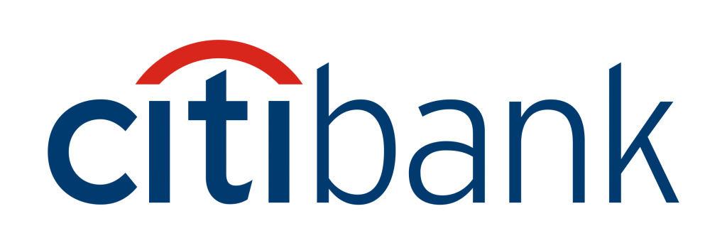
This is one of our favorite bank logos on the list because it checks all the boxes. This logo has not only been lucrative for Citibank (and still in use for over a decade), but it conveys everything you want a bank logo to embody. The sans serif font and exclusion of the dots above the I’s keep it modern and fresh. The dark blue anchors the name under the striking red arch (which simultaneously represents connection and unity). The logo is simple which promotes trust/security and there aren’t a bunch of bells and whistles (which would likely distract from the core mission of the company). The logo gets to the point, which in this instance is representing their ability to take proper care of your money.
Capital One Bank Logo Design

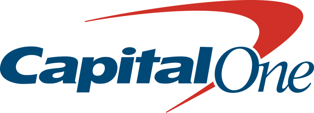
Let’s turn our attention to the Capital One Bank logo design which is, unfortunately, one of our least favorite banking designs on the list. Why? The arch, half Saturn ring, boomerang shape is one of the most overused graphics within the past 10 years. It’s honestly a bit shocking when large brands push such generic logo designs, but fortunately for Capital One, they do have the funds to stick with it.
That said, the forgettable design makes Capital One appear as if they are borderline trendy, which is the opposite of what a banking institution is striving for (it wouldn’t even qualify as classic). Considering banks conduct billions of digital transactions daily, do you really want a bank that doesn’t know how to stay current?
Bank of America Logo Design

The Bank of America logo is an interesting design. In 2001 it was slightly redesigned, positioning the American flag so that it looks like an acre of farmland. Why? A lot of farmers throughout middle America bank with Bank of America. This was a great way to recognize them and acknowledge their patronage.
The Bank of America logo boasts “America” in its name, so it makes sense that the American flag would be featured heavily in the design. The blue and red are bold. The typography is modern, easy-to-read, and easy to remember. This simple logo is effective, and with a subtle tip of the cap to their core clientele, it’s a strong mark.
Chase Logo Design

The Chase logo is another example of an uncomplicated, straightforward design. The typography choice features a sleek, modern font (with a tech vibe), which works well considering how crucial technology is to the industry. The abstract mark in the Chase logo creates movement within the design that actually represents the flow of money from consumers to banks and back to consumers. This logo works well because it communicates a sense of professionalism and the ability to harness cutting-edge techniques.
ING Bank Logo Design

The ING logo design is a breath of fresh air as it veers away from the blue and red logo designs we’ve discussed thus far. The lion is in bright orange and white, the Dutch national colors, while the lion is their national symbol. Orange, the complement of blue on the color wheel, symbolizes energy and youth as well as enthusiasm. It is a dynamic color and, when paired with the lion, can also symbolize strength.
The reason this design works so well is that it refers back to the country of origin. The lion is perhaps a bit overly detailed (and is a big departure from the simplified logos we’ve seen), but it’s easy to see how the lion symbolizes loyalty and protection. This is further compounded by the use of the country’s national symbol and color to give the Dutch people a sense of national pride. Beyond the icon, the rest of the design is simple. The dark blue lettering grounds the orange lion and adds a level of seriousness. Because the name of the bank is only three letters, there is less clutter, so the more intricate lion design doesn’t overwhelm the logo.
UBS Bank Logo Design

Another logo design from overseas is Switzerland’s UBS bank logo design. The red color choice for the font can symbolize danger or urgency as well as speed. Considering red is a key part of the national flag of Switzerland, this also pays homage to the bank’s homeland. It promotes a sense of loyalty and trust. The font is traditional and easy to read.
The interesting part of this design is the icon associated with the bank’s name. The symbol is three keys, all in black, crossing each other. The keys symbolize UBS bank’s core values: confidence, discretion, and security. It is a solid choice due to the fact that keys are a great way to represent the safekeeping of money and valuables. Connecting a familiar image with an industry is a great way to deliver an iconic logo design.
Choosing Your Logo Design
When it comes to logo design, there is never a one-size-fits-all solution. While we discussed a few of our personal favorites, the reality is that any logo can be successful depending on the situation. Here at Logo Coast, we always welcome clients to be involved in the process. Do you already have a color scheme and typography in mind? Let your designer know if you have an idea for the logo and if you would prefer to stick with something similar to that design. At the same time, your logo designer can often be trusted to take your preferences and turn them into something that works for your brand. With proper communication, a logo can capture your brand’s message and expertise.
Logo Coast works with new and existing brands from all industries to develop dynamic logo designs that match their brand messaging. If you want a unique logo that captures who you are as a brand, we’d love to work together!


