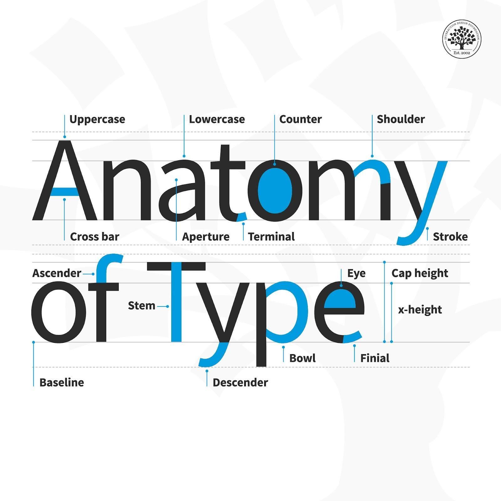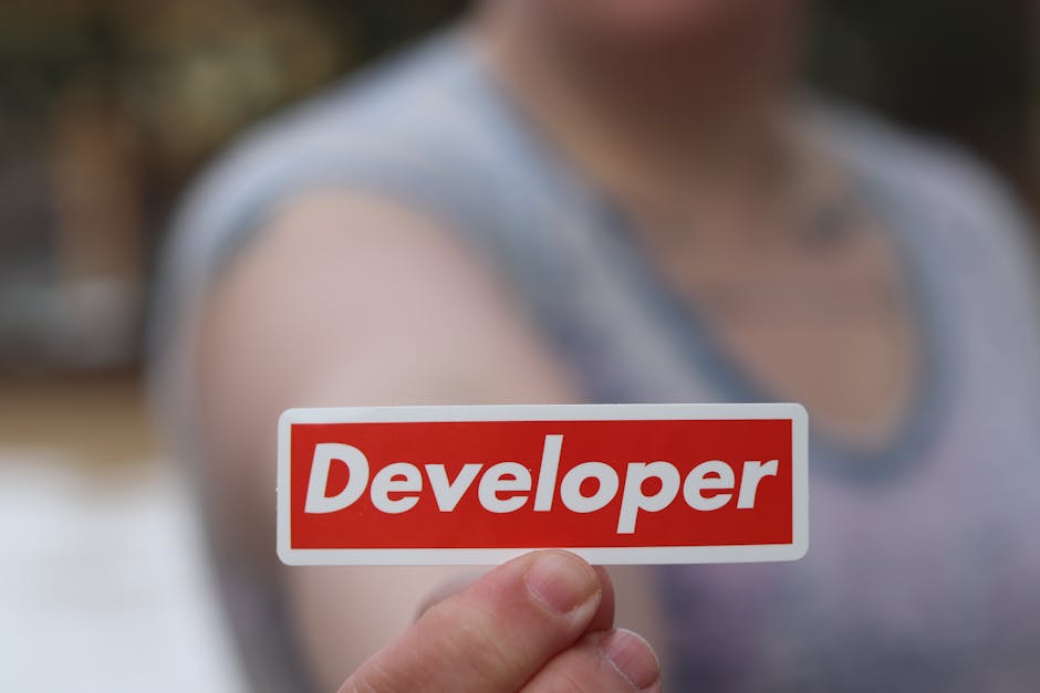
Attention all font fanatics and text nerds alike! Have you ever stopped to ponder the profound impact that typography has on the perception of logo design? From sleek sans-serif to whimsical script, the typeface used in a logo can make or break its appeal faster than you can say Comic Sans. Get ready to dive deep into the world of typefaceology and discover just how much those little letters can shape our logo-loving brains. It’s time to embrace the power of the font and unlock the secrets of logo perception – get ready to be wowed!
The Role of Typography in Logo Design
Typography is like the unsung hero of logo design. It’s that friend who always stays in the background, yet without them, the whole party would be a flop. Just like a good font, this friend knows how to make an entrance and steal the show without even trying.
Imagine a logo without typography – it would be like a birthday party without cake. You just can’t have one without the other. Typography brings personality, flair, and style to a logo, making it memorable and impactful. It’s the cherry on top that takes a logo from meh to magnificent.
When choosing typography for a logo, it’s important to consider the vibe you want to convey. Are you going for sleek and modern? Playful and whimsical? Vintage and nostalgic? The right font can set the tone in an instant. And remember, not all fonts are created equal – some are like the life of the party, while others are more like the wallflowers. Choose wisely!
In conclusion, typography plays a crucial role in logo design. It’s the secret sauce that adds flavor and personality to a brand’s identity. So next time you’re designing a logo, don’t underestimate the power of a good font. Trust me, it can make all the difference.
Typography as a Reflection of Brand Identity
When it comes to branding, typography plays a key role in reflecting a brand’s identity. Just like choosing the perfect outfit for a first date, the right font can make or break a brand’s first impression. Think of typography as the wingman to your logo’s main act – it sets the tone, conveys personality, and helps establish credibility.
Choosing the right font is like choosing the right personality trait for your brand. Are you quirky and fun-loving? Opt for a playful and whimsical font like Comic Sans (just kidding, please don’t do that). Or maybe you’re a no-nonsense, professional brand – in that case, a clean and modern font like Helvetica is your best bet. Remember, your font choice should align with your brand’s values and personality.
Just like a bad hair day can ruin your confidence, using the wrong font can send mixed signals to your audience. Have you ever seen a luxury brand use Comic Sans? I don’t think so. Consistency is key, so make sure to stick with one or two fonts that complement each other and can be used across all brand materials – from your website to your business cards.
So, the next time you’re designing your brand’s identity, remember that typography is more than just letters on a page – it’s a reflection of who you are as a brand. Choose wisely, my friends, and let your font do the talking (but please, no more Comic Sans).

The Influence of Typeface on Consumer Perception
When it comes to choosing a font for your brand, it’s not just about picking something that looks pretty. Typeface can actually have a major impact on how consumers perceive your products or services. Think of it like the font is the outfit your brand wears to a first date – it sets the tone for the entire interaction.
Imagine walking into a fancy restaurant and being handed a menu written in Comic Sans. You’d probably think twice about ordering the steak, right? That’s because the font used can subconsciously signal to customers whether your brand is professional, trustworthy, or even fun and quirky.
So, how do you choose the right font to make the best impression on your customers? Here are a few tips:
- Consider your target audience: Different fonts appeal to different demographics. Make sure the typeface you choose resonates with your ideal customer.
- Keep it consistent: Using a mishmash of fonts can confuse consumers and dilute your brand’s message. Stick to one or two typefaces that complement each other.
- Test it out: Don’t be afraid to A/B test different fonts to see which one resonates best with your audience. Your gut feeling might not always be right!
The Power of Font Choice in Creating a Memorable Logo
When it comes to creating a memorable logo, the font you choose can make all the difference. Just imagine trying to convey a sense of fun and whimsy with a font that looks more like it belongs on a legal document – talk about a branding disaster!
So, how do you harness the power of font choice to create a logo that stands out from the crowd? Here are some tips to keep in mind:
- Personality is key: Your font choice should reflect the personality of your brand. Are you sleek and modern? Playful and quirky? Channel those vibes into your font selection.
- Legibility matters: While it’s tempting to go for a super fancy, intricate font, make sure your logo is still easily readable. After all, you want people to remember your brand, not strain their eyes trying to decipher it.
- Consider the competition: Take a look at what other brands in your industry are doing with their logos. You don’t want to blend in with the crowd, but you also don’t want to stick out like a sore thumb in all the wrong ways.
Remember, your logo is often the first impression people will have of your brand, so make sure it’s a good one. And don’t be afraid to have a little fun with your font choice – after all, who doesn’t love a logo that makes them smile?

Typography Trends and Their Impact on Logo Design
Typography trends have a huge impact on logo design, shaping the way brands are perceived and recognized. Let’s take a look at how these trends are influencing the logo design world:
1. **Custom Fonts**: Designers are now creating custom fonts for logos to stand out from the crowd. These bespoke typefaces add personality and uniqueness to a brand’s identity.
2. **Bold and Playful Typography**: Playful and bold typography is becoming increasingly popular in logo design. It helps brands communicate a fun and quirky image, making them more relatable to their target audience.
3. **Minimalist Typography**: Minimalism is still a big trend in logo design, with clean and simple fonts being used to convey a sense of sophistication and elegance. Less is more in this case, with the focus being on the message rather than the style of the font.
How Typography Enhances Brand Recognition
Ever think about the font you use when typing something up? Well, you should! Typography plays a crucial role in brand recognition, believe it or not.
First off, who doesn’t love a good, bold, attention-grabbing font? Your brand needs to stand out in a sea of Comic Sans and Papyrus. Choose a unique font that reflects your brand’s personality and values. Whether you go for a sleek, modern look or a fun, whimsical vibe, your typography should be a reflection of who you are. Bold, italicized, underlined – get crazy with it!
Consistency is key. Imagine if McDonald’s suddenly started using Times New Roman instead of the iconic golden arches font. Chaos would ensue! Your audience should be able to recognize your brand based on the font alone. Be consistent across all platforms – from your website to your social media posts and everything in between.
Lastly, keep it simple. Don’t overcomplicate things with too many fonts and styles. Stick to a few key fonts that complement each other and work well together. Your audience shouldn’t have to decipher hieroglyphics to understand your message. Keep it clean, legible, and memorable. Your font game is on point, and your brand recognition will be, too!
The Subliminal Messaging of Typography in Logos
Do you ever find yourself staring at a logo and feeling inexplicably drawn to it? Well, there’s a good chance that the typography used in that logo is subconsciously influencing your perception of the brand. Typography is an art form that goes beyond just selecting a font – it conveys emotion, personality, and even hidden messages.
Take a closer look at some famous logos and you’ll start to notice the sneaky subliminal messaging hidden in their typography. From the playful curves of the Coca-Cola logo that evoke a sense of happiness and nostalgia, to the bold, angular letters of the FedEx logo that subtly form an arrow, these logos are expertly designed to communicate more than meets the eye.
But it’s not just the shape of the letters that matters – the color, size, and spacing of each character also play a crucial role in conveying a brand’s identity. Whether it’s the sleek, modern look of Apple’s minimalist logo or the quirky, hand-drawn feel of the Disney logo, typography is a powerful tool for shaping how we perceive a brand.
So next time you find yourself mesmerized by a logo, take a closer look at the typography. You might just uncover a hidden message that’s been right in front of you all along!
FAQs
How does typography influence logo perception?
Typography is like the spicy seasoning in a dish – it can totally change the flavor! Different fonts convey different vibes, whether it’s professional, fun, or quirky. So, choosing the right typography for a logo can make all the difference in how it’s perceived by the audience.
Can the wrong typography hurt a logo’s effectiveness?
Absolutely! Imagine trying to sell luxury cars with a Comic Sans logo – it just doesn’t scream sophistication. Using mismatched typography can confuse your audience and send mixed messages about your brand identity. So, always choose your fonts wisely!
How can typography help make a logo stand out?
Typography is like the cherry on top of the logo sundae – it can make your design pop! Bold, unique fonts can catch the eye and create a memorable impression. So, don’t be afraid to push the boundaries and experiment with different typography styles to stand out from the crowd.
What are some common typography pitfalls to avoid in logo design?
Oh, let me count the ways! Avoid using too many fonts in one logo – it’s like a text overload. Also, steer clear of overly trendy or illegible fonts that may confuse your audience. Stick to timeless and versatile typography choices for a logo that will withstand the test of time.
Is there a formula for choosing the perfect typography for a logo?
While there’s no one-size-fits-all formula, consider factors like your brand’s personality, target audience, and industry when selecting typography. Experiment with different fonts, sizes, and spacing to see what resonates best with your brand identity. Trust your gut – or better yet, trust your designer’s gut!
Just a Typo Away from a Whole New Brand Image!
So there you have it, folks! Typography isn’t just about choosing pretty fonts – it can make or break your logo’s perception. Whether you’re going for sleek and modern or bold and playful, make sure your typeface is sending the right message. And remember, the next time you’re designing a logo, don’t be afraid to play around with those fonts – you never know, a simple typo could lead to a whole new brand identity!


