In a world where logos reign supreme, staying ahead of the design curve is crucial. From minimalist chic to bold and colorful creations, modern logo design trends can be as diverse as a rainbow-colored unicorn at a disco. So, grab your design pens and buckle up for a wild ride through the whimsical world of logo design in the digital age, where creativity knows no bounds and conformity is about as welcome as a pineapple pizza at a gourmet soirée. Ready to dive into the colorful abyss? Let’s embrace the art of modern logo design and ride that design wave like a boss! Minimalism in Logo Design“>
Minimalism in Logo Design
When it comes to logo design, less is definitely more. Minimalism is all the rage these days, and for good reason. Why clutter up your brand with unnecessary frills and fuss when you can make a bold statement with just a few simple lines and shapes? Here are a few reasons why minimalism is the way to go in logo design:
- **Memorable:** Think about some of the most iconic logos out there – Nike, Apple, McDonald’s. What do they all have in common? They’re clean, simple, and instantly recognizable. A minimalist logo is much more likely to stick in people’s minds than one that’s overly complicated.
- **Timeless:** Trends come and go, but minimalist design is forever. A sleek, stripped-down logo will never go out of style, saving you the hassle of constantly updating your brand image to keep up with the latest fads.
- **Versatile:** A minimalist logo is like a little black dress – it goes with everything. Whether you’re printing it on a business card, plastering it on a billboard, or embedding it on your website, a simple logo will always look clean and professional.
So next time you’re brainstorming ideas for your brand’s logo, remember: keep it simple, keep it sleek, and keep it minimalist. Your brand will thank you.
Incorporating Geometric Shapes
Looking to add some flair to your designs? Why not incorporate geometric shapes! These clean, angular forms can bring a modern edge to any project.
Here are a few ways to make use of geometric shapes in your designs:
- Use shapes like squares, triangles, and circles to create interesting patterns and backgrounds.
- Combine shapes to create new and unique designs.
- Experiment with different sizes and rotations to add depth and complexity to your compositions.
Got a boring logo that needs a facelift? Try incorporating some geometric shapes! Add some triangles or hexagons to give it a modern, sleek look. Your brand will thank you.
Remember, when it comes to geometric shapes, the possibilities are endless. So go on, get creative and start incorporating some shapes into your designs today!
Typography as a Focal Point
When it comes to design, typography can truly make or break a project. Imagine trying to read a novel written entirely in Comic Sans – it would be a nightmare! That’s why choosing the right font is crucial in capturing the attention of your audience.
One of the best ways to make typography a focal point is by using a combination of fonts to create visual interest. Pair a bold, eye-catching font for headings with a more subtle, easy-to-read font for body text. This contrast will make your text pop and keep readers engaged.
Don’t be afraid to play around with font sizes and styles to create hierarchy in your design. Use larger fonts for important information and smaller fonts for secondary text. This will help guide your audience’s eyes and make it easier for them to navigate your content.
Remember, typography is more than just choosing a font - it’s about creating a visual language that complements your overall design. So next time you’re working on a project, don’t overlook the power of typography. Embrace it, have fun with it, and watch as your designs come to life!
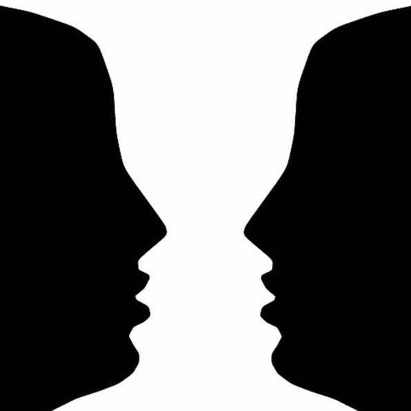
Negative Space Usage
Negative space, you know that empty space on a page that you sometimes forget exists until it slaps you in the face? Well, turns out it’s not just there to make your design look fancy, it actually serves a purpose! Here’s how you can use it to your advantage:
1. **Hide Easter Eggs:** Negative space can be used creatively to hide little surprises for users to find. Whether it’s a hidden message, a secret image, or a clever design element, utilizing negative space can add an element of fun and mystery to your design.
2. **Create Optical Illusions:** By strategically manipulating negative space, you can create optical illusions that trick the eye and boggle the mind. Play around with shapes and patterns to create mind-bending designs that will have people scratching their heads in confusion.
3. **Enhance Visual Hierarchy:** Negative space can be used to direct the viewer’s eye to specific elements of your design. By creating contrast between the positive and negative space, you can draw attention to important information or make certain elements stand out more.

Color Psychology in Logo Design
When it comes to designing a logo, color psychology can play a huge role in how people perceive your brand. It’s amazing how just a simple color can make people feel a certain way. Let’s dive into the world of colors and their hidden meanings in logo design!
First up, let’s talk about red. This bold and passionate color can evoke feelings of excitement and urgency. It’s no wonder fast food chains like McDonald’s and KFC use red in their logos – they want you to be hungry and ready to devour that burger ASAP!
Next, we have blue. This calm and trustworthy color is often used by tech companies like Facebook and IBM. They want you to feel safe and secure when using their products. Plus, who doesn’t love a nice soothing blue screen staring back at them?
And let’s not forget about yellow. This sunny and cheerful color is perfect for brands that want to convey optimism and energy. Just think of the smiling faces of the yellow M&M and the Cheerios bee – they’re just bursting with happiness!
Dynamic and Adaptive Logos
Forget static logos that just sit there looking pretty! are where it’s at. These logos have a life of their own and can change and adapt depending on the context. It’s like having a logo that’s a master of disguise!
With dynamic logos, you can shake things up and keep your brand fresh and exciting. Your logo can change colors, shapes, and even animate itself. It’s like having a logo that’s always ready to party! Plus, with adaptive logos, your brand can seamlessly fit into any setting. Whether it’s on a billboard, a business card, or even a t-shirt, your logo will look its best no matter where it is.
are not only fun and eye-catching, but they also show that your brand is versatile and creative. They can help you stand out in a sea of boring, static logos. It’s like having a logo that’s the life of the party and always ready to steal the show!
So why settle for a logo that just sits there when you can have one that’s constantly evolving and adapting? Embrace the dynamic and adaptive logo revolution and watch your brand come to life in ways you never thought possible! Let your logo shine bright like a diamond (or a disco ball, depending on its mood).
FAQs
Why should businesses care about modern logo design trends?
Because nothing screams “outdated” like a logo from the 90s. Customers want to see that you’re keeping up with the times, not stuck in the past like a washed-up boy band.
What are some current design trends in modern logo design?
Think gradients, bold typography, and minimalist styles. It’s all about making a statement without being too flashy, like a well-dressed ninja blending into the shadows.
How can businesses incorporate current logo design trends into their branding?
Get inspired by what’s hot right now, but put your own spin on it. Don’t be a copycat – nobody likes a wannabe. Show the world what makes your business unique!
What are the benefits of embracing modern logo design trends?
Stay relevant, attract new customers, and show your competitors who’s boss. Plus, it’s a great excuse to ditch that tacky clipart logo you’ve been holding onto for dear life.
Keep Calm and Design On!
Whether you’re a seasoned graphic designer or just dipping your toes into the world of logo design, embracing current trends is key to creating logos that stand out in today’s competitive market. From bold colors and sleek typography to minimalist icons and playful illustrations, the art of modern logo design is all about pushing the boundaries and staying ahead of the curve. So don’t be afraid to experiment, take risks, and most importantly, have fun with your designs. After all, as they say, the only way to predict the future is to create it!


