Oh, logo design – the bread and butter of branding, the cherry on top of a brand’s identity, the ever-important first impression maker. But, oh, the pitfalls that lie in wait for the unsuspecting designer! From clichés to clutter, from color catastrophes to font fiascos, there are plenty of ways to go wrong when creating a logo. But fear not, brave designer, for we are here to guide you through the treacherous waters of logo design and help you steer clear of some common mistakes that could sink your project faster than you can say ”Comic Sans.” So grab your design compass and prepare for a journey through the perilous world of logo design pitfalls – we promise, it’s going to be a wild ride!
Understanding the Impact of Logo Design
So you’ve got a logo for your business, but do you truly understand the impact it can have? Let’s break it down, shall we?
First and foremost, a logo is like the face of your business. It’s the first thing people see and what they’ll remember you by. Having a memorable logo is crucial for standing out in a sea of competitors.
Think of your logo as your business’s superhero cape. It’s what gives you that extra boost of power and confidence to take on the world. A well-designed logo can make you feel like you can conquer anything, from winning over customers to taking on your arch-nemesis competitor.
When it comes to logo design, it’s all about making a lasting impression. Your logo should be like that catchy song you can’t get out of your head – you want people to see it once and instantly recognize your brand. It’s the secret sauce that sets you apart from the rest.

Choosing the Right Typeface and Color Palette
When it comes to for your project, it’s important to remember that not all fonts and colors are created equal. Just like choosing the perfect outfit for a first date, you want to make sure that your typography and color choices make a good impression and leave a lasting impact.
First things first, when selecting a typeface, consider the mood and tone you want to convey. Are you going for a sophisticated and elegant look? Or maybe you want to exude a playful and whimsical vibe. Whatever the case may be, make sure to choose a font that aligns with your desired aesthetic.
Next, let’s talk about color palettes. Colors can evoke emotion and set the overall tone of your design. Whether you’re aiming for a bold and vibrant color scheme or a more subtle and muted palette, the key is to choose colors that complement each other and work harmoniously together.
Remember, there’s no one-size-fits-all approach when it comes to typography and color selection. It’s all about experimenting, trying out different combinations, and finding what speaks to you. So go ahead, have fun with it, and let your creativity shine!

Avoiding Overly Complicated Designs
Have you ever looked at a design and immediately felt a headache coming on? That’s probably a sign that the designer went a little overboard with the complexity. Here are a few tips on how to avoid overly complicated designs:
First of all, keep it simple, stupid! Remember the KISS principle – the simpler, the better. Don’t try to cram every single element imaginable into your design. Sometimes less is more.
Secondly, don’t get too fancy with fonts. Yes, that cursive script might look pretty, but if it’s illegible, what’s the point? Stick to easy-to-read fonts that won’t strain your viewers’ eyes.
Another thing to keep in mind is uncluttered spacing. White space is your friend! Don’t be afraid of a little breathing room in your design. It will make everything look cleaner and more organized.

Ensuring Scalability and Versatility
When it comes to , one must always think outside the box. You can’t just stick to the same old tired methods and expect to see exponential growth. No, my friends, you have to be willing to push the boundaries, break the mold, and maybe even dance like no one is watching.
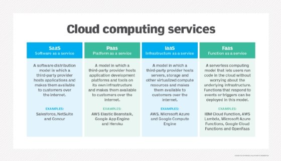
One way to ensure scalability is to embrace the power of **cloud computing**. It’s like having your own personal genie in a bottle, granting you unlimited wishes for storage and computing power. Plus, who doesn’t want to feel like they’re living in the future? I know I do!
Another important factor to consider is **automation**. Gone are the days of manually crunching numbers or sending out emails one by one. Let your machines do the heavy lifting for you, so you can focus on more important things like finally learning how to juggle or perfecting that recipe for the world’s best peanut butter and jelly sandwich.
Lastly, don’t forget about **flexibility**. Just like a gymnast doing the splits, your systems should be able to bend and stretch to accommodate whatever life throws at them. Be willing to pivot, adapt, and maybe even do a little yoga if that helps keep things running smoothly. After all, it’s all about finding that perfect balance, both in work and in life.
Consistency in Branding Across Platforms and Marketing Materials
Are you tired of seeing a different logo on every social media platform? Does inconsistent branding give you a headache? Well, fear not! We are here to help you achieve total brand harmony across all platforms and marketing materials.
First and foremost, make sure your logo is the same everywhere. It’s like having a twin – you wouldn’t change your twin’s face every time you switch platforms, would you? Keep it consistent, keep it recognizable.
Secondly, use the same color palette across the board. Let’s avoid giving your customers a mild case of color confusion, shall we? Pick a few colors and stick to them like glue – your brand will thank you in the long run.
Lastly, maintain a consistent tone of voice in all your messaging. Whether you’re posting on Instagram or sending out a newsletter, let your brand’s personality shine through. Are you a sassy unicorn or a charming sloth? Embrace your brand’s quirks and let them show in everything you do.
Seeking Professional Help When Necessary
When it comes to seeking professional help, sometimes we all need a little push in the right direction. Don’t worry, you’re not alone in feeling overwhelmed or unsure of where to turn. Here are a few signs that it might be time to seek out some expert assistance:
- Feeling like you’re stuck in a rut and can’t seem to shake it off
- Noticing a decline in your mental health (anxiety, depression, etc.) that just won’t go away
- Realizing that your DIY home improvement project is going terribly wrong
Remember, seeking professional help doesn’t mean you’re weak or incapable. It just means you’re smart enough to know when you need a little extra support. Whether it’s therapy, consulting an expert in your field, or hiring a professional to fix that leaky faucet, there’s no shame in admitting when you need help.
So, next time you find yourself drowning in stress or uncertainty, take a deep breath and reach out for assistance. Trust me, you’ll thank yourself later when you’re no longer stuck in that never-ending cycle of trying to do it all on your own.
FAQs
What are some common mistakes to avoid when designing a logo?
Oh, where do I even begin? Let’s start with using too many fonts – just like wearing too many patterns, it’s a visual disaster! Also, don’t go overboard with colors – it’s a logo, not a rainbow. And for goodness’ sake, steer clear of clipart - nobody wants to see a generic smiley face representing your company!
Why is it important to avoid cliches in logo design?
Because no one wants to be remembered as the company with the overused lightbulb symbol for innovation or the generic globe for global reach. Be original, stand out from the crowd, and please, for the love of design, don’t use a swoosh unless you’re Nike!
Can you give some tips on creating a timeless logo?
Absolutely! Keep it simple, avoid trendy fonts or graphics that will soon be outdated, and make sure your logo works in black and white – because sometimes, simplicity is key. Think of classic logos like Coca-Cola or McDonald’s - they’ve stood the test of time for a reason!
How can I ensure my logo is versatile and scalable?
Oh, this is a good one! Make sure your logo looks just as good on a billboard as it does on a business card. Test it out in different sizes and formats to see if it maintains its integrity. And remember, a good logo should be able to adapt to any medium – whether it’s print, digital, or even embroidered on a polo shirt!
Don’t Fall into the Logo Design Trap!
Alright folks, you’ve made it to the end of our logo design journey. Remember, the road to a successful logo is fraught with pitfalls, but armed with the knowledge of these common mistakes to avoid, you’ll be able to steer clear and emerge victorious! So go forth, brave designer, and may your logos be bold, memorable, and pitfall-free! Keep creating and stay fabulous!


