Are you tired of your logo looking like it was created by a toddler with a crayon? Well, fear not, my fellow design-challenged friend. In this article, we’re going to teach you all the tricks of the trade to master logo design like a seasoned pro. Get ready to elevate your branding game and leave those amateur logos in the dust. So grab your favorite sketchpad and let’s get cracking!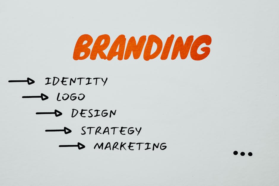
Understanding the Importance of Logo Design
Why Logo Design is Crucial for Your Brand
Have you ever tried to play a game of Guess Who without pictures? It’s a total disaster! Just like in the board game, a logo is the face of your brand that helps people instantly recognize and remember you. Here’s why logo design is no joke:
- First Impressions Matter: Your logo is often the first thing potential customers see, so make sure it’s a good one. It’s like choosing the right outfit for a first date – you want to wow them from the get-go!
- Memorable AF: A well-designed logo sticks in people’s minds like that catchy song you can’t stop humming. Be the earworm of the business world.
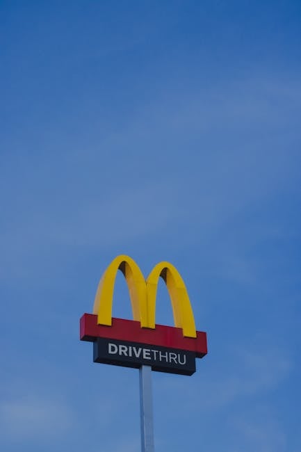
Think about all the iconic logos out there – Apple, Nike, McDonald’s. Would they be as successful without their memorable logos? I think not! Your logo is basically your brand’s BFF – always there to represent you and make you look good. So, treat it with the respect and admiration it deserves!
![]()
Key Elements of a Successful Logo
When creating a successful logo, you need to consider a few key elements that will help your brand stand out in a sea of mediocrity.
One essential element is simplicity. A logo should be easily recognizable and memorable, so avoid cluttering it with unnecessary details. Think of it like a good joke – the punchline should be clear and hit you right in the funny bone.
Another important element is relevance. Your logo should reflect your brand’s personality and values. It’s like picking the right outfit for a first date – you want to look good and make a good impression, but you don’t want to show up in a tuxedo to a casual coffee shop.
Lastly, versatility is key. Your logo should look just as good on a billboard as it does on a business card. It’s like a good actor who can play any role – whether they’re starring in a blockbuster movie or a quirky indie film, they always steal the show.

Choosing the Right Color Palette for Your Brand
Have you ever looked at your brand’s color palette and thought, “Hmm, are these colors really representing my brand’s personality or did I accidentally pick them blindfolded?” Well, fear not my friend, for today we are going to dive into the magical world of color psychology and find the perfect hues for your brand.
First things first, let’s talk about the importance of choosing the right colors for your brand. Colors play a huge role in shaping the perception of your brand and can even influence people’s emotions and behaviors. So, it’s crucial to choose colors that not only look good but also resonate with your brand’s values and message.
Now, onto the fun part – picking the right color palette for your brand. Here are a few tips to help you out:
– **Know Your Audience**: Consider who your target audience is and what colors they are drawn to. Are they into bold and vibrant colors or do they prefer more muted tones?
– **Reflect Your Brand’s Personality**: What is your brand all about? Is it fun and quirky, elegant and sophisticated, or maybe a bit of both? Choose colors that reflect the personality of your brand.
- **Keep It Simple**: Don’t go overboard with too many colors. Stick to a few key colors that work well together and complement each other.
So, there you have it - the secret to choosing the perfect color palette for your brand. Remember, colors are powerful tools that can help your brand stand out and make a lasting impression. So, go forth and paint the town (or rather, your brand) with the perfect hues!
Typography and Logo Design: Finding the Perfect Balance
When it comes to typography and logo design, finding the perfect balance is like trying to juggle flaming chainsaws while riding a unicycle – it’s tricky, but oh so satisfying when you get it right.
Imagine your logo as the star of the show, the diva of the design world. It needs to stand out, make a statement, and leave a lasting impression. But if you pair it with the wrong typography, it’s like dressing up for a black-tie event and showing up in a Hawaiian shirt – not a good look.
On the other hand, if your typography is too flashy and steals the spotlight from your logo, it’s like having a sidekick who constantly tries to upstage you. You want your typography to complement your logo, not compete with it. It should be like the perfect wingman, enhancing the overall look without overshadowing the main attraction.
So, how do you strike that elusive balance? First, choose a font that matches the personality of your logo. If your logo is sleek and modern, opt for a clean, minimalist font. If it’s bold and eye-catching, go for something with a bit more flair. Experiment with different combinations until you find the one that makes your logo shine like a diamond on a velvet pillow.
Creating a Memorable and Timeless Logo
When it comes to , it’s all about finding that perfect mix of creativity and simplicity. Keep these tips in mind to ensure your logo stands the test of time:
- Think outside the box: Don’t be afraid to get a little weird with your design. Quirky logos are often the most memorable!
- Less is more: Avoid cluttering your logo with unnecessary details or text. A clean and simple design will be easier for people to remember.
- Color is key: Choose colors that not only represent your brand but also resonate with your target audience. Bright, bold colors can make your logo pop!
Remember, a timeless logo is like a fine wine – it only gets better with age. So, take your time, experiment with different designs, and don’t be afraid to break the mold. Who knows, you might just create the next iconic logo that people will remember for years to come!
Utilizing Negative Space in Logo Design
Negative space is like the ninja of logo design – often overlooked, but when used correctly, it can deliver a knockout punch to your design competition. Here are some creative ways to utilize negative space in your logo designs:
**1. Hidden messages:** Just like a secret agent sneaking around undetected, negative space can be used to hide subtle messages or images within your logo. Think of the arrow hidden in the FedEx logo – once you see it, you can’t unsee it! Get creative with negative space to add an element of surprise to your design.
**2. Playful illusions:** Negative space can create optical illusions that make your logo design stand out from the crowd. Play around with shapes and colors to trick the eye and create visual interest. You’ll have people doing a double-take when they realize the clever use of negative space in your logo.
**3. Bold simplicity:** Sometimes, less is more. Negative space can be used to create a clean and minimalist logo design that packs a powerful punch. Embrace the beauty of simplicity and let the negative space do the talking in your logo.
So next time you’re designing a logo, don’t underestimate the power of negative space. With a little creativity and a touch of ninja-like stealth, you can create a logo design that grabs attention and leaves a lasting impression.
Testing and Refining Your Logo for Maximum Impact
So you’ve got a logo, huh? Congratulations, you’re officially a business owner! But before you start plastering that bad boy everywhere, you’re going to want to make sure it’s as impactful as possible. Here are a few tips to test and refine your logo until it’s as shiny as a freshly polished penny:
- Ask for Feedback: Don’t be shy about showing your logo to friends, family, or even strangers on the street. Getting different perspectives can help you see things you might have missed.
- Put it to the Test: Try sticking your logo on different backgrounds, resizing it, and even mocking up a few marketing materials to see how it looks in action.
- Get Out the Magnifying Glass: Details matter, so take a close look at your logo at various sizes. If it’s starting to look like a pixelated mess when you shrink it down, it might be time for a redesign.
Remember, Rome wasn’t built in a day, and neither was the Nike swoosh. Take your time to test and refine your logo until it’s a true reflection of your brand. After all, you wouldn’t want to be caught slinging a subpar logo around town, would you?
FAQs
How can I create a unique and memorable logo for my brand?
To create a logo that stands out, mix a cup of creativity with a pinch of originality. Stir in some inspiration and sprinkle some imagination on top. Remember, a logo is like a first impression – make it count!
What are some common mistakes to avoid when designing a logo?
Avoid using clichés like the plague. Don’t be a copycat either - originality is key! And please, for the love of design, steer clear of Comic Sans. Your brand deserves better!
How important is color selection in logo design?
Color selection can make or break your logo. Choose colors that reflect your brand’s personality and evoke the right emotions. Just remember, neon green might work for a slime-themed party, but probably not for a law firm.
Should I incorporate the company name into the logo?
Well, that’s like asking if peanut butter goes well with jelly. If your company name is catchy and memorable, by all means, slap it on that logo! But if your name is longer than a CVS receipt, you might want to consider just using initials or a symbol instead.
How can I ensure my logo works across different platforms and mediums?
Make sure your logo is versatile by testing it in various sizes and backgrounds. Your logo should look fly on a billboard, a business card, and even an airplane banner (because why not go big or go home, am I right?).
Put a Stamp on Your Brand with These Logo Design Tips
Congratulations, you’ve now become a master of logo design! You’ve learned all the expert tips and tricks for creating effective branding that will make your company stand out from the crowd. So go forth and conquer the world of design, armed with your newfound knowledge and a sharp eye for creating the perfect logo. Remember, a great logo is like a fine wine – it only gets better with time. Cheers to your success in branding!


