Welcome to the wild world of logo design, where pixels collide, colors clash, and fonts frolic in a dance of technological brilliance. In this article, we will explore the mysterious art of decoding technology to master the principles of logo design. So grab your magnifying glass, sharpen your creative wit, and prepare to embark on a journey through the digital jungle of branding wizardry. Let’s unveil the secrets behind creating logos that are not only visually stunning, but also cleverly crafted to communicate a brand’s message with wit and charm. Let the decoding begin!
Understanding the Elements of Logo Design
So, you want to understand the elements of logo design, do you? Well buckle up, because we’re about to dive into the wonderful world of branding aesthetics!
Let’s start with the first element: **color**. Colors can evoke certain emotions and convey messages without saying a word. Think of red for passion, blue for trust, and green for nature (or money, depending on your perspective!). Choose your colors wisely, my friend. Otherwise, your logo might end up looking like a unicorn threw up a rainbow.
Next up is **typography**. Fonts can make or break a design. You wouldn’t want to use Comic Sans for a law firm logo, or would you? (Please, don’t.) Stick to classy serifs or modern sans-serifs, and for the love of Arial, never center-align your text unless you want to set off a design nerd’s alarm.
Another crucial element is **simplicity**. Keep it simple, stupid! A logo should be easily recognizable and scalable. If your logo looks like a Rorschach inkblot test, you might want to reconsider your design choices. Remember, less is more. Unless you’re going for the “I’m compensating for something” look.
And last but definitely not least, **versatility**. Your logo should look just as fabulous on a billboard as it does on a business card. Make sure your design works in black and white, small sizes, and different backgrounds. After all, you don’t want your logo disappearing into the void like that sock you lost in the laundry.![]()
Creating Memorable and Timeless Logos
When it comes to , there are a few key elements to keep in mind:
First and foremost, simplicity is key. A cluttered logo will only confuse your audience and make it difficult to remember. Keep it clean and simple, like a minimalist masterpiece that will make even Picasso jealous.
Secondly, consider using bold colors that will make your logo pop. Forget about pastels and muted tones – go for colors that will grab your audience by the eyeballs and scream, ”Look at me!”
Lastly, don’t be afraid to think outside the box. Your logo doesn’t have to be literal – consider using abstract shapes or designs that will leave a lasting impression on anyone who sees it. Remember, a logo is like a fine wine – it only gets better with age.
Utilizing Color Psychology in Logo Design
Color psychology in logo design is a fascinating subject that can truly make or break a company’s branding efforts. By tapping into the emotional responses that certain colors evoke, designers can create logos that speak to customers on a subconscious level. Here are some key points to keep in mind when choosing colors for your logo:
- **Red**: This color is often associated with passion, energy, and excitement. It can grab attention and convey a sense of urgency or importance.
- **Blue**: Blue is a calming, trustworthy color that is often used by corporate brands to convey reliability and professionalism.
- **Yellow**: Symbolizing optimism and creativity, yellow can be a great choice for brands looking to stand out and make a bold statement.
Remember, it’s not just about choosing a color that you personally like. Consider your target audience and the emotions you want your brand to evoke. A thoughtful approach to color psychology can help your logo make a lasting impact on consumers. So, don’t be afraid to think outside the box and experiment with different hues to see what resonates best with your brand’s message.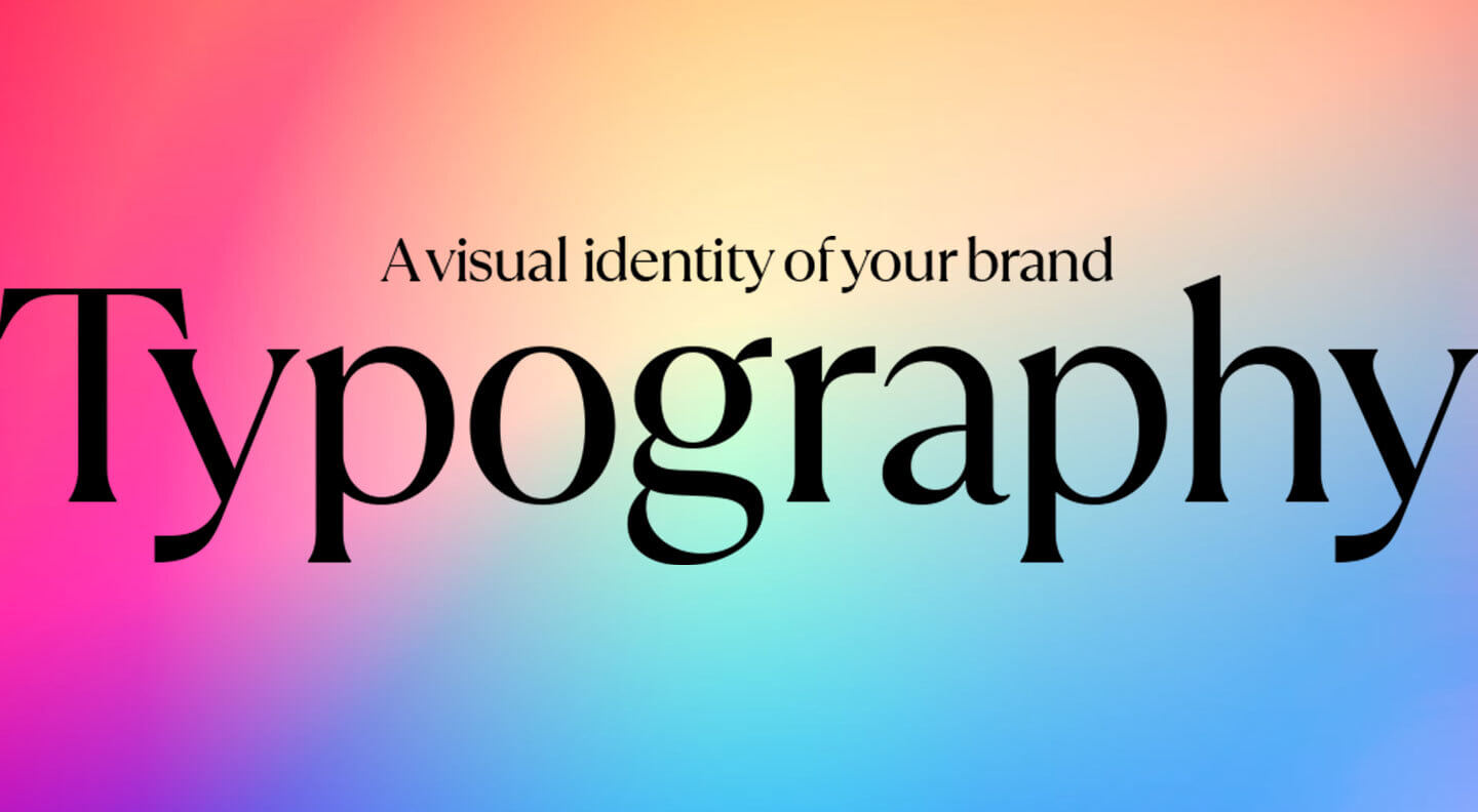
Mastering Typography for Effective Logos
Typography is the unsung hero of logo design. Just like a ninja sneaking through the shadows, good typography can make or break the effectiveness of a logo. Here are some tips to help you become a typography master:
- Play with Different Fonts: Mix and match different fonts to create a unique and eye-catching logo. Just like a good cheese platter, variety is key.
- Focus on Readability: Your logo won’t be effective if people can’t read it. Unless you’re going for that mysterious hieroglyphic vibe, make sure your text is clear and legible.
- Kerning is Key: Pay attention to the spacing between letters. Too tight and your logo will look cramped, too loose and it will look like it’s been hit with the stretch tool in MS Paint.
Remember, typography is like the seasoning in a dish – the right amount can elevate your logo to gourmet status, while too much can leave a bad taste in people’s mouths. So, go forth and conquer the world of typography, one logo at a time!
![]()
Balancing Simplicity and Complexity in Logo Design
When it comes to logo design, finding the perfect balance between simplicity and complexity can be quite the challenge. You want your logo to be memorable and eye-catching, but you also don’t want it to overwhelm your audience with too many details. It’s like walking a tightrope, but with colors and shapes instead of a pole.
One way to strike this delicate balance is by incorporating a mix of both simple and complex elements in your design. Think of it like making a gourmet sandwich – you have your basic ingredients like bread and cheese, but you also add some fancy arugula and aioli to give it that extra flair. In logo design terms, this could mean combining a clean, minimalistic font with a detailed illustration or icon.
Another approach is to play with the concept of negative space. This is where you cleverly use the space around and between elements in your logo to create hidden meanings or shapes. It’s like a visual puzzle for your audience to solve, making your logo not only visually appealing but also intellectually stimulating. Who says logos can’t be both pretty and brainy?
Remember, the key to successful logo design is finding that sweet spot between simplicity and complexity. So, next time you’re brainstorming ideas for a new logo, think outside the box and embrace the challenge of striking the perfect balance. Who knows, you might just create the next iconic logo that stands the test of time!
Exploring Different Logo Styles and Trends
Are you tired of your same, boring logo? It’s time to shake things up and explore different logo styles and trends that will make your brand stand out from the crowd!
From minimalistic designs to intricate illustrations, there are endless possibilities when it comes to creating a logo that truly represents your brand. Here are some trending logo styles to consider:
- Geometric: Clean lines and shapes that create a modern and professional look.
- Vintage: A throwback to retro styles, perfect for adding a touch of nostalgia to your brand.
- Hand-drawn: Uniquely crafted designs that give your logo a personal touch.
- Abstract: Playful and creative shapes that spark interest and curiosity.
Don’t be afraid to mix and match different styles to create a logo that is uniquely yours. Experiment with colors, fonts, and imagery to see what resonates with your target audience. Remember, the key to a successful logo is staying true to your brand’s identity while also being bold and creative!
Implementing Graphic Design Principles in Logo Creation
When creating a logo, it’s important to keep in mind the basic principles of graphic design. These principles will help you create a logo that is visually appealing and effectively communicates your brand message. Here are some tips on how to implement graphic design principles in logo creation:
- Keep it simple: Remember, less is often more when it comes to logo design. A simple, clean logo will be more memorable and versatile than a cluttered, overly complex design.
- Focus on readability: Make sure that your logo is easily readable, even at small sizes. Avoid using overly decorative fonts or intricate graphics that may be hard to decipher.
- Consider balance: A well-balanced logo will be visually pleasing and easy to look at. Make sure that all elements of your logo are harmoniously arranged.
Additionally, think about color theory when designing your logo. Different colors evoke different emotions and can help communicate your brand personality. For example, blue can represent trust and reliability, while yellow can convey optimism and energy. Choose colors that align with your brand values and target audience.
FAQs
What are some common mistakes to avoid when designing a logo?
– Oh boy, where do I begin? Avoid using too many colors, complex fonts, or random clip art. Your logo shouldn’t look like a ransom note from a magazine cutout party.
Why is it important to simplify your logo design?
– Because nobody wants to play “Where’s Waldo” with your logo. Keep it simple, stupid. A clean and straightforward logo is more memorable and versatile.
How can I make sure my logo is scalable for different applications?
– Think of your logo as a chameleon that can adapt to any environment. Test it out in various sizes and formats to make sure it looks good on a business card as well as a billboard.
What role does color psychology play in logo design?
– Colors have feelings too, you know. Choose colors that reflect your brand’s personality and resonate with your target audience. No one wants to feel blue about your logo choice.
How can I ensure my logo is unique and not just a copycat design?
– Don’t be a logo thief! Do your research, brainstorm ideas, and sketch out different concepts. Your goal is to stand out, not blend in with the crowd of uninspired logos.
Why is it important to seek feedback on your logo design?
– Two heads are better than one, especially when it comes to logo design. Get feedback from friends, family, and even strangers to see if your logo hits the mark or misses the toilet.
The Finale: Unleash Your Inner Logo Jedi
Congratulations, young Padawan! You have now completed your training in the mystical art of logo design. Armed with the principles and knowledge shared in this article, you are now prepared to venture forth into the digital galaxy and conquer all design challenges that come your way.
Remember, with great power comes great responsibility. Use your newfound logo design skills wisely and always trust in the force of creativity to guide you. And remember, may the pixels be ever in your favor!
Go forth now, logo master, and may your designs be as legendary as the tale of Darth Vader’s redemption. The design force is strong with you!


