Are you tired of searching for the perfect logo design for your brand, only to find out that it costs an arm and a leg? Well, fear not, fellow DIY enthusiasts, because we’ve got some tips and tricks to help you craft a logo that screams “YOU” without breaking the bank (or your spirit)! So grab your glue gun, pour yourself a cup of coffee, and get ready to unleash your inner design guru with our DIY logo design tips!
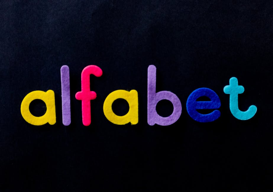
Choosing the Right Color Palette
Need help choosing the perfect color palette for your next project? Don’t worry, we’ve got you covered! With so many colors to choose from, it can be overwhelming to find the right combination. Luckily, we have some tips to help you pick the perfect palette that will make your design pop!
First things first, think about the mood you want to convey with your design. Are you going for a fun and energetic vibe, or something more calm and serene? Once you’ve got that in mind, it’s time to start playing with color combinations. Consider the following:
- Complementary colors: Colors that are opposite each other on the color wheel can create a vibrant and eye-catching palette.
- Analogous colors: Colors that are next to each other on the color wheel can create a harmonious and cohesive palette.
- Monochromatic colors: Different shades of the same color can create a sleek and sophisticated palette.
Don’t be afraid to experiment and mix things up! Remember, there are no strict rules when it comes to choosing a color palette. Trust your instincts and go with what feels right for your design. And most importantly, have fun with it!
typography“>Creating a Memorable Typography
Typography is more than just picking a fancy font for your design – it’s about creating an experience that sticks in people’s minds like gum on a shoe. So, how do you achieve that? Here are some tips to create a memorable typography that will have your audience saying “Whoa, that’s some sick type, bro!”
First off, pay attention to the size of your text. **Bold** headlines are great for grabbing attention, but make sure to balance them out with smaller, subtler fonts for body text. This contrast will keep your design from looking like a ransom note created by a deranged typophile.
Next, mix it up with different styles and weights. Varying between **serif** and **sans-serif** fonts can add depth and visual interest to your layout. Think of it like a buffet of typefaces – you wouldn’t want to eat just one dish, would you? So, why settle for just one font?
Don’t forget about spacing! Just like giving your pet some breathing room so they don’t drive you crazy, proper kerning and leading can make or break your design. Give your text some room to breathe and it will thank you by looking oh-so-fine. And remember, alignment is key. Nothing says “I have no idea what I’m doing” like randomly placing text all over the place. So, keep it tidy and watch your typography shine like a freshly polished Comic Sans.
simplicity-and-versatility“>Emphasizing Simplicity and Versatility
Looking for a way to simplify your life and add a touch of versatility to your daily routine? Well, look no further because we have just what you need!
Our products are designed with simplicity in mind, making them easy to use and hassle-free. Whether you’re a tech-savvy guru or a novice just starting out, our items are user-friendly and perfect for all skill levels. No need for complicated manuals or confusing instructions – just plug and play!
But wait, there’s more! Not only are our products simple to use, but they are also incredibly versatile. From multi-functional gadgets to customizable accessories, the possibilities are endless. Want to switch up your look? No problem! Our items can be easily adapted to fit your style and needs.
So why settle for ordinary when you can have extraordinary? Embrace simplicity and versatility with our products and make your life easier and more exciting!

Incorporating Symbolism and Meaning
When into your work, it’s important to think outside the box. Don’t just stick to the basics – get creative with your choices!
One way to add symbolism is through the use of colors. Think about the emotions and ideas that are typically associated with different colors. For example:
- Red can represent passion, anger, or danger. Maybe incorporate some red elements into a scene to add a sense of urgency or intensity.
- Blue often symbolizes calmness and stability. Consider using shades of blue in a tranquil setting to evoke a sense of peace.
- Yellow is associated with happiness and energy. Add a pop of yellow to brighten up a scene and give it a playful vibe.
Another way to infuse meaning into your work is through the use of objects or imagery. Think about what certain objects might represent in a broader context. For example:
- Use a broken mirror to symbolize bad luck or a disrupted reality.
- Include a clock ticking in the background to create a sense of urgency or impending doom.
- Have a character wear a lock and key necklace to represent the idea of secret-keeping or unlocking hidden truths.
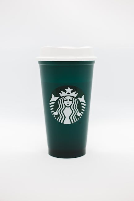
Ensuring Consistency Across Different Platforms and Materials
When it comes to , it can feel like trying to herd cats – impossible! But fear not, with a little bit of strategy and creativity, you can conquer this daunting task.
First and foremost, make sure to establish a **style guide** for all your materials. This guide should include guidelines on typography, color usage, imagery, and overall brand voice. Think of it as your trusty sidekick in the battle against inconsistency.
Another tip is to **schedule regular check-ins** with your team to review ongoing projects and ensure everyone is on the same page. Communication is key, and you don’t want to end up with a website that looks like it was designed by a different company altogether!
Lastly, don’t be afraid to **experiment** with different platforms and materials. Trying new things can often lead to a breakthrough in creativity. Just make sure to always refer back to your trusty style guide to keep everything cohesive. Who knows, maybe your next project will be the talk of the town for all the right reasons!
FAQs
Why is having a unique logo important for my brand?
Having a unique logo is important because it helps differentiate your brand from your competitors. It’s like your brand’s fingerprint – no two should be alike!
What are some tips for creating a memorable logo?
To create a memorable logo, think simple, yet creative. Use bold colors and fonts that reflect your brand’s personality. And don’t be afraid to think outside the box!
How can I ensure my DIY logo design looks professional?
Make sure your DIY logo design is high-resolution and scalable. Avoid using too many intricate details and keep it clean and simple. And always get feedback from others before finalizing your design!
What are some common mistakes to avoid when designing a logo?
Avoid using clip art or generic templates. Your logo should be original and reflective of your brand. Also, steer clear of using too many colors or fonts – simplicity is key!
Now go forth and create a logo masterpiece!
You’ve armed yourself with the knowledge and tools to design a logo that perfectly represents your brand. So, grab your metaphorical paintbrush and start crafting! Remember, Rome wasn’t built in a day, and neither was Nike’s iconic swoosh. Take your time, experiment, and most importantly, have fun with it. Who knows, you might just create the next big thing in logo design. Good luck and happy crafting!


