Have you ever stopped to think about the impact that color has on your life? From the moment you wake up to the moment you lay your head to rest, color is there, influencing your mood, your decisions, and even your appetite (looking at you, fast food chains). But did you ever stop to consider the power that color holds in the realm of logo design? Strap in, folks, because we’re about to take a colorful journey through the wild world of branding and discover just how important choosing the right hues can be when it comes to making a lasting impression. So grab your rainbow-colored glasses and let’s dive into the wonderful world of understanding the power of color in logo design! Impact of Color on Brand Recognition”>
The Impact of Color on Brand Recognition
When it comes to brand recognition, color plays a huge role in how consumers perceive a company. Think about it - if McDonald’s suddenly changed their iconic red and yellow color scheme to something like purple and orange, would you still recognize them as easily? Probably not.
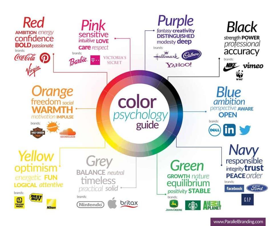
Colors can evoke emotions and feelings in people, so it’s important for brands to choose their colors carefully. Red can symbolize passion and energy, while blue is often associated with trust and reliability. Green is linked to nature and growth, while purple can represent luxury and sophistication. So, next time you see a logo, take a moment to think about the colors they’ve chosen and how it makes you feel.
Some brands have become so synonymous with their colors that they’ve become instantly recognizable. Just think about the golden arches of McDonald’s, the swoosh of Nike, or the bright red of Coca-Cola. These companies have successfully used color to establish their brand identity and stand out from the competition.
So, the next time you’re creating a logo or designing a website, remember the power of color. Choose wisely, and you might just create a brand that’s instantly recognizable and unforgettable!
Creating Emotional Connections Through Color
Feeling blue? Or maybe you’re seeing red? Well, hold onto your hats, because we’re diving into the wonderful world of color and its emotional impact!
First off, let’s talk about the color red. This fiery hue is known for evoking feelings of passion, excitement, and energy. So, if you want to bring some heat to your brand, red is the way to go! Just make sure you don’t overdo it, or you might end up looking like a walking tomato.
On the other end of the spectrum, we have the calming color blue. This cool shade is perfect for creating a sense of trust, loyalty, and serenity. So, if you want your brand to give off vibes of professionalism and reliability, blue is your best bet. Just be careful not to drown your audience in a sea of blue, or they might mistake you for a smurf.
And let’s not forget about everyone’s favorite color, yellow! This cheerful hue is all about optimism, happiness, and creativity. Want to inject some sunshine into your brand? Go for yellow! Just be prepared for your audience to break out into song and dance whenever they see your logo.
Choosing Colors That Resonate With Your Target Audience
When it comes to , it’s not just about picking your favorite shades of the rainbow. You need to consider what will truly connect with the people you’re trying to reach. Think of it like a first date – you wouldn’t show up in a neon green suit and expect to make a good impression, right?
So, how do you know which colors will make your audience swoon? Start by doing a little research. Look into color psychology and see what emotions different hues evoke. For example, did you know that red can create a sense of urgency, while blue is often associated with trust and reliability? Pay attention to what colors your competitors are using too. You don’t want to blend in like a chameleon at a rainbow convention.
Once you’ve narrowed down your color options, it’s time to put them to the test. Show some samples to a focus group and see which ones elicit the strongest reactions. You want your audience to feel like they’ve found their color soulmate – not like they’re stuck in a bad ’70s disco. And remember, it’s not just about the hue itself. The right combination of colors can really make your brand pop. Think green with envy? Well, envy looks good on you!

The Psychology Behind Color Choice in Logo Design
Red:
Red is a bold and powerful color often associated with passion, love, and urgency. When companies use red in their logos, they are sending a loud and clear message that they mean business. It grabs your attention like a toddler throwing a tantrum in the grocery store aisle – you can’t ignore it!
Blue:
Blue is the color of trust, stability, and calmness. It’s like your favorite cozy blanket on a chilly winter night, making you feel safe and secure. Companies that use blue in their logos are saying, “Hey, we’re reliable and chill – like that friend who always has snacks.”
Yellow:
Yellow is the color of sunshine, happiness, and positivity. It’s like a burst of confetti in a gray and dreary world, instantly brightening your day. Companies that use yellow in their logos are spreading joy and good vibes – like that one person who always brings cupcakes to the office.

Using Color to Communicate Brand Values
In the world of branding, color isn’t just a visual choice – it’s a language that speaks volumes about your brand values. So, if you’re looking to make a splash (of color) in the competitive sea of brands out there, here are a few tips to help you use color to communicate your brand values:
- **Be bold with primary colors:** Red, blue, and yellow aren’t just for kids’ crayon boxes - they’re powerful tools for evoking emotions and making a statement. Want to convey passion and energy? Go for red. Want to exude trustworthiness and professionalism? Blue is your go-to. And yellow? Well, that’s just fun in color form.
- **Create harmony with complementary colors:** If you want your brand to be seen as innovative and forward-thinking, consider using complementary colors like purple and yellow, or green and red. These color combinations create a visual harmony that is pleasing to the eye and signals to your audience that you’re a brand that’s unafraid to push boundaries.
- **Stay true to your brand personality:** Just like people, brands have personalities too – and your color choices should reflect yours. Are you a bold, adventurous brand that loves to take risks? Opt for vibrant, attention-grabbing colors. Or maybe you’re a more understated, classic brand that values tradition and timelessness – in which case, muted, sophisticated colors might be more your style. Whatever your brand personality, make sure your color choices align with it to ensure a consistent and authentic brand image.
– **Don’t be afraid to experiment:** While it’s important to choose colors that align with your brand values, that doesn’t mean you can’t have a little fun along the way. Feel free to mix and match different shades, explore new color palettes, and experiment with different combinations to see what works best for your brand. After all, a little color play never hurt anyone – except maybe that one time I tried to dye my hair pink and ended up looking like a neon flamingo. But hey, at least I stood out in a crowd!
The Role of Color in Establishing Brand Identity
Color plays a pivotal role in establishing a brand identity, almost like picking out the right outfit for a first date. It sets the tone, conveys emotion, and leaves a lasting impression. Imagine showing up to that first date in a neon pink suit – that’s like using clashing colors for your brand identity, a definite no-no!
When choosing colors for your brand, consider the psychology behind each hue. For example, blue evokes trust and professionalism, perfect for financial institutions. Meanwhile, red screams passion and energy, great for a sports brand. So, think about what vibe you want to give off – are you cool and collected like a cucumber or fiery and fierce like a chili pepper?
Consistency is key when it comes to color in branding. Just like wearing the same pair of lucky socks every game day, using the same colors across all marketing materials helps consumers recognize and remember your brand. It’s like creating a signature look that everyone will associate with your company. So, pick your colors wisely and stick to them like glue!
Remember, your brand colors are like your trusty sidekicks, helping you conquer the vast world of marketing. So, choose them wisely, use them consistently, and watch your brand identity shine brighter than a disco ball on New Year’s Eve! It’s time to paint the town red, or blue, or green – whatever suits your brand personality best!
FAQs
Why is color important in logo design?
Color is like the cherry on top of a logo design sundae – it adds flavor, personality, and makes it stand out in a sea of vanilla designs. Without color, a logo would be as exciting as oatmeal without sugar.
How can different colors evoke different emotions or reactions?
Think of colors as little mood ring-wearing minions that can influence how people feel when they see your logo. For example, red can make them feel passionate, green can make them feel peaceful, and yellow can make them crave a Big Mac.
Can using the wrong color negatively impact a logo’s effectiveness?
Absolutely! Choosing the wrong color for your logo is like wearing a neon green tutu to a black-tie event – it’s a surefire way to stand out in the wrong way. Colors can either attract or repel potential customers, so choose wisely.
How should a company choose the right colors for their logo?
When choosing colors for your logo, it’s important to first consider your target audience and what emotions or associations you want to evoke. Just remember, if you’re a funeral home, hot pink and neon green might not be the best choice (unless your target audience is goth unicorns).
Are there any trends in logo color schemes that companies should be aware of?
Just like fashion trends, logo color trends come and go faster than you can say “millennial pink.” Currently, gradients, duotones, and vibrant, bold colors are all the rage. So, if you want to be on the cutting edge of logo design, embrace your inner rainbow.
Color Your Logo with Confidence!
Now that you understand the power of color in logo design, go forth and create eye-catching, memorable logos that truly stand out. Remember, red for passion, blue for trust, and green for growth – but hey, if you want to throw in a little pink for pizzazz, go for it! Just make sure it aligns with your brand message and target audience. So, grab your color wheel and start coloring – your logo game is about to get a whole lot brighter!


