Have you ever stopped to think about why certain logos catch your eye and evoke specific emotions? It’s not just pure luck or coincidence – there’s actually a whole science behind the psychology of colors in logos. From the calming blues of Facebook to the bold reds of Coca-Cola, colors play a sneaky little mind game with our emotions. So, buckle up, because we’re about to take a journey into the colorful world of logo design and the tricks they use to play with our feelings.
Understanding the Impact of Color Psychology
Have you ever felt a sudden surge of happiness when you look at a bright, sunny yellow wall? Or maybe you’ve noticed how a pale blue room instantly makes you feel calm and relaxed. Well, my friend, that’s the magic of color psychology at work!
Colors have the power to evoke emotions, influence moods, and even alter behavior. It’s like living in a real-life mood ring, except instead of changing colors based on your emotions, the colors around you are actually shaping how you feel!
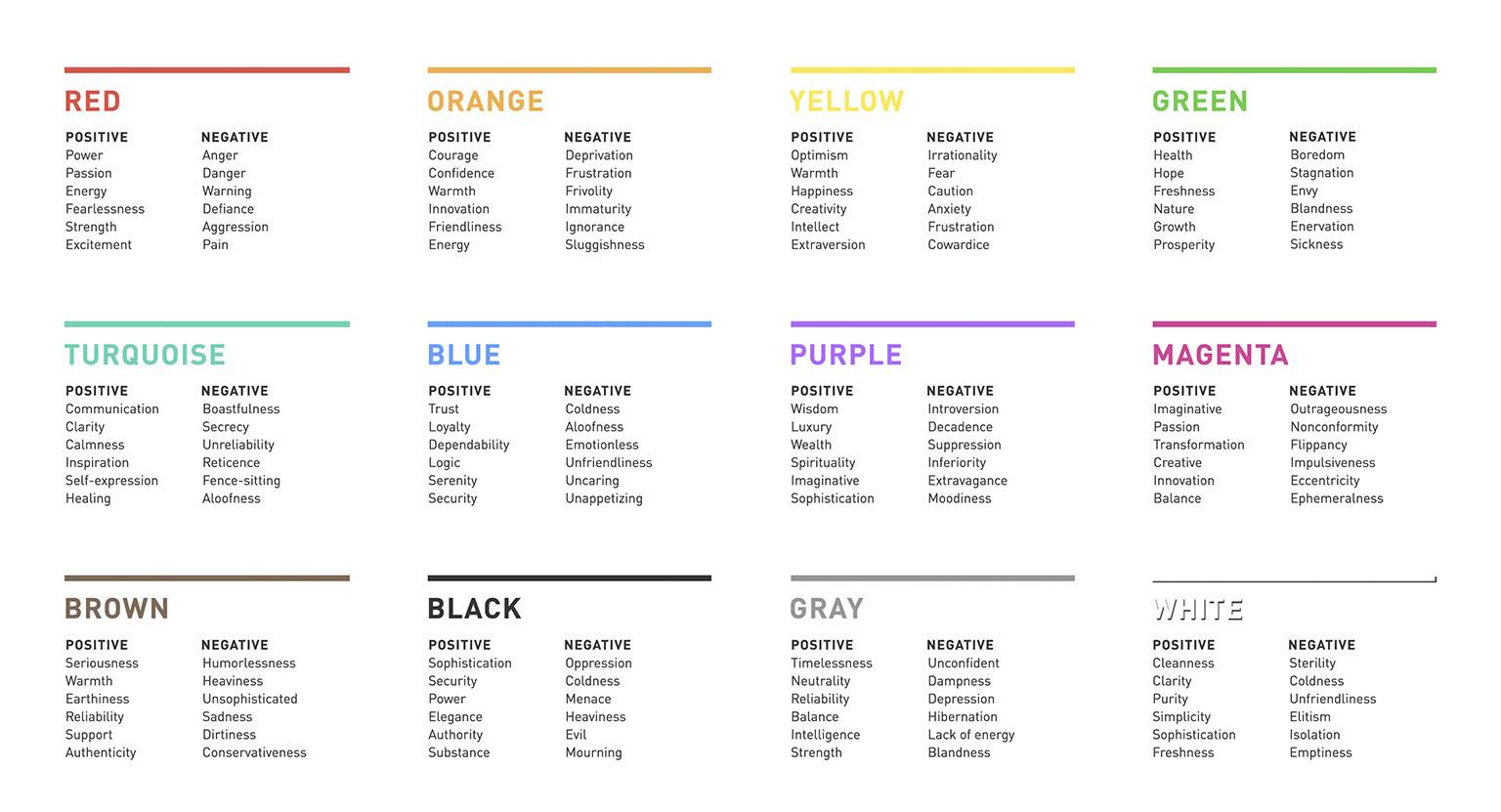
Here’s a fun little rundown of some common colors and their psychological effects:
- Red: Known for stimulating energy and passion, but be careful – too much red can also evoke feelings of anger and hostility.
- Blue: The color of tranquility and trust, blue is perfect for creating a sense of calm and security.
- Yellow: This cheerful hue is associated with happiness and optimism, making it a great choice for boosting your mood.
So next time you’re feeling blue, consider painting your walls a sunny shade of yellow or decking out your room in calming blues. Who knew that something as simple as color could have such a profound impact on our daily lives?
The Power of Red: Passion, Excitement, and Energy
Red: The Color of Passion, Excitement, and Energy
Have you ever noticed how the color red has the power to evoke such strong emotions? It’s like the friend who always knows how to get the party started – loud, vibrant, and oh so much fun!
Picture yourself wearing a bold red dress, strutting into a room like you own the place. The heads turn, the hearts race, and suddenly everyone is buzzing with excitement. That’s the power of red – it commands attention and demands to be noticed.
Whether it’s a red sports car zooming down the highway, a fiery sunset painting the sky, or a hot chili pepper setting your taste buds on fire, red is the color of life in the fast lane. It’s the spark that ignites our passion, lights up our excitement, and fuels our energy.

The Serenity of Blue: Trust, Security, and Stability
When it comes to **blue**, there’s a sense of trust, security, and stability that washes over you like a wave crashing on the shore. It’s the color of the vast ocean and endless skies, a hue that whispers tales of calm and peace.
Just like how a clear blue sky can instantly lift your spirits and make everything seem a little bit brighter, the color blue has a magical way of making you feel safe and secure. It’s like wrapping yourself in a cozy blanket or snuggling up with a warm cup of tea on a chilly evening – comforting and reassuring.
Blue is the color that reminds you to take a deep breath, relax, and trust that everything will be okay. It’s the steady rock in a sea of uncertainty, the anchor that keeps you grounded when the world feels like it’s spinning out of control. With blue by your side, you can weather any storm with grace and poise.
So next time you’re feeling overwhelmed or anxious, just remember the serenity of blue. Trust in its calming presence, find security in its familiar embrace, and revel in the stability it brings to your chaotic world. After all, a little bit of blue can go a long way in making everything feel right again.

The Optimism of Yellow: Happiness, Creativity, and Warmth
Yellow is the color of sunshine, daisies, and lemonade. It exudes positivity and an infectious optimism that can brighten even the dreariest of days. Just a glimpse of this vibrant hue can spark a smile and lift your spirits higher than a helium balloon on a summer day.
When you think of yellow, you can’t help but think of happiness. It’s like a big, warm hug in color form. Whether it’s the cheerful yellow walls of a cozy cafe or the golden glow of a sunny day, yellow has the power to make you feel like everything is going to be okay, no matter what life throws your way.
Yellow is also the color of creativity. It’s the color of Van Gogh’s sunflowers, of Picasso’s abstract art, of the golden age of Hollywood. It inspires innovation, imagination, and out-of-the-box thinking. When you surround yourself with yellow, you’re bound to feel more inspired and motivated to chase your dreams, no matter how big or small they may be.
So next time you’re feeling a little down in the dumps, just remember the optimism of yellow. Embrace its happiness, creativity, and warmth, and let it light up your life like a ray of sunshine on a cloudy day.

The Sophistication of Black: Elegance, Authority, and Mystery
Black – the color of sophistication, elegance, authority, and mystery. There’s just something about this dark, mysterious hue that exudes a certain je ne sais quoi. Whether you’re rocking a little black dress or a sleek black suit, you can’t help but feel like a total boss when you’re decked out in black from head to toe.
When it comes to style, black is a total game-changer. It’s a classic color that never goes out of style and always looks effortlessly chic. Plus, black goes with everything, so you never have to worry about clashing colors or looking like a fashion disaster. It’s like the little black dress of colors – it’s always in vogue.
Not to mention, black is the color of authority. Need to make a power move at work or assert yourself in a social situation? Just slip on that black blazer or throw on those black loafers, and you’ll instantly command attention and respect. It’s like black has a way of making you feel like you can take on the world – in style, of course.
But perhaps the best thing about black is its air of mystery. There’s something enigmatic and alluring about the color black that draws people in and leaves them wanting more. It’s like a secret weapon in your style arsenal - you never know what kind of awe-inspiring reactions you’ll get when you wear black. So go ahead, embrace the sophistication of black and watch as heads turn wherever you go.
The Freshness of Green: Growth, Renewal, and Health
When it comes to embracing the lushness of greenery, there’s nothing quite like the feeling of growth, renewal, and health that comes with it. It’s like putting your soul on a green juice cleanse and watching it bloom like a beautiful, photosynthesizing flower.
Greenery isn’t just about looking pretty – although let’s be real, we all love a good Instagram-worthy plant pic. It’s about the benefits it brings to our minds, bodies, and spirits. So embrace the green and watch yourself transform into a glowing, chlorophyll-infused being of pure health and vitality.
- Green is the color of growth – so go ahead and bloom where you’re planted, just like a beautiful sunflower reaching for the sky.
- Renewal is like hitting the reset button on your life – except instead of restarting your computer, you’re rejuvenating your soul with the power of nature.
- Health is wealth, my friends – so fill your life with all the green goodness you can find and watch your energy levels soar like a majestic eagle soaring through the clear blue sky.
So next time you’re feeling a bit wilted and droopy, remember the magic of greenery. It’s like a fresh breath of air for the soul – invigorating, revitalizing, and just a bit whimsical. Embrace the freshness of green and watch yourself grow, renew, and flourish like never before.
The Playfulness of Pink: Youthfulness, Femininity, and Compassion
Pink is more than just a color—it’s a way of life. In the world of fashion and design, pink represents youthfulness, femininity, and compassion. It’s a color that isn’t afraid to stand out, make a statement, and have a little fun along the way.
When you think of pink, you can’t help but picture playful moments spent twirling in a fluffy pink tutu or snuggling up in a cozy pink blanket. It’s a color that exudes a sense of carefree joy and whimsy, making it the perfect choice for those who want to embrace their inner child and add a touch of magic to their everyday lives.
Pink isn’t just for princesses and ballerinas—it’s for anyone who isn’t afraid to show off their soft, compassionate side. Whether you’re rocking a bold pink lip or adding a pop of pink to your home decor, this color is all about spreading love and kindness wherever you go. So go ahead, embrace the playfulness of pink and let your feminine flair shine through!
FAQs
What colors are best for evoking trust and reliability in a logo?
Well, if you want people to see your logo and instantly think, “Wow, that’s a trustworthy company,” then you might want to stick to blues like navy or royal blue. These colors are associated with stability and dependability, making your customers feel secure in their relationship with your brand.
Can certain colors in logos help create a sense of excitement and energy?
Absolutely! If you want your logo to scream “fun and lively,” then go for bold and vibrant colors like red or orange. These hues are known for their ability to stimulate the senses and create a sense of urgency, perfect for grabbing your audience’s attention and getting them excited about your brand.
Do specific colors in logos have the power to create a sense of luxury and sophistication?
If you want your brand to exude elegance and sophistication, then look no further than colors like black, gold, or silver. These hues are associated with wealth and exclusivity, making your logo the epitome of luxury. Who said you can’t buy class?
How can colors in logos be used to cultivate a sense of calm and tranquility?
If you want your logo to be the visual equivalent of a spa day, then try incorporating soft and soothing colors like light blue or pastel green. These colors have a calming effect on the mind, helping your customers feel at ease and relaxed when they interact with your brand.
Can the wrong choice of colors in a logo actually have a negative impact on a brand’s image?
Absolutely! Choosing the wrong colors for your logo can send the wrong message to your audience and potentially damage your brand’s image. For example, using harsh and aggressive colors like neon yellow or hot pink might give off the wrong vibe if you’re trying to convey professionalism and authority. So, make sure you choose your colors wisely!
Feeling Colorful Yet?
So there you have it – the fascinating world of how colors in logos can shape our emotions. Next time you see a red logo, you’ll think of excitement. And when you see a green logo, you’ll think of nature (and maybe vegetables, too). Remember, it’s not just about the colors themselves, but the emotions they can evoke in us. So go forth and analyze all the logos around you – just try not to go cross-eyed from staring at too many colors!


