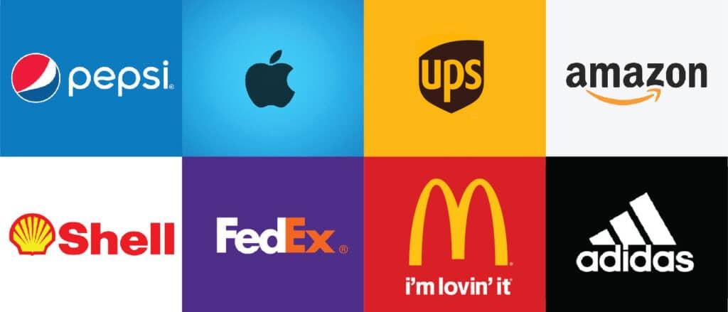
Welcome to the magical world of typography, where letters and shapes come together to create unforgettable logos that leave a lasting impression. In this article, we’ll dive into the power of typography in logo design and how it can spark emotions, evoke memories, and foster deeper connections with consumers. So buckle up, grab your favorite font, and let’s explore the wonderful world of typographic wizardry! Typography in Logo Design”>
The Importance of Typography in Logo Design
Imagine if the Coca-Cola logo was written in Comic Sans. Would it have the same iconic recognition that it does now? I think not, my friends! Typography plays a crucial role in logo design, setting the tone and personality of a brand. Choosing the right font can make or break a logo – it’s like picking the perfect outfit for a first date. You want to make a good impression, don’t you?
When it comes to typography in logo design, consistency is key. You wouldn’t wear mismatched socks to a job interview, would you? So why would you mix and match random fonts in your logo? Stick to one or two complementary typefaces to create a cohesive look that conveys professionalism and harmony. Remember, unity is strength!
Don’t underestimate the power of negative space, my fellow designers. Just like the pause between a good joke and the punchline, spacing plays a crucial role in typography. Give your letters some breathing room to avoid overcrowding and confusion. Your logo should be like a well-organized closet – neat, tidy, and visually appealing.
Lastly, don’t forget to experiment and have fun with typography. Try out different fonts, sizes, and styles to see what works best for your brand. After all, design is a creative process – embrace the journey of discovery and let your imagination run wild. Who knows, you might just stumble upon the perfect font that brings your logo to life!
Choosing the Right Font for Your Brand Identity
When it comes to , you don’t want to be left in the Comic Sans. You might think Arial is just fine, but let me tell you, there are over 60,000 fonts out there just waiting to spice up your brand like a beautifully kerned seriffed superhero.
Helvetica might be the safe choice, like wearing a plain white t-shirt to a job interview. But why settle for plain when you could be rocking a sassy script font that screams “I’m fun, I’m fancy, and I’m fabulous”? Embrace your inner typographic diva and let your brand shine bright like a diamond in a sea of Times New Roman.
Consider the personality of your brand when choosing a font. Is it sleek and modern like Roboto or playful and quirky like Lobster? Maybe it’s as bold as Impact or as elegant as Garamond. Remember, the font you choose will be the words that speak for your brand when you’re not around to do the talking. So choose wisely, my friends, and let your brand’s font do the talking while you sit back and watch the magic happen.
How Typography Can Evoke Emotions and Communicate Messages
Picture this: you’re strolling through the bookstore, and suddenly a book cover catches your eye. The font choice is bold and impactful, with words dripping in emotion. It’s as if the typography itself is whispering “pick me up, I have a story to tell.” That’s the power of typography - it has the ability to evoke emotions and communicate messages without saying a single word.
Just think about the last time you received a handwritten letter. The looping cursive or printed block letters immediately set the tone for what’s inside. The same goes for digital typography – whether it’s a sleek sans serif font screaming modernity or a whimsical script font whispering playfulness, each typeface carries its own personality and can sway us in unexpected ways.
It’s like a secret language that only designers and font enthusiasts truly understand. The subtle shift from a serif to a sans serif font can change the entire mood of a piece. It can make us feel nostalgic, excited, or even uneasy. Think of it as the magic spell that sets the tone for how we interpret the words on the page.
So next time you’re crafting a message – whether it’s a social media post or a business presentation – don’t underestimate the power of typography. Choose your fonts wisely, and let them do the talking for you. Who knew a few curves and lines could speak volumes?

Creating Visual Appeal with Typeface Selection
Choosing the right typeface can make or break your design. It’s like choosing the right pair of shoes for your outfit – you want them to complement each other, not clash. Don’t be afraid to mix and match different typefaces to create visual interest. Just like a good recipe, you want to strike the perfect balance so your design doesn’t end up looking like a hot mess.
When it comes to selecting typefaces, remember the age-old saying – variety is the spice of life. Experiment with different fonts to see what works best for your design. Maybe pair a bold, attention-grabbing font with a more subtle, elegant one to create a dynamic look. Just be careful not to go overboard – you don’t want your design to scream “I couldn’t make up my mind”.
Keep in mind the overall tone and feel of your design when choosing typefaces. If you’re going for a sleek, modern look, opt for clean, sans-serif fonts. For a more whimsical feel, consider using playful, handwritten fonts. Remember, your typeface selection should reflect the message you’re trying to convey. You wouldn’t wear a clown costume to a job interview, would you? So don’t use Comic Sans for a professional business presentation.
Don’t forget about spacing and alignment when working with typefaces. Proper kerning and leading can make a world of difference in how your text is perceived. Just like arranging furniture in a room, you want to make sure everything is nicely spaced out and aligned. Otherwise, you’ll end up with a design that’s as awkward as a first date conversation. And nobody wants that.

Typography Trends in Logo Design for 2021
When it comes to , the key is boldness and creativity. Say goodbye to boring old fonts and hello to exciting new styles that will make your logo stand out from the crowd!
**Here are some of the top typography trends to keep an eye on this year:**
– **Handwritten Fonts:** Handwritten fonts are all the rage right now, adding a personal touch to any design. Whether it’s a casual script or a more elegant cursive, handwritten fonts bring a sense of authenticity and warmth to your logo.
– **Variable Fonts:** Variable fonts are a game-changer in the world of typography, allowing for seamless transitions between different styles and weights. With variable fonts, you can create dynamic and eye-catching logos that are sure to turn heads.
– **Retro Revival:** Everything old is new again, and that includes typography. Retro fonts from the ’70s and ’80s are making a big comeback in logo design this year. Think bold, blocky letters and groovy curves that will give your logo a nostalgic vibe.
So embrace the latest typography trends and get ready to make a statement with your logo design in 2021!
Using Typography to Build Brand Recognition and Loyalty
Typography plays a crucial role in creating a memorable brand identity. In a sea of bland fonts, using the right typography can be the key to standing out from the crowd. Just like picking the perfect outfit for a first date, choosing the right font can make or break your brand’s first impression.
When it comes to building brand recognition, consistency is key. Think of typography as your brand’s wardrobe – stick to a consistent style throughout all your marketing materials to ensure your brand is easily recognizable. Whether it’s on your website, social media, or promotional materials, make sure your fonts are as consistent as your morning coffee order.
Not only does typography help in building brand recognition, but it also plays a crucial role in fostering brand loyalty. Just like a good friend that never lets you down, a well-chosen font can create a sense of trust and reliability with your audience. Whether it’s a sleek sans-serif or a charming script, choose a font that speaks to your brand’s personality and resonates with your target audience.
In a world filled with endless font choices, remember to have fun with typography! Experiment with different fonts, sizes, and colors to find the perfect combination that represents your brand. After all, building brand recognition and loyalty should be as fun and exciting as finding the perfect pair of shoes – it’s all about the right fit. So, grab your virtual fashion designer hat and start playing around with typography to make your brand shine!
FAQs
What font should I use for my logo if I want it to convey a sense of elegance and sophistication?
For an elegant and sophisticated vibe, consider using serif fonts like Baskerville or Didot. These fonts are timeless and exude a sense of luxury.
Can I use a playful and fun font for my logo to appeal to a younger audience?
Absolutely! Playful and fun fonts like Comic Sans or Papyrus can be a great choice for appealing to a younger demographic. Just make sure it fits with your brand’s overall image.
How important is it to choose the right font for my logo design?
Choosing the right font for your logo design is crucial. The font you choose can convey a lot about your brand’s personality and values, so make sure it aligns with your message.
Is it okay to mix different fonts in my logo design?
Mixing fonts in your logo design can add visual interest, but be careful not to go overboard. Stick to using no more than two complementary fonts to maintain a cohesive look.
What are some popular typography trends in logo design right now?
Currently, minimalist and clean typography is a popular trend in logo design. Fonts like Helvetica and Futura are go-to choices for creating modern and sleek logos.
Putting the “type” in typography
So, next time you see a logo that really speaks to you, remember that the power of typography is at play! Whether it’s a clever use of space or a playful font choice, typography can create a deeper connection with consumers and leave a lasting impression. So, go forth and appreciate the art of fonts – you never know what kind of magic they might weave into your next logo design!


