Welcome to the wonderful world of typography, where letters and fonts come together to create branding magic like a spell cast by a design wizard. From the bold confidence of a sans serif to the elegant curves of a script typeface, the power of typography in branding design is not to be underestimated - it’s like the secret sauce that makes your logo pop and your message sing. So grab your favorite font and let’s dive into the wild and wacky world of typographic branding!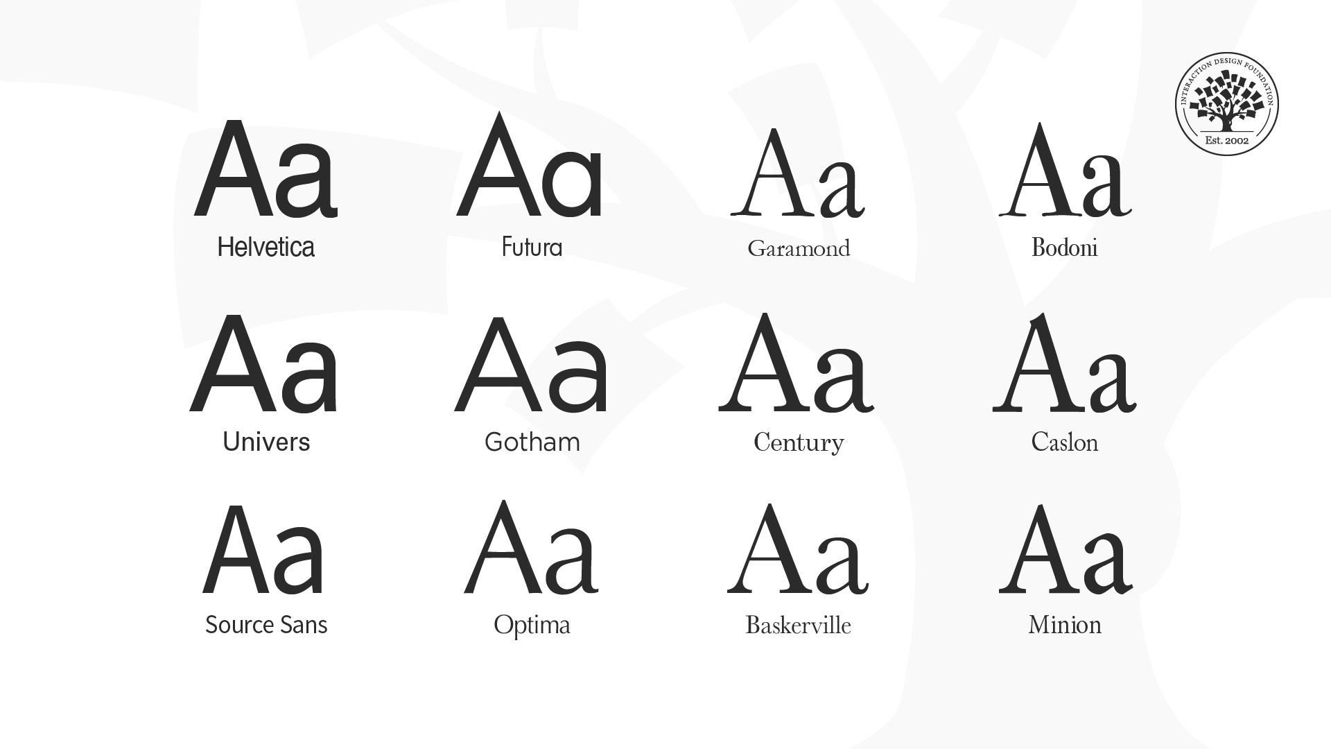
identity“>The Role of Typography in Brand Identity
Typography is like the wingman of brand identity, always there to make the brand look good and help it score some points with the audience. Just like a wingman, the right typography can make all the difference in how a brand is perceived.
One of the key roles of typography in brand identity is to convey the brand’s personality. Different fonts have different personalities - some are bold and confident, while others are more laid-back and approachable. Choosing the right font can help convey the right message about the brand.
Typography also helps with brand recognition. Think about Coca-Cola’s iconic swirly script or the bold, all-caps logo of Adidas. These fonts are instantly recognizable and help consumers identify the brand at a glance. Choosing a unique and memorable font can help a brand stand out in a sea of competitors.
In addition, typography can also help create a cohesive look across all brand materials. By using the same fonts consistently on everything from business cards to websites, a brand can create a strong visual identity that helps consumers remember and recognize them. So next time you’re picking out fonts for your brand, remember – typography is not just about looking good, it’s about making your brand shine!
Creating a Visual Identity with Typography
So you want to create a visual identity that really pops? Well, let me tell you, typography is going to be your best friend in this journey. Not only does it convey a message, but it also adds personality to your design. Here are some tips to help you on your way:
- Choose fonts wisely. Don’t just pick any old font – think about what message you want to convey and choose a font that reflects that. Maybe you want something bold and eye-catching, or maybe you prefer something more subtle and classy. The choice is yours!
- Experiment with different font pairings. Mixing and matching fonts can create some seriously cool effects. Just remember, opposites attract – try pairing a bold, chunky font with a delicate, elegant one for maximum impact.
Feeling overwhelmed by all the options out there? Don’t worry, we’ve all been there. Just take a deep breath, maybe grab a cup of coffee, and remember – there’s no rush! Play around with different fonts, sizes, and colors until you find the perfect combination that screams “you.”
And last but not least, trust your instincts. If something doesn’t feel right, it probably isn’t. Design is all about intuition, so don’t be afraid to take risks and try something new. Who knows, you might just create something totally amazing that everyone will be talking about!

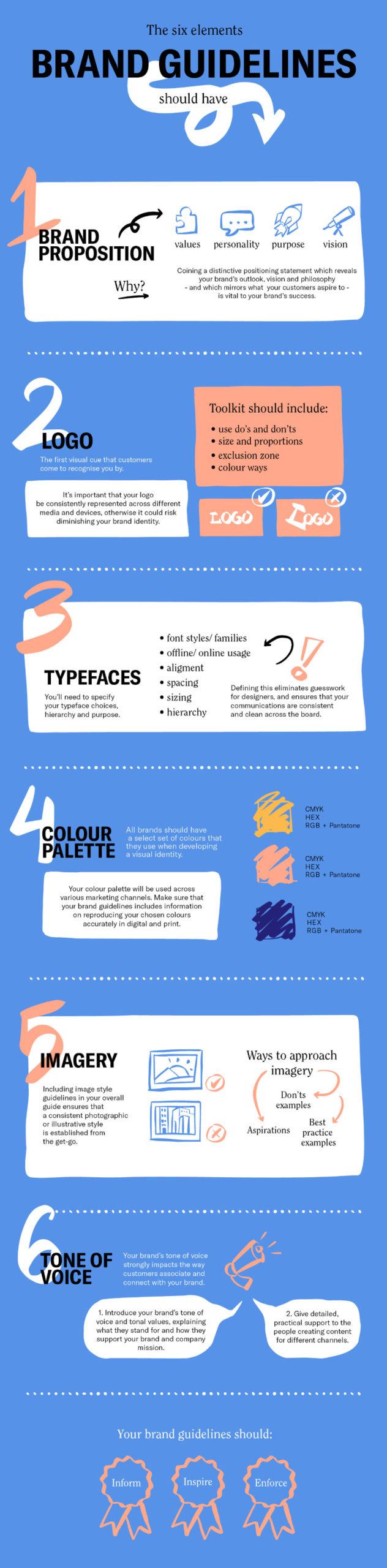
Choosing the Right Fonts for Branding
When it comes to branding, choosing the right fonts can make all the difference in the world. A font has the power to convey the essence of your brand – whether it’s sleek and professional, fun and playful, or somewhere in between. So, how do you go about picking the perfect font for your brand? Here are a few tips:
- Know Your Audience: Before you start browsing through endless font options, take a moment to think about your target audience. What kind of fonts are they drawn to? What would resonate with them? Keep these questions in mind as you explore different font styles.
- Consider Your Brand Personality: Your brand has a personality, and your font should reflect that. Are you bold and edgy? Opt for a modern sans-serif font. Are you classic and timeless? A serif font might be the way to go. Just remember, your font should complement your brand, not distract from it.
- Don’t Overdo It: While it can be tempting to mix and match different fonts, it’s best to stick to a maximum of two or three fonts for your branding. Any more than that and your design might start to look cluttered and confusing. Keep it simple and let your fonts do the talking.

Typography as a Reflection of Brand Personality
When it comes to typography, the font you choose says a lot about your brand’s personality. It’s like the clothes your brand wears to make a first impression on others. Just like how you wouldn’t wear pajamas to a job interview (although honestly, that sounds pretty comfortable), you can’t just slap any old font on your brand and call it a day.
Choosing the right typography is crucial because it sets the tone for how your brand is perceived. Whether you’re elegant and sophisticated or fun and quirky, your font choice should embody that vibe. Imagine showing up to a black-tie event in a Hawaiian shirt—yeah, we don’t want that for your brand.
Here are some common font personalities and the type of brands they would embody:
- Serif Fonts: Classic, timeless, and elegant—perfect for luxury brands or fancy-pants companies.
- Sans-serif Fonts: Modern, clean, and no-nonsense—ideal for tech companies or minimalist brands.
- Handwritten Fonts: Playful, friendly, and approachable—great for brands targeting a younger audience or those looking to add a personal touch.
So, before you go all willy-nilly with Comic Sans or Papyrus (please, just don’t), think about what your brand stands for and choose a typography that reflects that personality. Remember, your font choice can make or break your brand’s first impression, so choose wisely, my font-loving friends.
Typography’s Impact on Consumer Perception
Nothing screams “I don’t know what I’m doing” like using Comic Sans in your branding materials. The font you choose can have a huge impact on how consumers perceive your brand.
Here are a few ways that typography can affect consumer perception:
- Trustworthiness: Using a clean, professional font can make consumers feel like they are dealing with a reputable company. On the other hand, a sloppy or childish font can make people question your credibility.
- Emotional Response: Different fonts can evoke different emotions. For example, a bold, modern font might make consumers feel excited or energized, while a delicate, script font might make them feel more relaxed or nostalgic.
- Readability: If consumers have to strain to read your text because you’ve chosen a weird, hard-to-read font, they’re not going to stick around for long. Make sure your font is easy on the eyes.
So next time you’re choosing a font for your website, social media posts, or marketing materials, remember that typography isn’t just about looking pretty – it’s about shaping how your audience sees you. Choose wisely!
Crafting Consistency through Typography in Branding Design
When it comes to branding design, typography plays a crucial role in establishing consistency across different platforms. Just imagine a brand that uses a different font for every piece of marketing material- chaos, right? No one wants to be known as the brand with an identity crisis!
By carefully selecting and using consistent typefaces, you can convey a sense of cohesion and professionalism that will set your brand apart from the competition. Think of typography as the glue that holds your brand’s visual identity together. It’s like the reliable sidekick that always has your back, never failing to make you look good.
So, how can you ensure that your brand’s typography is on point? Here are a few tips:
- Choose a primary font: This will be the main typeface used in all your branding materials. It should reflect your brand’s personality and be easily readable across various platforms.
- Pair fonts wisely: If you’re using multiple typefaces, make sure they complement each other. Avoid pairing two conflicting fonts that will make your brand look like a hot mess.
- Stick to a consistent hierarchy: Use font sizes and styles consistently to create a sense of order and guide the reader’s eye through the content.
FAQs
Why is typography important in branding design?
Well, have you ever tried to read a billboard in Comic Sans? Exactly. Typography sets the tone for your brand and communicates its personality. It’s basically the voice of your brand, so choose wisely!
How can typography impact brand recognition?
Think of it this way: if Coca-Cola suddenly started using a different font for their logo, would you still recognize it? Probably not. Consistent typography creates brand recognition and helps consumers remember you.
What should I consider when choosing typography for my brand?
First things first, make sure it actually fits your brand’s personality. A fun, whimsical font might not be the best choice for a law firm (unless you’re going for that quirky lawyer vibe). Also, consider legibility – if people can’t read your brand name, they won’t remember it.
Can typography help make my brand stand out from the competition?
Absolutely! Your font choice can differentiate your brand from others in your industry. Just imagine an aisle of plain white milk cartons and then there’s one with bold, eye-catching typography – which one would you reach for?
How can I use typography to evoke emotions in my audience?
Typography is a powerful tool for setting the mood. Want to convey sophistication? Try a sleek, modern font. Want to seem friendly and approachable? Opt for a rounded, bubbly font. Just be careful – no one wants to feel sad when reading your brand name in a gothic font.
Time to Make a Typeface for Yourself!
Now that you’ve seen the incredible power of typography in branding design, it’s time for you to dive in and start creating your own unique fonts! Get ready to unleash your inner typographic genius and watch your branding designs come to life in ways you never thought possible. So go ahead, grab your pens, pencils, and digital tools – it’s time to make a typeface for yourself and take your branding to the next level!


