Have you ever stopped to consider the role that color plays in the intricate world of logo design and branding? Let’s face it, colors aren’t just for unicorns and rainbows – they’re powerful tools that can make or break a brand’s image faster than you can say “fuchsia”. So strap in, grab your color wheel, and get ready to dive deep into the wild and wonderful world of color psychology in logo design. It’s about to get chromatically chic up in here!
Understanding the Psychology of Color
When it comes to choosing the right color for your home, wardrobe, or logo, it’s important to understand the psychology behind each hue. Colors have the power to evoke certain emotions and behaviors, so let’s dive into the wonderful world of color psychology!
First up, let’s talk about red. This fiery hue is known to increase heart rate and energy levels, making it the perfect choice for creating a sense of urgency. But be careful, too much red can also come off as aggressive and overwhelming. So, unless you want your guests to feel like they’re in a perpetual state of emergency, use this color sparingly.
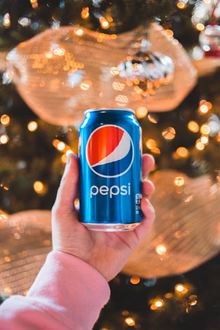
Next, we have blue. This calming color is often associated with trust, stability, and reliability. It’s no wonder that many banks and financial institutions use blue in their branding. But too much blue can also create a sense of coldness, so make sure to balance it out with warmer tones.
And let’s not forget about yellow! This vibrant hue is known for its energy and optimism, making it a great choice for grabbing attention. However, too much yellow can also be overwhelming and lead to feelings of frustration. So, use it in moderation and pair it with calming colors like blue or green.

Choosing the Right Color Palette for Your Logo
When it comes to choosing the perfect color palette for your logo, you don’t want to just throw some random colors together and call it a day. No, you want to carefully consider each hue and how it will impact your brand. Here are a few tips to help you make the right decision:
First off, think about what emotions you want your logo to evoke. Do you want to convey trustworthiness and reliability? Maybe go for some cool blues and calming greens. Looking to show off your creativity and uniqueness? Vibrant oranges and bold purples might be the way to go.
Another thing to keep in mind is your target audience. Different colors have different meanings in various cultures, so make sure you’re not inadvertently sending the wrong message. And don’t forget about color psychology – did you know that yellow is associated with joy and optimism, while black can evoke sophistication and elegance?
Finally, don’t be afraid to get a little wild with your color choices. Sometimes, the most unexpected combos can be the most memorable. Just remember to keep it cohesive and make sure your logo still looks good in black and white – you never know when you might need a monochrome version!
How Color Impacts Brand Recognition
Have you ever wondered why McDonald’s is always associated with the color red and yellow, or why Starbucks exudes that calming green vibe? It’s all about the power of color in brand recognition!
Here’s a **fun** fact for you – **color increases brand recognition by up to 80%!** So, if you want your brand to be as memorable as that childhood crush you had on Zac Efron, you better start picking the right hues!
But hold your horses! Before you go crazy with the colors of the rainbow, make sure to consider the psychology behind each shade. For example, blue is often associated with trust and reliability, while purple screams luxury and sophistication. Choose wisely, my friend!
Remember, when it comes to branding, it’s not just about slapping your logo on everything in sight. It’s about creating a visual identity that speaks to your audience on a subconscious level. So, next time you’re feeling indecisive, just remember – it’s all in the colors, baby!

The Importance of Consistency in Branding
Consistency in branding is like wearing the same pair of lucky socks every day. You wouldn’t switch to a different pair just because it’s Tuesday, right? Your brand should have that same level of unwavering commitment to its look, feel, and messaging.
Imagine if McDonald’s suddenly started using blue arches instead of golden ones. Confusion would reign supreme as customers wondered if they had stumbled into a new fast-food joint. Consistency ensures that your brand is instantly recognizable and trustworthy.
Think of your brand as a trendy fashionista strutting down the catwalk. You wouldn’t catch her mixing polka dots with plaid or wearing sneakers with a ballgown. Your brand should exude that same level of style and grace by maintaining a unified visual identity.
So, be like a brand ninja – stealthily consistent in every touchpoint. From social media posts to logo design, keep it consistent, keep it memorable, and keep your customers coming back for more.
Creating Emotional Connections Through Color
Color is more than just a visual experience; it has the power to evoke deep emotions within us. By strategically using colors in your design, you can create emotional connections with your audience that go beyond words. Let’s dive into the wonderful world of colors and how they can help you establish a strong emotional bond with your viewers.
Think about how certain colors make you feel when you see them. Red may evoke feelings of passion and excitement, while blue might bring about a sense of calmness and tranquility. By understanding the psychological effects of different colors, you can use them to your advantage in design to elicit specific emotions from your audience. Here are a few examples:
- Red: Use red to create a sense of urgency or to grab attention.
- Green: Opt for green to symbolize growth, harmony, and freshness.
- Yellow: Yellow can spark feelings of happiness, optimism, and warmth.
When incorporating colors into your design, it’s important to consider cultural associations as well. For example, white symbolizes purity and cleanliness in Western cultures, but it represents mourning and death in some Eastern cultures. Be mindful of these cultural connotations to ensure that your color choices resonate with your target audience in a meaningful way.
Utilizing Color Theory in Logo Design
Color theory can play a huge role in the effectiveness of a logo design. By understanding the psychology behind colors, you can create a logo that truly resonates with your target audience.
One of the key principles of color theory is the power of contrast. Choosing colors that are opposite on the color wheel can help make your logo pop and stand out from the competition. Think about using a bold yellow against a deep purple background to create a logo that demands attention.
Another important aspect of color theory is the emotional impact of different colors. For example, red is often associated with passion and energy, while blue conveys trust and professionalism. By choosing colors that align with your brand’s values, you can evoke the desired emotions in your audience.
Don’t be afraid to experiment with color combinations and see what works best for your logo design. Remember, the key is to create a logo that not only looks visually appealing but also effectively communicates your brand’s message. So, go ahead and unleash your inner color theorist to create a logo that truly shines!
FAQs
Why is color so important in logo design?
Because without color, logos would just be black and white. And who wants a boring logo?
How does color choice affect consumer perception?
Well, if you use a lot of green in your logo, people might think your brand is all about nature and being eco-friendly. If you use a lot of red, people might think you’re passionate (or angry).
Can you use too many colors in a logo?
Yes, you can. Just like you shouldn’t wear every color of the rainbow at once, you shouldn’t overload your logo with too many hues.
What if I don’t like the traditional colors associated with my industry?
Then pick different colors! Who says a tech company has to use blue? Break the mold, be a rebel.
How can I use color to stand out from my competitors?
Simple. Just choose colors that no one else in your industry is using. Be the bold, bright shining star amidst a sea of blah logos.
Color Me Impressed!
And there you have it, folks! The colorful world of logo design and branding has the power to make or break a brand. So remember, choose your colors wisely and watch your brand shine bright like a neon rainbow. Until next time, stay colorful, stay bold, and keep branding like a boss!


