
They say a picture is worth a thousand words, but a truly iconic logo? That’s worth a whole library of novels, a few Shakespearean tragedies, and a Lifetime movie marathon. Welcome to the world of logo design, where artists (and let’s be honest, magicians) create the symbols that instill brand recognition, inspire loyalty, and make us all feel a little bit cooler when we wear them on our T-shirts. Strap on your beret and grab your wand, because we’re about to dive into the wild and wacky world of creating logos that go down in history as the stuff of legends.
Design Process and Inspiration
Everyone knows that the design process is where the magic happens! It’s where we take our wild ideas and turn them into something tangible. So, how do we get from a blank canvas to a beautiful masterpiece? Let me break it down for you.
First things first, we need inspiration! Inspiration can come from anywhere and everywhere – whether it’s a walk in nature, flipping through a magazine, or even just staring at a blank wall. Once we find that spark, it’s time to get those creative juices flowing!
Next up, research! We’re talking deep dives on Google, scrolling through Pinterest for hours on end, and maybe even taking a trip to the museum for some old-fashioned inspo. It’s all about understanding the latest trends and figuring out how we can put our own twist on them.
Once we’ve got our inspiration and research sorted, it’s time to get down to business. This is where the real work begins – sketching, brainstorming, and maybe even a little bit of crying (don’t worry, it’s all part of the process). We’ll iterate, refine, and eventually come out on the other side with a design that we’re proud to call our own.
Researching the Brand Identity
Before diving into creating a brand identity, it’s crucial to do your research and really get to know the brand you’re working with. You can’t just slap on a logo and call it a day – oh no, my friend, it’s much more complex than that! Here are some tips to guide you through your brand identity sleuthing:
First things first, get to know the brand’s history. Who founded it, why did they start the company, what’s their story? It’s like digging through your grandma’s old photo albums – you never know what hidden gems you might uncover!
Next, take a good look at the brand’s digital presence. Check out their website, social media pages, online reviews – basically stalk them like you’re crushing on your high school crush. You’ll learn a lot about their personality, values, and how they interact with their audience.
Lastly, don’t forget to analyze the competition. What are other brands in the same industry doing? What sets your brand apart? It’s like a game of cat and mouse – you gotta be one step ahead to stand out in a crowded market!

Sketching and Conceptualizing
When it comes to , the possibilities are as endless as my procrastination when it comes to actually starting the work. But fear not, because with a pencil in hand and a blank canvas, the world is your oyster!
First things first, let’s talk about sketching. It’s like drawing, but with a fancy name that makes it sound more artistic. Get yourself a trusty pencil (or pen if you’re feeling reckless) and let your imagination run wild. Don’t worry about making mistakes, that’s what erasers are for – unless you’re using pen, in which case, good luck!
Now onto conceptualizing. This is where you take your random thoughts and ideas and try to make sense of them. Think of it as trying to solve a puzzle without knowing what the final picture is supposed to look like. It’s a messy, chaotic process, but that’s where the magic happens!
Remember, is all about embracing your creativity and letting your ideas flow freely. Don’t be afraid to think outside the box (or in my case, outside the lines). So grab your favorite art supplies, put on some funky music, and let the begin!

Simplifying and Iterating Designs
Are you tired of sifting through endless design options like a kid in a candy store without a clue of what to choose? Well, fear not my friends! We are here to simplify the madness and help you iterate your way to the perfect design.
First things first, let’s break it down into bite-sized chunks that even your grandma could understand. No more jargon-filled, mind-boggling design terms. **Keep it simple, silly!**
- Start by outlining your design goals – What the heck are you trying to achieve anyway?
- Brainstorm some basic ideas – Think outside the box, or heck, throw the box out the window!
- Refine and iterate – Like a fine wine, let your design ideas age gracefully until they reach perfection.
Remember, Rome wasn’t built in a day, and your design masterpiece won’t be either. So embrace the process, have fun with it, and most importantly, don’t take yourself too seriously. **After all, it’s just a design, not brain surgery!**
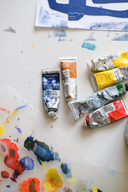
Selecting Colors and Fonts
When for your project, remember that your choices can make or break the overall design. Picking the right hues and typefaces can help convey your message effectively and enhance the user experience.
Start by considering your brand’s identity and target audience. **Bold** and vibrant colors may appeal to a younger demographic, while more muted tones might be better suited for a professional audience. Play around with different combinations to see what works best for your project.
When it comes to fonts, the options can be overwhelming. Stick to a maximum of three typefaces to avoid a chaotic look. Pair a **bold** and eye-catching headline font with a simpler and more readable body font. Remember, legibility is key - you don’t want your readers squinting at the screen!
Don’t be afraid to think outside the box and experiment with unconventional color palettes and font combinations. After all, design is all about creativity and pushing boundaries. Just remember to keep it cohesive and ensure that your colors and fonts complement each other harmoniously. Happy designing!
Applying Principles of Psychology in Logo Design
When it comes to creating a logo that resonates with your audience, applying principles of psychology can be a game-changer. By understanding how the human brain works and reacts to different stimuli, you can design a logo that not only looks good but also speaks to the subconscious mind.
One of the most important principles to keep in mind is the concept of color psychology. Different colors evoke different emotions and associations, so choose your color palette wisely. For example, using bold and vibrant colors like red or orange can create a sense of excitement and energy, while softer tones like blue or green can convey a feeling of calm and trust.
Another key aspect to consider is the use of shapes and symbols in your logo design. Certain shapes can trigger specific reactions in the brain, so think about what message you want to convey. For instance, using a circle can represent unity or wholeness, while a triangle can symbolize stability and strength.
Remember, the best logos are not only aesthetically pleasing but also strategically crafted to appeal to the subconscious mind. So, next time you’re designing a logo, don’t forget to put on your psychologist hat and delve into the fascinating world of visual communication!
Finalizing the Iconic Logo
After weeks of brainstorming, collaboration, and probably a few heated debates, we are finally ready to unveil the new and improved iconic logo! Brace yourselves, because this logo is sure to make waves in the industry.
We’ve carefully considered every detail, from the color scheme to the font choice. We wanted a logo that not only represents our brand but also stands out in a sea of competition. And boy, did we succeed!
So, sit back, relax, and get ready to be blown away by the sheer beauty and brilliance of our masterpiece. Get ready to witness a logo that will have tongues wagging and jaws dropping all across the globe.
Thank you to everyone who has been a part of this journey. We couldn’t have done it without your creative genius and sharp eye for design. Get ready to make history with the unveiling of our new iconic logo!
FAQs
What sets iconic logos apart from the rest?
Iconic logos have the power to evoke strong emotions and instantly connect with consumers. They are simple, memorable, and timeless, making them easily recognizable and able to stand the test of time.
How important is color in creating a memorable logo?
Color plays a crucial role in creating a memorable logo. It can convey emotions, set the tone for a brand, and make a logo more visually appealing. So, make sure to choose colors wisely!
Is it necessary to incorporate hidden meanings or symbolism in a logo?
While hidden meanings or symbolism can add depth to a logo, they are not necessary for creating an iconic one. Sometimes, simplicity is key, and a straightforward design can be just as effective.
How can businesses ensure their logo stands out in a crowded market?
To stand out in a crowded market, businesses should focus on creating a unique and distinctive logo that reflects their brand identity. This could involve experimenting with different shapes, fonts, or styles to make their logo truly one-of-a-kind.
What are some common mistakes to avoid when designing a logo?
Some common mistakes to avoid when designing a logo include overcomplicating the design, using trendy fonts or colors that may quickly become outdated, and failing to consider how the logo will look across different platforms and mediums.
How can businesses ensure their logo remains relevant for years to come?
To ensure their logo remains relevant for years to come, businesses should focus on creating a timeless design that will not be easily dated. They should also be open to evolving their logo over time to keep up with changing trends and consumer preferences.
In conclusion, remember:
Creating an iconic logo is no easy task. It requires creativity, originality, and a whole lot of trial and error. But with the right mix of talent, dedication, and maybe a little bit of luck, you too can design a logo that stands the test of time. So go forth, budding designers, and start sketching, brainstorming, and Photoshopping your way to logo greatness. Who knows, maybe one day your logo will be the next Nike swoosh or Apple bitten apple. But let’s be real, even if it’s not, at least you had fun trying!


