Attention all logo designers and visual branding enthusiasts! Are you tired of creating logos that look like they were designed by a toddler with a box of crayons? Well, fear not, because we have the ultimate guide to streamlined logo design techniques that will have your clients saying “Wow!” instead of ”What were they thinking?” Say goodbye to cluttered, confusing logos and hello to sleek, sophisticated designs that will make you the envy of your creative peers. So grab a latte, put on your favorite playlist, and get ready to learn the secrets to creating logos that are as smooth as butter (but hopefully not as greasy).
Creating a Design Brief
In order to create a design brief that doesn’t leave your designer scratching their head, follow these key steps:
First and foremost, clearly outline your objectives and expectations. Don’t leave your designer playing guessing games. Be as specific as possible about what you want to achieve with this project. Remember, mind reading is not a designer’s primary skill (although some might claim otherwise).
Next, provide detailed information about your target audience. Who are they? What are their preferences? The more your designer understands about the people who will interact with the design, the better they can tailor their work to meet your needs.
Include examples of designs you love (and also those you hate). This will give your designer a sense of your style preferences and help them avoid any major design faux pas. Plus, it’s always fun to bond over a mutual disdain for Comic Sans. **Let’s keep it classy, folks!**
Lastly, be open to feedback and collaboration. Design is a process, not a one-and-done deal. Your designer may have some brilliant ideas that you never even considered. So, keep an open mind and remember, the journey to a killer design is paved with good communication and a dash of creativity. **Let’s design our way to the stars, my friends!**
Choosing a Versatile Typeface
When it comes to , the options are endless! But fear not, dear readers, for I am here to guide you through the perilous world of typography. First things first, consider the overall look and feel you want to achieve with your design. Do you want something bold and attention-grabbing, or subtle and sophisticated? The typeface you choose will set the tone for your entire project, so choose wisely!
Next, take into account where your typeface will be displayed. Is it for a website, a flyer, a business card? Different typefaces work better in different mediums, so be sure to test out a few options before committing. And don’t forget about readability – nobody wants to strain their eyes trying to decipher your message!
When in doubt, go for a classic sans-serif typeface like Helvetica or Arial. These tried-and-true fonts are like the little black dress of the typography world – they go with everything! And remember, it’s always better to be safe than sorry. So go forth, brave designers, and may the typeface gods smile upon you!

Simplifying Color Palettes
Are you tired of spending hours trying to figure out the perfect color palette for your project? Well, fear not, because we are here to simplify the process for you! By following a few simple tips and tricks, you can create a stunning color palette in no time.
One of the easiest ways to simplify your color palette is to stick to a limited number of colors. Too many colors can be overwhelming and make your design look busy. Instead, try sticking to 3-5 colors that work well together. Remember, less is more!
Another tip is to use color harmonies to your advantage. By choosing colors that are next to each other on the color wheel (analogous colors) or directly opposite each other (complementary colors), you can create a visually pleasing palette that is sure to impress.
Lastly, don’t be afraid to experiment with different shades and tones of the same color. Mixing light and dark versions of a color can add depth and interest to your design. And remember, practice makes perfect, so don’t be discouraged if your first attempts aren’t perfect. Keep experimenting and you’ll soon be creating beautiful color palettes like a pro!
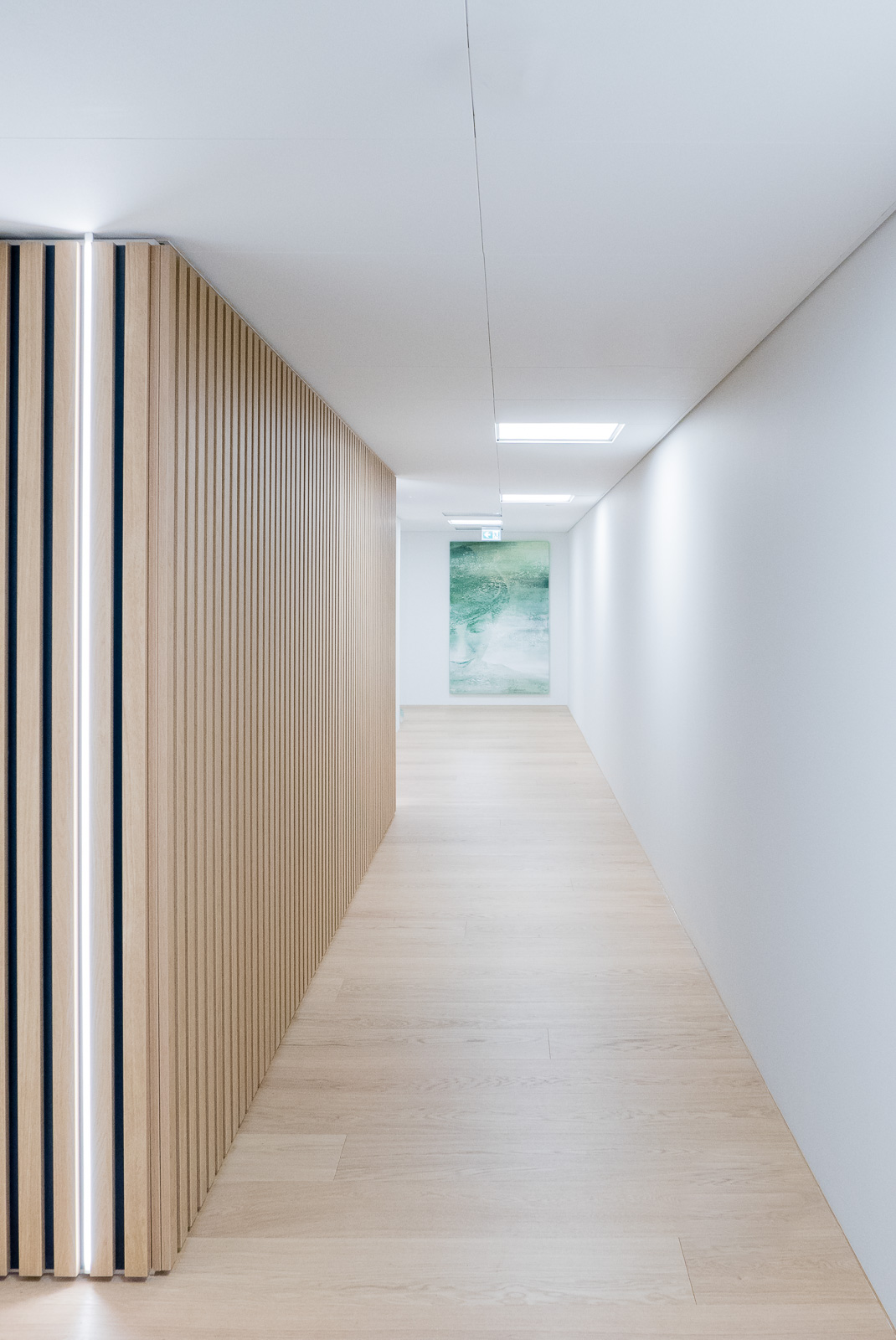
Emphasizing Minimalist Imagery
When it comes to minimalist imagery, less is always more. Embracing simplicity and clean lines, minimalist imagery can speak volumes without overwhelming the viewer. To truly emphasize this style, there are a few key tips to keep in mind:
First and foremost, white space is your best friend. Don’t be afraid to leave large areas of your composition blank to draw attention to the focal point. White space gives your image room to breathe and allows the viewer’s eye to rest.
Secondly, stick to a limited color palette. Using only a few colors can help create a cohesive and impactful visual experience. Whether you choose a monochromatic scheme or a harmonious combination, less is definitely more in the world of minimalist imagery.
Lastly, focus on small details and textures to add interest to your composition. A simple line drawing can be elevated by adding a subtle texture or intricate pattern. These small details can create depth and complexity without overwhelming the overall minimalist aesthetic.

Utilizing Negative Space Strategically
When it comes to design, negative space is like the unsung hero. It’s the sidekick that doesn’t get enough credit, but without it, the whole design would fall apart like a sad, deflated balloon.
So how do you utilize negative space strategically? Well, first things first, don’t be afraid of it! Embrace the void, my friends. Here are some tips to help you make the most of that empty space:
- Give your design room to breathe: Negative space can help balance out your design and prevent it from looking cluttered. It’s like giving your design some fresh air to prevent it from suffocating.
- Highlight the important stuff: Negative space can draw attention to the key elements of your design. Think of it like a spotlight, shining brightly on the star of the show.
- Create visual interest: Negative space can add depth and complexity to your design. It’s like adding a dash of mystery to keep things intriguing.
Testing for Scalability and Legibility
When it comes to , there are a few key things to keep in mind. First and foremost, your website or application should be able to handle an influx of users without crashing. This means running stress tests to see how many users your site can handle at once. You don’t want your website to buckle under the pressure like a cheap lawn chair!
Secondly, legibility is crucial for user experience. This means that your content should be easy to read and understand. If your text is too small or the font is difficult to decipher, users will quickly lose interest and click away faster than you can say “Comic Sans.”
One way to test for legibility is to conduct user testing and gather feedback on the readability of your content. Incorporate their suggestions to make your website more user-friendly and visually appealing. Remember, readability is key if you want to keep users engaged and coming back for more!
So, remember to always test for scalability and legibility to ensure that your website is ready for the big leagues. Because if your site can’t handle the traffic and your content is harder to read than a medical textbook, you might as well pack up and go back to the drawing board!
FAQs
How can I make my logo design more streamlined?
Well, you can start by decluttering your design. Less is more, my friend. Stick to simple shapes and fonts to create a clean and sleek logo that gets straight to the point.
What are some techniques for creating a streamlined logo?
One technique is to focus on negative space. Embrace the power of the blank space to create a logo that is both simple and striking. You can also experiment with different shapes and sizes to find the perfect balance for your design.
How can I ensure my logo is easy to reproduce in different sizes and formats?
Consider using vector graphics for your logo design. Vector images can be scaled infinitely without losing quality, making them a versatile choice for logos that need to be reproduced in various sizes and formats. Plus, your printer will thank you.
What role does color play in creating a streamlined logo?
Color can be a powerful tool in logo design, but when it comes to streamlining your logo, less is more. Stick to a simple color palette of two or three colors to keep your design clean and cohesive. Remember, a little pop of color can go a long way.
How important is typography in creating a streamlined logo?
Typography can make or break a logo design. Choose a simple and easily readable font that complements your logo’s overall aesthetic. Don’t get fancy with your typography – save that for your next dinner party.
In Conclusion: Streamline Your Logo, Streamline Your Success!
Congratulations, you’ve made it to the end of our crash course in streamlined logo design techniques. Hopefully, you’ve picked up some valuable tips and tricks along the way to help you create sleek, professional logos that pack a punch.
Remember, when it comes to logo design, less is often more. So ditch those unnecessary bells and whistles, simplify your design, and watch your logo shine. With these streamlined techniques in your arsenal, you’ll be well on your way to logo greatness.
So go forth, budding designers, and streamline those logos like a boss. And always remember: Keep it simple, keep it stylish, and keep on designing!


