Choosing the logo-design-crafting-brands-that-communicate-dynamically/” title=”The Power of Color in Logo Design: Crafting Brands that Communicate Dynamically”>perfect color scheme for your logo is like picking out the perfect outfit for a first date - it sets the tone, makes a statement, and can ultimately determine whether you make a lasting impression or end up blending in with the background. So grab your color wheel and let’s dive into the wonderful world of logo design, where finding the ideal hues is like finding the perfect shade of lipstick – it may take a few tries, but once you find “the one”, you’ll be turning heads wherever you go.
Understanding the Psychology of Colors
Ever wonder why certain colors make you feel a certain way? Well, buckle up because we’re about to dive into the wild world of color psychology!
Did you know that blue is often associated with trust and tranquility? It’s no wonder that so many corporate logos are blue – they’re trying to subliminally convince you to trust them! But be careful, too much blue can leave you feeling a little too relaxed, like you’ve just binge-watched an entire season of your favorite show.
Red, on the other hand, is the color of passion and power. It’s a real attention-grabber, which is why it’s often used in advertising. Wear a red shirt and watch as people stop and stare – just be prepared for all the extra attention (and maybe a few awkward stares).
And let’s not forget green, the color of growth and harmony. Think of it as nature’s way of saying ”hey, everything’s gonna be okay.” It’s no wonder that spending time in nature can leave you feeling refreshed and rejuvenated – that greenery is working its magic on your psyche!

Identifying Your Brand’s Personality
So you’ve got a brand. But have you ever stopped to think about what kind of personality your brand has? If not, it’s time to dig deep and uncover the essence of your brand’s character. Trust me, it’s a lot more fun than taking a Buzzfeed quiz to find out which Friends character you are (spoiler alert: you’re definitely a Chandler).
Here are a few tips to help you identify your brand’s personality:
- Get introspective: Take a good, hard look at your brand and ask yourself, “If my brand was a person, who would they be?” Are they outgoing and adventurous like Indiana Jones? Or maybe more reserved and classy like James Bond?
- Think about your audience: Consider who your target audience is and what kind of personality would resonate with them. Are they young and hip, or more mature and sophisticated? Your brand’s personality should align with the people you’re trying to attract.
- Get inspired: Look to other brands that you admire and see what kind of personality they have. Are they quirky and fun like Taco Bell, or more serious and professional like IBM? Take cues from brands that have successfully carved out their own unique identities.
Remember, your brand’s personality is what sets you apart from the competition and helps you connect with your audience on a deeper level. So don’t be afraid to let your brand’s freak flag fly and embrace the quirks and eccentricities that make you who you are.
Choosing Colors that Represent Your Values
First, think about what values are most important to you. Are you a compassionate soul who values kindness and empathy above all else? Maybe a soft pastel pink or a calming seafoam green could be the perfect colors to represent your gentle nature.
On the other hand, if you’re a bold and adventurous spirit who values excitement and risk-taking, vivid hues like electric blue or fiery red might be more your style. Just make sure you don’t accidentally choose colors that represent reckless behavior – we don’t want you getting into trouble for getting too wild with your color choices!
Remember, there are no wrong answers when it comes to . Whether you prefer peaceful neutrals that signify balance and harmony, or vibrant shades that scream individuality and creativity, the most important thing is to pick colors that make you feel happy and true to yourself. So go ahead, unleash your inner color connoisseur and let your values shine through with every color choice you make!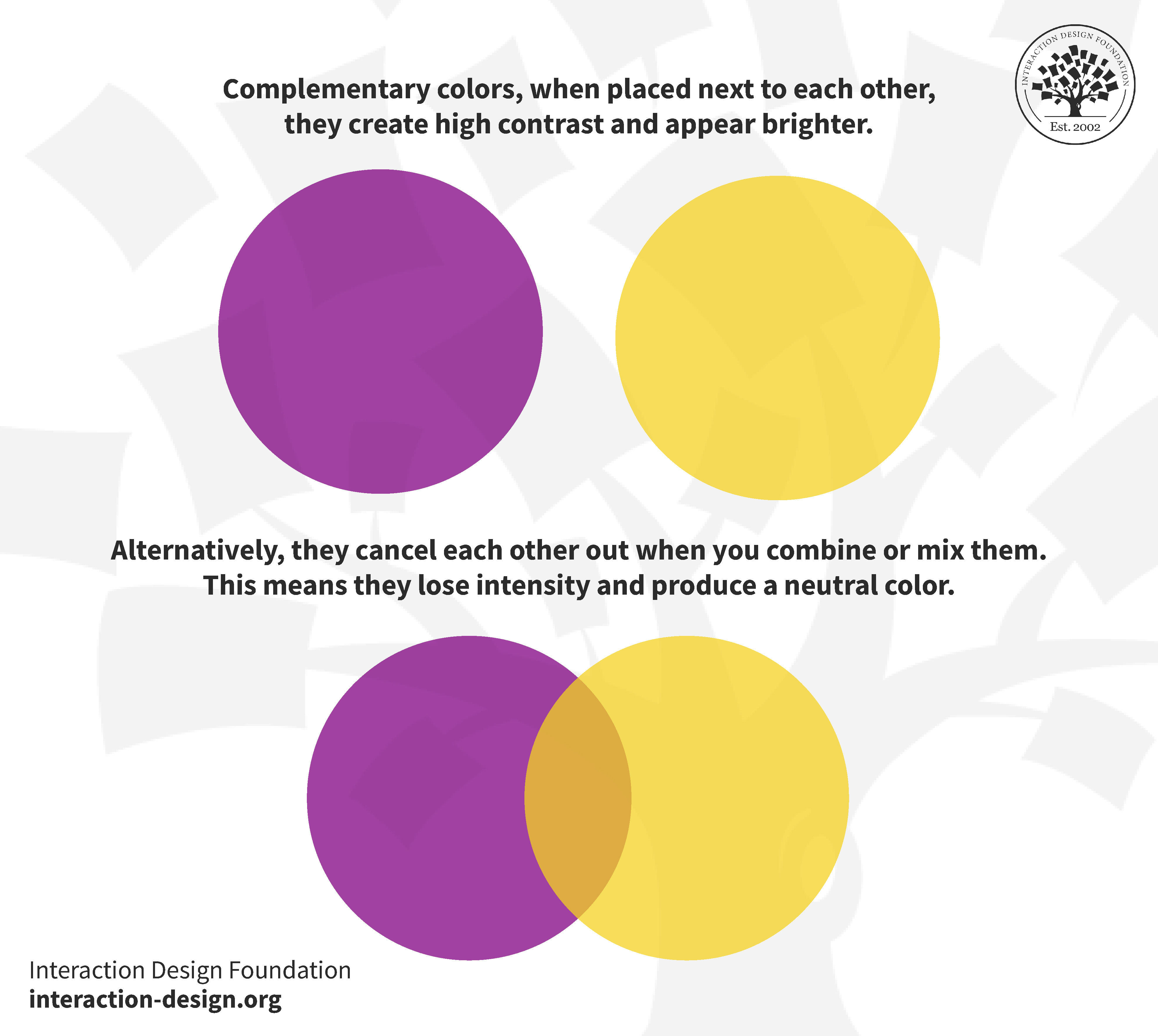
Considering Color Contrast for Visibility
When it comes to designing anything for visibility, color contrast is king. You wouldn’t want to choose a light pink font on a white background – unless you want your readers to squint and strain their eyes trying to decipher your message!
Consider using bold, contrasting colors to make your content pop. Pairing a deep navy blue with a bright yellow can create a visual feast for the eyes – as long as you don’t overdo it and blind your readers!
Remember, each color has its own psychological impact. For example, using a calming green with a fiery red might confuse your audience – are they supposed to relax or get fired up? Make sure your color choices reflect the mood you want to convey.
Lastly, don’t forget about accessibility. Use tools to check if your color combinations are readable for those with visual impairments. After all, you want everyone to be able to enjoy your content, not just those with perfect eyesight!

Using Color Palettes to Create Harmony
Color palettes are a magical tool that can turn a chaotic mess of colors into a harmonious masterpiece (or at least make your room look less like a clown’s nightmare). With the right combination of shades and tones, you can create a sense of balance and unity that will have your friends saying, “Wow, did you hire a professional interior designer or did you just get lucky?”
The key to using color palettes effectively is to consider not just the colors themselves, but also how they interact with each other. Think of it like hosting a dinner party - you don’t want all your guests to be constantly bickering and stealing each other’s food. Instead, aim for a harmonious blend of personalities that complements each other, just like your colors should complement each other. Remember, we want a cozy gathering, not a chaotic food fight.
One way to create harmony with color palettes is to stick to a theme or mood. Whether you’re going for a calming oasis or a vibrant carnival, keeping your colors within the same family or category can help tie everything together. Just imagine if you invited a bunch of superheroes to your dinner party – sure, it’d be exciting, but eventually, someone’s going to start throwing punches. Stick with a peaceful pastel palette or a bold primary color scheme, and you’ll avoid any table flipping incidents.
Don’t forget that is all about balance. Think about the proportions of each color you’re using – you don’t want one shade to overpower the others like a loudmouth at the party who won’t stop talking about their stamp collection. Use bold colors as accents, play with different intensities and shades, and give each color its moment to shine. With a little trial and error (and maybe a glass of wine or two), you’ll soon be the maestro of your very own color symphony.
Avoiding Common Logo Color Mistakes
When designing a logo, it’s crucial to pay attention to the colors you choose. A common mistake is using too many colors in a single design. Remember, less is more! Stick to a palette of 2-3 colors to keep your logo simple and memorable.
Another logo color mistake is forgetting about contrast. It’s important to ensure that your logo colors contrast well with each other so that the design is easy to read and stands out. Always test your logo in black and white to make sure it still looks strong without color.
Color psychology is also something to consider when choosing logo colors. Each color evokes different emotions and associations, so do your research to make sure your chosen colors align with your brand’s message. For example, green symbolizes growth and harmony, while red indicates passion and energy.
Lastly, be mindful of how your logo colors will appear in different contexts. Consider how your logo will look on various backgrounds, in different sizes, and in both digital and print formats. A versatile logo color scheme is key to ensuring your brand remains consistent and recognizable across all platforms.
FAQs
How can I choose the right color scheme that represents my brand?
Think about the emotions you want your brand to evoke. Use colors that align with your message and target audience. Remember, pink might not be the best choice for a grunge band logo.
What impact can color have on how my logo is perceived?
Color can influence how people feel about your brand. For example, blue can convey trustworthiness, while red can evoke excitement. Choose wisely!
Should I follow current trends or go with timeless colors?
It’s okay to take inspiration from trends, but don’t let them dictate your entire color scheme. Remember, neon was cool in the ’80s, but now it’s just blinding.
Can I use multiple colors in my logo, or should I stick to one?
Using multiple colors can add depth and complexity to your logo, but be careful not to overwhelm. Don’t go overboard unless you want your logo to look like a unicorn threw up on it.
How important is contrast in a color scheme?
Contrast is crucial for legibility and visual impact. Make sure your colors don’t blend into each other like a bad camouflaged outfit.
Happy color hunting!
Armed with the knowledge of the psychology of colors and design principles, you are now well-equipped to select the ideal color scheme for your logo. Remember, colors are not just a visual element, they have the power to evoke emotions and create lasting impressions. Have fun experimenting with different combinations and trust your instincts. After all, choosing the perfect colors for your logo is like finding the perfect pair of socks– it may take some time, but once you find the right match, it’s a total game-changer! So go forth and create a logo that truly reflects the essence of your brand. Good luck!


