In a world where first impressions are everything and attention spans are shorter than a toddler’s tantrum, your logo has to pop like a can of soda on a hot day. And guess what? The secret weapon in your design arsenal is as simple as a box of crayons: color. Dive into the rainbow of possibilities and discover how harnessing the power of strategic hues can make your logo shine brighter than a disco ball at Studio 54. So grab your color wheel and buckle up, because we’re about to take your brand from ho-hum to oh damn!
The Psychology of Color in Logo Design
When it comes to creating a logo, the psychology of color plays a major role in capturing the attention of your audience. Each color has its own unique psychological impact, so it’s important to choose wisely when designing your logo. Let’s dive into the colorful world of logo design!
Red is known to evoke feelings of passion, excitement, and urgency. This is why many fast-food chains like McDonald’s and KFC use red in their logos to make you crave those fries and chicken nuggets like there’s no tomorrow. Yellow, on the other hand, is associated with happiness, optimism, and energy – ideal for brands like IKEA that want to bring a little sunshine into your life.
Blue is a calming color that often represents trust, reliability, and professionalism. That’s why many banks and tech companies opt for blue in their logos to make you feel confident in their services. Green symbolizes growth, harmony, and nature, making it perfect for eco-friendly brands like Whole Earth and The Body Shop.
In conclusion, when designing your logo, consider the psychological impact of color to convey the right message to your audience. Whether you want to ignite passion, spread happiness, instill trust, or promote sustainability, choosing the right colors can make all the difference in creating a memorable and effective logo.
Choosing the Right Color Palette for Your Brand
is like choosing the right outfit for a first date – you want to make a good impression, but you also want to feel comfortable and confident. Here are some tips to help you find the perfect colors to represent your brand personality.
First, think about the emotions you want your brand to evoke. Do you want to exude sophistication and trustworthiness? Consider classic colors like navy blue and deep red. Want to come across as fun and playful? Bright colors like hot pink and lime green could be the way to go. After all, who doesn’t love a brand that can make them smile?
Next, consider your target audience. Are you catering to young, trendy millennials or established professionals? Your color palette should speak to your audience and resonate with their tastes and preferences. Remember, you want your brand to be like a good friend – someone they can relate to and feel comfortable with.
Don’t be afraid to mix and match different colors to create a unique palette that sets you apart from the competition. Experiment with complementary colors and shades to find the perfect combination that screams “This is me!” After all, you want your brand to stand out in a sea of blandness, like a peacock in a flock of pigeons.
How Color Influences Consumer Perception
Color has a sneaky way of slipping into our brains and influencing our thoughts without us even realizing it. It’s like that one friend who always knows how to push your buttons, except in this case, it’s the friend who persuades you to buy that expensive sweater you don’t need.
Have you ever noticed how certain colors make you feel a certain way? Here’s a little secret – companies know this too, and they use it to their advantage. By strategically choosing colors for their branding and products, they can manipulate your perception without you even knowing it.
For example, did you know that:
- Red can create a sense of urgency and encourage impulse buying?
- Blue instills a feeling of trust and reliability, making you more likely to make a purchase?
- Yellow stimulates appetite, which is why so many fast-food chains use it in their logos?
So next time you find yourself reaching for that yellow bag of chips or clicking on that blue button to buy something, just remember – it’s all because of the power of color!
Using Color to Differentiate Your Brand from Competitors
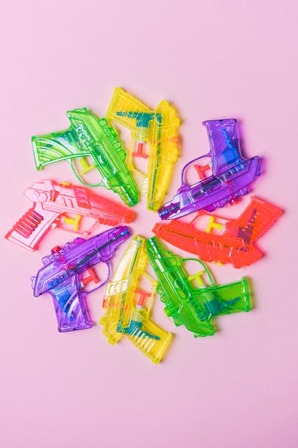
When it comes to standing out in a sea of competitors, color can be your secret weapon. By choosing a unique and eye-catching color scheme, you can differentiate your brand from the rest and make a lasting impression on customers. So, say goodbye to boring black-and-white logos and embrace the rainbow!
One way to use color to your advantage is to pick a signature shade that sets you apart from the competition. Think outside the box and choose a color that is unexpected but still resonates with your brand’s values. Whether it’s a vibrant neon pink or a soothing mint green, bold choices will grab attention and make your brand unforgettable.
Another strategy is to use color psychology to your advantage. Different colors can evoke different emotions and associations, so choose hues that align with your brand’s personality and message. For example, blue conveys trust and reliability, while red exudes passion and energy. By strategically incorporating these colors into your branding, you can subtly influence how customers perceive your business.
Lastly, don’t be afraid to mix and match colors to create a visually appealing and dynamic brand image. Play around with complementary and contrasting color combinations to create a logo and visual identity that is both memorable and impactful. Remember, the goal is to make your brand stand out in a crowded marketplace, so don’t hold back when it comes to experimenting with color!

Strategies for Incorporating Color Theory into Your Logo Design Process
Why settle for a boring black and white logo when you can make it pop with some vibrant colors? By incorporating color theory into your logo design process, you can create a visually appealing and memorable brand image that will leave a lasting impression on your audience. Here are some strategies to help you add a pop of color to your designs:
- Start with the basics: Understand the fundamentals of color theory, such as the color wheel, complementary colors, and color harmonies. This will help you choose the right color combinations that evoke the desired emotions and convey your brand message effectively.
- Use color psychology to your advantage: Different colors can evoke different emotions and associations in people. For example, red can convey passion and energy, while blue can represent trust and reliability. Choose colors that resonate with your brand values and target audience.
- Experiment with different color schemes: Don’t be afraid to step out of your comfort zone and try bold and unconventional color combinations. Play around with analogous, triadic, or monochromatic color schemes to see what works best for your logo design.
Remember, the key to successful logo design is to strike the right balance between creativity and professionalism. So go ahead, unleash your inner color wizard and create a logo that will make your brand stand out from the crowd!
Creating Emotional Connections Through Strategic Use of Hues
When it comes to evoking emotions through design, color plays a crucial role. The strategic use of hues can elicit a wide range of feelings, from happiness and excitement to calmness and nostalgia. By understanding the psychology behind different colors, designers can create emotional connections with their audience.
One way to use color effectively is by creating contrast. Pairing bold, vibrant hues with softer, more muted tones can create a sense of balance and harmony in a design. This juxtaposition can draw the viewer’s eye and evoke a sense of intrigue and excitement. Think of it as the visual equivalent of a spicy-sweet flavor combination—it keeps things interesting!
Another important aspect to consider is the cultural significance of different colors. For example, in Western cultures, red is often associated with love and passion, while in Asian cultures, it symbolizes luck and prosperity. By taking these cultural connotations into account, designers can create designs that resonate with a diverse audience.
Ultimately, the key to creating emotional connections through color is to think outside the box. Don’t be afraid to experiment with unconventional color combinations or bold palettes. After all, who says you can’t evoke a sense of whimsy and wonder with a bright purple and neon green color scheme? Embrace the power of color and watch as your designs come to life!
FAQs
How can color impact the success of a logo?
Oh, color can make or break a logo, my friend! It’s like adding spice to a dish – the right hue can make your logo pop and resonate with your target audience, while the wrong one can leave a bad taste in their mouths.
What kinds of emotions can different colors evoke in people?
Oh, let me tell you, colors are powerful little tricksters! Red can make people feel passionate, while blue can evoke feelings of trust and reliability. Green might make them think of money (cha-ching!), while yellow can bring on feelings of joy and optimism. It’s like a whole rainbow of emotions out there!
How should a company choose the right colors for their logo?
Well, it’s like picking out an outfit for a first date – you want to make a good impression! Companies should think about their target audience, the message they want to convey, and the feelings they want to evoke. It’s all about strategic color choices, baby!
Can using the wrong colors in a logo actually harm a company’s brand?
Oh, absolutely! It’s like wearing socks with sandals – a major fashion faux pas! Using the wrong colors can send the wrong message to customers and tarnish a company’s brand image. So, choose your colors wisely, my friend!
Time to Color Outside the Lines!
Congratulations, you’ve made it to the end of our colorful journey into the world of logo design. Remember, when it comes to creating logos with strategic hues, the possibilities are as vibrant as a rainbow after a storm. So go ahead, unleash your inner artist and paint the town red, yellow, green…you get the picture. Just remember to think outside the box and embrace the power of color in your designs. Now go forth and color outside the lines like a true logo design maverick!


