Welcome, budding Picassos of the design world! Are you ready to embark on a wild and wacky journey through the mind-bending world of logo design? Well, grab your paintbrushes and buckle up, because we’re about to unleash some seriously rad tips to help you become a logo design master. Get ready to dive headfirst into the world of pixels, vectors, and Pantone colors - it’s going to be a bumpy, but totally awesome ride!
Understanding the Elements of Logo Design
When it comes to creating a standout logo, it’s important to understand the key elements that go into its design. Whether you’re a seasoned graphic designer or just dipping your toes into the world of branding, mastering these elements will set you on the path to logo greatness.
First up, we have color. Choosing the right color palette can make or break a logo. Think about the emotions you want to evoke – calming blues, fiery reds, or maybe a subtle pastel rainbow. The possibilities are endless, so don’t be afraid to get creative!
Next, let’s talk about shape. Whether you’re going for a sleek, modern look with sharp angles or a more whimsical vibe with rounded edges, the shape of your logo can communicate a lot about your brand’s personality. Play around with different shapes and see what speaks to you.
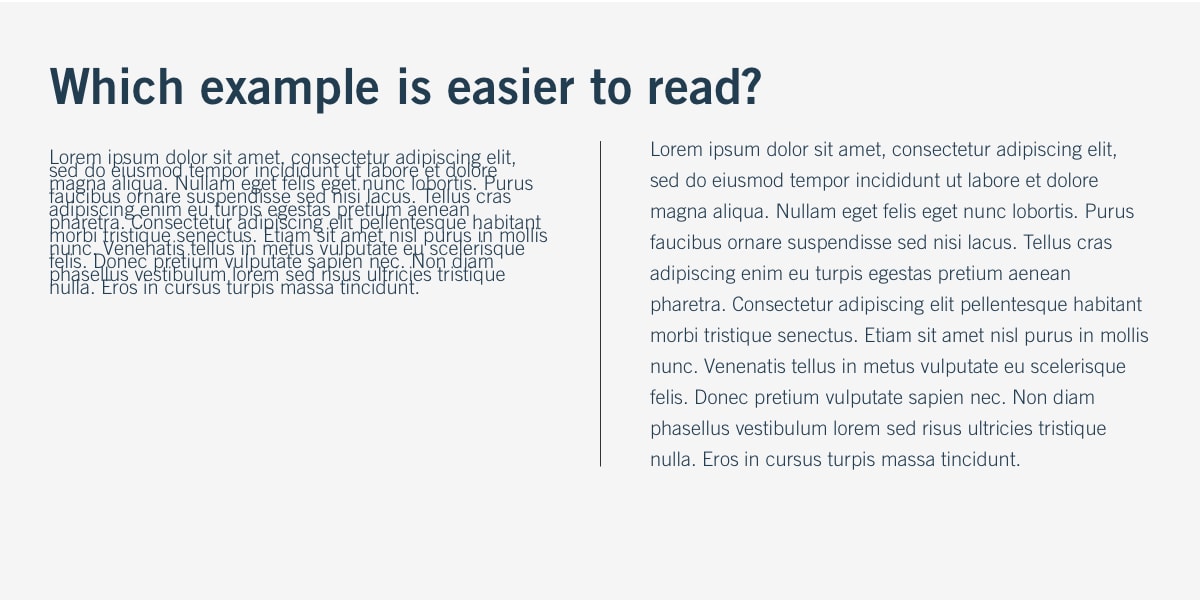
Finally, we have typography. The font you choose can make a huge impact on the overall look and feel of your logo. Whether you opt for a classic serif, a playful script, or a bold sans-serif, make sure your typography reflects the essence of your brand.

Choosing the Right Typography for Your Logo
When it comes to , you don’t want to be left in the font dust. Your logo is the face of your brand, so you want to make sure it’s sending the right message. Here are a few tips to help you pick the perfect font to make your logo pop:
- **Know your vibe**: Are you a sleek, modern company or a fun, quirky one? Your font should reflect your brand’s personality. Just like you wouldn’t wear a clown nose to a black-tie event, you don’t want your logo to send the wrong message.
– **Stand out, but not too much**: You want your logo to catch people’s eye, but not blind them. Choose a font that is unique, but still readable. You don’t want people squinting and asking, “What does that say?”
- **Keep it simple**: Just like a good joke, the best logos are often the simplest. Too many swirls, loops, and flourishes can distract from your message. Remember, less is more when it comes to typography.
So, next time you’re designing a logo, don’t just pick the first font in your drop-down menu. Take the time to choose a typography that speaks to your brand and sends the right message. After all, your logo is the first thing people see – make sure it’s saying the right thing.
Utilizing Colors Effectively in Logo Design
Color Selection: When choosing colors for your logo design, think beyond the basic ROYGBIV. Get creative with unusual color combinations like mustard yellow and lavender or neon green and hot pink. Remember, the more unexpected the colors, the more memorable your logo will be.
Color Psychology: Each color evokes different emotions and associations, so choose your hues wisely. For example, red can represent passion and energy, while blue can convey trust and professionalism. Be strategic in your color selection to send the right message to your audience.
Contrast is Key: Make sure your colors contrast effectively to ensure your logo is legible and visually striking. Pair light colors with dark colors or use complementary colors to make your logo pop. Avoid using similar shades that blend together and make your design look muddy.
Test, Test, Test: Don’t be afraid to experiment with different color combinations to find the perfect match for your logo. Test your design in both digital and print formats to see how the colors appear in various contexts. And remember, color is just one element of logo design – make sure it complements your overall branding strategy.

Creating a Timeless Logo that Resonates with Your Audience
Elements of a Timeless Logo
When creating a logo that stands the test of time, it’s important to consider a few key elements that will resonate with your audience for years to come:
- Simplicity is key: Keep your design clean and uncluttered. A simple logo is easier to remember and more likely to be recognized.
- Timeless color scheme: Choose colors that are classic and versatile. Avoid trendy color combinations that may quickly go out of style.
- Symbolism: Incorporate symbols or imagery that are meaningful and relevant to your brand. A logo with depth and meaning will resonate with your audience on a deeper level.
Avoiding Logo Fads
While it can be tempting to jump on the latest design trends, it’s important to remember that fads come and go. To create a logo that stands the test of time, steer clear of these common pitfalls:
- Overly complex designs: Intricate logos may look impressive at first, but they can quickly become dated and difficult to reproduce across different mediums.
- Using clichés: Avoid overused symbols or imagery that lack originality. Your logo should be unique and set your brand apart from the competition.
- Following the crowd: Just because everyone else is using a certain design element doesn’t mean it’s right for your logo. Stay true to your brand identity and create a logo that is authentic to your values.
Testing and Iterating
Once you’ve created a logo that you believe resonates with your audience, it’s important to test it out before making it official. Gather feedback from trusted friends, family, and colleagues, and be open to making changes based on their input. Remember, a timeless logo is one that evolves with your brand over time, so don’t be afraid to iterate and refine your design as needed.

Balancing Simplicity and Creativity in Logo Design
When it comes to logo design, finding the perfect balance between simplicity and creativity can be quite the challenge. You want your logo to be eye-catching and memorable, but you also don’t want it to be overwhelming and cluttered. It’s like walking a tightrope, but with a sketchpad instead of a balancing pole.
One way to achieve this balance is to start by brainstorming ideas for your logo. Think about your brand’s personality and the message you want to convey. And remember, just because you’re striving for simplicity doesn’t mean you have to skimp on creativity. Think outside the box - or should I say, outside the rectangle?
Once you have some ideas, start sketching them out. Play around with different fonts, shapes, and colors. Don’t be afraid to experiment! And don’t forget to step back and look at the big picture (literally, if necessary). Sometimes a little distance can help you see things in a new light.
And finally, remember that Rome wasn’t built in a day - and neither was the Nike swoosh. Take your time to refine your logo design, seeking feedback from others along the way. And most importantly, have fun with it! After all, logo design is where simplicity and creativity collide in the most delightful way.
FAQs
How important is color selection in logo design?
Color selection is crucial in logo design. It can evoke emotions, convey a message, and help your logo stand out. So, choose your colors wisely!
What are some common mistakes to avoid in logo design?
Avoid overcomplicating your design, using too many fonts, or being too literal with your imagery. Keep it simple, sleek, and memorable!
How can I make my logo design versatile for different applications?
Make sure your logo looks great in both color and black and white. Also, consider how it will appear on various media, from business cards to billboards.
What role does research play in logo design?
Research is key! Understanding your target audience, industry trends, and competitors will help you create a logo that resonates with your clients.
How can I ensure my logo design is unique and not a copy of someone else’s work?
Do your due diligence by researching existing logos and trademarks. It’s essential to create something original that sets you apart from the competition!
So, what are you waiting for? Get out there and start creating some logo magic!
With these tips for beginners, you’ll be well on your way to mastering the art of logo design. Remember, practice makes perfect, so don’t be afraid to experiment and try new things. And most importantly, have fun with it! Who knows, maybe your logo designs will be the next big thing in the design world. Good luck!


