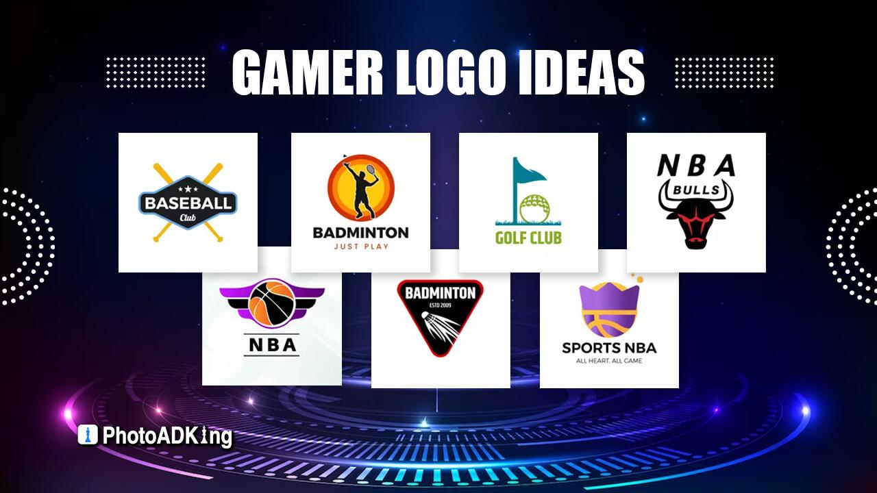
Attention gamers! Are you tired of logos that look like they were designed by a level 1 noob? It’s time to level up your logo game and start dominating the competition with designs that will have your opponents shaking in their virtual boots. Get ready to unlock the secrets to mastering the art of logo design for gamers and become the ultimate boss of branding. Let’s dive into the pixelated world of epic logos and unleash your creative power!
Understanding the Importance of Logos in the Gaming Industry
Logos in the gaming industry may seem like just a bunch of fancy symbols and colors slapped together, but oh, they are so much more than that! These little emblems are like the superhero capes of the gaming world, representing everything a game stands for in a single image.
Imagine trying to play your favorite game without its logo. It would be like trying to eat a burger without the bun – messy, confusing, and just not as satisfying. Logos are the glue that holds a game together, providing a visual identity that players can instantly recognize and connect with.
But logos aren’t just for show. They serve a vital purpose in the gaming industry, acting as a beacon of brand loyalty and trust. A well-designed logo can make or break a game’s success, drawing in players like moths to a flame (or, in the case of Fire Emblem, like dragons to a treasure hoard).
So next time you boot up your favorite game, take a moment to appreciate the logo that greets you. It’s not just a pretty picture – it’s the cornerstone of an entire gaming universe, ready to transport you to worlds unknown and adventures untold.

Key Elements to Include in a Gamer-Friendly Logo Design
When it comes to crafting a logo that will resonate with gamers, it’s important to consider a few key elements to make sure you hit the mark. First off, you’ll want to make sure your design is visually appealing and memorable. This means using bold colors, striking imagery, and unique shapes that will catch the eye of even the most distracted of players.
Another crucial element to include in your gamer-friendly logo design is versatility. Gamers come in all shapes and sizes, so your logo should be able to look just as cool on a tiny app icon as it does blown up on a t-shirt or poster. Make sure your design is scalable and can be easily adapted for different platforms and mediums.
In addition to being visually appealing and versatile, a gamer-friendly logo should also be easily recognizable. You want your logo to be instantly associated with your brand, so make sure it’s simple yet impactful. A good trick is to incorporate elements that are familiar to gamers, such as controllers, consoles, or iconic characters. This will help create a strong connection with your target audience and make your logo stand out in a sea of competitors.
Lastly, don’t forget to inject a bit of personality into your design. Gamers love brands that have a sense of humor or a unique point of view, so don’t be afraid to get creative and think outside the box. Whether it’s a clever pun, a hidden Easter egg, or a playful font choice, adding a touch of personality to your logo will make it more engaging and memorable for gamers of all kinds.
Choosing the Right Color Scheme to Appeal to Gamers
When it comes to appealing to gamers, choosing the right color scheme is crucial. Gamers are a visual bunch and are attracted to designs that catch their eye. Here are some tips to help you pick the perfect color scheme:
1. Consider the player’s mood: Think about the emotions you want to evoke in your players. Bright colors like neon green or hot pink can create a sense of excitement and energy, while darker colors like navy blue or black can convey a feeling of mystery and suspense.
2. Use contrasting colors: To make your game stand out, use colors that contrast with each other. Pairing bold colors like red and blue or yellow and purple can create a visually striking design that grabs players’ attention.
3. Keep it simple: While it may be tempting to go wild with your color choices, remember that less is often more. Stick to a few key colors that complement each other, rather than overwhelming players with a rainbow of hues.

Typography Tips for Creating an Impactful Gaming Logo
When it comes to creating a killer gaming logo, typography plays a crucial role. You want your logo to stand out, grab attention, and make a statement. Here are some typography tips to help you level up your logo game:
- Choose the right font: Fonts can make or break a logo. Make sure to pick a font that reflects the vibe of your game and resonates with your audience. Whether you go for bold and impactful or sleek and futuristic, the right font can set the tone for your logo.
- Experiment with different styles: Don’t be afraid to mix and match different typography styles to create a unique look. You can play around with sizes, weights, and spacing to find the perfect combination that makes your logo pop.
- Keep it simple: While it’s tempting to go all out with crazy fonts and elaborate designs, sometimes less is more. A clean and simple typography can be just as powerful as something more intricate. Remember, you want your logo to be easily recognizable and memorable.
So there you have it – typography tips to help you craft an impactful gaming logo that will leave a lasting impression. With the right font, style, and design, you can create a logo that truly stands out in the gaming world. Good luck and happy logo-making!
Incorporating Symbolism and Iconography in Gaming Logos
When it comes to designing gaming logos, incorporating symbolism and iconography can take your brand to the next level. Imagine a logo with a fierce dragon breathing fire or a sneaky ninja hiding in the shadows – now that’s some epic symbolism right there!
But don’t just slap on any random symbol onto your logo. Make sure it resonates with your brand identity and the message you want to convey. Are you all about speed and agility? A lightning bolt might be the perfect symbol for you. Or maybe you’re all about strategy and cunning – in that case, a sly fox could be your mascot.
Iconography is equally important in gaming logos. Icons can instantly convey a message or represent a concept without the need for words. Think of iconic gaming logos like the power-up mushroom in Mario or the triforce symbol in Legend of Zelda. These images instantly evoke a sense of nostalgia and recognition among gamers.
- Choose symbols that align with your brand’s values and personality
- Use icons that are instantly recognizable and resonate with gamers
- Don’t be afraid to get creative and think outside the box – gaming logos are meant to be fun and unique!
Utilizing Negative Space and Simplistic Design Techniques
When it comes to design, sometimes less is more. can really make your work stand out. Instead of cramming every inch of your canvas with images and text, consider leaving some areas blank to create a sense of balance and harmony.
One way to effectively use negative space is to let your design breathe. Give your elements room to shine by not overcrowding the space. This will not only make your design more visually appealing, but it will also help guide the viewer’s eye to the most important parts of your work.
Another trick is to keep your design simple. Don’t overcomplicate things with too many colors, fonts, or elements. Stick to a clean, minimalistic approach to really make a statement. Remember, sometimes the most impactful designs are the ones that say the most with the least amount of visual clutter.
So next time you’re working on a project, consider incorporating negative space and simplistic design techniques. Your work will thank you, and who knows, you might just create something truly unforgettable.
Testing and Refining Your Gaming Logo for Maximum Impact
Now that you have your gaming logo, it’s time to put it to the test! Here are a few ways to refine it for maximum impact:
- Get Feedback: Share your logo with friends, family, or even strangers online to get their honest opinions. You never know what suggestions they might have!
- Test Different Backgrounds: Try placing your logo on different backgrounds to see how it stands out. A good logo should be versatile and look great no matter where it’s placed.
- Experiment with Colors: Don’t be afraid to play around with different color schemes for your logo. Sometimes a small tweak in color can make a big difference in its overall impact.
Remember, the key to a successful gaming logo is making sure it’s memorable, versatile, and reflective of your brand. So, don’t be afraid to try out different ideas and have fun with the process! After all, your logo is the face of your gaming identity – make sure it’s one that leaves a lasting impression.
FAQs
Why is logo design important for gamers?
Because let’s face it, no one wants to be seen sporting a rookie logo while gaming. A killer logo will strike fear in your opponents’ hearts and make you instantly recognizable in the gaming community.
What elements should be included in a gamer logo?
Think of it like creating your own superhero persona. You’ll need a badass font, epic color scheme, and a design that represents your unique gaming style. Bonus points for incorporating elements from your favorite games!
How can I make my logo stand out from the crowd?
Get creative! Don’t be afraid to think outside the box and push the boundaries of traditional logo design. The more unique and original your logo is, the more likely it is to catch the eye of fellow gamers.
Should I hire a professional designer or create my own logo?
While a professional designer can definitely help bring your vision to life, there’s something to be said for creating your own logo. After all, who knows your gaming style better than you? Plus, it’s a great way to show off your artistic skills.
What are some common mistakes to avoid when designing a gamer logo?
Avoid cliches like using generic gaming symbols or overloading your logo with too many details. Keep it simple, sleek, and memorable. And for the love of all things gaming, please spell-check your logo!
Level Up Your Logo Game!
Congratulations, gamer! You’ve now mastered the art of logo design for gamers. With your newfound skills, you’re ready to create logos that will make other gamers bow down in awe. So go forth, unleash your creativity, and level up your logo game like never before. Remember, the pixelated sky’s the limit!


