In a world filled with fleeting fads and passing trends, one thing remains constant: the power of a timeless logo. Like a fine wine or a perfectly aged cheese, a well-crafted logo only gets better with time. So grab your chisels and sharpen your pencils, because we’re about to dive into the art of creating logos that will stand the test of time.
Design Principles for Timeless Logos
When it comes to creating a logo that stands the test of time, there are a few design principles you should keep in mind. After all, you don’t want your logo to look outdated before you even finish paying for it!
One of the key factors in designing a timeless logo is simplicity. Think about some of the most iconic logos out there – Apple, Nike, McDonald’s. What do they all have in common? They’re all simple, clean, and easy to recognize. So ditch the bells and whistles and opt for a sleek and streamlined design instead.
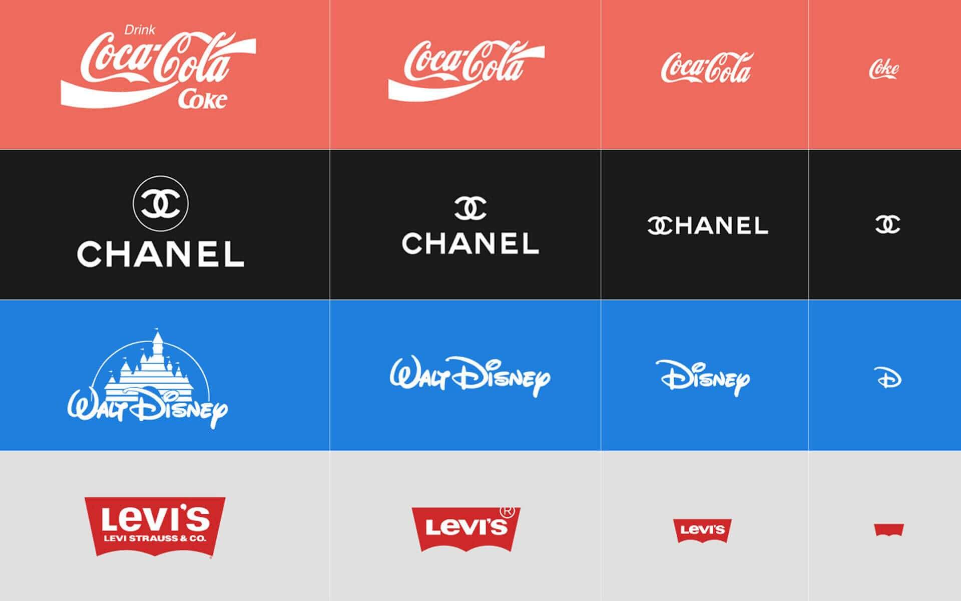
Another important design principle to consider is versatility. Your logo should look just as good in black and white as it does in color, and it should be able to be scaled up or down without losing its impact. After all, a logo that falls apart when you shrink it down to business card size is about as useful as a chocolate teapot.
Finally, don’t be afraid to embrace negative space in your logo design. Negative space can add depth and interest to your logo, making it more memorable and visually appealing. Plus, it’s a great way to sneak in a hidden message or two – just ask anyone who’s ever spotted the arrow hidden in the FedEx logo!

Understanding the Psychology of Logos
Logos are more than just pretty pictures slapped onto a webpage or business card. There’s actual psychology behind those cleverly designed symbols that make us feel all warm and fuzzy inside. Let’s delve into the fascinating world of logo psychology and uncover the mysteries behind these iconic emblems.
Ever wondered why certain logos stick in your mind like a catchy jingle? It’s all about creating a connection with your subconscious. A well-designed logo can evoke feelings of trust, reliability, and quality in an instant. It’s like love at first sight, but with a logo.
Colors play a huge role in logo psychology. Each shade has its own hidden message that can subliminally influence your perception of a brand. For example, the color blue conveys trust and professionalism, while red screams passion and excitement. It’s like a secret language that only graphic designers and psychologists understand.
And let’s not forget about shape psychology. Whether it’s a sleek circle, a bold square, or a whimsical swirl, the shape of a logo can communicate volumes about a company’s identity. Geometric shapes convey stability and strength, while soft curves suggest friendliness and approachability. So next time you gaze upon a logo, remember that there’s more to it than meets the eye.

Elements of a Successful Logo Design
Creating a logo might seem like a piece of cake, but a successful logo design requires more than just slapping together some colors and shapes. Here are some elements to consider:
- Originality is key – avoid copying other logos or using generic clip art. Your logo should stand out like a unicorn in a sea of horses.
- Simplicity is your best friend – don’t overcomplicate things with too many elements. Remember, less is more!
- Color psychology matters – choose colors that reflect your brand personality. No one wants a logo that screams “I’m lost in a rainbow!”
- Versatility is a must – your logo should look good on a billboard as well as a business card. If it can’t scale down to the size of a stamp without losing its essence, it’s time for a redesign.
So, next time you’re designing a logo, remember to keep it original, keep it simple, choose your colors wisely, and make sure it looks good no matter where it’s displayed. And who knows, you might just end up with a logo that makes the competition green with envy!

Case Studies of Iconic Logos
Let’s dive into some fascinating that have stood the test of time and become symbols of their respective brands:
Apple:
- The half-bitten apple logo is one of the most recognizable symbols in the world.
- It was designed by Rob Janoff in 1977, inspired by a real apple orchard.
- People often joke that taking a bite out of this apple logo will not give you a virus, unlike biting into a real apple!
Nike:
- The swoosh logo was created by a graphic design student, Carolyn Davidson, in 1971, for a mere $35.
- It represents the wing of the Greek goddess of victory, Nike, symbolizing movement and speed.
- Fun fact: Nike’s co-founder, Phil Knight, initially didn’t love the logo, but it has since become one of the most iconic symbols in sports history!
McDonald’s:
- The golden arches logo dates back to the 1960s and was inspired by the architecture of the first McDonald’s restaurant.
- It’s said that the arches represent the “M” in McDonald’s and also symbolize the warmth and friendliness of the brand.
- Whether you’re craving a Big Mac or just need a quick pit stop for a coffee, those golden arches are a beacon of familiarity and comfort for millions of customers worldwide.

Tips for Creating Memorable Logos
When it comes to creating memorable logos, there are a few key things to keep in mind to ensure that your design stands out. Here are some tips to help you craft a logo that will leave a lasting impression on your audience:
Keep it simple: The best logos are often the simplest ones. Avoid cluttering your design with too many elements or intricate details. Remember, less is more!
Use bold colors: Eye-catching colors can help your logo stand out from the crowd. Be bold in your color choices and don’t be afraid to experiment with different combinations to find the perfect match.
Be original: To create a truly memorable logo, you need to think outside the box. Avoid using cliché symbols or overused fonts, and strive to come up with a design that is unique and original. Remember, you want your logo to be instantly recognizable and distinctive.
Maintaining Consistency in Logo Design
So you’ve finally designed the perfect logo for your company, congratulations! But now comes the hard part, maintaining consistency in your logo design. Don’t worry, we’ve got your back with some helpful tips and tricks.
– **Create a style guide:** This is like the Bible for your logo design. Outline the color palette, font choices, and sizing guidelines to ensure everyone on your team is on the same page.
– **Use the same elements:** Whether it’s the same fonts, colors, or shapes, make sure all versions of your logo have consistent elements to maintain brand recognition.
– **Avoid unnecessary changes:** Don’t succumb to the temptation of constantly tweaking your logo. Stick to the original design as much as possible to build familiarity with your audience.
Remember, consistency is key in establishing a strong brand identity. So don’t let your logo design become a hot mess of conflicting elements. Stick to the plan, follow these tips, and watch your brand flourish with a solid logo foundation.
FAQs
Why is it important to have a timeless logo?
Having a timeless logo is like having a good pair of jeans - it never goes out of style! A logo that stands the test of time means you won’t have to constantly rebrand every time a new design trend comes along. Plus, it helps build brand recognition and loyalty over the years.
What are some key elements to consider when crafting a timeless logo?
When crafting a timeless logo, think simple, think versatile, and think iconic. Keep your design clean and uncluttered, choose colors and fonts that will still look good in 10 years, and make sure your logo can be easily scaled up or down without losing its impact. And most importantly, make it memorable!
How can I make my logo stand out while still being timeless?
To make your logo stand out while still being timeless, try incorporating unique elements or design features that set it apart from the competition. Experiment with different shapes, symbols, or textures that reflect your brand personality but make sure to keep it balanced and cohesive.
What are some common mistakes to avoid when creating a logo?
Avoid trendy design elements that may become outdated quickly, like gradients, drop shadows, or overly intricate details. Also, steer clear of using too many colors or fonts in your logo – less is more when it comes to creating a timeless design. And remember, clarity is key – make sure your logo is easily readable and recognizable at a glance.
Time to Let Your Logo Shine!
Congratulations, you’ve now unlocked the secrets to creating logos that stand the test of time! Remember, great logos aren’t crafted in a day – they require dedication, creativity, and a sprinkle of magic. So go forth, unleash your imagination, and let your logo shine brighter than the North Star! It’s time to make your mark on the world of design. Keep crafting, keep creating, and remember – the logo is the window to the soul of your brand. Happy designing!


