Logos are like the fabulously dressed celebrities of the design world – instantly recognizable, effortlessly cool, and always stealing the spotlight. But creating a killer logo isn’t just about throwing together some fancy fonts and trendy colors, oh no. It takes skill, strategy, and a whole lot of creativity. So, buckle up and get ready to dive into the wild and wonderful world of logo design, where we’ll uncover the top principles you need to know to master the art of logo creation. Let’s make your brand shine brighter than a sequined gown on the red carpet!
Understanding the Purpose of a Logo
When it comes to logos, they’re more than just a random design slapped onto a company‘s branding material. No, no, no. Logos have a big job to do – they’re like the company’s spokesperson, but in visual form. Let’s break it down and dive into the purpose of a logo in all its glory!
A logo is like a first impression - it tells people who you are without saying a word. It’s like wearing a fancy outfit to a job interview or a killer pair of shoes on a first date. You want to make a statement and leave a lasting impression, right? That’s where a logo comes in. It’s your company’s chance to shine and show off its personality.
Think of a logo like a superhero emblem. Batman has his iconic bat signal, and Superman has that ‘S’ that makes every bad guy cower in fear. Your logo should be just as powerful and instantly recognizable. It should instill trust, evoke emotion, and make people want to learn more about your brand. It’s like the secret weapon in your marketing arsenal!
So, in the grand scheme of things, a logo is like the MVP of your branding efforts. It’s the face of your company, the silent ambassador that speaks volumes without uttering a word. It’s the thread that ties everything together and makes your brand stand out in a sea of competitors. So, give your logo the love and attention it deserves – it’s the unsung hero of your business!

Implementing the 5 Key Principles of Logo Design
So, you’ve decided to take on the challenge of creating the perfect logo for your brand. Congratulations! Now, it’s time to put on your designer hat and dive into the wonderful world of logo design. But fear not, we’re here to guide you through the process with the 5 key principles of logo design.
First up, simplicity. Remember, less is always more in the world of logo design. Keep your design clean and clutter-free to ensure maximum impact.
Next, we have relevance. Your logo should represent your brand and its values. Think about what makes your brand unique and incorporate that into your design.
Now, let’s talk about versatility. Your logo should look great on everything from business cards to billboards. Make sure it’s scalable and works in both color and black and white.
And last but not least, memorability. Your logo should be unforgettable. Think of all the iconic logos out there – Nike, Apple, McDonald’s. Aim for that level of recognition with your own design.
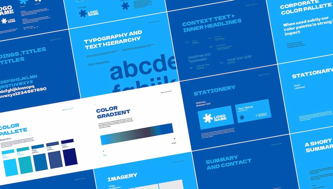
Creating a Strong Visual Identity
When it comes to , it’s all about standing out from the crowd. You want your brand to be like a zebra in a sea of horses – distinctive, memorable, and just a little bit wild. Here are some tips to help you create a visual identity that will make your competitors green with envy:
1. Choose your colors wisely: Just like a chameleon blends into its surroundings, your brand colors should reflect the essence of your business. Whether you go for bold and bright or understated and elegant, make sure your color palette speaks volumes about who you are.
2. Find your logo soulmate: Your logo is like the face of your brand – it should be instantly recognizable and full of personality. Whether you opt for a minimalist design or a quirky illustration, your logo should embody the heart and soul of your business.
3. Keep it consistent: Like a well-dressed man in a suit that fits just right, your visual identity should be cohesive across all platforms. From your website to your social media profiles, make sure every element stays true to your brand image. Consistency is key to building a strong visual identity that sticks in people’s minds like a catchy jingle.

Balancing Creativity and Simplicity in Logo Design
When it comes to logo design, finding the perfect balance between creativity and simplicity is key. You want your logo to stand out and be memorable, but you also don’t want it to be overly complicated or confusing. Here are a few tips to help you achieve that perfect balance:
Keep it simple: While it’s tempting to go all out with wild fonts and intricate designs, sometimes less is more. A clean, simple logo can often make a bigger impact than a cluttered one.
Think outside the box: Don’t be afraid to get creative with your logo design. Look for inspiration in unexpected places and don’t be afraid to take risks. After all, some of the best logos are the ones that break the mold.
Consider your audience: Remember who your logo is for and try to tailor your design to appeal to them. Whether you’re targeting a fun-loving crowd or a more serious audience, make sure your logo reflects their tastes and preferences.
Remember, finding the right balance between creativity and simplicity takes time and experimentation. Don’t be afraid to try out different ideas and see what works best for your brand. Happy designing!
Choosing the Right Color Palette for Your Logo
When it comes to , it’s not just about picking your favorite colors or using the entire rainbow. You need to consider the psychology behind colors and how they can evoke different emotions in your audience. Here are some tips to help you create a logo that truly pops:
First off, think about the message you want your logo to convey. Do you want to come off as trustworthy and reliable? Go for blues and greens. Are you a fun and energetic brand? Yellows and oranges might be the way to go. Make sure your color choices reflect the personality of your brand.
Consider the competition. You don’t want to blend in with the crowd, so take a look at what colors your competitors are using and try to stand out. If everyone else is using red and black, maybe you should consider purple and gold to separate yourself from the pack.
Lastly, don’t be afraid to get creative with your color choices. Maybe you want to throw in a pop of hot pink or neon green to really make your logo pop. Remember, this is your chance to make a statement, so don’t be afraid to think outside the box!
Utilizing Typography to Enhance Brand Recognition
Typography is a powerful tool when it comes to creating brand recognition. By carefully selecting fonts and styles, you can make your brand stand out from the crowd. One way to do this is by choosing a unique font that reflects your brand’s personality. Whether you prefer a sleek and modern look or a more traditional feel, the right font can help convey your brand’s message in a memorable way.
Another way to utilize typography to enhance brand recognition is by using consistent fonts across all of your marketing materials. By establishing a cohesive visual identity, you can help consumers associate your brand with a specific look and feel. This can help build trust and loyalty among customers, making them more likely to remember and recognize your brand in the future.
In addition to selecting the right fonts, you can also use typography to create eye-catching logos and graphics that will help your brand stand out. By experimenting with different font sizes, weights, and styles, you can create dynamic designs that will grab the attention of your target audience. Remember, when it comes to typography, the sky’s the limit – so don’t be afraid to get creative and try new things!
In conclusion, typography is a powerful tool that can help enhance brand recognition in a fun and memorable way. By choosing the right fonts, using consistent styles, and creating eye-catching designs, you can make your brand stand out from the competition. So next time you’re brainstorming ideas for your marketing materials, don’t forget to consider how typography can help take your brand to the next level!
FAQs
Why is logo design important?
When was the last time you bought a product without seeing its logo first? Exactly. A well-designed logo is like that one person at a party who everyone wants to talk to – it draws people in and leaves a lasting impression.
What are the key principles to keep in mind when designing a logo?
Oh, where do we start? Keep it simple, versatile, relevant, and memorable. Just like a good dating profile – you want to show enough to catch attention, but not too much to scare someone off. Balance, my friend, balance.
How can color palettes affect a logo’s success?
Have you ever seen a logo that made you go “Wow, I absolutely need to buy whatever that is selling”? Yeah, that’s the power of colors. They can evoke emotions, convey messages, and make your logo stand out like a peacock in a sea of pigeons.
What role does typography play in logo design?
Imagine if your logo was a celebrity. Typography would be its stylist – determining how it should dress, what accessories to wear, and basically making sure it looks like a million bucks on the red carpet. Choose wisely, my friend.
How can I ensure my logo is unique and avoids looking like other logos?
It’s like dating in a small town – you don’t want your logo to be mistaken for someone else’s ex. Do your research, think outside the box, and put your own creative spin on it. Trust us, your logo will thank you for it.
Until Next Time, Design Gurus!
And there you have it, folks! Hopefully, after reading this article, you are now armed with the knowledge to become a logo design pro. So go forth and create some visually stunning logos that will leave your clients speechless (in a good way, of course). Remember, Rome wasn’t built in a day, so keep practicing those design principles and soon you’ll be a master of the logo design universe. Until next time, keep designing and stay creative, my friends!


