Are you tired of your logos looking like they were made by a kid with a crayon? Well, fear not my struggling design friends, because today we are going to dive into the wild world of logo design and uncover the essential steps and tips to help you become a master in no time. So grab your pencils, sharpen your skills, and let’s get ready to whip those logos into shape like a boss!
Understanding the Fundamentals of Logo Design
So you want to delve into the exciting world of logo design, eh? Well, you’ve come to the right place! Let’s break down the fundamentals of creating a killer logo that will make your competition green with envy.
First things first, you need to understand the importance of simplicity in logo design. Your logo should be like a good joke - easy to understand and impossible to forget. Avoid cluttering your design with unnecessary elements. Keep it clean and minimal, just like your ex’s side of the closet.
Next up, let’s talk about colors. Choosing the right color palette can make or break your logo. Remember, different colors evoke different emotions. For example, red is great for grabbing attention (just like your annoying neighbor’s car alarm), while blue conveys trust and reliability (unlike your unreliable brother-in-law). Play around with different color combinations until you find the perfect match for your brand.
And finally, don’t forget to consider scalability. Your logo should look just as fabulous on a billboard as it does on a business card. Make sure to test your design in various sizes to ensure that it remains legible and impactful. After all, you don’t want your logo to end up looking like a pixelated mess on a tiny Instagram profile picture.
Exploring Different Logo Types and Styles
When it comes to logo design, the possibilities are endless! Let’s dive into some of the different types and styles of logos that can help your brand stand out:
Minimalist Logos: These logos are sleek and simple, using clean lines and minimalistic design elements to make a big impact. Less is definitely more in the world of logo design!
Illustrative Logos: These logos are like little works of art, incorporating intricate illustrations and detailed imagery to tell a story and capture the essence of your brand. Who knew a logo could be so artistic?
Abstract Logos: Abstract logos are all about creativity and thinking outside the box. With unique shapes, colors, and patterns, these logos are sure to make a bold statement and leave a lasting impression on your audience.
![]()
Utilizing Color Theory and Psychology in Logo Design
When it comes to designing a logo, color theory and psychology play a crucial role in grabbing the attention of your audience. By understanding the meanings and emotions associated with different colors, you can create a logo that effectively communicates your brand’s message.
For example, if you want to convey trust and reliability, you might choose to use blue in your logo. Blue is often associated with stability and calmness, making it a popular choice for financial institutions and healthcare companies. On the other hand, if you want to convey energy and excitement, you might opt for a vibrant shade of red or orange.
Using complementary colors in your logo design can also create a sense of harmony and balance. By pairing colors that are opposite each other on the color wheel, you can create a visually appealing logo that captures the attention of your audience. This technique is especially effective for creating logos that stand out against competitors.
Overall, is a powerful tool for creating a logo that resonates with your target audience. By understanding the meanings and emotions associated with different colors, and by using complementary colors to create balance and harmony, you can create a logo that effectively communicates your brand’s message and sets you apart from the competition.
Choosing the Right Fonts and Typography for Your Logo
When it comes to , it’s like picking the perfect outfit for a first date – you want to make a good impression, but you also want to show off your unique style.
First off, **choose a font that reflects your brand’s personality**. Are you a fun, quirky brand? Go for a playful and whimsical font. Are you a serious and professional brand? Opt for a clean and modern font. Remember, your font choice says a lot about who you are.
Next, **consider readability**. Your logo may look gorgeous in that fancy script font, but if no one can read it, what’s the point? Make sure your font is clear and easy to read, especially when scaled down.
Lastly, **experiment with different combinations**. Mix and match fonts to see what works best together. Maybe a bold sans serif font pairs perfectly with a delicate script font. Don’t be afraid to play around until you find the perfect match made in typography heaven!
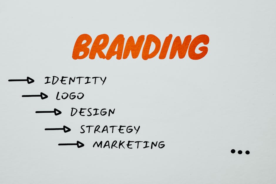
Creating a Strong Visual Identity for Your Brand
So you want your brand to stand out in a sea of competitors? Well, buckle up buttercup because it’s time to create a visual identity that’ll knock the socks off your target audience!
Here are some tips to help you craft a logo and branding design that’ll make your competitors green with envy:
- Choose a color scheme that screams “I’m fabulous!” Think bold and vibrant colors that’ll make heads turn.
- Find a font that speaks volumes about your brand’s personality. Whether it’s quirky, sophisticated, or downright wacky, make sure it represents your brand to a T.
- Think outside the box when designing your logo. Forget the clichés and go for something unique and memorable. Your logo should be like a good joke - it sticks in people’s minds!
And remember, consistency is key! Make sure your visual identity is carried through all your marketing materials, website, and social media platforms. You want your brand to be as recognizable as Beyoncé’s voice!
Implementing Feedback and Revisions in the Design Process
So, you’ve finally received feedback on your design and it’s time to make some revisions. Don’t worry, this is all part of the design process! Embrace the feedback and let’s dive into how you can implement those revisions like a pro.
First things first, take a deep breath and don’t let the feedback get you down. Remember, this is all about making your design even better. So, grab a cup of coffee (or whatever fuels your creativity) and let’s get to work.
Start by breaking down the feedback into actionable items. Maybe the client wants a brighter color scheme or a more user-friendly layout. Make a list of all the changes that need to be made and prioritize them. This way, you can tackle the revisions one by one and ensure nothing gets lost in the shuffle.
Next, roll up your sleeves and get to work. Make those revisions with gusto! Use bold colors, funky fonts, and eye-catching graphics to bring your design to life. Don’t be afraid to think outside the box and inject some personality into your work. Remember, design is all about creativity!
FAQs
Why is logo design important?
Because without a logo, your brand is just a sad, empty shell wandering aimlessly through the vast ocean of consumer choices. A good logo is like the cherry on top of a sundae – it’s the first thing people see and remember about your brand.
What are the essential steps in mastering logo design?
Step 1: Research – dig deep into your brand, your competitors, and your target audience.
Step 2: Sketch – put that pencil to paper and let your creativity flow.
Step 3: Refine – take your best sketches and polish them until they shine like a diamond.
Step 4: Test – show your designs to friends, family, and even strangers on the street to get feedback.
Step 5: Finalize – pick your winning design and make it official.
What are some tips for creating a memorable logo?
Tip 1: Keep it simple – don’t try to cram too much into your logo. Less is more.
Tip 2: Make it versatile – your logo should look good on everything from a business card to a billboard.
Tip 3: Choose the right colors – colors can evoke emotions and convey messages, so choose wisely.
Tip 4: Be unique – don’t be a copycat. Stand out from the crowd with a logo that is uniquely yours.
Ready to Level Up Your Logo Game?
Congratulations, you’re now armed with the essential steps and tips to conquer the world of logo design like a true master! So go forth, unleash your creativity, and remember: a great logo is worth a thousand words (and maybe even a million bucks, who knows?). Happy designing!


