Welcome to the wild world of logo design, where every curve, every color, and every font choice holds the power to make or break a brand. It’s a high-stakes game of visual storytelling, where one wrong move can turn a sleek logo into a sad excuse for clip art. But fear not, aspiring designers, for we are here to guide you through the treacherous waters of logo design and help you avoid the most common pitfalls along the way. So grab your sketchpad, buckle up, and prepare to master the art of logo design without making a fool of yourself in the process.
Understanding the fundamentals of logo design
So, you want to dive into the wonderful world of logo design, huh? Buckle up, my friend, because we’re about to take a wild ride through the fundamentals of creating eye-catching logos.
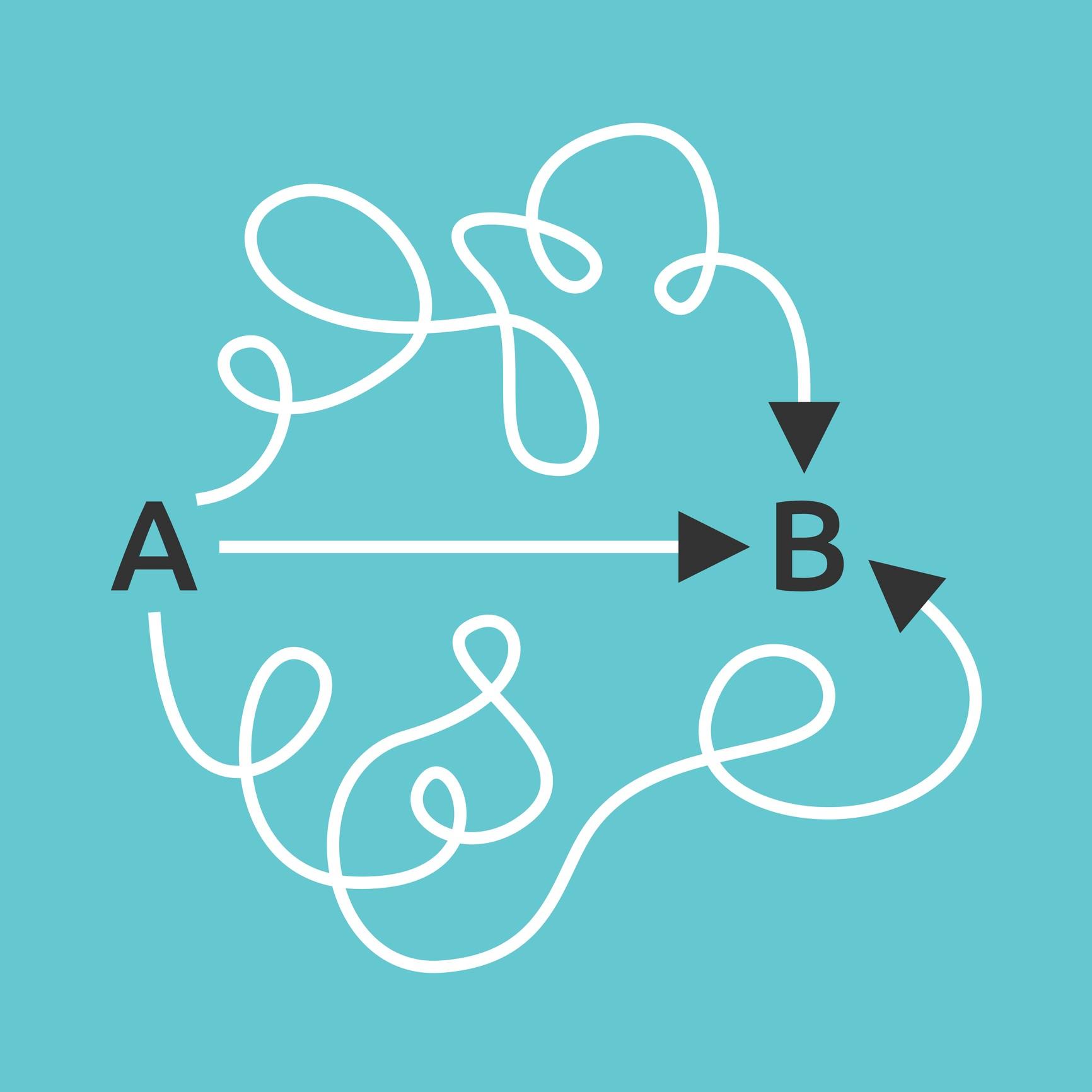
First things first, let’s talk about the importance of simplicity. Your logo should be like a good joke – short, sweet, and to the point. Think of some of the most iconic logos out there – Nike, Apple, McDonald’s. What do they all have in common? They’re as simple as a stick figure drawing on a napkin. Keep it clean and straightforward, and your logo will thank you for it.
Next up, let’s chat about versatility. Your logo needs to be like a chameleon – able to adapt to any situation. Whether it’s being slapped on a billboard or shrunk down to the size of a postage stamp, your logo should still be recognizable. Think about how your logo will look in black and white, in different sizes, and on various backgrounds. Adaptability is key, my friend.
And last but not least, let’s talk about uniqueness. Your logo should be like a snowflake – one of a kind. Sure, it’s tempting to hop on the latest design trend bandwagon, but trust me when I say that originality will take you far. Stand out from the crowd, dare to be different, and your logo will shine brighter than a disco ball at Studio 54.
 typography and color palette”>
Choosing the right typography and color palette
When it comes to for your project, it’s not just about picking random fonts and colors that you like. There’s a science behind it, my friend. A science that involves a delicate dance between aesthetics and readability.
First things first, let’s talk about typography. Your choice of fonts can make or break your design, so choose wisely. Opt for fonts that are easily readable and complement each other. Don’t go mixing Comic Sans with Times New Roman, unless you’re trying to start a font war. Stick to a cohesive font family and maybe throw in a fancy script font for some flair.
Now, onto the color palette. Colors can evoke emotions and set the tone for your design, so don’t underestimate their power. Choose colors that resonate with your brand or message. Need some inspiration? Take a walk in nature and steal some color schemes from Mother Earth herself. Or just google “trendy color palettes” like the rest of us lazy designers.
In conclusion, might seem like a daunting task, but with a little creativity and a touch of humor, you can create a design that’s both visually appealing and effective. So go forth, my fellow designer, and may your fonts be forever legible and your colors forever trendy.
Creating a logo that is versatile and scalable
Creating a logo that can shapeshift like Mystique from X-Men is no easy feat, but with some clever design choices, it’s totally possible! When designing a versatile and scalable logo, think about how it will look on everything from a business card to a billboard.
One trick to achieving logo greatness is to keep it simple. **Bold** shapes and minimalistic designs can easily be resized without losing their impact. Plus, they’re a lot easier to animate if you’re thinking of creating a fun little GIF for your website.
Another thing to consider is color. Think of your logo as a chameleon – it should be able to adapt to any background without losing its essence. Avoid using too many colors or gradients that can get muddy when scaled down. A solid color or a simple color palette will give your logo that versatile edge.
Lastly, test your logo out in different environments. Stick it on a mug, a T-shirt, a giant inflatable balloon – whatever floats your boat. If it still looks good and recognizable in all those scenarios, you’ve got yourself a winner. Now go forth, logo designer, and create something that can stand the test of size!
Avoiding overcomplicated and cluttered designs
Designing can be a tricky business. One common mistake that designers make is creating overcomplicated and cluttered designs that just end up looking like a hot mess. Trust me, no one wants their website or product to be the visual equivalent of a hoarder’s house.
So, how can you avoid falling into the trap of cluttered designs? It’s simple really. Just follow these tips:
- Simplicity is key: Keep it simple, stupid! Remember, less is more. Your design should be clean, sleek, and easy on the eyes. Avoid unnecessary elements that only serve to confuse and overwhelm the viewer.
- Whitespace is your friend: Don’t be afraid of empty space. Whitespace helps to create breathing room and allows the important elements of your design to stand out. Embrace the whitespace!
- Organize, organize, organize: Group similar elements together, use grids and guides to align everything perfectly, and make sure that there is a logical flow to your design. A well-organized design is a happy design.
By following these simple tips, you can ensure that your designs are clean, clear, and clutter-free. So, put down the glitter and confetti, and embrace the beauty of simplicity!

Utilizing negative space effectively
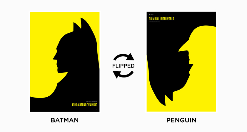
When it comes to design, negative space often gets a bad rap. After all, it’s just empty space, right? Wrong! Negative space can actually be a powerful tool in your design arsenal if utilized effectively. Here are some tips on how to make the most of that seemingly empty space:
- **Create balance**: Negative space helps create a sense of balance in your design. By leaving empty space around your central elements, you can draw the viewer’s focus to what’s truly important.
- **Enhance readability**: Ever tried to read a block of text that was crammed together with no breathing room? Not fun. Negative space can help improve readability by giving your content room to breathe.
- **Highlight important elements**: Want to make a certain element pop? Surround it with negative space to make it stand out. This can be especially useful for call-to-action buttons or important messages.
Remember, negative space doesn’t have to be boring. Get creative with how you use it in your designs. Experiment with different sizes and shapes of empty space to see what works best for your project. And most importantly, don’t underestimate the power of nothing!
Getting feedback and making revisions from multiple sources
Once you’ve gathered feedback from multiple sources, it’s time to put on your revision hat and get to work. Remember, not all feedback is created equal, so it’s important to sift through the comments and cherry-pick the ones that resonate with you the most.
Start by identifying recurring themes in the feedback. If several people mention the same issue, it’s likely worth addressing. **Make a list of the key points to focus on**, and consider how you can improve your work based on these insights.
Don’t be afraid to get creative with your revisions. Sometimes, the best ideas come from unexpected places. **Think outside the box and be open to trying new approaches** that might enhance your work.
Once you’ve made your revisions, don’t forget to solicit feedback from fresh eyes. A new perspective can provide valuable insights that you may have overlooked. **Keep an open mind and be willing to make further changes** based on this additional feedback.
Ensuring your logo is unique and distinct from others in the market
So, you want your logo to stand out from the crowd, huh? Well, buckle up because we’re about to take you on a wild ride through the world of logo design. First things first, you need to make sure that your logo is as unique as a unicorn riding a rainbow. Here are some tips to ensure that your logo is one-of-a-kind:
- Research, research, research: Before diving headfirst into the design process, take a look at what your competitors are doing. You don’t want your logo to look like a long-lost twin of another company’s logo. Be original, be bold!
- Get inspired: Look outside of your industry for inspiration. Take a walk in nature, browse through art galleries, or watch a sci-fi movie. You never know where that stroke of genius might come from.
- Keep it simple: A cluttered logo is like wearing all your favorite accessories at once – it’s just too much. Stick to a few key elements and colors to make your logo easily recognizable.
Now, imagine your logo is like a superhero in a world full of sidekicks. You want it to save the day and be memorable, right? By following these tips, your logo will be the talk of the town (or the market) in no time!
FAQs
Question 1: Can I use multiple fonts in a logo?
Well, technically, you can. But should you? Probably not. Using multiple fonts in a logo can make it look cluttered and unprofessional. Stick to one font or maybe two if you’re feeling adventurous, but make sure they complement each other.
Question 2: Is it okay to use clip art in my logo?
Sure, if you want your logo to look like it was designed in the ’90s by someone using their grandma’s ancient computer. Clip art is a big no-no in logo design. It’s always best to create something original that truly represents your brand.
Question 3: Should I follow the latest design trends for my logo?
Only if you want your logo to blend in with the millions of other trendy logos out there. While it’s important to stay current, it’s also important to create a logo that is timeless and unique to your brand. Ignore the trends and focus on creating something that will stand the test of time.
Question 4: Can I use too many colors in my logo?
Absolutely! In fact, the more colors, the better. Said no professional designer ever. Using too many colors in a logo can make it look busy and overwhelming. Stick to a simple color palette that reflects your brand’s personality and values.
Question 5: How important is scalability in logo design?
Scale-what-ability? Just kidding! Scalability is actually super important in logo design. Your logo should look just as good on a tiny business card as it does on a giant billboard. Make sure your logo is designed in vector format so it can be scaled up or down without losing quality.
Don’t Let Your Logo Design Be the Butt of Jokes!
Remember, mastering logo design is a journey filled with twists, turns, and the occasional design mishap. By avoiding common mistakes and staying true to your creative vision, you can craft a logo that truly stands out from the crowd. So go forth, fellow designer, and create with confidence – we believe in you!And if all else fails, just remember: at least your logo design won’t end up on a “worst logos of all time” list. Happy designing!


