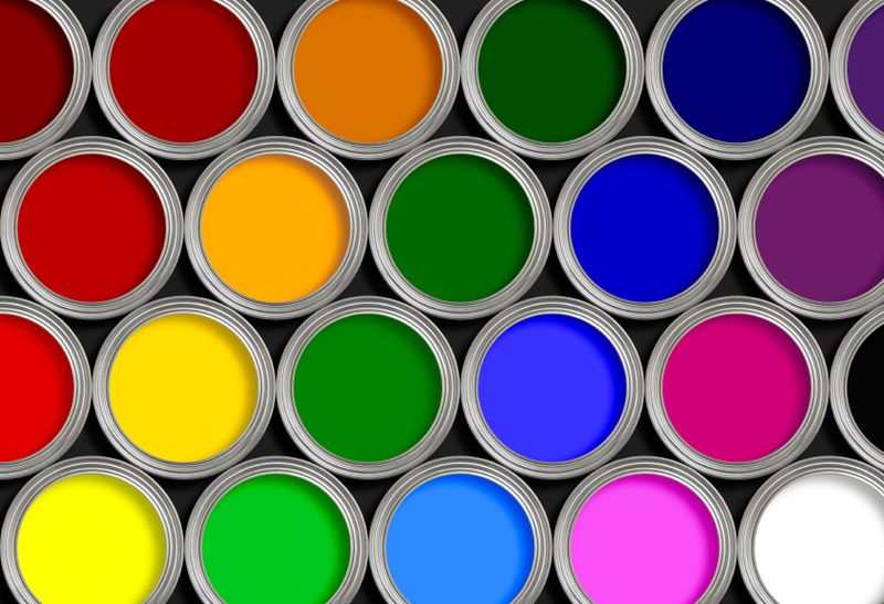
Are you tired of feeling blue about your brand’s lackluster logo? Well, it’s time to add some pizzazz to your visual identity with the power of color! In this guide, we’ll show you how to harness the rainbow to make your branding shine brighter than a disco ball at Studio 54. Get ready to paint the town (and your logo) red – with a splash of orange and a dash of purple for good measure! Let’s dive headfirst into the vibrant world of branding and logo design – no shades of gray allowed!
psychology-of-color”>Understanding the Psychology of Color
Ever wonder why your favorite color is yellow or why seeing red makes you angry? The psychology of color may hold the answers! Colors have a way of impacting our emotions, behaviors, and even our decision-making process. Let’s dive into the fascinating world of color psychology and discover the hidden power behind the hues.
**Red:** This fiery color is often associated with passion, love, and danger. It’s no wonder seeing red can make your heart race and your blood boil. So next time you’re feeling a bit hot-headed, blame it on the color red – not your co-worker who keeps stealing your lunch from the office fridge.
**Blue:** Feeling blue? Don’t worry, it’s not just you. Blue is often linked to feelings of calmness, tranquility, and trustworthiness. So the next time you want to appear more reliable in that job interview, consider wearing a blue suit instead of that neon green one your mom bought you for Christmas.
**Yellow:** The color of sunshine and happiness, yellow is known for its uplifting and energizing properties. So if you’re feeling a bit down in the dumps, surround yourself with some sunny yellow accents and watch your mood soar like a bumblebee on a flower-filled spring day.

Choosing the Right Color Palette for Your Brand
So you’ve decided to spruce up your brand with a fresh new color palette, huh? Well, buckle up, because choosing the right colors is no easy feat! It’s a bit like trying to find the perfect pair of jeans – it takes time, trial, and error.
Before you dive headfirst into a sea of hues, take some time to consider what message you want your brand to convey. Are you aiming for a sense of trustworthiness? Playfulness? Sophistication? Once you’ve nailed down the vibe you’re going for, it’s time to start playing with color combinations.
Remember, choosing the right colors is like assembling a killer girl group – each color needs to complement the others and bring something unique to the table. Consider creating a mood board of potential colors to see how they work together. Who knows, you might just end up with the color palette equivalent of Destiny’s Child!
And finally, don’t be afraid to think outside the box! Sure, everyone loves a classic black and white combo, but why not throw in a pop of neon green for some extra pizzazz? The world is your color wheel, so have fun with it and let your brand’s personality shine through!
The Importance of Consistency in Color Usage
When it comes to choosing colors for your brand or design projects, consistency is key! Imagine if McDonald’s suddenly decided to change their iconic red and yellow color scheme to purple and green. Not only would it confuse customers, but it would also ruin the brand recognition they have worked so hard to build.
Consistent color usage helps to establish brand identity and create a sense of familiarity among your audience. It makes your brand instantly recognizable and memorable. Think of Coca-Cola’s classic red and white cans or Starbucks’ iconic green logo – these colors have become synonymous with their respective brands.
Not only does consistent color usage help with brand recognition, but it also helps to create a cohesive and professional look across all of your marketing materials. Whether you’re designing a website, a social media post, or print materials, using the same colors consistently will tie everything together and make your brand look polished and put-together.
So remember, when it comes to color usage, be bold, be creative, but above all, be consistent! Your brand will thank you, and your audience will thank you too. Plus, who wants to be known as the company with the ever-changing color scheme? Stick to your colors like glue, and you’ll be on your way to color consistency greatness!
Utilizing Color to Evoke Emotional Responses
Color is a powerful tool that can evoke a wide range of emotional responses. Whether you’re feeling blue or seeing red, colors can impact your mood in an instant. Here’s how you can use color to evoke different emotions:
1. Red: This fiery hue is known for its ability to stimulate your senses and increase your heart rate. Use red to evoke passion, power, and energy. It’s the perfect color for a date night outfit or to add a touch of drama to your living room.
2. Blue: Feeling calm and collected? Blue is the color for you. This soothing hue is associated with tranquility, stability, and trust. Incorporate blue into your workspace to promote productivity and focus.
3. Yellow: Looking to add a pop of happiness to your day? Yellow is the way to go. This cheerful color is associated with sunshine, energy, and optimism. Wear a yellow scarf or add a splash of yellow to your home decor to lift your spirits.

Creating a Memorable Logo with Strategic Color Placement
When it comes to creating a logo that leaves a lasting impression, strategic color placement is key! Think of color as the secret ingredient in your logo recipe – it’s what makes it pop and stand out from the competition. Here are a few tips to help you master the art of color placement:
- Choose your color palette wisely: Before you start slapping colors onto your logo like a toddler with finger paint, take some time to consider what emotions and associations each color evokes. Remember, colors can communicate without saying a word!
- Balance is everything: Just like a delicate dance, your logo colors need to work together in perfect harmony. Make sure you’re not overwhelming your design with too many bold colors or leaving it feeling flat and boring with all neutrals.
- Play with contrast: Want your logo to really pop? Consider using complementary colors to create eye-catching contrast. This will help draw the viewer’s eye to your logo and make it hard to forget.
Remember, a well-designed logo will leave a lasting impression and help your business stand out from the crowd. So, don’t be afraid to get a little colorful and experiment with different combinations until you find the perfect match!
The Role of Color in Creating Brand Recognition and Loyalty
Color plays a crucial role in creating brand recognition and loyalty, so it’s important to choose shades that speak to your target audience. Here are a few ways color can influence your brand:
First and foremost, color has the power to evoke emotions and feelings in customers. When people see a certain color associated with a brand, it triggers a reaction in their brain. So, pick colors that reflect the personality of your brand and connect with your audience on an emotional level. Remember, a well-chosen color scheme can make your brand unforgettable!
Secondly, colors can help differentiate your brand from competitors. Imagine a world where every fast-food chain had red and yellow logos. It would be like a McDonald’s nightmare! By using unique and eye-catching colors, you can stand out in a crowded marketplace and create a lasting impression on customers.
Lastly, color consistency is key to building brand loyalty. If your brand switches up its color scheme every few months, it can confuse customers and weaken their connection to your brand. By sticking to a consistent color palette, you can establish a strong visual identity that customers will come to associate with quality and trustworthiness.
FAQs
How can color impact a brand’s identity and message?
Well, color is like the Robin to a brand’s Batman. It helps convey the brand’s personality and message with just a glance. Whether you’re going for bold reds or calming blues, choose wisely, because color speaks loudly without saying a word.
What are some common color associations in branding?
Oh, where do I start? Red for passion, blue for trust, green for growth, yellow for happiness – it’s like a rainbow of emotions and meanings. Just remember, choose colors that resonate with your brand’s identity and values.
How should I go about choosing colors for my logo design?
Think of it like picking your outfit for a first date - you want to make a good impression! Consider your target audience, your industry, and the emotions you want to evoke. And don’t forget to consult the color wheel for some extra pizzazz!
Can I use multiple colors in my logo design?
Absolutely! Just like a superhero team-up, combining colors can create a powerful impact. But be careful not to go overboard – you don’t want your logo looking like a unicorn threw up on it. Balance is key!
How important is consistency in using colors across branding materials?
Consistency is key, my friend! You wouldn’t wear mismatched socks to a job interview, would you? From your logo to your website to your business cards, keeping your colors consistent helps build brand recognition and trust. So, stick to your color palette like glue!
The Colorful Conclusion
And there you have it, folks! Hopefully, after reading this guide, you’ll be able to harness the power of color like a branding boss. Remember, when it comes to branding and logo design, color is your trusty sidekick. So go forth and dazzle the world with your chromatic creations. And who knows, maybe one day your logo will be as iconic as a rainbow unicorn riding a neon pink spaceship. The sky’s the limit, so paint it purple and make your brand pop!


