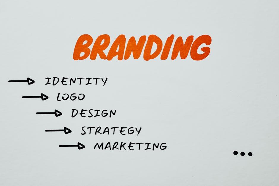
From the primordial ooze of branding, iconic logos have evolved over the decades, adapting to the changing tides of design trends and consumer preferences. Join us on a humorous journey through the annals of logo history, where we explore the mutations, adaptations, and fierce competition that have shaped some of the most recognizable symbols in the world. Buckle up, logo lovers, it’s going to be a wild ride!
The Birth of Logos: Early 20th Century Designs
As the early 20th century rolled around, designers started getting more creative than ever with their logo designs. This was the era when logos truly started to come into their own, evolving from simple monograms and symbols to more complex and visually captivating designs.
Some of the most iconic logos from this time include:
- Coca-Cola: With its iconic red and white script, the Coca-Cola logo has remained virtually unchanged since its creation in 1885. Talk about timeless!
- Shell: The Shell logo, with its distinctive yellow and red color scheme, has been a staple in gas stations and oil companies for over a century.
- Pepsi: The Pepsi logo underwent a major transformation in the early 20th century, going from a simple script font to the iconic red, white, and blue globe we know today.
These early 20th-century designs set the stage for the visually stunning logos we see today, paving the way for endless creativity and innovation in the world of branding. Who knew that a simple logo could pack such a punch?

Embracing Simplicity: Mid-Century Modern Logo Trends
In 2021, we’re seeing a resurgence of mid-century modern logo trends that embrace simplicity and clean lines. These logos are a throwback to the era of Mad Men, where everything was sleek, stylish, and oh-so-cool. If you want to give your brand a retro twist, look no further than these iconic design elements.
So, what makes a mid-century modern logo stand out? Here are some key characteristics:
- Geometric Shapes: Think circles, squares, and triangles. These shapes add a sense of balance and symmetry to your logo design.
- Minimalistic Typography: Keep it simple with clean, sans-serif fonts. Avoid anything too decorative or fussy.
- Bold Colors: Opt for bright, eye-catching colors like mustard yellow, teal, and burnt orange. These hues will make your logo pop.
When creating your mid-century modern logo, don’t be afraid to take risks and step outside the box. Experiment with different shapes, colors, and fonts until you find the perfect combination that embodies the spirit of the era. Whether you’re a startup or an established brand, embracing simplicity in your logo design will set you apart from the competition and leave a lasting impression on your audience.
The Rise of Digital Design: Logos in the Tech Age
In this digital age, logos have become more important than ever before. With technology evolving at lightning speed, companies are looking for ways to stand out in the crowded online marketplace. Enter digital design – the key to creating eye-catching logos that make a lasting impression on consumers.
Gone are the days of simple, static logos. Today, logos need to be adaptable, versatile, and capable of capturing the attention of users across a variety of digital platforms. From social media to websites to mobile apps, logos need to be dynamic enough to look good no matter where they’re displayed.
With the rise of digital design, companies are getting more creative than ever with their logos. No longer limited by the constraints of traditional printing methods, designers are free to experiment with bold colors, intricate patterns, and unique typography. The results are logos that are truly works of art – and guaranteed to make a statement in the tech age.
So, whether you’re a tech startup looking to make a splash or an established brand trying to stay ahead of the curve, investing in a standout digital logo is crucial. With the right design, your logo can become a powerful symbol of your brand, instantly recognizable to consumers in a sea of competitors. Embrace the digital design revolution and watch your logo soar to new heights in the tech age!

Cultural Impact: Iconic Logos That Defined an Era
Remember those logo designs that were so iconic they practically defined an entire era? Let’s take a walk down memory lane and revisit some of the most impactful logos that left a lasting cultural impression.
From McDonald’s golden arches to the Nike swoosh, these logos became more than just symbols – they became a part of our everyday lives. Here are a few gems that still have us feeling some serious nostalgia:
- Coca-Cola: With its signature cursive font and classic red and white color scheme, the Coca-Cola logo has been a staple of American culture for over a century.
- Apple: The bitten apple logo not only represents one of the most successful tech companies in the world, but it’s also a symbol of innovation and design.
- MTV: Who can forget the iconic “M” logo that defined an entire generation of music and pop culture enthusiasts?
These logos didn’t just sell products – they became ingrained in our daily lives, shaping the way we perceive brands and influencing our cultural landscape. So next time you see one of these logos, take a moment to appreciate the impact they’ve had on society. Who knows, maybe you’ll feel a twinge of nostalgia too.

Modern Minimalism: Contemporary Logo Trends in the 21st Century
When it comes to logo design in the 21st century, modern minimalism reigns supreme. Gone are the days of cluttered, overly intricate designs. Today, less is definitely more when it comes to creating a memorable and impactful logo.
One contemporary trend that has taken the logo design world by storm is the use of clean, simple lines and geometric shapes. Think sleek, sophisticated, and effortlessly stylish. This type of minimalism allows for a logo to be easily recognizable and memorable, without any unnecessary frills or distractions.
Another popular 21st-century logo trend is the use of negative space to create clever and eye-catching designs. By cleverly utilizing the space around and within letters and icons, designers are able to create logos that are not only visually appealing but also convey a deeper message or meaning.
And let’s not forget the rise of flat design in logo creation. This trend emphasizes simplicity, clarity, and minimalism, making logos appear clean, modern, and effortlessly cool. With flat design, it’s all about bold colors, crisp lines, and a focus on the essence of the brand.
FAQs
What inspired the iconic logos we see today?
Well, you see, ancient aliens actually came down to Earth and whispered design secrets into the ears of famous graphic designers. Just kidding! In reality, the logos we see today are inspired by a mix of cultural trends, technological advancements, and the creative genius of designers.
How have logos evolved over the decades?
Imagine logos going through a glow-up like a nerdy teenager in a teen movie - from awkward and clunky to sleek and stylish. Logos have evolved from simple, text-based designs to complex, multi-dimensional creations that can be easily recognized across the globe.
What role does nostalgia play in iconic logos?
Nostalgia is like that ex you can’t seem to forget – it creeps up on you when you least expect it. Iconic logos often evoke feelings of nostalgia, reminding us of simpler times and childhood memories. Brands capitalize on this by incorporating retro elements in their designs to appeal to our sentimental side.
How do iconic logos stand the test of time?
Iconic logos are like fine wine - they only get better with age. These logos have successfully withstood the ever-changing tides of design trends and cultural shifts, thanks to their timeless appeal and strong brand recognition. They are like the fashionistas of the branding world, always staying one step ahead of the game.
What can we learn from the evolution of iconic logos?
The evolution of iconic logos teaches us that adaptability is key to long-lasting success. Just like Madonna reinvents herself with each album, brands need to constantly evolve and innovate to stay relevant in the fast-paced world of design. So, embrace change, think outside the box, and who knows – maybe your logo will be the next iconic masterpiece!
And Remember, Logo Evolution is Not for the Faint of Heart!
So there you have it, folks – a whirlwind tour through the decades of iconic logo design. From simple beginnings to complex creations, logos have truly evolved over the years. Just remember, behind every successful logo design is a team of talented designers, countless iterations, and probably a few sleepless nights. So next time you see a logo that stands the test of time, remember the blood, sweat, and tears that went into its creation. And who knows, maybe one day your own logo will be added to the prestigious list of iconic designs!


