Attention all you logo designers out there! Are your designs falling flat like a deflated balloon at a birthday party? Are your logos about as memorable as your high school crush’s name? Fear not, because we’ve got the ultimate cheat sheet for mastering the essential graphic design principles that will take your logo game from amateur hour to design diva. So grab your pencils, fire up your creative juices, and get ready to shake things up in the world of graphic design!
Researching the Brand
So, you’re about to dive into the deep, dark rabbit hole of . Don’t worry, I’ve got your back. Here’s a little guide to help you navigate this treacherous terrain like a boss.
First things first, hit up that trusty ol’ search engine and type in the brand name. You’ll uncover a treasure trove of information - from their website to their social media presence. Keep your eyes peeled for any reviews, news articles, and customer feedback. Oh, the drama you’ll uncover!
Next, stalk them like it’s your full-time job (because it kinda is now). Check out their social media accounts - what are they posting? Any scandals brewing? Are they engaging with their followers or are they as boring as watching paint dry? Take notes like a spy on a mission.
Now, onto the fun part – sleuthing out their competitors. Who are they up against in the cutthroat world of branding? Compare their products, pricing, and marketing strategies. Create a **powerful** spreadsheet to keep track of all this sneaky reconnaissance. You’re basically a brand detective now. Time to put on your magnifying glass and get to work!
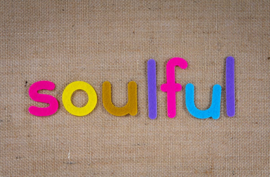
typography“>Understanding Typography
Typography is not just about choosing a fancy font for your Instagram captions or making your resume look more professional. It’s a complex world full of serifs, sans serifs, and all kinds of weird names that sound like the spellings of ancient runes. But fear not, brave typographer! With a little bit of understanding, you too can become a master of the alphabet.
First things first, let’s talk about the difference between serif and sans serif fonts. Serif fonts are like the wise old grandpas of typography, with little feet and decorative elements on the ends of their letters. Think of them as the fonts that wear suspenders and drink their coffee black. On the other hand, sans serif fonts are the rebellious teenagers of the typographic world – sleek, modern, and without any extra frills. They’re the fonts that blast rock music in their bedrooms and refuse to wear socks.
Next up, let’s delve into the fascinating world of kerning and leading. Kerning is the spacing between individual letters, and if done wrong, it can turn your beautiful words into a jumbled mess. Leading, on the other hand, is the spacing between lines of text, and getting it right can make your words sing on the page. It’s like conducting a symphony of letters – except instead of violins and trumpets, you’ve got lowercase g’s and uppercase T’s.
So, the next time you’re choosing a font for your project, remember to consider more than just how pretty it looks. Think about the personality of the font, the spacing between letters, and how it all comes together to create a harmonious visual experience. And who knows, maybe you’ll become the next Da Vinci of typography, creating masterpieces out of nothing but ink and paper.
Utilizing Negative Space
When it comes to design, sometimes less is more. in your projects can create a visually striking and intriguing composition. Here are some tips on how to make the most of negative space:
- Keep it simple: Don’t overcrowd your design with too many elements. Leave plenty of breathing room for the negative space to shine.
- Play with proportions: Experiment with different sizes and placements of elements to create balance and harmony within the negative space.
- Think outside the box: Negative space doesn’t have to be white or empty. It can be any color or texture that helps enhance the overall design.
Remember, negative space is just as important as the elements you choose to include in your design. Embrace the emptiness and let your creativity flow. With the right balance, negative space can elevate your design from good to great!
Creating Versatile Logos
When it comes to , there are a few key things to keep in mind. You want your logo to be able to adapt to any situation, whether it’s being printed on a business card or blown up to the size of a billboard. Here are some tips to help you create a logo that can do it all:
- Keep it simple: A simple logo is more likely to work across a variety of mediums. Avoid intricate details or tiny fonts that may get lost when scaled down.
- Choose a flexible color scheme: Opt for colors that look good in both print and digital formats. Avoid neon colors or shades that are hard to reproduce accurately.
- Focus on scalability: Make sure your logo looks good at all sizes, from a favicon on a website to a large sign on the side of a building. Test it out in different sizes to ensure it remains clear and recognizable.
Remember that versatility is key when it comes to designing a logo. Your logo should look great no matter where it’s displayed, so take the time to create something that can withstand the test of time and changing trends. By following these tips, you’ll be well on your way to creating a logo that can adapt to any situation with ease.

Choosing the Right Colors
When it comes to , it can be a daunting task for some. But fear not, we’re here to make it as easy as pie (or should I say, as easy as picking out your favorite flavor of ice cream?).
First things first, consider the vibe you want to create with your color scheme. Are you going for a bold and vibrant look, or perhaps something more soothing and subtle? Once you have that in mind, it’s time to unleash your inner artiste!
Don’t be afraid to mix and match different colors to see what works best together. It’s like creating a masterpiece on a canvas, except your canvas is your living room wall. And hey, if you make a mistake, you can always repaint – no harm, no foul!
Remember, there are no rules when it comes to choosing colors. If you want to paint your front door neon pink, go for it! Be bold, be daring, and most importantly, have fun with it. At the end of the day, it’s your space and it should reflect your unique personality and style.
Balancing Simplicity and Complexity
When it comes to finding the perfect balance between simplicity and complexity, it can feel like walking a tightrope while juggling flaming swords. On one hand, you want things to be straightforward and easy to understand, but on the other hand, a little complexity can add depth and intrigue to whatever you’re working on.
It’s like trying to decide between eating plain vanilla ice cream or a triple-layered sundae with all the toppings. Sure, vanilla is classic and simple, but that sundae has layers upon layers of delicious complexity that just can’t be ignored.
One way to find that sweet spot between simplicity and complexity is to use visual aids to break down complex ideas into more digestible pieces. This can help simplify the overall message while still allowing for a deeper understanding of the topic at hand.
Another approach is to embrace the power of balance in all aspects of your work. Mix in simple, straightforward elements with more complex, nuanced ones to create a harmonious blend that keeps things interesting without overwhelming your audience.
FAQs
Why is it important to use negative space in logo design?
Negative space, my friend, is like the silent ninja of the design world. It’s the art of utilizing the space around and between elements in your logo to create a clever and memorable design. So, don’t overlook the power of negative space in your logo creations!
How can color theory impact logo design?
Oh, color theory, the magical world of hues and shades! Choosing the right colors for your logo can evoke certain emotions and create a strong brand identity. Different colors convey different messages, so pick wisely, oh logo designer!
Why is simplicity key in logo design?
Simplicity, my dear Watson, is the secret sauce to a successful logo design. A simple and clean logo is more memorable and versatile. Remember, less is more when it comes to creating a logo that stands the test of time.
How can typography enhance a logo design?
Typography, the art of arranging type, can make or break a logo design. Choosing the right font can help convey the personality of your brand and create a cohesive look. So, play around with different typefaces and find the perfect match for your logo!
Why is scalability important in logo design?
Ah, scalability, the unsung hero of logo design! A good logo should look just as fabulous on a billboard as it does on a business card. So, make sure your logo is easily scalable to ensure it looks stunning no matter the size.
And Remember, Graphic Design Is Like a Fine Wine…or a Good Cheese
So there you have it, logo designers! Armed with these essential graphic design principles, you’re well on your way to creating stunning, memorable logos that will make your clients jump for joy.
But always remember, graphic design is a lot like a fine wine or a good cheese – it gets better with time and practice. So keep experimenting, keep pushing yourself creatively, and who knows? Maybe one day your logo designs will be as famous as that bottle of Chateau Margaux or that wheel of aged Gouda. Cheers to your graphic design success!


