If you’ve ever tried to write a love letter using Comic Sans, you know the importance of typography in making a lasting impression. In the world of logo design, choosing the perfect font can be the difference between “meh” and “OMG, I need to buy whatever that company is selling!” So sharpen your pencils and stretch those creative muscles, because we’re about to dive into the wild world of elevating brand identity through typography mastery in logo design. Let’s get fancy with fonts, people!
Choosing the Right Typeface for Your Brand
So you’ve decided to choose a typeface for your brand. Congratulations! This is a big step in establishing your brand identity. But don’t fret, we’re here to help you navigate the wild world of fonts.
First things first, consider the personality of your brand. Is it fun and quirky? Sleek and sophisticated? Bold and daring? Choose a typeface that reflects the essence of your brand. Remember, your font choice is like the outfit your brand wears – make sure it’s making the right statement!
Next, think about readability. You want your audience to be able to easily digest your message without squinting at their screens. Avoid overly ornate fonts or ones that are difficult to read in small sizes. Stick to clean, legible options that won’t leave your customers scratching their heads.
Don’t be afraid to mix and match different typefaces to create a unique look for your brand. Pair a bold, attention-grabbing font for headlines with a simpler, more subtle one for body text. Variety is the spice of life, after all! Just make sure the fonts complement each other and don’t clash like two strangers at a dinner party.

Size Matters: How to Use Typography to Convey Brand Message
When it comes to typography, size really does matter. The size of your text can say a lot about your brand without even using words. So how can you use typography to convey your brand message effectively?
First, consider the size of your headings. **Big and bold headings** can communicate power, authority, and confidence. They grab attention and make a statement. On the other hand, **smaller headings** can convey a sense of subtlety, sophistication, and elegance. Choose your heading size wisely to set the tone for your brand.
Next, think about the size of your body text. **Large body text** can make a bold statement and demand attention. It can show that your brand is modern, forward-thinking, and unafraid to stand out. On the other hand, **smaller body text** can communicate simplicity, minimalism, and attention to detail. It can make your brand feel more intimate and approachable.
Remember, there’s no one-size-fits-all solution when it comes to typography. Experiment with different sizes and see what resonates with your brand message. Whether you go big or small, make sure your typography reflects the essence of your brand in a way that’s visually appealing and memorable.

Exploring Different Fonts and Their Impact on Brand Identity
When it comes to choosing fonts for your brand, the possibilities are as endless as a buffet line at an all-you-can-eat restaurant. Each font brings its own unique flavor to the table, adding a dash of personality to your brand identity. Let’s explore the world of fonts and see how they can make or break your brand!
Comic Sans: Ah, the infamous Comic Sans. This font screams “I don’t take myself too seriously.” While it may not be the most professional choice, it can add a playful touch to brands targeting a younger audience or those in more lighthearted industries. Just remember, use Comic Sans sparingly, like sprinkles on a cupcake – a little goes a long way!
Helvetica: The king of fonts, Helvetica is like the classic little black dress of the typography world. It’s clean, sophisticated, and timeless. Brands that choose Helvetica are saying, “We are sleek, modern, and here to stay.” It’s a safe bet for those who want to convey a sense of professionalism and reliability.
Papyrus: Oh, Papyrus. You may have been all the rage in the early 2000s, but now you’re like that embarrassing uncle at family gatherings. Brands that use Papyrus are saying, ”We love a good throwback, even if it’s painfully outdated.” Proceed with caution when choosing Papyrus – it can come off as cliché and unoriginal. Remember, just because you can use Papyrus doesn’t mean you should!
In conclusion, the font you choose for your brand can have a big impact on how you are perceived. So, choose wisely, my fellow font enthusiasts. Whether you go for the quirky charm of Comic Sans, the timeless elegance of Helvetica, or the cringe-worthy nostalgia of Papyrus, make sure it aligns with your brand’s personality and message. And remember, it’s not just about the words you say, but how you say them that matters. Now, go forth and conquer the typography world with confidence and style!
Understanding the Psychology of Typography in Logo Design
When it comes to logo design, typography plays a crucial role in conveying the right message to your audience. By understanding the psychology behind typography, you can create a logo that not only looks visually appealing but also triggers the right emotions in your target market.
Typography in logo design is like the seasoning in your favorite dish – it adds flavor and personality. Just like how a pinch of salt can make or break a recipe, the font choice in your logo can make or break your brand identity. So, let’s delve into the fascinating world of typography psychology!
Here are some key insights to keep in mind:
- Fonts with sharp edges convey a sense of sophistication and modernity, perfect for high-end brands.
- Round fonts are perceived as friendly and approachable, ideal for brands targeting families or casual audiences.
- Typography also affects readability – make sure your font choice is legible and easy on the eyes.

Creating a Cohesive Branding Strategy Through Typography
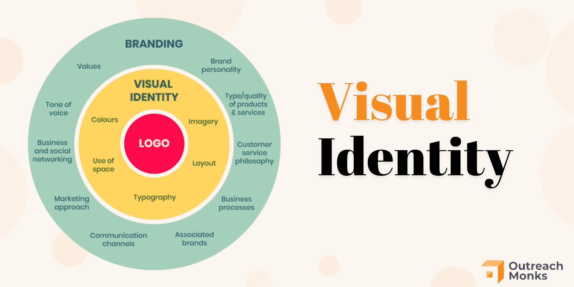
Typography plays a crucial role in creating a cohesive branding strategy. Choosing the right fonts can convey your brand’s personality and values to your audience. Here are some tips to help you master the art of typography:
- Consistency is key: Make sure to use the same fonts across all your branding materials, from your website to your social media posts. This will help establish a strong visual identity for your brand.
- Choose fonts that reflect your brand: Whether you’re a fun and quirky brand or a serious and professional one, your fonts should reflect that. Select fonts that align with your brand’s voice and tone.
- Mix and match: Don’t be afraid to experiment with different fonts. Combining a serif font with a sans-serif font can create visual interest and help convey different messages.
Remember, typography is more than just picking a pretty font – it’s about creating a visual language that speaks to your audience. So, get creative and have fun with it!
Mastering the Art of Kerning and Leading in Logo Design
So, you think you’re a logo design master, huh? You might have the perfect colors, the most eye-catching graphics, and the coolest font in town, but have you mastered the art of kerning and leading?
Let’s talk about kerning first. Kerning is the spacing between individual characters in a word. Trust me, getting the kerning just right can make or break your logo design. Don’t be afraid to play around with it until it looks juuuust right.
And then there’s leading. Leading is the spacing between lines of text. Let me tell you, you do not want your logo to look like it’s having a crowded party where lines are bumping into each other and no one can breathe. Give your lines some room to breathe, people!
Remember, a well-kerned and well-leaded logo will not only look more professional, but it will also elevate your entire design game. So, don’t skimp on the details, my friends. Get those kerning and leading skills on point, and watch your logo designs reach new levels of awesomeness!
FAQs
Why is typography important in logo design?
Well, imagine trying to read a menu at a fancy restaurant with Comic Sans plastered all over it. Typography sets the tone and personality of your brand, so choosing the right fonts is crucial for making a good first impression.
How can typography help elevate a brand’s identity?
Typography can help convey the brand’s values and message through the choice of fonts, spacing, and alignment. It’s like giving your brand a voice – would you want it to sound like Fran Drescher or Morgan Freeman?
What are some common mistakes to avoid in typography for logo design?
Avoid using too many fonts (keep it to 1 or 2 max), making sure the fonts are readable (looking at you, Wingdings), and not properly kerning or tracking your text. Remember, people should be able to read your logo without squinting or needing a magnifying glass.
How can designers choose the right fonts for a logo?
Consider the brand’s personality and target audience. Are you designing a logo for a children’s toy company or a law firm? Choose fonts that reflect the brand’s values and appeal to the right demographic. And for the love of Helvetica, stay away from Papyrus.
Can typography make or break a logo design?
Absolutely! Typography can make a logo memorable and iconic, or it can make it forgettable and cringeworthy. It’s like picking the right outfit for a job interview – you want to dress to impress, not to distress.
Wrapping it Up
And there you have it—your crash course in typography mastery for logo design! Remember, when it comes to elevating your brand identity, the devil is in the details (and the serifs). So go forth, armed with your newfound knowledge of font families, weights, and kerning, and create logo designs that are as unique as your personal collection of obscure fonts. Happy designing!


