Creating an effective logo is like landing a perfect handstand in yoga class – it requires balance, creativity, and a little bit of sweat (hopefully only metaphorical sweat, though). In the world of design, logos are like the stylish handshake of your brand, introducing you to the world with just a glance. So, let’s dive into the mystical realm of design principles and uncover the secrets to crafting logos that leave a lasting impression. Let’s get our creative juices flowing and design our way to logo greatness!
The Importance of Strong Brand Identity
Imagine walking into a crowded room full of people wearing name tags. Now, imagine all those name tags look exactly the same – generic, boring, easily forgettable. Would you remember any of those people by the end of the night? Probably not. The same goes for your brand identity – if it’s not strong and distinctive, it’s easy to get lost in the sea of competition.
Having a strong brand identity is like having a superpower in the business world. It helps you stand out, be memorable, and connect with your audience on a deeper level. It’s like putting on a cape and becoming a superhero – ready to save the day and win the hearts of your customers. So, don’t be a plain Jane brand in a world full of superheroes. Be bold, be unique, be unforgettable.
One great way to build a strong brand identity is through consistent visual elements. Think of your brand as a work of art - every stroke, color, and shape should reflect your personality and values. Use bold colors, quirky fonts, and eye-catching logos to create a visual signature that’s unmistakably you. And don’t be afraid to get creative – after all, Picasso didn’t become famous by painting stick figures.
Remember, a strong brand identity isn’t just about looking pretty – it’s about building trust and loyalty with your customers. When they see your brand, they should feel an instant connection and know exactly what you stand for. So, sprinkle some magic dust on your brand identity and watch it soar to new heights. Who knows, maybe one day you’ll be as famous as Batman (minus the cape and the Batmobile, of course).

Simplicity and Memorability in Logo Design
When it comes to logo design, keeping it simple and memorable is key. Think about it: have you ever tried to explain a complicated logo to someone, only to end up sounding like you’re reciting an ancient incantation?
By keeping your logo design simple, you’re not only making it easier for people to remember, but you’re also saving yourself from having to explain it over and over again. Plus, a clean and minimalist logo just looks cool. It’s like the little black dress of the design world – timeless, versatile, and always in style.
So, how do you achieve simplicity in logo design? Here are a few tips:
- Use fewer colors: Stick to a limited color palette to avoid visual clutter.
- Avoid intricate details: Opt for clean lines and shapes over complex patterns and textures.
- Focus on the essentials: Highlight the most important elements of your brand identity and keep everything else to a minimum.
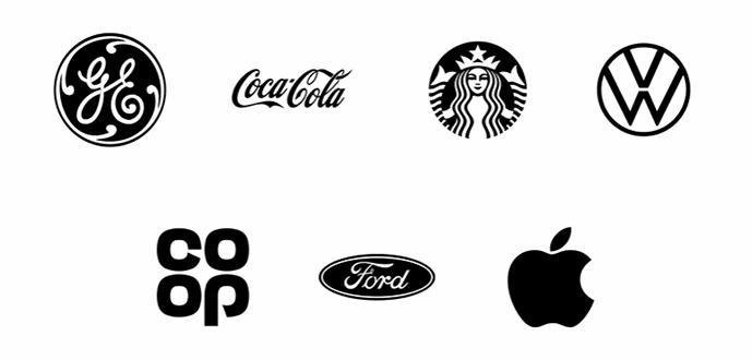
Remember, a simple and memorable logo doesn’t have to be boring. In fact, some of the most iconic logos in history are simple yet incredibly powerful. So, go ahead, embrace the beauty of simplicity in your logo design and watch your brand shine!
Balancing Creativity and Versatility
Are you torn between letting your creativity run wild and being a versatile jack-of-all-trades? Well, fear not, my indecisive friend, for I am here to help you navigate the treacherous waters of .
First and foremost, remember that it’s okay to dabble in a little bit of everything. Being versatile doesn’t mean you have to stick to one thing and one thing only. In fact, versatility is all about being able to adapt and thrive in various situations. So go ahead, indulge in your creative pursuits while also honing your skills in other areas.
When it comes to creativity, don’t be afraid to think outside the box. Let your imagination run wild and don’t be constrained by rules or norms. After all, some of the greatest inventions and innovations have come from those who dared to be different. Embrace your quirks and let your creativity shine!
Remember, finding the perfect balance between creativity and versatility is a journey, not a destination. So don’t stress about getting it right the first time. Take your time, experiment, and most importantly, have fun along the way. Who knows, you might just discover a hidden talent or two that you never knew you had!

Color Theory and Psychological Impact
Who knew that color could have such a profound impact on our psyche? From calming blues to energizing reds, the colors we surround ourselves with can greatly affect our mood and emotions.
Take blue, for example. Often associated with the ocean and sky, this hue is known for its calming and serene qualities. It can help promote relaxation and lower stress levels – perfect for creating a peaceful oasis in your home.
On the other hand, red is a bold and passionate color that can evoke feelings of excitement and energy. It’s the perfect hue to use when you want to make a statement or add some fiery flair to your space.
So next time you’re feeling down, think about how a splash of color could lift your spirits. Whether it’s a calming blue or an energizing red, the power of color theory is not to be underestimated!
typography-choices-for-brand-consistency”>Typography Choices for Brand Consistency
When it comes to choosing typography for your brand, consistency is key. Your fonts are like the characters in a quirky indie film – they need to all work together to tell a cohesive story. Here are some tips on how to keep your brand font choices on point:
- Stick to a font family: Just like a dysfunctional family, your fonts should look like they belong together. Choose a font family that has a variety of styles (bold, italic, etc.) so you can mix and match while still maintaining a consistent look.
- Limit your fonts: Having too many fonts is like trying to juggle too many balls - it’s impressive at first, but eventually, everything comes crashing down. Pick 2-3 fonts for your brand and stick with them. Trust us, less is more.
- Know your brand personality: Is your brand fun and quirky or serious and professional? Choose fonts that reflect your brand’s personality. Comic Sans might work for a children’s birthday party planning service, but probably not for a law firm.
Remember, your typography choices are a big part of your brand identity, so don’t take them lightly. Just like choosing an outfit for a first date, your fonts should be chosen carefully to make the right impression. So next time you’re picking out fonts for your brand, think of yourself as a font matchmaker - you want to find the perfect pairings that will make your brand shine.
Scalability and Adaptability for Multiple Platforms and Uses
When it comes to scalability and adaptability, we’ve got you covered like a cozy blanket on a chilly night. Our platform is as versatile as a chameleon at a color-changing party, able to seamlessly adjust to any device or situation with ease.
With our cutting-edge technology, you can rest assured that your content will look just as fabulous on a desktop computer as it does on a mobile phone or tablet. Say goodbye to awkward formatting issues or wonky layouts – our platform will keep your content looking fresh and stylish, no matter where it’s being viewed.
Whether you’re a small business owner looking to expand your reach or a seasoned blogger ready to take your content to the next level, our platform is designed to grow with you. We’ve got all the bells and whistles you need to customize your content and make it shine like a diamond in the rough.
So why settle for a platform that’s stuck in the Stone Age? Join us today and experience the freedom and flexibility of a platform that’s as adaptable and scalable as you are. Your content deserves nothing less!
FAQs
What elements should I consider when designing a logo?
Think about the ingredients of a good logo: a dash of simplicity, a sprinkle of memorability, a pinch of versatility, and a dollop of relevance. Mix well and bake at 350 degrees for about 30 minutes.
How can I ensure my logo stands out from the competition?
Show off your logo’s unique personality! Add a pop of color, a twist of creativity, and a dash of quirkiness. Don’t be afraid to break the design rules – just make sure it still looks appealing!
What are some common mistakes to avoid when designing a logo?
Avoid the temptation to mix too many colors, use complex fonts, or cram too many elements into your design. Remember, less is more! Keep it simple, sleek, and stylish.
How important is it to get feedback on my logo design?
Getting feedback is crucial – it’s like asking for fashion advice before a big date. Show your logo to friends, family, and even strangers on the street. Listen to their feedback and make adjustments as needed.
What are some tips for creating a timeless logo?
To create a logo that stands the test of time, think classic – like the little black dress of the design world. Avoid trendy elements, focus on simplicity, and aim for a design that will still look stylish in 10, 20, or even 50 years.
So, what makes a great logo?
Remember, a good logo is like a good joke – it should be simple, memorable, and leave a lasting impression. By following these design principles, you can craft an effective logo that resonates with your audience and stands the test of time. Don’t stress too much if your first attempt isn’t a masterpiece – even the Mona Lisa was just stick figures to begin with (probably). Keep experimenting, stay inspired, and soon enough, you’ll have a logo that’s worth raising a glass to. Cheers to great design!


