Are you tired of your logo looking like it was designed by your grandma (no offense to grandma, of course)? Do you want to create a logo that will make your competitors green with envy (or possibly just green with confusion)? Well, fear not, because with the help of Design“>Adobe Illustrator, you can craft logos so unforgettable, even that goldfish with a three-second memory will be singing your praises. So grab your creativity by the horns and let’s dive into the wild world of logo design. Let’s make your logo pop like a fresh can of Pringles on a Friday night.
Choosing the Right Typeface
Whether you’re a design pro or a total newbie, picking the perfect typeface can be a daunting task. With thousands of options out there, it’s easy to get overwhelmed. But fear not, we’ve got you covered with some tips that will have you like a pro in no time!
First things first, consider the overall tone and vibe of your project. Are you going for something playful and fun, or sleek and professional? Different typefaces convey different emotions, so make sure your choice aligns with the message you’re trying to send. And if all else fails, just go with Comic Sans… just kidding, please don’t!
Next, think about readability. Sure, that super fancy script font might look gorgeous, but if no one can actually read what it says, what’s the point? Stick with typefaces that are clear and easy to read to ensure your message gets across loud and clear.
Lastly, don’t be afraid to mix it up! Combining different typefaces can add visual interest and help guide the reader’s eye. Just make sure the fonts you choose complement each other and don’t clash. And remember, at the end of the day, there’s no right or wrong answer when it comes to choosing a typeface… except for Comic Sans. Seriously, just say no!
 Graphics“>
Utilizing Vector Graphics
Vector graphics are like the cool kids of the digital art world – sleek, fashionable, and always ready to impress. With their ability to scale infinitely without losing quality, they’re basically the superhero of images. Need a logo for a business card and a billboard? No problem, vector graphics have got you covered.
One of the best things about vector graphics is their versatility. From sleek logos to intricate illustrations, these graphics can handle pretty much any design challenge you throw their way. Want to create a stylish infographic for your blog? Vector graphics are your trusty sidekick. Need to whip up a quirky character design for a video game? Vector graphics have your back.
Forget pixelated nightmares and jagged edges - vector graphics are here to save the day. With their smooth lines and crisp colors, these graphics are like the high-def TV of the art world. So go ahead, unleash your creativity and start utilizing the power of vector graphics in your designs. Your projects will thank you. Color Palette“>
Creating a Strong Color Palette
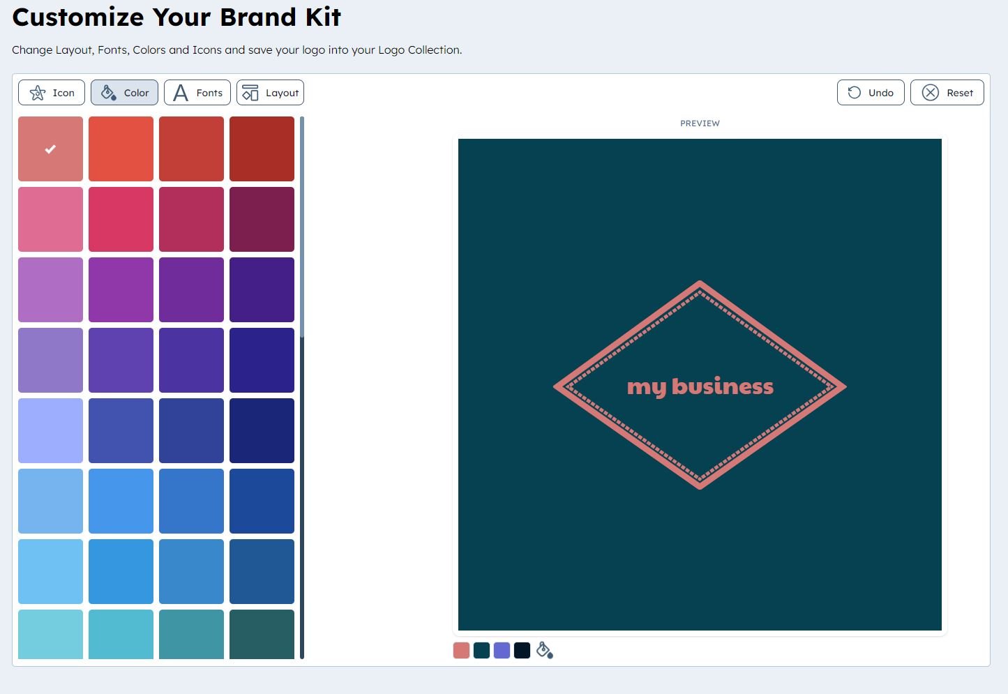
When , it’s important to keep a few key things in mind. First and foremost, you want your colors to be harmonious and eye-catching. Think of your color palette as a motley crew of characters – each one unique and important in its own way.
To start, pick a hero color that will be the star of the show. This color should be bold and memorable, like a superhero in a comic book. Next, choose a couple of sidekick colors that complement your hero color. These colors should be supportive and help elevate your hero to new heights.
Remember, variety is the spice of life when it comes to color palettes. Don’t be afraid to mix and match different hues and tones to create a dynamic and engaging palette. Just like a well-balanced sitcom cast, each color should bring something special to the table and work together harmoniously.
So go forth and create the color palette of your dreams! With a little creativity and a lot of imagination, you can craft a palette that is as bold and vibrant as a blockbuster movie. Your designs will thank you, and your audience will be dazzled by your color prowess.

Incorporating Symbolism and Imagery
Symbols and imagery are like the sprinkles on top of a cupcake – they add that extra layer of deliciousness to your writing. So why not incorporate them into your work and take your readers on a journey through hidden meanings and visual delights?
One way to use symbolism is to make a certain object represent something else. For example, a red rose could symbolize love and passion, while a wilting flower could symbolize decay and the passage of time. It’s like playing a game of charades with your readers, but instead of acting it out, you’re writing it out!
Imagery, on the other hand, is all about painting a vivid picture with words. Instead of saying “the room was dark”, you could say “the shadows crept along the walls like mischievous cats”. See how much more interesting that sounds? It’s like adding a splash of color to a black and white movie.
So go ahead, sprinkle a little symbolism and imagery into your writing and watch as your words come to life in the minds of your readers. It’s like turning a plain old cake into a masterpiece - delicious, captivating, and oh so satisfying.
 Typography Techniques”>
Mastering Typography Techniques
Typography can make or break a design faster than you can say “Comic Sans”. To truly become a typography master, you need to embrace the art of playing with fonts, sizes, spacing, and alignment.
Start by understanding the different font categories – serif, sans serif, script, and display. Each category has its own personality, just like a group of friends at a party. Experiment with mixing and matching fonts to create unique combinations that make your design sing like a diva on stage.
Next, don’t be afraid to break the rules (but only if you know them first). Play with font sizes to create hierarchy in your design, making important information stand out like a diamond in the rough. **Bold** headings, italicize subheadings, and underline call-to-action texts to guide the viewer’s eyes and give your design some sass.
Finally, pay attention to spacing and alignment like it’s a drama-filled reality show. Use line spacing and letter spacing to give your text room to breathe, like a yogi in a crowded room. Experiment with aligning text left, right, center, or justified to create visual interest and balance in your design. Remember, typography is not just about choosing pretty fonts – it’s about creating a harmonious dance of text that captivates and communicates like a smooth-talking charmer.
Refining and Perfecting the Design
So, you think your design is on point, huh? Well, think again! It’s time to refine and perfect that baby until it shines brighter than a diamond in a goat’s eye. Here are some tips to help you take your design from ”meh” to “WOW!”
- Study the competition like a hawk on steroids. Take notes, make improvements, and then steal all their best ideas. I mean, get inspired by their work.
- Ask your friends, family, and random strangers on the street for feedback. Remember, everyone’s opinion matters, even if they have zero design experience.
- Experiment with different fonts, colors, and layouts. Mix and match until you find the perfect combination that makes unicorns weep tears of joy.
Remember, Rome wasn’t built in a day, and neither was a killer design. It takes time, dedication, and lots of coffee (or tea, if that’s your thing). So, roll up your sleeves, grab your mouse (or pen if you’re old school), and get ready to dive deep into the world of design perfection!
FAQs
Why is Adobe Illustrator the best tool for crafting logos?
Because it’s the Photoshop equivalent of a logo designer’s dreams! With its vector-based capabilities and endless design possibilities, Adobe Illustrator allows you to create sleek, professional logos that will leave a lasting impression.
What are some tips for beginners using Adobe Illustrator for logo design?
First and foremost, don’t be intimidated by the vast array of tools and options in Illustrator. Start by familiarizing yourself with the basic shapes, fonts, and colors, and experiment with different combinations to see what works best for your logo design.
How can I make my logo stand out from the competition?
Think outside the box! Don’t be afraid to play with unique shapes, unexpected color palettes, and unconventional typography. Remember, the goal is to create a logo that’s not only memorable but also sets your brand apart from the rest.
What are some common mistakes designers make when crafting logos with Adobe Illustrator?
One common mistake is overcomplicating the design. Remember, less is often more when it comes to logo design. Another mistake is not considering scalability – make sure your logo looks great whether it’s on a business card or a billboard.
Are there any resources or tutorials available for logo design in Adobe Illustrator?
Absolutely! There are a plethora of online tutorials, courses, and templates available to help you master logo design in Adobe Illustrator. From beginner guides to advanced techniques, there’s something out there for every level of designer.
Ready to Craft Your Own Fantastic Logo?
Now that you have all the tips and tricks to create unforgettable logos with Adobe Illustrator, it’s time to let your creativity shine. Don’t be afraid to experiment, play around, and most importantly, have fun with it. Remember, a logo is the face of a brand, so make sure yours stands out in the crowd.
So what are you waiting for? Fire up Adobe Illustrator, unleash your inner artist, and craft a logo that will leave a lasting impression on everyone who sees it. Who knows, maybe your logo will be the next big thing to go viral.
Happy designing!


