Do you ever look at a sleek, logo-design/” title=”Accounting Logo Design”>sophisticated logo and think, “Wow, that brand must be fancy AF”? Well, you’re not wrong! Crafting sophisticated logos is an art form reserved for the upper echelon of brands- those who brunch on avocado toast and drive Teslas for fun. In this article, we’ll break down the key elements of luxury logos and show you how to make your brand look like a million bucks (even if your bank account says otherwise). So grab your monocle and let’s dive into the world of high-class design.![]()
simplicity-in-luxury-logos”>The Importance of Simplicity in Luxury Logos
When it comes to luxury logos, simplicity is key. A cluttered and busy design can detract from the elegance and sophistication that luxury brands strive to convey. By keeping the design clean and minimalistic, a luxury logo can make a powerful statement that speaks volumes.
Here are a few reasons why simplicity is so important in luxury logos:
- Memorability: Simple logos are more likely to be remembered by consumers, making them more effective in creating brand recognition.
- Elegance: A simple design exudes a sense of sophistication and class, which are essential characteristics of luxury brands.
- Timelessness: Simple logos have a timeless quality that won’t go out of style, ensuring that the brand remains relevant for years to come.
So, the next time you’re creating a luxury logo, remember that less is more. Keep it simple, keep it classy, and watch your brand shine.

Incorporating High-Quality Typography and Fonts
When it comes to typography and fonts, the key is to keep it classy and avoid the Comic Sans trap at all costs. Remember, just because a font is called “Funky Fresh” doesn’t mean it’s suitable for professional documents – save that for your birthday invitations.
One way to incorporate high-quality typography is to choose fonts that are clear, legible, and appropriate for the context. Opt for sleek, modern typefaces like **Montserrat** or **Roboto** for a clean and professional look. Avoid using overly decorative fonts like **Papyrus** or **Curlz MT** unless you’re designing a flyer for a Renaissance fair.
Additionally, consider the hierarchy of your text to guide the reader’s eye. Use sizes and weights to differentiate between headings, subheadings, and body text. Remember, if everything is bold and italicized, nothing stands out – it’s like wearing a neon sign as a hat in a crowd of mimes.
Lastly, don’t be afraid to experiment with different font pairings to create visual interest. Mix and match serif and sans-serif fonts for contrast, but don’t go overboard with too many different styles. Think of it like a fashion show – a little mixing and matching can be trendy, but too many patterns will hurt everyone’s eyes.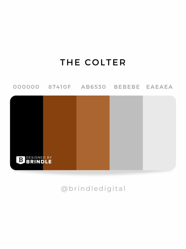
Choosing a Timeless Color Palette
When it comes to for your home, the possibilities are endless. However, there are a few key things to keep in mind to ensure you create a look that will never go out of style.
One important tip is to stick to classic, neutral colors that will stand the test of time. Think shades like:
- Soft beige
- Crisp white
- Warm grey
These colors can easily be paired with accent pieces in bolder shades for a pop of color that can be changed out as trends evolve.
Another key to is to consider the overall feel you want to achieve in your space. Are you going for a cozy, rustic look? Or maybe a sleek, modern vibe? By choosing colors that complement your desired aesthetic, you can ensure your space will always feel on-trend.
Utilizing Negative Space for Elegant Designs
One of the key tricks to achieving elegant and visually stunning designs is by making clever use of negative space. This underutilized space can often be the key to creating a piece that truly stands out. Here are some fun and creative ways to use negative space in your designs:
- Less is more: When it comes to negative space, remember that sometimes, less is more. Don’t be afraid to let your design breathe by incorporating plenty of open space.
- Hidden messages: Negative space can be used to create hidden messages within your design. Play around with shapes and sizes to reveal a secret message to your audience.
- Contrast is key: By using negative space to create contrast, you can draw the viewer’s eye to certain elements of your design. Experiment with different levels of contrast to see what works best for your project.
By utilizing negative space in your designs, you can create elegant and sophisticated pieces that are sure to make a statement. So don’t be afraid to get creative and think outside the box – or should we say, outside the space?
![]()
Integrating Intricate Details for a Memorable Logo
So, you want a logo that will make people say, “Wow, that’s cool!” You want a logo that will stand out in a sea of blandness. Well, my friend, you’ve come to the right place. Let’s talk about how to integrate intricate details to create a logo that will leave a lasting impression.
First things first, think about what makes your brand unique. Is it your quirky sense of humor? Your bold color choices? Your love of all things sparkly? Whatever it is, use that as inspiration for your logo. Maybe you incorporate a whimsical font or a playful illustration that captures the essence of your brand.
Next, consider adding subtle details that make people do a double-take. Maybe you sneak in a hidden message or symbol that only the keenest eye will notice. Or perhaps you use negative space to create a clever visual pun. The key here is to keep it subtle – you want people to notice the details, but not be overwhelmed by them.
And finally, don’t be afraid to get a little weird with it. Embrace the quirks and imperfections that make your brand unique. Maybe you add a quirky doodle or a random splatter of paint that doesn’t seem to make sense at first glance. Remember, sometimes the most memorable logos are the ones that make people scratch their heads and say, “What the heck am I looking at?”
FAQs
Why is it important for luxury brands to have sophisticated logos?
It’s simple - because if your logo isn’t sophisticated, people will think your brand isn’t either. And nobody wants to buy a designer purse from a brand that looks like it was designed by their little sister in Microsoft Paint.
What are the key elements that make a logo look luxurious?
Think fancy fonts, classy colors, and sleek design. Basically, if your logo looks like it belongs on a bottle of champagne, you’re on the right track.
Can a logo be too simple for a luxury brand?
Absolutely. If your logo looks like a child’s drawing of a stick figure, you might want to consider upping the sophistication factor a bit. Keep it classy, folks.
How can a brand stand out while still maintaining a luxurious image?
It’s all about finding that perfect balance of unique and elegant. Maybe add a subtle touch of gold or a clever hidden symbol to keep things interesting. Just don’t overdo it - you don’t want your logo to scream “look at me” like that guy at the party who won’t stop talking about his new Tesla.
What role does simplicity play in creating a sophisticated logo?
Simplicity is key, my friend. Take a cue from Audrey Hepburn – sometimes less is more. A clean, simple logo can speak volumes about your brand without having to shout “I’m fancy!”, so keep it sleek and chic.
Wrapping Up: The Art of Logo Luxury
And there you have it, folks! Crafting a sophisticated and luxurious logo isn’t just about slapping on some fancy fonts and colors. It’s about finding the perfect balance between simplicity and elegance, and making sure every element serves a purpose. So go forth, fellow designers, and remember: a touch of class goes a long way in the world of logo design. Happy crafting!


