In the vast and ever-evolving world of design, there exists a special breed of creatives who possess the rare gift of crafting logos that not only withstand the test of time, but also manage to make viewers stop in their tracks and utter a collective “Wow, that’s one sexy logo.” Join us as we dive into the whimsical world of Crafting Enduring Logos: The Art of Timeless Design. Strap in, folks. It’s gonna be a wild (and hopefully not too bumpy) ride!
The Evolution of Logo Design
Logos have come a long way from the days of basic, blocky designs to the sleek, stylish creations we see today. It’s like they went from wearing bellbottoms to sporting skinny jeans – talk about a fashion evolution!
Back in the day, logos had a one-size-fits-all mentality. Now, they’re all about customization and personalization. It’s like going to a tailor and getting a bespoke suit made just for you – but for your brand! Talk about fancy.
With the rise of technology, logos have gotten a major facelift. They’ve gone from black and white to full-on technicolor, from 2D to 3D, and from static images to animated masterpieces. It’s like they went to logo bootcamp and came back looking ripped!
And let’s not forget about the rise of minimalist design. Logos used to be all about the bling, but now they’re all about simplicity and sophistication. It’s like they Marie Kondo’d their design principles and only kept the essentials – sparking joy and making a statement all at once!

Key Elements of Timeless Logos
When creating a logo that stands the test of time, there are a few key elements to keep in mind. First and foremost, simplicity is key. Avoid cluttering your logo with unnecessary elements that may distract from your message. Think of some of the most iconic logos out there – Apple, Nike, Coca-Cola - what do they all have in common? They are sleek, simple, and instantly recognizable.
Another important element is versatility. Your logo should be able to adapt to different mediums and scales without losing its impact. A good logo should look just as sharp on a billboard as it does on a business card. Keep this in mind when choosing colors, fonts, and shapes for your design.
Consistency is also key when it comes to timeless logos. Make sure that your logo aligns with your brand’s overall aesthetic and messaging. Whether it’s a classic monogram or a playful icon, your logo should reflect the values and personality of your brand.
Don’t be afraid to think outside the box when it comes to designing a logo that will stand the test of time. Experiment with different concepts, colors, and typography until you find a design that truly resonates with your brand. Remember, a timeless logo is not just a symbol - it’s a representation of your brand’s identity and values.
Understanding the Psychology of Design
Ever wonder why certain designs catch your eye while others make you want to run for the hills? Well, my friend, that’s all thanks to the fascinating world of psychology of design. Let’s delve into the intricate workings of the human mind and how it influences our perception of design.
First and foremost, the color scheme of a design can play a huge role in how we perceive it. Did you know that red can evoke feelings of passion and urgency, while blue is often associated with tranquility and trustworthiness? That’s why you see so many fast-food logos in red and financial institutions opting for a soothing shade of blue. It’s all about subconsciously appealing to our emotions.
Furthermore, the layout and composition of a design can greatly impact how we interact with it. People tend to scan from left to right, so it’s crucial to place key information and focal points accordingly. A cluttered design can overwhelm the viewer, while a well-balanced layout can guide their eyes effortlessly. It’s all about striking that perfect balance between aesthetics and functionality.
And let’s not forget about the power of typography. The font choice can convey a tone and personality that directly influences how we interpret the message. Imagine reading a horror story in Comic Sans – it just doesn’t have the same chilling effect, does it? Choosing the right font is like picking the perfect outfit for a party - it sets the mood and makes a lasting impression.

Case Studies in Enduring Logo Design
Let’s dive into some of the most iconic and enduring logo designs that have stood the test of time. These case studies showcase the power of a well-crafted logo that can withstand changing trends and fads.
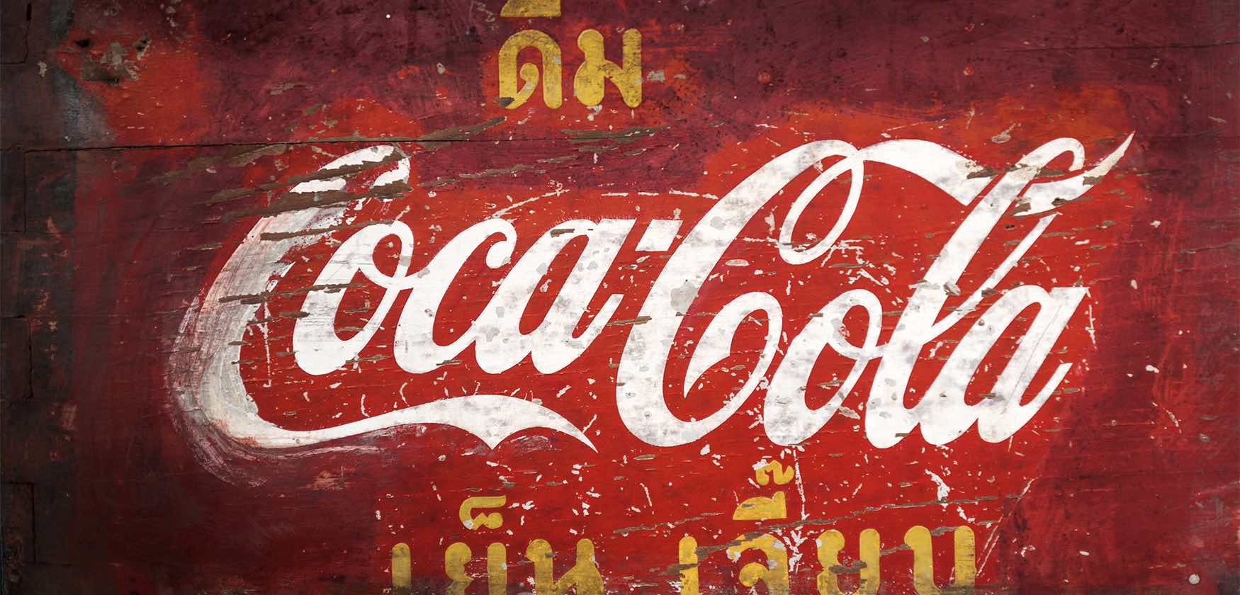
First up, we have the Coca-Cola logo, a classic example of timeless design. With its signature red and white color scheme and distinct swooping script font, this logo has remained virtually unchanged since its creation in the late 19th century. It’s a testament to the brand’s longevity and global appeal.
Next, we have the Apple logo, a simple yet powerful symbol of innovation and technology. The bitten apple silhouette is instantly recognizable, even without the company name accompanying it. This logo has evolved over the years, but its core elements have remained consistent, making it a true beacon of design consistency.
And let’s not forget about the Nike swoosh, a bold and dynamic logo that exudes movement and athleticism. Created by a design student in 1971, this logo has become synonymous with the brand’s commitment to excellence and performance. It’s a perfect example of how a minimalist design can pack a punch.

Tips for Crafting a Lasting Brand Identity
Are you tired of your brand identity being as memorable as a goldfish’s attention span? Fear not, for I have some tips that will help you craft a lasting brand identity that will stick with your audience like gum on a hot sidewalk.
First things first, you need to know your audience inside and out. Take the time to really understand who they are, what they like, and what makes them tick. This will help you tailor your brand identity to resonate with them on a deeper level.
Next, be consistent like that friend who always shows up late to brunch. Whether it’s your logo, colors, or messaging, make sure everything is cohesive and sticks to the same tone. Consistency is key to creating a recognizable brand identity that people will remember.
Don’t be afraid to stand out like a flamingo in a sea of pigeons. Inject some personality into your brand identity that sets you apart from the competition. Whether it’s through quirky messaging, bold design choices, or a unique brand voice, dare to be different and watch your brand identity soar.
FAQs
Q: What makes a logo design timeless?
A: Well, dear reader, a timeless logo design is like a fine wine – it only gets better with age. It’s all about simplicity, versatility, and memorability. Think of it as the Audrey Hepburn of logos – classy, elegant, and always in style.
Q: How can I ensure my logo design will stand the test of time?
A: Ah, young grasshopper, designing a timeless logo is no easy feat. It requires a keen eye for detail, a deep understanding of your brand, and a sprinkle of fairy dust for good measure. But fear not – with a solid concept, clean lines, and a touch of magic, your logo will shine bright like a diamond for years to come.
Q: What are some examples of timeless logos?
A: Well, my dear Watson, timeless logos are all around us, like shining beacons of design brilliance. Just take a look at the Nike swoosh – simple, iconic, and instantly recognizable. Or the Apple logo – sleek, sophisticated, and as cool as a cucumber. These logos have stood the test of time and will continue to do so, inspiring generations to come.
Q: How can I make my logo design appeal to a wide audience?
A: Ah, the age-old question of universal appeal. To make your logo design resonate with the masses, you need to tap into the collective consciousness of humanity – think love, peace, and puppies. Keep it simple, relatable, and above all, magical. With a sprinkle of stardust and a dash of unicorn tears, your logo will become a beacon of hope for all who lay eyes upon it.
Q: Is it worth investing in a professional designer for my logo?
A: Darling, if you want a logo that will stand the test of time, you need to call in the big guns. A professional designer is like a wizard with a wand – they can work wonders with a blank canvas and a dream. So, open your wallet, break out the champagne, and prepare to be dazzled by the magic of timeless design.


