Flat design can be beautiful. As an enduring design trend that’s outlasted many fancy alternatives, this is one crucial design style to pay attention to. From logos to entire websites, flat design is not going away anytime soon.
So let’s examine it. Having a better understanding of flat design (and its sibling, semi-flat design) will allow you to understand the psychology behind it. It will also help you make a more informed decision on whether or not it’s right for your business.
Table of Contents
- Flat Design, Defined
- What about Semi-Flat Design?
- The History of Designing Flat Illustrations
- The Pros and Cons of Flat Styles in a Marketing Context
- 5 Potential Uses of Flat Designs
- Are You Ready to Embrace Flat Design?
Flat Design, Defined
When it comes to a semi-obscure concept like flat design, it’s always best to start with a definition. Flat design is simplistic. It doesn’t attempt to add any dimension via 3-D effects or shadows. Instead, it’s just what its name suggests: flat, and proud of it.
This minimalism is very much intentional. The goal of this design style is to be unobtrusive, getting a core message across without impeding the user experience. Think app icons on your phone, or a simple shopping cart icon.
The resulting look tends to be very illustrative. It certainly doesn’t attempt to be realistic or overly detailed. At the same time, it can communicate complex pieces of information. Some recent design examples of award-winning flat web designs provide a firsthand look at this type of style.
What about Semi-Flat Design?
Not all design is entirely flat. In fact, most logos and websites have evolved towards what some design experts call ‘flat 2.0’: semi-flat design, which is essentially a 2D illustration with just a little touch of realism.
That touch may be a simple drop shadow, a changing color shade, or a background that suggests depth. Facebook’s current mobile app logo, with its reflective blue hue (to make it look more like a button), is a perfect example of this closely related alternative.
The History of Designing Flat Illustrations
Just as important as the basic definition of flat design is an examination of how we got there. With a solid grasp of the psychology behind flat design, you’ll have a better idea of where/when this style works (and doesn’t work) in your marketing efforts.
Art enthusiasts will notice the design’s heritage from the 20th-century styles of Bauhaus and Modernism. Both embraced the idea that simple can be great, and that high contrast and efficient use of space should be prioritized vs indulgent colors or excessive depth.
The style again became relevant in the digital transformation and smartphone age of the 21st century. Small screens require a simple illustration of complex topics. Higher resolutions and increasing screen sizes have allowed some more realistic elements back in, resulting in semi-flat design. But the basic point remains: simplicity tends to just work. Here are a few reasons why.
The Pros and Cons of Flat Styles in a Marketing Context
If you’ve been staying with us so far, you might have already noticed a few advantages of using flat design:
- Minimalist style makes it perfect for small icons and other confined spaces.
- Simplicity is highly effective in situations where the goal is to get a key message across clearly.
- The same simplicity also makes sense if you have to convey a message quickly, at first glance.
- When applied in web design, usability tends to be enhanced with easily readable content pieces.
- Designs often look cartoon-like, making it a perfect style for a fun, relatable brand or business.
- Semi-flat styles work well when looking to communicate more complex information (without having to change the style entirely).
With these advantages, it’s easy to see why so many businesses and design experts prefer flat design and its evolutionary cousin to more traditional, realistic counterparts. Still, it’s important to remember that this is not a cure-all.
Flat illustrations do have some drawbacks that are equally important to understand. As you consider whether or not this style will define your visual identity, these disadvantages are just as significant as the benefits.
- Usability might end up compromised due to a lack of visual cues. Your users might not know what to do without explicit instructions.
- An emphasis on vibrant colors can mean that subtlety gets lost, reducing the ability for any nuance in the design.
- Flat designs tend to emphasize type. If that type, through a lousy font or wording, is ineffective, the negative effects will be significant.
- The ‘coolness’ factor of flat design, embraced by style leaders like Apple, can work against you if you try to convey more serious messages.
- Any attempt at realism will be difficult to accomplish, which may be a problem, depending on your brand.
- You might also run into some challenges when attempting to distinguish yourself from others, both because of this style’s popularity and its relatively limited style options.
The takeaway here should be clear: flat illustration styles are not inherently good or bad. This style will not magically solve your visual identity, nor will it ruin a good thing by default. Instead, it can work beautifully for your business – if you apply it right and remain mindful of the pros and cons.
5 Potential Uses of Flat Designs
As mentioned above, flat design isn’t perfect for every situation. That said, it might just be the key ingredient to boost your message and get your audience’s attention. These five potential uses of flat and semi-flat designs have proven to be successful and are worth a closer look.
1) Your Company Logo
Especially small and medium-sized businesses (that still need to focus on gaining brand awareness) can benefit from this design style. Designed right, it helps you clearly communicate your brand and core benefits to your audience in a single icon.
Some examples of famous logos using this design style include:
- The Nike swoosh and Adidas bars
- The Disney wordmark
- Audi, presenting a semi-flat style with its interwoven rings
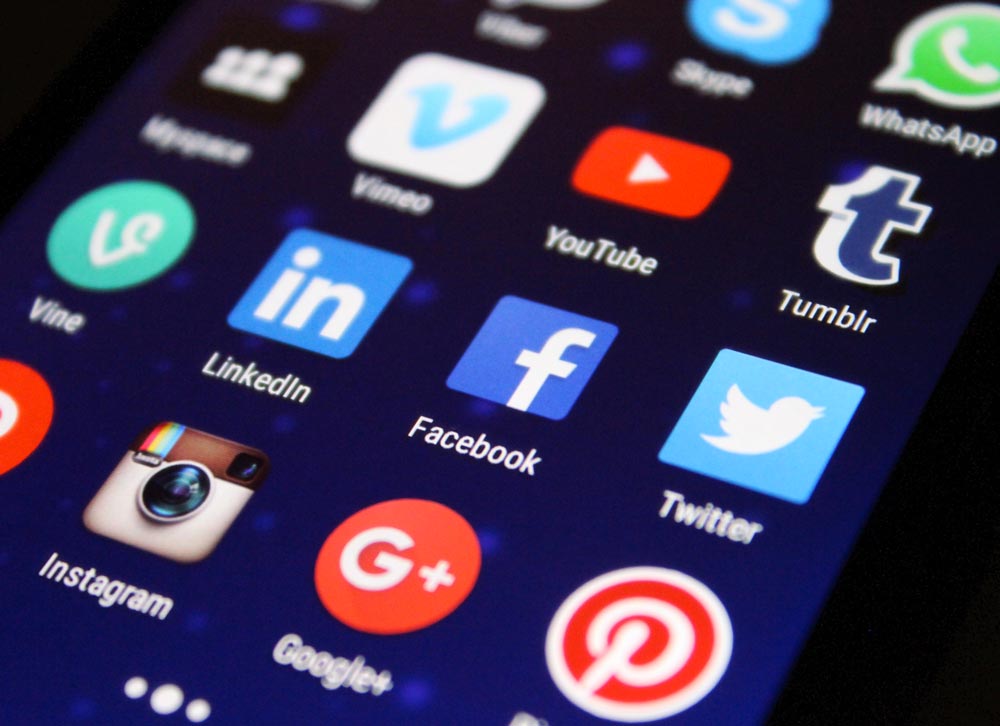
2) The Mobile App Icon
Just as a company logo works well because of its required small size and simplicity, so does the typical mobile app logo. It has to stand out (in crowded app stores) amidst hundreds of close alternatives, all while not being too complicated or confusing. Too much detail here, and it will become impossible to decipher.
You’ll find plenty of examples of both flat and semi-flat styles in your phone’s app store:
- Snapchat’s ghost, in pure white on a yellow background without any add-ons.
- Slack – which recently went flat to simplify the way it markets itself to business users.
- The above-mentioned Facebook app and its slight shading that adds depth, presenting the semi-flat option.
3) Infographics
Both of the above examples represent simple examples that play into the straightforward nature of flat designs. It doesn’t have to be that way. Almost every infographic you will come across likely utilizes this style. The information represented here calls for simplicity just as a logo would.
Infographics – and data visualization in general – are all about condensing down complex topics into simple, snackable nuggets. That’s precisely where flat illustrations tend to shine.
4) Website Entry Points
When your audience visits your website, particularly on your homepage, they’ll likely have multiple options to navigate to the next steps. Where exactly they go depends on how quickly they find the information needed to take that next step.
You don’t want them ‘bouncing’ off your page. By clearly denoting those next steps, you make navigation easy and minimize distractions.
In addition to these award-winning websites, you can find some of the same design elements on our homepage for reference.
5) Push Advertising
Finally, some types of advertising can be more effective with the right kind of flat design. That’s especially true for push advertising, which denotes any ads your audience sees without necessarily having a connection to your business yet.
These users don’t have time to decode an intricate design. Using a simple, flat-alternative gets the same information across quickly, allowing them to make their own decision on whether or not they should take action and learn more about you.
Are You Ready to Embrace Flat Design?
Flat design isn’t perfect, but it’s extremely popular due to a plethora of advantages. Which leaves one question: Is your business ready for flat design?
Hopefully this guide has you on your way to answering that question. Do keep in mind that there is no perfect, indisputable answer. The design style is too versatile and too unique to draw any blanket conclusions. Instead, you need to make sure it fits with your specific business just right.
If you’re on the fence, we’re always happy to discuss your options. Our team is very familiar with flat design (as well as its alternatives) and would love to have a conversation about what makes sense for you. Are you ready to build your brand? Let’s connect.


