
Ever wonder why some construction and design/” title=”Real Estate Logo Design”>real estate logos make you feel like you’re being hugged by a warm cozy blanket, while others make you want to run for the hills? It’s not just random design choices, folks. It’s all about the fascinating world of color psychology. So grab your hard hat and your thinking cap, because we’re about to dive into the colorful world of construction and real estate logos like never before!
Understanding the Impact of Color Psychology in Construction Logos
Have you ever wondered why construction logos are often adorned with bold and vibrant colors? Well, the secret lies in the fascinating world of color psychology!
In the competitive construction industry, standing out is key. That’s where color psychology comes into play. By strategically choosing colors for their logos, construction companies can evoke specific emotions and perceptions in consumers’ minds.
Here are a few examples of how different colors can impact the perception of a construction company:
- Yellow: Radiates positivity and energy. Perfect for companies that want to exude confidence and exuberance.
- Blue: Represents trust and reliability. Ideal for construction companies that want to convey a sense of stability and professionalism.
- Orange: Symbolizes creativity and enthusiasm. Great for companies looking to showcase their innovative approach to construction.
So, the next time you see a construction logo that catches your eye, take a moment to appreciate the thought and strategy behind the color choices. Who knew that a simple splash of color could say so much about a company?
Choosing the Right Color Palette for Real Estate Logos
When it comes to creating a real estate logo, choosing the right color palette is crucial. After all, you want to convey trustworthiness, professionalism, and a hint of luxury. So, how do you pick the perfect hues for your brand?
First off, think about the message you want to send. Are you a modern, cutting-edge agency? Consider using bold, vibrant colors like blue, green, or red. Or maybe you’re going for a more sophisticated, upscale vibe? Elegant shades like navy, gold, or silver might be more your style.
Another thing to consider is the psychology of color. Did you know that purple is associated with luxury and power, while orange signifies energy and creativity? Keep these meanings in mind when selecting your color palette.
Lastly, don’t be afraid to get creative with your color choices. Play around with different combinations and see what resonates with you. Remember, your logo is the face of your brand, so make sure it’s a true reflection of who you are!
The Psychology Behind Popular Colors in Construction and Real Estate
Have you ever wondered why certain colors are so popular in construction and real estate? Let me break it down for you in a way that even your grandmother can understand.
First up, let’s talk about blue. This color is like the Beyoncé of the color wheel – everyone loves it. In construction and real estate, blue symbolizes trust, stability, and reliability. It’s like the color equivalent of your favorite pair of sweatpants – comforting and familiar.
Next, we have gray. Gray is like that one friend who always knows the perfect neutral paint color for your walls. It’s versatile, timeless, and sophisticated. In construction and real estate, gray represents balance and neutrality, making it the perfect backdrop for potential buyers or tenants to envision themselves living in a space.
And finally, we can’t forget about green. No, not the kind you find in your post-workout smoothie. Green symbolizes renewal, growth, and prosperity, making it a popular choice in construction and real estate. It’s like a little slice of nature brought indoors, reminding us all that money really does grow on trees (or at least on well-painted walls).
How Color Influences Brand Perception in the Construction Industry
The construction industry is often associated with ruggedness and durability, but did you know that the color of a brand can also play a significant role in shaping how it is perceived by consumers? Colors have a powerful impact on our emotions and can subconsciously influence our perception of a brand without us even realizing it.
Here are some ways in which color influences brand perception in the construction industry:
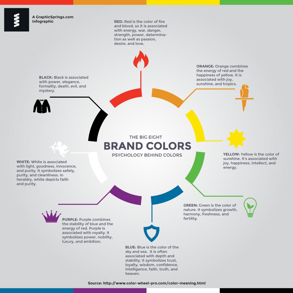
- Red: Red is often associated with power, strength, and urgency. Brands that use red in their logos or branding may be perceived as more assertive and dynamic.
- Yellow: Yellow is a color that is often associated with warmth, positivity, and creativity. Brands that use yellow in their branding may be perceived as friendlier and more approachable.
- Blue: Blue is a color that is often associated with trust, reliability, and professionalism. Brands that use blue in their branding may be seen as more trustworthy and dependable.
It’s important for construction companies to consider the psychological impact of color when designing their branding. By choosing colors that align with the values and image they want to portray, companies can influence how their brand is perceived by consumers and stand out in a competitive industry.

Utilizing Color Theory to Create Memorable Real Estate Logos
When it comes to creating a memorable real estate logo, one of the most important factors to consider is color theory. By taking advantage of the psychology behind different colors, you can create a logo that resonates with your audience and leaves a lasting impression. Here are a few tips on how to utilize color theory to create a standout real estate logo:
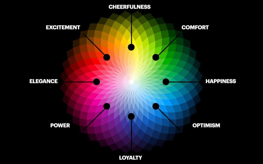
First and foremost, you’ll want to think about the emotions that different colors evoke. For example, warm colors like red, orange, and yellow can convey feelings of energy, passion, and warmth. On the other hand, cool colors like blue, green, and purple are often associated with tranquility, trust, and stability. Consider which emotions you want your real estate logo to evoke and choose your colors accordingly.
Another important aspect of color theory to consider is color contrast. By combining colors that are opposite each other on the color wheel, you can create a logo that pops and grabs attention. For example, pairing a bold blue with a bright yellow can create a visually striking logo that stands out from the competition. Don’t be afraid to experiment with different color combinations to find the perfect look for your real estate logo.
Lastly, be mindful of the cultural associations that different colors may have. While white may symbolize purity and cleanliness in Western cultures, it can represent mourning and death in other parts of the world. Make sure you research the cultural significance of the colors you choose to ensure your real estate logo sends the right message to your target audience. With a little creativity and a solid understanding of color theory, you can create a memorable real estate logo that sets your brand apart from the rest.
Case Studies: Successful Construction and Real Estate Logos That Utilize Color Psychology
Case Studies:
Let’s take a look at some examples of successful construction and real estate logos that have utilized color psychology to their advantage:
- The Blueprints Brothers: This construction company’s logo uses a calming shade of blue to convey trustworthiness and professionalism. The use of blue also symbolizes stability and reliability, making potential clients feel confident in their abilities.
- The Bold Builders: With a logo featuring vibrant shades of orange and yellow, this real estate company exudes energy and enthusiasm. These warm colors evoke feelings of excitement and optimism, perfect for attracting potential homebuyers looking for a fresh start.
- The Green Dream Developers: By incorporating various shades of green in their logo, this sustainable construction firm showcases their commitment to environmentally-friendly practices. Green is often associated with growth, harmony, and renewal, making this logo an excellent choice for attracting eco-conscious clients.
By leveraging the power of color psychology in their logos, these companies have successfully established strong brand identities and connected with their target audiences on a deeper level. Remember, when designing your own construction or real estate logo, don’t underestimate the impact that color can have on the perception of your brand!
FAQs
What colors are commonly used in construction and real estate logos?
Builders often opt for sturdy, reliable colors like brown, grey, and blue. Real estate agents lean towards warm, inviting hues such as yellow, orange, and red.
How can color psychology impact a potential buyer’s perception of a construction or real estate company?
Color can make or break a deal faster than you can say “open house”. Warm colors like red and orange can create a sense of urgency, urging buyers to act fast. Cool colors like blue and green can instill trust and reliability.
Are there any colors that should be avoided in construction and real estate logos?
Absolutely! Stay away from colors like neon green or hot pink unless you want your clients to think you’re running a circus instead of a contracting business.
Can changing the color scheme of a logo really make a difference in attracting clients?
It’s like giving your logo a fresh coat of paint! A well-thought-out color scheme can attract the right clients faster than a “For Sale” sign in a hot market.
How can I use color psychology to stand out from my competitors in the construction or real estate industry?
Think outside of the color palette! Consider using unique color combinations that convey your company’s personality and values. Who says a construction company can’t use a splash of lavender?
Time to Paint Your Logo Red!
So there you have it – the power of color psychology in construction and real estate logos. From creating trust with blue hues to showcasing luxury with gold tones, the possibilities are endless. Don’t be afraid to think outside the box and experiment with different colors to see what resonates with your audience. Remember, colors speak louder than words, so make sure your logo is painting the right picture for your brand. Now go forth and design your logo with confidence - just remember, there’s a rainbow of possibilities waiting for you!


