Are you feeling a little blue about your brand‘s lackluster logo design? Well, it’s time to shake off the monochrome madness and embrace the full spectrum of success! In this article, we’ll dive deep into the world of color psychology and show you how to wield the power of hues to boost your brand’s influence and captivate your audience. So grab your paintbrushes, lay out the rainbow welcome mat, and prepare to paint the town red with your vibrant new logo design!
Selecting the Right Color Palette for Your Brand
When it comes to , it’s like choosing the perfect outfit for a first date – you want to make a good impression and stand out from the crowd. Here are some tips to help you make the right choice:
- Reflect your brand personality: Are you a fun and quirky brand? Go for bright and bold colors. Are you a sophisticated and elegant brand? Opt for a more muted and classic palette.
- Consider your target audience: Think about who you’re trying to attract. Are they young and trendy? Use on-trend colors. Are they professional and serious? Stick to more traditional hues.
- Check out the competition: Take a look at what other brands in your industry are doing. You don’t want to blend in with the crowd, but you also don’t want to stick out like a sore thumb. Find a balance between standing out and fitting in.
Remember, the colors you choose will not only be used in your logo and website, but they will also set the tone for all your branding materials. So choose wisely, and make sure your colors represent your brand in the best possible light. After all, you want to make a lasting impression, not a fashion faux pas!

Understanding the Psychological Impact of Colors on Consumer Behavior
Ever wonder why you always feel calm and relaxed when you’re surrounded by blues and greens, but energized and hungry when you see red and yellow? It’s all in the psychology of colors and how they can influence our consumer behavior.
Let’s start with blue. This color is known to evoke feelings of trust and security, which is why it’s often used in banking and finance logos. So next time you’re feeling a little financially unstable, maybe a shopping spree in a blue-themed store will help calm those nerves!
On the flip side, red is a color that screams excitement and urgency. That’s why fast-food chains like McDonald’s and KFC love using red in their branding – it makes you crave that Big Mac like there’s no tomorrow! But be careful, too much exposure to red can also lead to aggression and restlessness. So maybe skip the red room makeover unless you want to start fights with your significant other.
And then there’s yellow, the color of happiness and positivity. This sunshine hue can make you feel warm and fuzzy inside, which is why it’s often used in marketing to create a sense of cheerfulness and optimism. So next time you’re feeling a bit down in the dumps, surround yourself with some yellow decor and let the good vibes flow!

Utilizing Color Theory to Create a Memorable Logo Design
When it comes to designing a memorable logo, color theory can be your best friend. By understanding how different colors work together, you can create a logo that stands out from the competition and leaves a lasting impression on your audience.
So how can you harness the power of color theory to create a killer logo design? Here are a few tips to get you started:
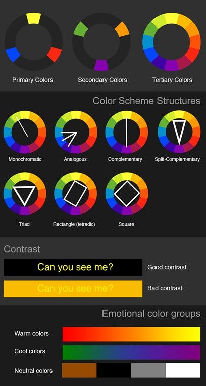
- Contrast is key: Make sure to choose colors that contrast with one another to make your logo pop. Think about pairing complementary colors like red and green or blue and orange for maximum impact.
- Think about psychology: Different colors can evoke different emotions in people, so make sure to choose colors that align with your brand’s message. Want to convey trust and reliability? Go for blues and greys. Want to exude energy and excitement? Think reds and yellows.
- Keep it simple: While it can be tempting to use a rainbow of colors in your logo, sometimes less is more. Stick to a few key colors that represent your brand and use them strategically to create a cohesive design.
By utilizing color theory in your logo design, you can create a visual identity that not only looks great but also resonates with your audience on a deeper level. So go ahead, experiment with different color combinations and see what magic you can create!

The Importance of Consistency in Color Usage Across Different Branding Materials
Picture this: you’re walking down the street and see a billboard for your favorite brand. The colors used are vibrant and eye-catching, making you want to stop and take a closer look. Now, imagine if that same brand’s website used completely different colors that clashed and made your eyes hurt. Not a pleasant experience, right? That’s why consistency in color usage across different branding materials is essential.
When a brand uses the same colors across all its materials, whether it’s on print ads, social media, or packaging, it creates a sense of cohesion and unity. Think of it as the brand’s way of saying, “Hey, we’ve got our act together!” It also helps customers recognize and remember the brand more easily. So, if you want people to associate your brand with professionalism and reliability, stick to the same color palette.
Not convinced yet? Well, think about this: inconsistency in color usage can confuse and even alienate customers. Imagine if McDonald’s suddenly started using blue and green instead of its iconic red and yellow. You’d probably think you stumbled into a parallel universe where fast food chains just don’t get it. Don’t let that happen to your brand! Stay consistent and keep your customers happy.
So, next time you’re brainstorming ideas for your brand’s materials, remember the golden rule: keep the colors consistent. Your brand will thank you, your customers will thank you, and most importantly, your eyes will thank you. Let’s make the world a more colorful and harmonious place, one branding material at a time!

Harnessing the Emotional Connection of Color to Strengthen Brand Identity
When it comes to branding, color is not just about aesthetics – it’s about emotions. Color has the power to sway our feelings, evoke memories, and influence our decisions. So, it’s no wonder that brands harness the emotional connection of color to strengthen their brand identity.
Whether it’s the bold red of Coca-Cola or the calming green of Starbucks, brands strategically choose their colors to evoke certain emotions in their customers. Here are a few ways brands use color to strengthen their identity:
- Building Trust: Blue is often associated with trust and reliability. That’s why so many financial institutions like Chase and PayPal use blue in their branding.
- Appealing to Emotions: Yellow is a color known for its cheerful and optimistic vibes. Brands like McDonald’s capitalize on this by using yellow to convey happiness and warmth.
- Standing Out: Sometimes, it’s not about fitting in – it’s about standing out. Take a look at Target and its iconic red bullseye logo. It’s hard to miss!
So, the next time you see a logo or branding that speaks to you on a deeper level, remember that it’s not just the design – it’s the emotional connection of color at play.
Case Studies: Successful Brands that Have Leveraged Color to Drive Brand Success
Color is not just a visual aspect of branding, it’s a powerful tool that can make or break a brand’s success. Let’s take a look at some successful brands that have leveraged color to drive their brand success.
First up, we have McDonald’s. The golden arches are not just a random color choice – they are carefully selected to trigger hunger and excitement. The bright yellow is said to evoke feelings of happiness and energy, making you crave those golden fries and juicy burgers. And let’s face it, who can resist the temptation of a McDonald’s meal when you see those iconic golden arches?
Next, we have Coca-Cola. The classic red color of the Coca-Cola logo is instantly recognizable and has become synonymous with happiness and good times. The color red is known to stimulate appetite and create a sense of urgency, making you reach for a cold Coke whenever you see that iconic red label. It’s no wonder that Coca-Cola is one of the most successful brands in the world!
Lastly, we have Starbucks. The iconic green color of the Starbucks logo is not just any shade of green – it’s a carefully chosen color that represents growth, harmony, and freshness. The soothing green tones of Starbucks’ branding create a sense of calm and relaxation, making it the perfect place to enjoy your favorite latte or Frappuccino. Plus, who can resist posting a cute Starbucks cup on Instagram? It’s all about that aesthetic, baby!
FAQs
Why is color important in logo design?
Color is important because it can evoke certain emotions and feelings in consumers, which can ultimately affect how they perceive a brand. Choosing the right colors can help a logo stand out and make a memorable impact.
How can I choose the right colors for my logo?
Choosing the right colors for your logo involves considering your target audience, your brand values, and the message you want to convey. Do some research on color psychology and think about what colors best represent your brand’s personality.
Can using too many colors in a logo be a bad thing?
Absolutely! Just like wearing rainbow-colored socks with a polka dot shirt, using too many colors in a logo can create visual chaos and confuse consumers. Stick to a maximum of three colors to keep things sleek and professional.
What are some common color associations in branding?
Red can evoke feelings of passion and excitement, while blue is often associated with trust and reliability. Yellow is seen as energetic and youthful, while green can represent nature and wellness. Think about the image you want to portray for your brand and choose colors accordingly.
How can I make sure my logo is still effective in black and white?
Design your logo in color first, then test it in black and white to ensure that it still retains its impact and readability. A strong logo should be able to stand out even without any color.
Time to Color Outside the Lines!
Now that you’ve unlocked the secrets to the power of color in logo design, it’s time to unleash your creativity and create a logo that truly reflects the personality and values of your brand. Remember, choosing the right colors can make all the difference in how your brand is perceived, so don’t be afraid to experiment and think outside the box. Let your colors shine bright and bold, and watch as your brand success skyrockets to new heights! So go forth, fellow color enthusiast, and may your logo always be as vibrant as a rainbow on a sunny day.


