
Welcome to the colorful world of branding, where logos are not just logos, but vibrant statements that scream, ”Look at me, I’m fabulous!” Forget bland and boring designs - we’re here to show you how to create memorable logos that will make your brand pop like a confetti canon at a clown convention. Get ready to unleash your inner design diva and learn the art of mastering branding with eye-catching colors that will have your competitors green with envy. Let’s dive into the kaleidoscope of branding and turn up the saturation on your logo game!
Choosing the Right Color Palette for Your Brand
When it comes to choosing the perfect color palette for your brand, you want to make sure you’re sending the right message to your audience. After all, you don’t want them thinking you’re a serious business when you’re really a fun-loving, laid-back brand, right?
So, how do you go about selecting the ideal colors for your brand? Well, let me break it down for you:
- Know Your Audience: Think about who your target demographic is. Are they young and hip? Maybe go for some vibrant, eye-catching colors. Are they more sophisticated and refined? Opt for more muted, elegant tones.
- Mood Matters: Colors can evoke different emotions and feelings. Consider how you want your audience to feel when they interact with your brand. Want them to feel energetic and excited? Bright, bold colors are your go-to.
- Be Unique: Stand out from the competition by choosing a color palette that sets you apart. Don’t just go with the same old boring colors everyone else is using. Be bold, be daring, be YOU.
Remember, your color palette is like the outfit your brand wears every day. Make sure it reflects your personality and values, and most importantly, make sure it looks good!

Understanding the Psychology of Color in Logo Design
Color psychology is more than just knowing that yellow can make you feel cheerful or that red can make you feel bold. In logo design, the colors you choose can evoke a range of emotions and associations. Let’s dive into the fascinating world of color psychology in logo design!
When designing a logo, selecting the right colors can make or break your brand’s message. Here are a few key points to keep in mind:
- Color association is key. Think about how different colors are traditionally perceived. Green is often associated with nature and health, while black can convey sophistication and power.
- Consider your target audience. Are you trying to attract adventurous millennials or sophisticated baby boomers? Different colors will resonate differently with different demographics.
- Contrast is crucial. Making sure your logo colors stand out from one another can help ensure that your logo is visually appealing and easy to remember.
So, next time you’re designing a logo, remember to think about the psychology behind the colors you choose. It’s amazing what a simple splash of color can do to communicate your brand’s identity and message!
Creating a Strong Visual Identity Through Vibrant Colors
Are you tired of blending in with the crowd? Want to stand out and make a statement with your brand? Look no further! By incorporating vibrant colors into your visual identity, you can capture the attention of your audience and leave a lasting impression.
Imagine a world where your brand is as eye-catching as a neon sign on a dark night. With the power of bold, vivid colors, you can make that dream a reality. Whether you choose electric blue, neon green, or hot pink, these vibrant hues will set you apart from the competition and make your brand pop.
Don’t be afraid to mix and match different colors to create a unique palette that represents your brand’s personality. From fiery reds to sunny yellows, the possibilities are endless. Embrace the power of color and watch as your visual identity comes to life in ways you never thought possible.
So go ahead, unleash your inner artist and paint the town red (or any other vibrant color you choose)! With a strong visual identity built on bold and vibrant colors, you’ll be sure to turn heads and make a splash wherever you go. Stand out, be bold, and let your brand shine brighter than ever before!
Optimizing Logo Design for Digital and Print Applications
When designing a logo, it’s important to consider how it will look across different mediums like digital and print. After all, you don’t want your logo looking pixelated on a website or blurry on a business card!
To optimize your logo for both digital and print applications, here are some tips:
- Keep it simple: A cluttered logo may look great on a computer screen, but once you shrink it down for a business card, it could become a jumbled mess. Stick to clean lines and minimal details.
- Choose the right file formats: For digital applications, you’ll want to use scalable vector graphics (SVG) to ensure your logo looks crisp on any screen size. For print, use high-resolution files like EPS or PDF.
- Consider color: Bright, neon colors may look eye-catching online, but they could be difficult to replicate in print. Stick to a color palette that works well in both digital and print.
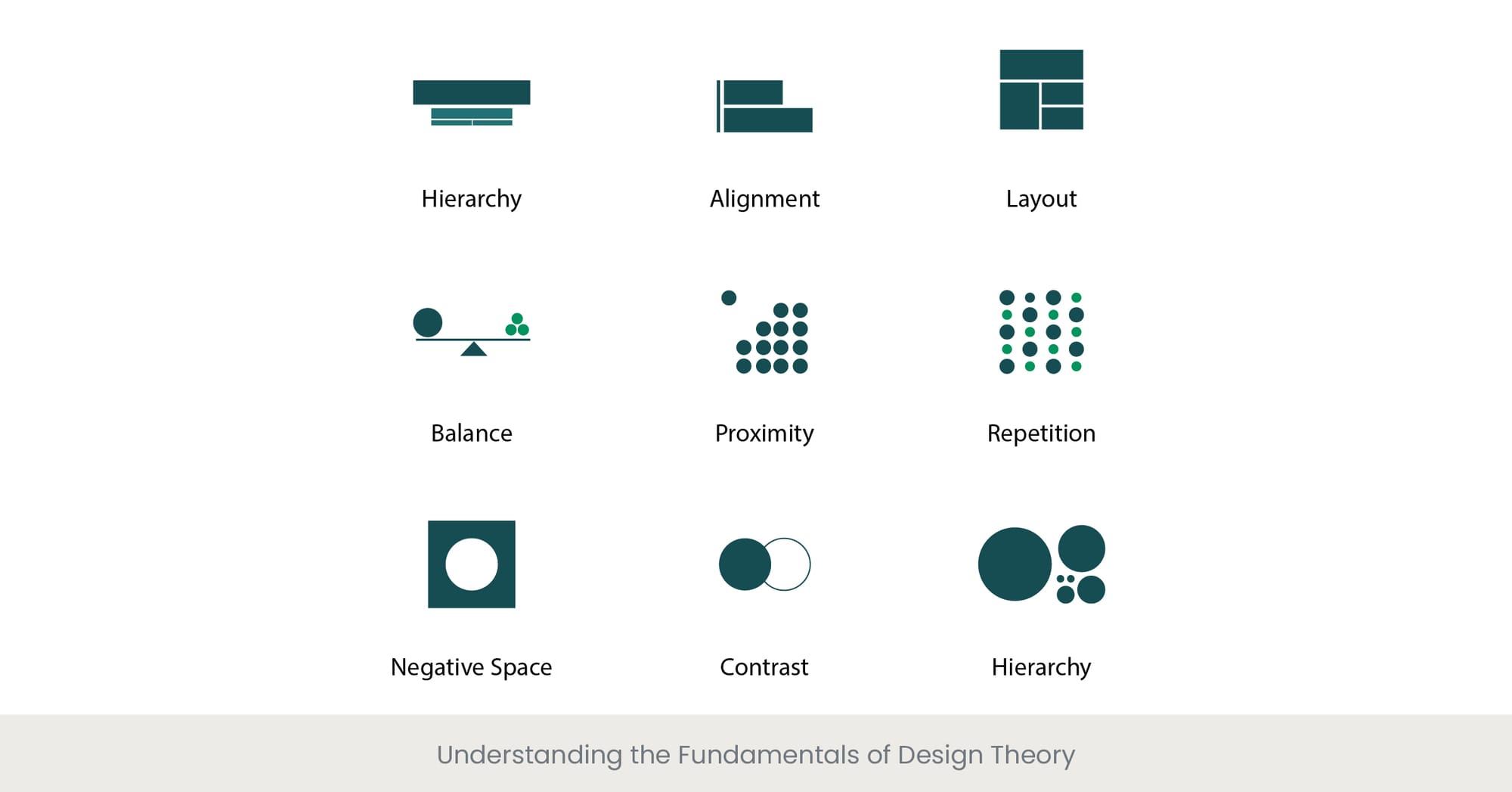
Using Contrast and Hierarchy to Enhance Brand Recognition
When it comes to enhancing brand recognition, contrast and hierarchy are your best friends. These design elements can help your brand stand out in a sea of competitors, making it easily recognizable to your target audience.
One way to use contrast effectively is by playing with colors. Think about using bold, bright colors against neutral backgrounds to make your brand pop. This will ensure that your logo and brand materials are eye-catching and memorable.
Another technique is to play with hierarchy in your design. By emphasizing certain elements over others, you can guide your audience’s eyes to what’s most important. Use larger text for your brand name or slogan, and keep other elements smaller to create a sense of importance.
Remember, the key is to create a visual hierarchy that is both clear and engaging. By using contrast and hierarchy effectively, you can take your brand recognition to the next level and leave a lasting impression on your audience.
Implementing Color Theory to Elevate Your Brand’s Image
Ready to take your brand’s image to the next level? It’s time to dive into the wonderful world of color theory! By implementing the right colors in your branding strategy, you can make a powerful impact on your audience and stand out from the competition.
First things first, let’s talk about the basics. Remember ROYGBIV from elementary school? Well, it’s time to put those colors to good use. Each color represents different emotions and can evoke specific reactions from your audience. For example, red is bold and energetic, while blue is calming and trustworthy. Choose your colors wisely!
Next, think about color combinations. The key here is contrast. Use complementary colors to make your brand pop, or go for an analogous scheme for a more harmonious look. And don’t forget about the power of neutrals! They can help balance out your palette and make your brand more versatile.
But wait, there’s more! Did you know that color can also affect how your brand is perceived culturally? Different colors have different meanings in different parts of the world. So, if you’re targeting an international audience, be sure to do your research and choose your colors accordingly. Remember, a little color theory can go a long way in enhancing your brand’s image!
Leveraging Vibrant Colors for Brand Consistency Across Platforms
When it comes to establishing brand consistency, using vibrant colors can make your brand pop across all platforms. Whether it’s your website, social media profiles, or marketing materials, incorporating bold and eye-catching colors can help make your brand memorable and recognizable.
One way to ensure consistency is by creating a brand style guide that outlines the specific colors to be used in all communications. This guide should include the hex codes for each color so that there is no room for interpretation. Remember, it’s all about creating a cohesive look and feel for your brand. Consistency is key!
Don’t be afraid to get creative with your color choices. Experiment with different combinations to see what resonates with your audience. Maybe a neon green paired with a hot pink will give your brand the edge it needs to stand out in a crowded marketplace. Just remember to keep your colors consistent across all platforms to maintain that strong brand identity.
So go ahead, embrace the power of vibrant colors and watch as your brand shines like never before. Remember, when in doubt, just throw in some bold and bright colors and watch your brand consistency soar!
FAQs
What are some tips for choosing vibrant colors for a logo?
When selecting colors for your logo, think about what emotions and values you want to evoke. Choose colors that reflect your brand personality and stand out in a competitive market. Don’t be afraid to be bold and experiment with unique color combinations!
How can color theory impact the effectiveness of a logo?
Color theory plays a crucial role in logo design. Certain colors can evoke specific emotions or associations, so it’s essential to choose colors that align with your brand message. Understanding color psychology can help create a logo that resonates with your target audience.
What are some common mistakes to avoid when designing a logo with vibrant colors?
Avoid using too many colors in a logo, as this can overwhelm viewers and dilute your brand message. Make sure the colors you choose have good contrast to ensure readability, and consider how your logo will look in different sizes and formats.
How can vibrant colors help a logo stand out in a crowded marketplace?
Vibrant colors have the power to grab attention and make a logo memorable. By incorporating bright and bold colors into your logo design, you can differentiate your brand from competitors and create a strong visual identity that resonates with customers.
What role do gradients and textures play in designing a logo with vibrant colors?
Gradients and textures can add depth and dimension to a logo, making it more visually interesting and engaging. When used thoughtfully, gradients and textures can enhance the vibrancy of colors and create a dynamic, eye-catching logo that captures attention.
Ready to make your brand pop with vibrant colors?
So go forth, brave designer! Use these tips and tricks to create logos that will be seared into the minds of your audience. Remember, when it comes to branding, it’s not just about being memorable – it’s about being unforgettable. And with the power of vibrant colors at your fingertips, there’s no limit to what you can achieve. So grab your Pantone swatch book and unleash your creativity!


