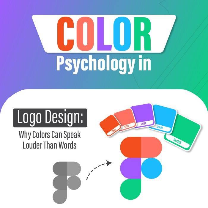
Have you ever stopped to think about just how much power a little bit of color holds? No, we’re not talking about the magic of a rainbow or the allure of a vibrant sunset. We’re talking about the impact of color in logo design. That’s right, those seemingly innocent hues have the potential to make or break a brand’s image faster than you can say “roy G. biv”. So buckle up, folks, because we’re about to take a colorful journey through the world of logo design and decode the mysterious influence of the rainbow on your favorite brands.
Primary Colors and Brand Identity
When it comes to creating a strong brand identity, choosing the right primary colors is crucial. Your brand colors can say a lot about who you are as a company, so it’s important to make sure they embody your personality and values.
Think of primary colors as your brand’s superhero squad – bold, powerful, and ready to save the day (or at least attract some loyal customers). Whether you opt for the classic primary colors of red, blue, and yellow, or mix things up with a more unconventional palette, your choices will leave a lasting impression on your audience.
Red is like the captain of the team – commanding attention and exuding confidence. Blue is the loyal sidekick, trustworthy and dependable. And yellow? Well, yellow is the quirky comic relief, injecting some fun and playfulness into your brand.
Remember, your primary colors aren’t just for show – they should be reflected across all aspects of your brand, from your logo and website to your marketing materials. Consistency is key, so make sure your colors are always on brand and working together harmoniously to create a cohesive identity.
Psychological Associations with Color Choices
When it comes to color choices, our subconscious minds are working overtime without us even realizing it. Different colors can evoke different emotions and psychological associations, guiding us to pick the perfect shade for our moods and personalities.
Here are some fun to keep in mind next time you’re painting your walls or picking out a new outfit:
- Red: This fiery color is associated with passion, energy, and love. It can raise your heart rate and make you feel more alert and alive. Be careful though, too much red can also evoke feelings of anger and aggression.
- Blue: The color of calm and tranquility, blue is often associated with stability and trust. It’s no wonder it’s a popular choice for bedrooms and offices where relaxation and focus are key.
- Yellow: Yellow is the color of happiness and optimism. It can boost your mood and energy levels, making it a great choice for kitchens and living rooms where you want to create a positive and sunny atmosphere.

Cultural Impact on Logo Design
When it comes to logo design, cultural influences play a huge role in shaping the way we perceive and interpret different brands. From traditional symbols to modern trends, here are some fun ways culture impacts logo design:
Incorporating symbolism and mythology from different cultures can add depth and meaning to a logo. For example, using a lotus flower in a logo can convey purity or enlightenment, while incorporating a dragon might symbolize power and strength.
Color psychology is another aspect of . Different cultures associate different meanings with colors – for instance, in Western cultures, red can symbolize passion or danger, while in Asian cultures, it often represents good luck and happiness.
Typography can also be heavily influenced by cultural aesthetics. Serif fonts might convey a sense of tradition and history, while sans-serif fonts can feel more modern and sleek. By choosing the right typography, designers can tap into cultural preferences and create a logo that resonates with a specific audience.

Choosing Colors for Target Audience
So, you’ve decided to tackle the daunting task of choosing colors for your target audience. Congratulations! You’re about to embark on a journey that will determine the success (or failure) of your marketing efforts. No pressure, right?
Let’s start by addressing the elephant in the room: your target audience. Who are these mystical beings that you’re trying to captivate with your color choices? Are they millennials who can’t get enough of avocado toast and rose gold? Or maybe they’re Gen Xers who still haven’t recovered from the trauma of the Y2K bug. Whoever they are, you need to figure out their likes and dislikes before you can even think about selecting colors for them.
Once you’ve got a handle on your target audience, it’s time to delve into the world of color psychology. Yes, that’s right – colors have the power to evoke all kinds of emotions and reactions in people. It’s like magic, but with less rabbits and more rainbows. Do some research on what different colors symbolize and how they can influence behavior. For example, did you know that red can increase appetite? Maybe that’s why McDonald’s decided to go with those golden arches.
Now that you’ve armed yourself with knowledge about your target audience and color psychology, it’s time to put that information to good use. Consider what emotions you want to evoke in your audience and choose colors accordingly. Maybe you want to inspire trust with a calming blue, or create a sense of urgency with a vibrant red. The possibilities are endless – just like the number of times you’ll change your mind before settling on the perfect color palette.

Color Combinations for Maximum Impact
Choosing the right color combinations can make or break the impact of your design. Gone are the days of boring black and white – it’s time to embrace the rainbow and all its glory! Here are some bold and eye-catching color combinations that will make your designs stand out from the crowd:
- Red and Green: Who said red and green can only be for Christmas? This bold combo packs a punch and will definitely make a statement.
- Pink and Blue: Embrace your inner unicorn with this magical color combo. It’s fun, bright, and oh-so-pretty!
- Orange and Purple: Who knew opposites attract? This unexpected pairing is sure to turn heads and make your design pop!
So next time you’re stuck in a creative rut, don’t be afraid to experiment with different color combinations. After all, life’s too short for boring designs!
The Science Behind Color Perception
Have you ever wondered why some people see a color as blue while others see it as green? Well, welcome to the wonderful world of color perception! Our eyes and brains play a fascinating game of telephone to interpret the hues that surround us.
One key player in this game is the cone cells in our retinas. These little guys come in three varieties: red cones, green cones, and blue cones. They work together like a dysfunctional family to capture different wavelengths of light and send signals to our brain. But sometimes, just like siblings fighting over the last cookie, these cones can get a little confused.
Our brains also play a huge role in color perception. They take the bits and pieces of information sent by the cone cells and try to piece together the puzzle of what color we’re seeing. So next time you argue with your friend about whether a dress is black and blue or white and gold, just remember – it’s not about what you see, it’s about how your brain interprets it!
FAQs
What role does color play in logo design?
Color in logo design is like the spice in your grandma’s famous stew – it can make or break the dish. Colors have the power to evoke emotions, convey messages, and even shape perceptions of a brand. So yeah, it’s kind of a big deal.
How can different colors impact brand perception?
Oh, let me count the ways! Each color brings its own baggage to the party. Red screams passion and excitement, while blue whispers trust and reliability. Choose wisely, my friends, for the wrong color could send your brand straight into the dumpster fire of mediocrity.
Are there any universal meanings associated with specific colors in logo design?
Oh, absolutely! It’s like a secret language that the whole world understands. Green for growth and nature, purple for luxury and royalty, yellow for joy and sunshine – it’s like a rainbow of symbolism just waiting to be unleashed in your logo design.
How can I choose the right color for my logo?
Well, my dear logo novice, it all comes down to your brand’s personality and message. Are you a bold and fierce lion or a playful and quirky dolphin? Pick colors that reflect who you are and what you stand for. And remember, when in doubt, go with hot pink - it never fails.
Can changing the color of a logo impact a brand’s identity?
Oh, for sure! It’s like giving your logo a fresh new haircut or a fancy facelift. A color change can breathe new life into a brand, attract new customers, and even boost sales. Just don’t go overboard and end up with a neon pink monstrosity – balance is key, my friends.
Any tips for incorporating multiple colors into a logo design?
Ah, the age-old debate of color coordination. Much like trying to match your socks in the morning, it can be a daunting task. But fear not, my friend! Stick to a cohesive color palette, use contrasting hues to create visual interest, and remember – less is often more. Just don’t go full rainbow unicorn on us, okay
Color Me Impressed!
Thanks for exploring the colorful world of logo design with us! Remember, the next time you see a logo, take a moment to decipher the impact of its colors. After all, in the world of design, every shade has a story to tell. Stay vibrant and keep on coloring outside the lines!


