In a world dominated by logos, where every brand is vying for attention like a pack of seagulls fighting over a French fry, it’s crucial for companies to have dynamic logos that can stand out in the sea of mediocrity. A logo isn’t just a pretty picture; it’s a badge of honor, a sign of strength, a symbol of success. So buckle up, buttercup, because we’re about to dive deep into the wild and wonderful world of unlocking brand power through the magic of dynamic logos. Hold onto your hats, folks, because we’re about to take your brand on a wild ride through the logo jungle. Let’s get wild and logo-tastic, shall we
The Evolution of Brand Identity through Logos
Logos have come a long way since the days of yore when businesses simply slapped their name on a sign and called it a day. Today, brand identity is all about creating a logo that speaks volumes without saying a word.
From the simple black and white designs of yesteryear to the flashy, 3D creations of today, logos have evolved in ways we never could have imagined. It’s like they’ve gone through a chameleon-like transformation, changing colors and shapes to meet the ever-evolving demands of consumers.
Just take a look at the evolution of the McDonald’s logo, from the retro golden arches to the modern, minimalist design we all know and love. It’s like they went from “welcome to the 60s” to “hello, future!” in the blink of an eye.
- Logos have gone from basic to bold, from subtle to striking.
- They’ve evolved from static to dynamic, from flat to fabulous.
- And they’ve transformed from forgettable to iconic, from meh to memorable.
So next time you see a logo, take a moment to appreciate the journey it’s been on. Who knows, maybe someday your own brand’s logo will be the talk of the town!
Key Elements of a Dynamic Logo Design
So, you want a logo that’s as dynamic as a superhero on a sugar rush? Well, you’re in luck because we’ve got the keys to designing one that will make heads turn faster than a speeding bullet!
First things first, your logo needs to be simple yet memorable. Think of it like a catchy jingle – you want people to remember it without even realizing they’ve stored it in their brains. Keep it clean, keep it sleek, keep it iconic.
Next up, colors are your best friends when it comes to making a logo pop. Think of them as the spice to your design dish – a little goes a long way, but too much can leave a bad taste in your audience’s mouth. Choose a palette that reflects your brand’s personality and makes it stand out in a sea of bland logos.
And lastly, make sure your logo is versatile and scalable. You never know where you’ll need to slap that bad boy – from billboards to business cards, your logo needs to be able to look good no matter what size it is. So, keep it flexible, keep it adaptable, and watch your brand soar to new heights!

The Psychological Impact of Logos on Consumer Behavior
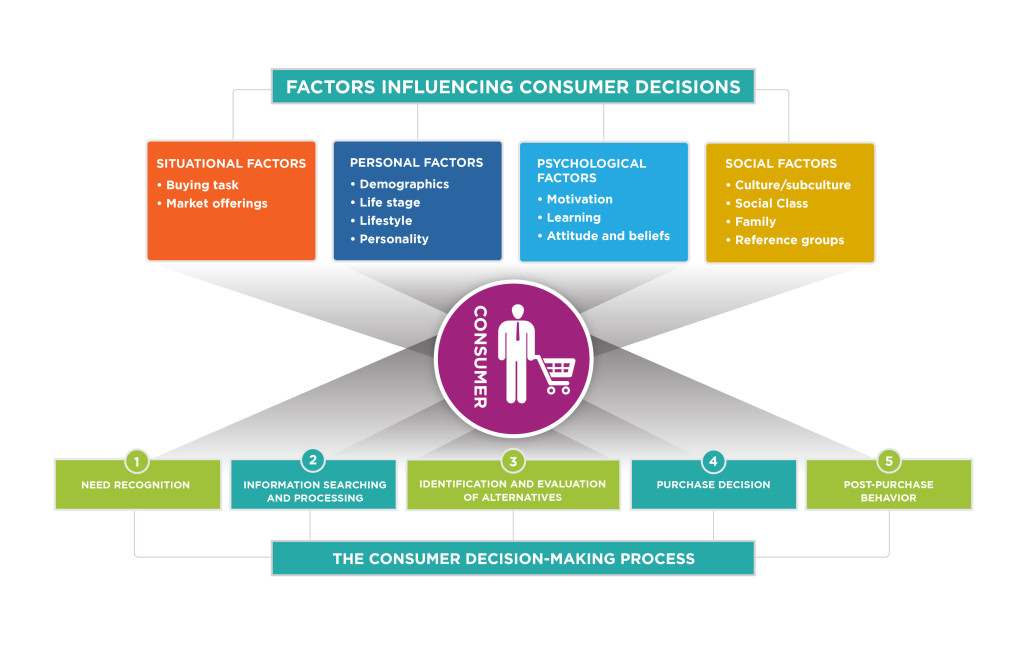
Logos are like mind ninjas, sneaking into our brains and influencing our every consumer decision without us even realizing it. These little design elements have the power to evoke emotions, memories, and desires that can make or break a sale faster than you can say “brand loyalty”.
From the hypnotic allure of the golden arches to the soothing comfort of the Starbucks mermaid, logos have a way of tapping into our deepest psychological desires and manipulating us into buying things we never knew we needed. It’s like they have a direct line to our subconscious, whispering sweet nothings about luxury, status, and self-worth.
But beware, not all logos are created equal. Some are deceptively simple, like the Nike swoosh, while others are more complex, like the intricate swirls of the Coca-Cola logo. Each design element is carefully crafted to trigger a specific response in our lizard brains, making us feel like we absolutely must have that new iPhone or designer handbag.
So next time you find yourself mindlessly reaching for that product with the flashy logo, remember that you’re not just buying a thing – you’re buying into a carefully constructed illusion of happiness and fulfillment. But hey, at least you’ll look stylish while doing it.

How to Create a Memorable Logo that Stands Out
When it comes to creating a logo that truly stands out, there are a few key things to keep in mind. First and foremost, you want your logo to be memorable – something that will stick in people’s minds long after they’ve seen it. One way to achieve this is by ensuring your logo is simple and easy to recognize. Think of some of the most iconic logos out there – Apple, Nike, McDonald’s – they all have one thing in common: simplicity.
Another important factor in creating a memorable logo is choosing colors wisely. Colors have the power to evoke emotions and can play a big role in how your logo is perceived. Consider the psychology of colors when selecting a color palette for your logo. For example, red can convey excitement and energy, while blue is often associated with trust and reliability.
It’s also crucial to make sure your logo is versatile and can be easily resized without losing its impact. This will ensure that your logo looks great on a variety of platforms, from business cards to billboards. And last but not least, don’t be afraid to inject some personality into your logo – after all, you want it to stand out from the crowd!

The Role of Logos in Establishing Brand Recognition
Logos are like the signature outfits of brands – they help them stand out in a crowded room full of competitors. Think of them as the superhero capes that make brands instantly recognizable. Whether it’s the swoosh of Nike or the apple of Apple, logos play a crucial role in establishing brand recognition.
Have you ever walked down the street and instantly knew which brand a store belonged to, just by catching a glimpse of their logo? That’s the power of a well-designed logo. It’s like a secret handshake, a nod of acknowledgment that says, “Hey, I know you!”
When it comes to brand recognition, logos are the unsung heroes. They work tirelessly behind the scenes, making sure that customers can easily identify and remember a brand. Just imagine a world without logos – it would be like a movie without end credits, leaving you wondering, ”Wait, who was that again?”
So, next time you see a logo, give it a little nod of appreciation. After all, it’s not easy being the face of a brand, but someone’s got to do it. And logos do it with style, flair, and a whole lot of personality.
Strategies for Updating and Refreshing Your Brand Logo
So, you’ve come to the realization that your brand logo is looking a bit outdated and in need of a facelift. Fear not, my friend! We’ve got some killer strategies that will have your logo looking fresher than ever.
First off, let’s talk about incorporating some modern design elements into your logo. Think clean lines, bold colors, and maybe even a touch of minimalism. You want your logo to stand out from the crowd, not get lost in a sea of outdated designs. Consider using bold typography or a sleek icon to give your logo that WOW factor.
Next, why not take a trip down memory lane and see if there are any elements from your original logo that can be updated or reimagined. Maybe there’s a hidden gem buried in that dated design just waiting to be brought back to life. Don’t be afraid to play around with different variations until you find the perfect blend of old and new.
And finally, don’t forget to gather feedback from your audience. After all, they’re the ones who will be seeing your logo day in and day out. So, whether it’s through focus groups, surveys, or just good old-fashioned social media polls, make sure to get input from the people who matter most. Who knows, you might just stumble upon a genius idea that never would have crossed your mind otherwise!
Maximizing Brand Power through Consistent Logo Usage
Consistency is key when it comes to maximizing your brand power through logo usage. Think of your logo as your brand’s trusty sidekick, always there to save the day and make a lasting impression on your audience.
Whether you’re slapping your logo on a billboard, a business card, or a social media post, make sure it looks the same every time. Uniformity is your best friend in the world of branding!
Remember, your logo is like your brand’s costume – you wouldn’t see Batman running around in a Superman suit, would you? Keep your logo front and center, and your brand will be instantly recognizable, just like a famous celebrity on the red carpet.
So, repeat after me: “I solemnly swear to always use my logo consistently and never let it slouch or fade into the background.” Your brand will thank you for it, and you’ll be one step closer to world domination – I mean, brand success!
FAQs
What makes a dynamic logo different from a static one?
Think of a dynamic logo as a chameleon on caffeine. It changes, morphs, and adapts to its environment like a master of disguise. A static logo is more like a grumpy old grandpa who refuses to change his ways.
Why is it important for a brand to have a dynamic logo?
A dynamic logo is like a secret weapon in a brand’s arsenal. It can flex, twist, and turn to match the ever-changing trends and tastes of its audience. Plus, it keeps things fresh and exciting, like a magician pulling rabbits out of a hat.
How can a dynamic logo help a brand stand out in a crowded market?
Imagine a sea of boring, cookie-cutter logos floating aimlessly in a vast ocean of monotony. Now picture your dynamic logo swooping in like a majestic eagle, soaring above the competition and capturing the attention of all who gaze upon it. You do the math.
What are some examples of successful brands with dynamic logos?
Take a look at companies like Google, MTV, and Starbucks. Their logos are like shape-shifters, constantly evolving to stay ahead of the game. It’s like watching a caterpillar transform into a glorious butterfly, but with more coffee and pop culture references.
How can a brand start incorporating dynamic elements into their existing logo?
It’s time to get creative! Think about how your logo can adapt to different seasons, holidays, or special events. Maybe add some animated elements, or experiment with different color schemes. The possibilities are endless, like a blank canvas just waiting for your artistic genius to come alive.
In Conclusion, Let Your Logo Shine Bright!
So there you have it, folks! Your logo is not just a static image – it’s a dynamic powerhouse that holds the key to unlocking your brand’s full potential. So go ahead, let your logo spread its wings, dance a little jig, and show the world what your brand is all about. Remember, a little logo love goes a long way. Stay dynamic, stay fabulous, and watch your brand power soar to new heights!


