
In a world where attention spans are shorter than a goldfish’s memory, creating a memorable logo is more important than ever. With the rise of social media and endless scrolling, your logo needs to be able to catch someone’s eye faster than they can swipe left on a bad date. So how do you create a logo that stands out in the digital era? Buckle up, because we’re about to take you on a wild ride through the wacky world of logo design.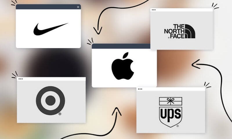
Key Elements of a Strong Logo Design
When it comes to creating a strong logo design, there are a few key elements that you absolutely must include. These elements are what will set your logo apart from the competition and make it memorable to your audience. Here are some important things to keep in mind:
- Simplicity is key: Your logo should be simple and easy to recognize at a glance. Don’t try to cram too many elements or colors into your design, or it will end up looking cluttered and confusing.
- Unique elements: You want your logo to stand out from the crowd, so try to incorporate some unique elements that will make it instantly recognizable. Whether it’s a clever play on words or a quirky illustration, adding something unexpected can really make your logo pop.
- Colors matter: The colors you choose for your logo can have a big impact on how it’s perceived. Make sure to pick colors that not only reflect your brand’s personality, but also work well together and are easy on the eyes.
Remember, a strong logo design is the first step in building a successful brand, so take the time to get it right. By focusing on simplicity, uniqueness, and color choices, you’ll be well on your way to creating a logo that stands out from the rest.

Understanding Brand Identity and Audience
So, you’ve got a brand, but do you really know who your audience is? I mean, sure, you may think you know them, but do you really know them? Here are a few tips to help you really understand your brand identity and audience:
- Get inside their heads: No, not literally… that would be creepy. But you need to really think about what makes your audience tick. What do they love? What do they hate? What are their hopes and dreams?
- Do your research: Don’t just assume you know everything about your audience. Actually talk to them! Get their feedback, conduct surveys, stalk them on social media… okay, maybe not that last one. But you get the idea.
- Be consistent: Your brand identity should be like a good cup of coffee – strong, consistent, and leaves a lasting impression. Make sure your brand voice, imagery, and messaging all align with your audience’s preferences.
Remember, understanding your brand identity and audience is like being a detective – you need to piece together clues, uncover hidden truths, and maybe even wear a cool fedora. So put on your thinking cap (or fedora) and get to work!
Incorporating Simplicity and Versatility
When it comes to into your life, there are a few key things to keep in mind. First and foremost, simplicity is all about cutting out the unnecessary clutter and focusing on what truly brings you joy. That means saying goodbye to that drawer full of mismatched socks and hello to a minimalist wardrobe that screams style and sophistication.
Next, versatility is key. You want pieces in your life that can easily transition from day to night, work to play, and everything in between. Think of your favorite pair of black leggings – they’re perfect for hitting the gym, running errands, or dressing up with a cute top and heels for a night out on the town. Who knew a single piece of clothing could be so versatile?
So, embrace simplicity and versatility in every aspect of your life – from your wardrobe to your home décor to your daily routine. Keep only what you love and use frequently, and don’t be afraid to mix and match to create new and exciting combinations. Remember, the key to a happy and fulfilled life is keeping things simple and versatile. Who knew it could be so easy?

Utilizing Color Psychology for Impact
Color psychology is a powerful tool that can be used to make a big impact without saying a single word. Imagine walking into a room painted entirely in bold, vibrant red – you can practically feel the energy and passion vibrating off the walls. Or, on the flip side, picture a serene, calming blue painted bedroom that instantly makes you want to curl up and take a nap. That’s the power of color!
So, how can you utilize color psychology to create the impact you desire? Here are a few tips:
- Consider the emotions you want to evoke: Different colors evoke different emotions. For example, red is often associated with passion and energy, while green is calming and promotes feelings of growth and abundance.
- Use contrasting colors for maximum impact: Pairing contrasting colors can create a visually striking effect. Think about the classic combination of black and white – it’s timeless for a reason!
- Don’t be afraid to experiment: Color is all about personal preference, so don’t be afraid to step outside your comfort zone. Who knows, that neon pink accent wall might be just what your living room needs!
Remember, color is a powerful tool that can completely transform a space and evoke a wide range of emotions. So, next time you’re redecorating or planning an event, think about the impact you want to make and choose your colors wisely!
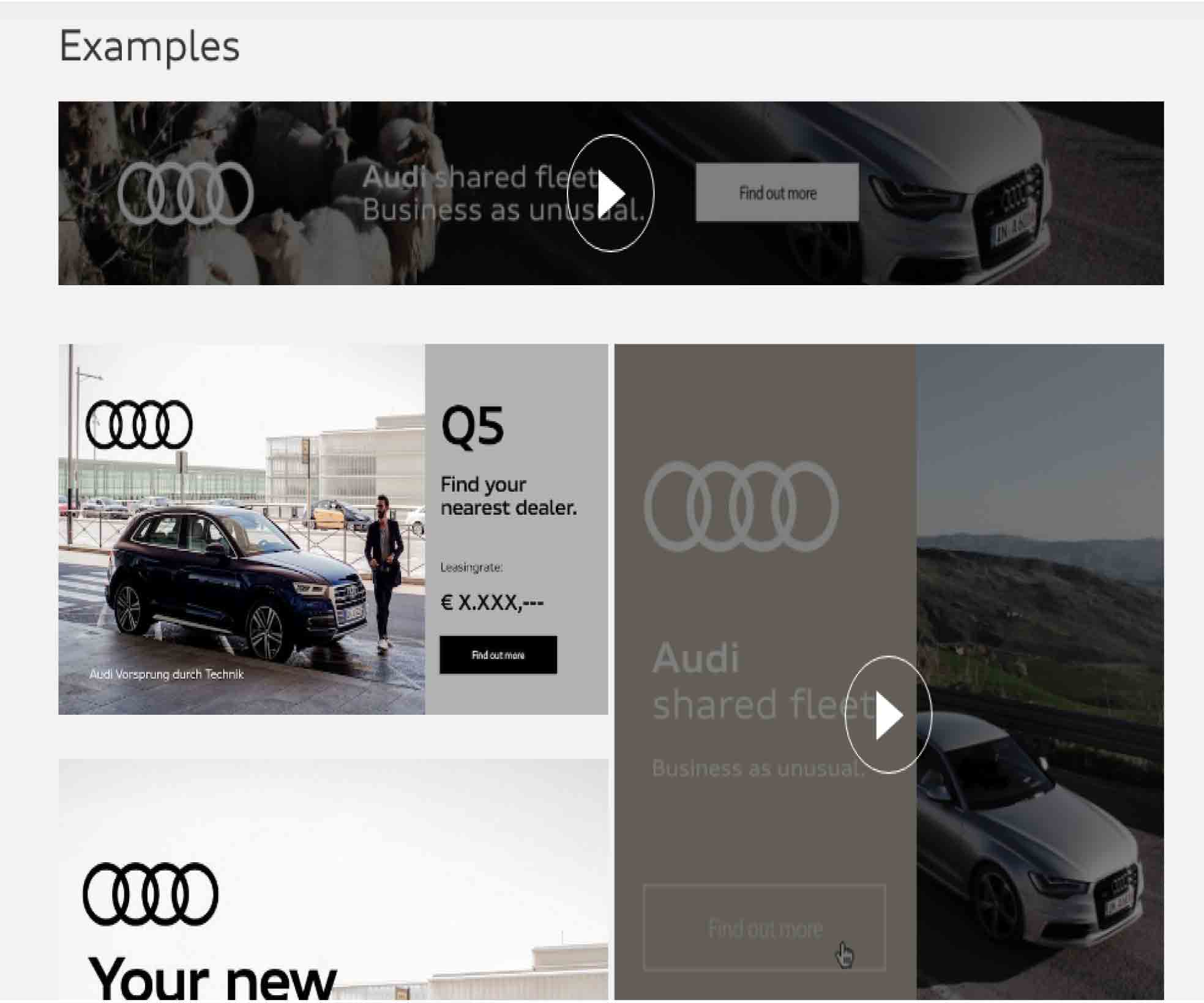
Adapting Logos for Different Digital Platforms and Sizes
When it comes to , it’s important to remember that one size does not fit all. Each platform has its own unique dimensions and requirements, which means your logo may need to undergo a few makeovers to look its best everywhere it goes.
Here are a few tips to keep in mind when resizing your logo for different digital platforms:
- Keep it simple: Remember, your logo may need to be scaled down to fit on a tiny mobile screen or blown up to fill a billboard. Make sure your design is clean and easy to read at any size.
- Consider different formats: Some platforms may require a transparent background or a specific file type. Be prepared to save your logo in various formats to ensure it looks its best wherever it goes.
- Test it out: Before you upload your logo to a new platform, make sure to test it out on different devices to ensure it’s legible and looks good on every screen size.
By following these tips and tricks, you can ensure that your logo looks great no matter where it goes in the digital world. So go ahead, resize, reformat, and adapt your logo with confidence!
Implementing Timeless Design Principles
When it comes to , there are a few key things to keep in mind to ensure your space stands the test of time.
First and foremost, focus on incorporating classic elements that will never go out of style. Think clean lines, neutral colors, and simple shapes. Avoid trendy patterns and bold colors that may quickly become outdated.
Another important aspect to consider is the use of quality materials. Opt for durable fabrics, timeless finishes, and solid construction. Investing in well-made pieces will not only look great now but will also last for years to come.
Lastly, don’t be afraid to mix old and new. Incorporating antiques or vintage pieces into a modern space adds character and depth. Balance is key, so be sure to blend classic and contemporary elements seamlessly for a cohesive and timeless look.
Testing and Iterating for Optimal Results
So you think you’ve got the perfect solution right out of the gate, huh? What are you, some kind of genius? Well, guess what? Nobody’s perfect, not even you. That’s why it’s important to constantly test and iterate to achieve optimal results.
Let me break it down for you in simple terms. Testing is like trying out different flavors of ice cream until you find your favorite. You wouldn’t just settle for vanilla when there’s a whole world of flavors out there waiting to be explored. So why settle for your first idea when there’s always room for improvement?
And iterating? It’s like going back to the drawing board and putting on your thinking cap to make things even better. Sure, it might take a little extra time and effort, but trust me, it’ll be worth it in the end. Think of it as adding sprinkles and whipped cream to your already delicious sundae.
Remember, Rome wasn’t built in a day, and your perfect solution won’t be either. Embrace the process, embrace the failures, and most importantly, embrace the ice cream. Because at the end of the day, testing and iterating will lead you to the sweet taste of success.
FAQs
Why is it important to create a memorable logo for the digital era?
Creating a memorable logo for the digital era is important because in this age of short attention spans and constant scrolling, you need something that will grab your audience’s attention and stick in their minds like gum on a shoe.
What are some key elements to consider when designing a logo for the digital era?
When designing a logo for the digital era, you need to think about how it will look across different platforms and devices. Make sure it’s versatile, scalable, and looks just as good on a phone screen as it does on a billboard.
How can color choice impact the effectiveness of a logo in the digital era?
Color choice is crucial when it comes to creating a memorable logo for the digital era. Different colors evoke different emotions and can help your logo stand out in a sea of blandness. Just make sure to steer clear of neon pink unless you want to blind your audience.
What role does simplicity play in creating a memorable logo for the digital era?
Simplicity is key when it comes to creating a memorable logo for the digital era. You want something that is easy to recognize and remember, not a hot mess of gradients, drop shadows, and clip art that looks like it was designed by a toddler hopped up on sugar.
How can a business ensure their logo stands the test of time in the ever-evolving digital world?
To ensure your logo stands the test of time in the ever-evolving digital world, focus on creating a timeless design that isn’t tied to any passing fads or trends. Think of it like a fine wine or a good cheese – it only gets better with age (unlike your Aunt Mildred’s meatloaf).
In Conclusion: Stand Out in the Digital Crowd!
Thank you for embarking on this logo design adventure with us! Remember, when it comes to creating memorable logos for the digital era, thinking outside the box is key. So go forth, unleash your creativity, and make your mark in the vast digital landscape. Your brand deserves to stand out like a disco ball at a black-tie event. Happy designing!


