Welcome to the magical world of color psychology, where the hues of the rainbow hold the key to unlocking the secrets of the human mind – and more importantly, the success of your logo design! Get ready to dive headfirst into a kaleidoscope of creativity as we explore how different colors can evoke emotions, convey messages, and ultimately make your logo pop like a disco ball at a 70s dance party. So grab your paintbrushes and buckle up, because this is going to be one colorful ride!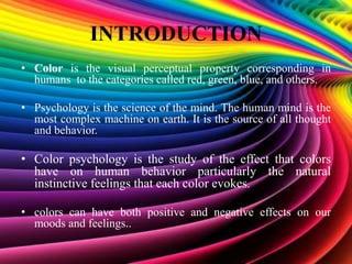
Understanding the Basics of Color Psychology
Color psychology is a fascinating field that explores how different colors can affect our emotions and behavior. To truly understand color psychology, we must first grasp the basics. Here are some key points you need to know:
– **Color Associations:** Different colors can evoke different emotions and associations. For example, red is often associated with passion and energy, while blue is seen as calming and trustworthy. It’s important to consider these associations when choosing colors for your website, logo, or even your outfit.
– **The Power of Color Combinations:** While individual colors can have their own meanings, the way they are combined can also have a significant impact. Complementary colors (those opposite on the color wheel) can create a vibrant and dynamic look, while analogous colors (those next to each other on the wheel) can create a more harmonious and soothing effect.
– **Cultural Influences:** Keep in mind that the meaning of colors can vary across different cultures. For example, in Western cultures, white is often associated with purity and innocence, while in some Asian cultures it is associated with mourning. Make sure to consider the cultural context when choosing colors for a global audience.
By understanding these basics of color psychology, you can harness the power of color to create the desired emotional impact in your designs and marketing materials. So next time you’re choosing a color scheme, don’t just go with your favorite color – think about the message you want to convey and choose your colors wisely!
The Impact of Color on Consumer Perception
Consumers are often swayed by the power of color more than they realize. The choice of colors in marketing can greatly influence perception, emotion, and even purchasing decisions – who knew picking the right shade of blue could make or break a sale?
Here are a few fun facts about how color can impact consumer perception:
- Red: This sizzling hue is known to grab attention and create a sense of urgency. That’s why it’s often used in clearance sales – because who can resist a good bargain, especially when it’s in bold red?
- Green: Calming and reassuring, green is often associated with nature and eco-friendliness. No wonder organic and sustainable brands gravitate towards this hue like bees to honey.
So next time you’re brainstorming a marketing campaign, don’t just pick colors willy-nilly. Take a minute to think about – it might just be the secret ingredient you need to make your brand stand out in a sea of competition!

Choosing the Right Colors for Your Brand Identity
When it comes to , it’s not all black and white. In fact, there’s a whole rainbow of options to consider! Here are a few tips to help you pick the perfect palette:
- Consider your target audience: Are you catering to serious professionals or fun-loving millennials? Different colors evoke different emotions, so make sure your palette resonates with your target market.
- Look at the competition: You don’t want to blend in with the crowd, but you also don’t want to stick out like a sore thumb. Find a balance between standing out and fitting in with your industry.
- Think about longevity: Sure, neon green might be trendy now, but will it still be cool in a year? Choose colors that will stand the test of time and won’t make your brand look dated.
Ultimately, the right colors for your brand identity should reflect who you are as a company and what you stand for. So don’t be afraid to get creative and think outside the box (or outside the CMYK color gamut, for all you design nerds out there). After all, when it comes to colors, the sky’s the limit!

Utilizing Color Psychology in Logo Design
When it comes to designing a logo, color psychology can play a huge role in how people perceive your brand. Different colors evoke different emotions and reactions, so it’s important to choose your colors wisely!
Red: This color is commonly associated with energy, passion, and action. It can create a sense of urgency or excitement, making it a great choice for brands that want to stand out. Just be careful not to overdo it, or your customers might start feeling a little too energized!
Blue: Cool, calm, and collected, blue is a popular choice for brands that want to convey trustworthiness and professionalism. It’s also said to promote a sense of security and reliability, which is great for businesses looking to build long-lasting relationships with their customers.
Yellow: Bright and cheerful, yellow is often associated with positivity and optimism. It can help your brand stand out and grab attention, but be careful not to use too much yellow or you might end up overwhelming your audience with all that sunshine!
Creating Emotional Connections Through Color
Have you ever looked at a painting and felt an overwhelming surge of emotions wash over you? It’s like the artist reached deep into your soul and plucked out all your feelings, leaving you both terrified and exhilarated at the same time. Well, my friends, that’s the power of color. It can make you laugh, cry, or even question your entire existence. And let me tell you, it’s a wild ride.
So, how exactly do colors have this mind-bending effect on us mere mortals? It’s all about the vibes, man. Each color has its own unique personality, its own quirks and charms that make it stand out in a crowd. When you mix and match them just right, you create a symphony of emotions that can rival even the best tear-jerker movie. It’s like playing with fire, only instead of burning your eyebrows off, you’re burning a hole straight through your heart.
Picture this: a deep, rich shade of red that whispers sweet nothings in your ear, telling you everything will be okay. Or a vibrant yellow that screams at you to seize the day and live life to the fullest. And let’s not forget about the calming embrace of a soft, muted blue that lulls you into a sense of serenity. These colors aren’t just random blobs on a canvas – they’re emotional ninjas, stealthily sneaking into your brain and hijacking your feelings.
So, the next time you find yourself staring at a piece of art, take a moment to really soak in the colors. Let them wash over you like a wave crashing on the shore, pulling you deeper and deeper into their kaleidoscope world. Who knows, you might just discover a new part of yourself you never knew existed. Or you might just end up with a killer headache. Either way, it’s all in the name of art, baby.
How Different Colors Evoke Specific Emotions
Have you ever looked at a color and felt an overwhelming sense of joy or sadness? Well, that’s because different colors have the power to evoke specific emotions within us. It’s like magic, but without the wand-waving and spell-casting.
Think about it - when you see a bright red fire truck zooming by, you can’t help but feel a sense of urgency and excitement. That’s because red is associated with passion, power, and energy. It’s the color of love and war, so it’s no wonder it gets our hearts racing.
On the other hand, blue is the color of calm and tranquility. When you gaze at a peaceful ocean or a clear blue sky, you can’t help but feel a sense of serenity wash over you. Blue is all about stability, trust, and peace – it’s like a big, warm hug for your soul.
And let’s not forget about green – the color of nature and growth. When you’re surrounded by lush greenery, you can feel a sense of renewal and hope washing over you. Green is all about balance, harmony, and freshness - it’s like a breath of fresh air for your mind and body.
The Science Behind Color Selection in Logo Design
Choosing the right colors for a logo isn’t just about picking your favorite shade of blue or green. There’s actually a whole science behind color selection in logo design that can greatly impact how people perceive your brand. Here are some fun facts to consider:
- Red: This color is associated with energy, passion, and action. It can evoke feelings of excitement and urgency, making it a popular choice for companies in the food and entertainment industries.
- Blue: Calm, trust, and stability are the feelings often associated with blue. It’s a great choice for corporate logos or tech companies looking to exude professionalism.
When it comes to color combinations, it’s important to think about how certain colors work together to create a cohesive look. For example, complementary colors can create a dynamic contrast that catches the eye, while analogous colors can create a harmonious and calming effect. So, next time you’re designing a logo, think about how different colors can work together to convey the right message to your audience.
Remember, at the end of the day, color is all about how it makes people feel. So choose your logo’s colors wisely, and watch as your brand comes to life in vibrant hues that speak to your target audience.
FAQs
How can color psychology impact consumer perception of a brand through logo design?
Well, dear reader, let me tell you – colors can influence emotions, trigger specific reactions, and convey messages without saying a word! Choosing the right colors for your logo can create a certain mood or feeling that resonates with your target audience, ultimately shaping how they perceive your brand. It’s like magic, but with science.
Are there specific colors that are universally associated with certain emotions or traits?
Absolutely! For example, red is often associated with passion, excitement, and energy, while blue is linked to trust, reliability, and calmness. Green might make people think of growth, harmony, or eco-friendliness, while purple exudes luxury, creativity, and sophistication. It’s like your logo is speaking a secret language to your customers - and they’re loving it!
Can using the wrong colors in a logo design have a negative impact on a brand?
Oh, most definitely! Picture this: you’re trying to convey a sense of tranquility and trustworthiness, but your logo screams boldness and aggression. Your poor customers will be left feeling confused, like mixing up salt and sugar in a recipe – it just doesn’t taste right. So, choose your colors wisely, my friend, to avoid sending mixed signals to your audience.
How can smaller businesses with limited resources use color psychology effectively in their logo design?
Ah, the age-old question! Don’t fret, my fellow small business owner, for there are ways to harness the power of color psychology on a budget. Consider starting with one or two key colors that align with your brand personality and target audience. Remember, simplicity can be just as impactful as complexity – kind of like a single brushstroke that captures the essence of your brand. Embrace the power of color, my friend, and watch your logo work its magic!
Color Your World with Logo Design
Color psychology isn’t just for hippies and art majors anymore – it’s a powerful tool that can elevate your logo design game to new heights. So next time you’re staring blankly at a color wheel, just remember: the right hue could be the key to unlocking the hearts and wallets of your audience. So go forth, brave designer, and paint the town red, blue, or whatever color your heart desires. Your logo will thank you for it!


