Have you ever wondered why certain logos make you feel confident and ready to conquer the world, while others leave you feeling as blue as a sad emoji? Well, it’s time to shake off that design confusion and dive into the colorful world of logo psychology. Get ready to unravel the mysterious powers of color and discover how they can make or break a logo design faster than you can say, “Where’s my Pantone chart?” Let’s decode the hues and cries of logo design, one shade at a time.
The Impact of Color in Logo Design
When it comes to logo design, color is like the secret sauce that takes your brand from bland to bam! The impact of color cannot be understated, as it plays a huge role in shaping how your brand is perceived by the world. Here’s a rundown of some key ways that color influences logo design:
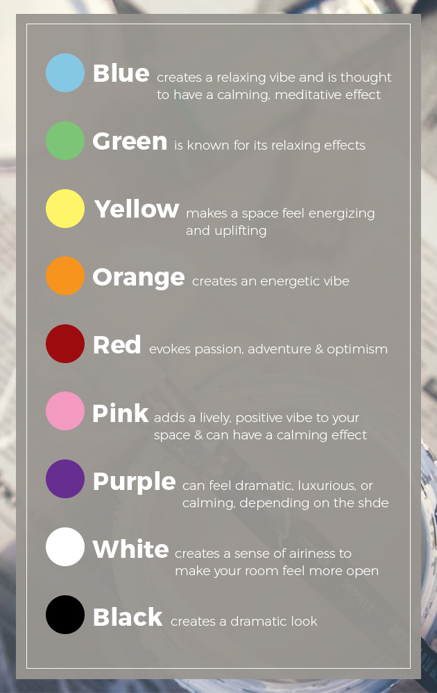
First off, let’s talk about psychology. Each color carries its own set of meanings and associations, which can evoke different emotions and responses from viewers. For example:
- Red: Bold, passionate, and attention-grabbing. Just like that fiery ex you can’t seem to get over.
- Blue: Calm, trustworthy, and dependable. Like that friend who always has your back, no matter what.
- Yellow: Cheerful, optimistic, and energetic. Basically, the human embodiment of a puppy.
Next up, we have brand identity. The colors you choose for your logo can have a big impact on how your brand is perceived by consumers. Think about it: would McDonald’s still be the same if their logo was black and white? (Spoiler alert: nope. You’d probably just drive right past it on the highway without a second thought.)
And last but not least, we have visual appeal. Let’s face it – no one wants to look at a logo that’s as exciting as watching paint dry. The right color combination can make your logo pop and stand out from the competition, like a neon sign in a sea of boring beige billboards.

Understanding Color Psychology
Color psychology is a fascinating field that explores how different colors can affect our thoughts, emotions, and behavior. From calming blues to energizing yellows, each color has its own unique impact on our psyche. Let’s dive into the colorful world of color psychology and discover the hidden meanings behind our favorite hues.
Did you know that the color red is often associated with passion, power, and energy? It’s no wonder that red is a popular choice for fast-food logos and sports cars. Meanwhile, cool tones like blue and green are known for their calming and soothing effects. They’re like a zen garden for your eyes!
Yellow is the life of the party, with its cheerful and optimistic vibes. Just one look at a sunny yellow room and you can’t help but smile. On the other hand, black is the mysterious bad boy of the color wheel, representing sophistication and elegance. It’s like the James Bond of colors, always looking sharp in a tuxedo.
So whether you’re feeling blue, seeing red, or painting the town yellow, remember that colors have a lot more to say than meets the eye. From setting the mood in your home to influencing consumer choices in marketing, the psychology of color is everywhere. So next time you’re picking out paint swatches or designing a logo, think about the message you want to send with your color choices. And remember, there’s more to color than meets the eye!

Choosing the Right Colors for Your Brand
When it comes to choosing the perfect colors for your brand, it’s important to pick ones that truly represent your company’s personality and values. Remember, you want your colors to be memorable and eye-catching!
Here are some tips to help you select the right colors:
- Consider your target audience. Are they more drawn to bright, bold colors or subtle, muted tones?
- Think about your competitors. You don’t want to pick the same colors as everyone else in your industry!
- Take into account the psychology of color. Different colors evoke different emotions, so choose ones that resonate with your brand’s message.
Now, let’s talk about the actual colors themselves. Are you a fun and playful brand? Go for vibrant hues like hot pink or electric blue. If you’re more sophisticated and elegant, opt for timeless shades like navy or charcoal gray.

The Emotional Influence of Different Colors
Have you ever wondered why certain colors evoke specific emotions? Let’s dive into the fascinating world of color psychology and explore how different shades can influence our moods, feelings, and even our behavior.
Hold onto your hats, folks, because we’re about to take a wild rollercoaster ride through the rainbow of emotions! From the fiery passion of red to the calming tranquility of blue, each color has its own unique way of tugging at our heartstrings and sparking all kinds of feelings.
So, grab your paintbrushes and let’s paint the town red, green, blue, and every color in between! Remember, it’s not just about how your walls look – it’s about how they make you feel. Let’s shake things up and inject some color into our lives. Who knew that a simple coat of paint could have such a profound impact on our emotional well-being?
So, the next time you’re feeling blue, why not surround yourself with some vibrant yellows and oranges to lift your spirits? Or if you’re feeling overwhelmed, maybe a touch of calming green or soothing purple is just what the doctor ordered. Let’s embrace the emotional power of color and unleash its magic in our lives. After all, who says you can’t paint your world with a little bit of sunshine and rainbows? Let’s color outside the lines and make our lives a masterpiece!

How Color Combination Can Affect Perception
Color combinations are a powerful tool that can influence how we perceive things in our environment. From the hues of a sunset to the colors of a brand logo, the way colors interact can make a big impact on our mood and feelings. Have you ever noticed how a splash of red in your living room can make you feel energized, while a calming blue in your bedroom helps you relax?
When it comes to perception, the right color combination can make all the difference. Imagine walking into a room painted in a chaotic mishmash of clashing colors – it would be like a visual assault on your senses! On the other hand, a well-thought-out palette of complementary colors can create a harmonious and inviting space.
Think about your favorite outfit – chances are, the colors work together in perfect harmony to make you feel confident and put-together. The same principle applies to everything from websites to product packaging. A well-chosen color combination can attract attention, convey a message, and even influence purchasing decisions.
So next time you’re choosing a color scheme, remember the power of color combinations. Whether you’re trying to create a calming oasis or make a bold statement, the right colors can work wonders on how you and others perceive the world around you.
Using Color to Communicate Your Brand’s Identity
When it comes to branding, color is more than just a pretty face – it’s the key to communicating your brand’s identity loud and proud! Forget about boring black and white – it’s time to paint the town red (or whatever color best represents your brand)!
But before you start slapping colors willy-nilly onto your logo and website, take a step back and think about what message you want to convey. Are you a bold and daring brand that screams “look at me”? Or are you more understated and elegant, whispering “I’m classy and sophisticated”? Whatever your vibe, choose colors that speak to your target audience in a language they understand.
Remember, consistency is key when it comes to color. You don’t want to be the brand that’s a rainbow of chaos – unless that’s exactly what you’re going for! Pick a color palette that reflects your brand’s personality and stick with it like glue. And don’t forget about the emotional connotations of colors – blue for trustworthiness, red for passion, yellow for…well, sunshine, I guess?
So go ahead, get out your paintbrushes and start splashing color all over your brand! Just make sure it’s a masterpiece that speaks volumes about who you are and what you stand for. And remember, when in doubt, just add more glitter – because who doesn’t love a little extra sparkle?
Implementing Color Psychology in Logo Design for Success
Have you ever wondered why some logos make you feel happy and others make you feel anxious? It’s all about color psychology! By using the right colors in your logo design, you can create an emotional connection with your audience and increase your chances of success.
So, how can you implement color psychology in your logo design? Here are a few tips to get you started:
- Understand the basics: Each color has its own unique meaning and can evoke different emotions. For example, blue is often associated with trust and reliability, while red is linked to energy and passion.
- Choose the right colors: Think about the message you want to convey and choose colors that align with that message. If you want to create a sense of calm and peace, consider using greens or blues. If you want to convey excitement and energy, reds and yellows might be the way to go.
- Consider your audience: Different colors can have different meanings in different cultures, so make sure to consider your target audience when choosing colors for your logo. What might be seen as positive in one culture could be seen as negative in another.
Remember, color psychology is just one piece of the puzzle when it comes to logo design, but it can make a big impact on how your brand is perceived. So, get creative with your colors and watch your logo design success soar!
FAQs
Why do different colors evoke different emotions?
Well, you see, colors are like little mood influencers. They have the power to make you feel all warm and fuzzy inside or as if you just saw a ghost. It all boils down to science and psychology – each color triggers certain emotions and associations in our brain. It’s like magic, but with a lot more research behind it.
How can I choose the right colors for my logo design?
Choosing the right colors for your logo is like picking the right outfit for a first date – you want to make a good impression! First, think about what emotions or vibes you want your brand to convey. Then, look into color psychology to see which hues align with those feelings. And don’t forget to consider your target audience - you want to speak their language, even if it’s just with colors.
Can using the wrong colors in my logo design be detrimental to my brand?
Oh, absolutely! Using the wrong colors in your logo design is like showing up to a job interview in pajamas – it’s just not going to work out. Colors have the power to either attract or repel your audience, so you want to make sure you’re sending the right message. You don’t want people thinking your brand is all about doom and gloom when you’re actually the life of the party, right?
Should I consider cultural differences when choosing colors for my logo design?
Absolutely! Just like different cultures have different cuisines and customs, they also have different associations with colors. What might mean luck and prosperity in one culture could mean something completely different in another. So, if you’re thinking of going global with your brand, it’s a good idea to do a little research and make sure your colors don’t accidentally offend or confuse anyone.
Time to Color Outside the Lines
Now that you’ve learned the ins and outs of color psychology in logo design, it’s time to get creative and put your newfound knowledge to use. So go ahead, break out the paintbrushes, experiment with different hues, and unleash your inner Picasso. Who knows, with the power of color psychology on your side, you just might create the next iconic logo that leaves the competition green with envy.


