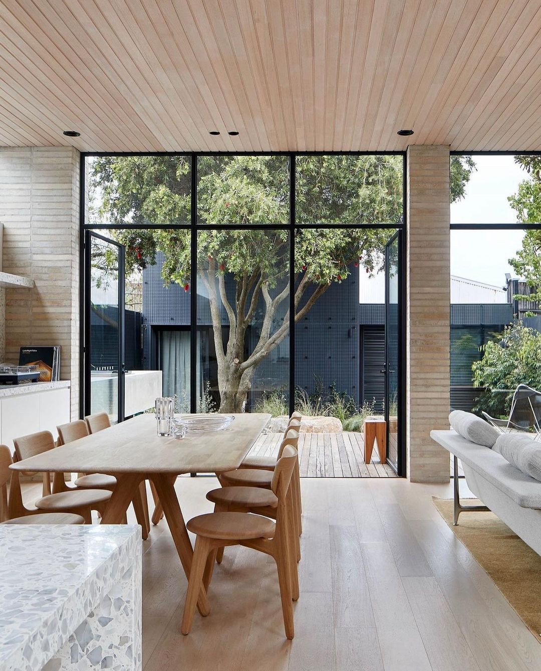
In a world full of logos that look like they’ve been attacked by a pack of over-caffeinated octopuses armed with rainbow paintbrushes, there shines a beacon of simplicity and elegance. Minimalist logo design is like the Marie Kondo of the branding world, decluttering our visual landscapes and sparking joy in our eyes. So grab some popcorn, sit back, and prepare to witness the unveiling of the beauty of minimalist logo design in all its stripped-down glory. Let’s dive into the world of less is more, where even a plain circle can make you go “Ooh la la!” because, hey, sometimes less really is more-ish.
Understanding Minimalist Design
Minimalist design is all about keeping things simple, clean, and clutter-free. It’s like the Marie Kondo of interior design - if it doesn’t spark joy, it’s outta there! Here are some key principles to help you understand minimalism:
- Less is more: In minimalist design, less is definitely more. Say goodbye to unnecessary frills, patterns, and decorations. Embrace clean lines, simple colors, and uncluttered spaces.
- Functionality over form: Minimalist design focuses on functionality rather than aesthetics. Every piece of furniture or decor should serve a purpose and add value to the space.
- Quality over quantity: Instead of filling your space with cheap, disposable items, invest in high-quality, timeless pieces that will stand the test of time.
Remember, minimalist design doesn’t mean living like a monk in an empty room. It’s about creating a peaceful, harmonious environment that allows you to focus on what truly matters. So declutter, simplify, and let go of the things that no longer serve you. Embrace the beauty of less, and you’ll be well on your way to mastering minimalist design.

Simplicity is Key in Logo Design
When it comes to logo design, less is more. Keeping it simple not only makes your logo more visually appealing, but also ensures it’s easily recognizable and memorable. Remember, you want people to look at your logo and think ”Wow, that’s clever!” not “What is that supposed to be?”
Think about some of the most iconic logos out there – Apple, Nike, McDonald’s. What do they all have in common? They’re simple yet instantly recognizable. A cluttered logo is like a bad hair day – no one wants to look at it for too long.
So how do you create a simple yet effective logo? Here are some tips:
- Avoid using too many colors: Stick to a maximum of three colors to keep your logo clean and cohesive.
- Use negative space: Don’t be afraid of empty space – it can be just as impactful as a busy design.
- Think about scalability: Your logo should look just as good on a billboard as it does on a business card. Keep it simple to ensure it’s versatile across different mediums.
Remember, . So next time you’re toying with a new logo concept, ask yourself: is this design sleek and straightforward, or does it look like a toddler’s finger painting? Choose wisely!
The Power of Negative Space
Negative space is the unsung hero of design. It’s like the friend who always lets you shine in the spotlight while they hang back in the shadows. But don’t underestimate – it can make or break a design faster than you can say “white space.”
Imagine negative space as the blank canvas that allows the main elements of a design to pop. It’s like the silent ninja, stealthily guiding your eyes towards the focal point without you even realizing it. So next time you’re feeling overwhelmed by all the clutter in your design, remember to embrace and let it work its magic.
When used effectively, negative space can create a sense of balance and harmony in your design. It’s like the yin to your yang, the peanut butter to your jelly, the avocado to your toast. So don’t be afraid to strip away the excess and let the negative space do its thing – your design will thank you for it.
So here’s to negative space – the unsung hero of design, the silent ninja of the creative world. Embrace it, cherish it, and wield its power with confidence. Who knew that a whole lot of nothing could make such a big impact?

Less is More: Mastering Minimalist Logo Design
So, you’ve decided to jump on the minimalist logo design bandwagon, huh? Good for you! Less is definitely more when it comes to creating a sleek and sophisticated logo that packs a punch without all the bells and whistles.
When it comes to mastering minimalist logo design, there are a few key things to keep in mind:
- Simplicity is Key: Remember, the goal of a minimalist logo is to keep things clean and uncomplicated. Stick to simple shapes, fonts, and colors to convey your message effectively.
- Focus on Negative Space: Sometimes, what you don’t see is just as important as what you do see. Using negative space creatively can add depth and intrigue to your logo design.
- Less Color, More Impact: Don’t get carried away with a rainbow of colors. Stick to a limited color palette to keep your logo classy and timeless.
So there you have it – a crash course in mastering minimalist logo design. Keep it simple, focus on negative space, and remember that less color equals more impact. Now go forth and design your next minimalist masterpiece!

Creating Timeless Logos with Minimalist Principles
When it comes to creating logos that stand the test of time, less is definitely more. By applying minimalist principles, you can ensure that your logo remains relevant and impactful for years to come.
So, how exactly do you go about creating a timeless logo with minimalist flair? Here are a few tips to get you started:
- Simplicity is key: Keep your design clean and uncluttered. Avoid using too many elements or intricate details that can make your logo look dated.
- Stick to a limited color palette: Opt for a simple color scheme that is versatile and easy on the eyes. Remember, timeless logos are often those that can adapt to different contexts and trends.
- Focus on typography: Choose a font that is sleek and modern. Avoid trendy typefaces that can quickly go out of style. Remember, less is more when it comes to typography.
By following these minimalist principles, you can create a logo that not only looks great now but will continue to resonate with your audience for years to come. Remember, timeless design is all about simplicity, elegance, and staying power.
Effective Use of Typography in Minimalist Logos
Typography in minimalist logos can make or break the entire design. Here are a few tips to ensure you’re using typography effectively in your minimalist logo:
First and foremost, keep it simple. Minimalist logos thrive on simplicity, so opt for clean, sans-serif fonts that are easy to read. Avoid overly decorative or ornate fonts that can clutter up your design.
Make sure your typography complements your logo icon. The font you choose should work seamlessly with the other elements in your logo, enhancing the overall look and feel. Think of your typography as the sidekick to your logo icon – they should work together harmoniously.
Consider spacing and alignment. Proper spacing and alignment can make a world of difference in how your typography is perceived. Play around with different spacing options and alignment choices to find the perfect balance for your minimalist logo.
Lastly, don’t be afraid to experiment. Typography is a powerful tool that can completely transform the look and feel of your logo. Try out different fonts, sizes, and styles until you find the perfect combination that truly captures the essence of your brand. Remember, in the world of minimalist logos, less is more – but that doesn’t mean you can’t have a little fun with your typography!
FAQs
Why should companies consider using a minimalist logo design?
Minimalist logo designs are like the little black dress of the design world – they never go out of style. Simple, clean designs have a timeless appeal that can make your brand look sleek and sophisticated. Plus, they’re easier to scale and reproduce, which means your logo will look sharp no matter where you put it.
What are the key elements of a successful minimalist logo design?
When it comes to minimalist logo design, less is definitely more. Focus on using simple shapes, clean lines, and a limited color palette to create a logo that is easy on the eyes and easy to remember. Avoid clutter and unnecessary details – remember, you’re going for sleek and chic, not busy and chaotic.
How can companies ensure that their minimalist logo design stands out?
Just because your logo is minimalist doesn’t mean it has to be boring. Play around with negative space, unique typography, and subtle design elements to give your logo that extra oomph. And remember, a minimalist logo is all about precision and balance, so make sure every element has a purpose and contributes to the overall aesthetic.
What are some examples of successful minimalist logo designs?
There are plenty of iconic minimalist logos out there to draw inspiration from. Think about the golden arches of McDonald’s, the swoosh of Nike, or the apple of… well, Apple. These logos are simple, memorable, and instantly recognizable – proof that sometimes less really is more.
In Conclusion: Embrace the Simplicity!
Congratulations on making it to the end of our exploration into minimalist logo design! Hopefully, you’ve come to appreciate the beauty of simplicity and the power of a well-crafted logo that speaks volumes with just a few elements. So, the next time you’re designing a logo, remember to keep it simple, stylish, and oh-so-minimalist. Who knew that less could truly be more? Thanks for joining us on this minimalist journey – stay minimalist, stay stylish, and stay fabulous!


