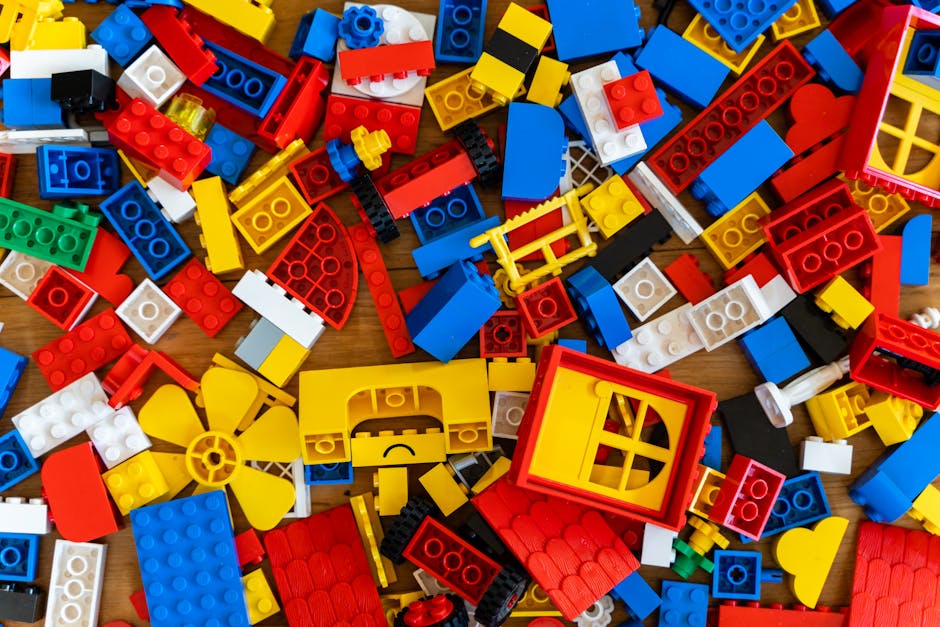
Color, color everywhere, but do we really understand its power? When it comes to logo design, choosing the right colors can make or break a brand’s success. So let’s dive into the vibrant world of hues and shades, and unravel the mystery behind the magic of color in logo design. Hold on to your paintbrushes, things are about to get colorful!
psychology-of-color-in-logo-design”>The Psychology of Color in Logo Design
Have you ever wondered why certain logos use specific colors? It’s not just because they look pretty – there’s a whole psychology behind it! Colors have the power to evoke emotions and influence how we perceive a brand. Let’s take a closer look at the fascinating world of color psychology in logo design.
**Red:** This color is all about passion, energy, and excitement. No wonder it’s often used by fast-food chains like McDonald’s and KFC – they want you to feel hungry and eager to grab a burger or bucket of chicken! On the flip side, red can also signal danger or urgency, which is why it’s commonly seen in warning signs and alerts.
**Blue:** Calm, trust, and reliability – that’s what blue represents. It’s no surprise that many tech companies like Facebook and IBM use this color in their logos. They want to convey a sense of security and competence to their users. Plus, who wouldn’t feel a little more at ease knowing that their data is in good hands with a calming shade of blue?
- **Yellow:** Joy, sunshine, and optimism – that’s the power of yellow. It’s no wonder that brands like IKEA and Best Buy use this cheerful color in their logos. They want to make you feel happy and excited about their products. So next time you’re feeling down, maybe a stroll through a sunny yellow store is just what you need!
- **Green:** Nature, growth, and health – that’s the magic of green. Brands like Whole Foods and Starbucks use this color to convey a sense of freshness and vitality. Just a glimpse of that leafy green logo can make you feel like you’re about to embark on a healthy and revitalizing experience.

Choosing the Right Color Palette for Your Brand
When it comes to , you want to make sure you pick hues that truly represent your brand’s personality and message. Think of your color palette as the sassy sidekick to your brand’s main character – it’s there to complement and enhance the overall vibe.
Consider the emotions you want your brand to evoke. Do you want to exude confidence and power? Opt for bold and striking colors like fiery red or sleek black. Maybe you want to convey a sense of calm and tranquility – in that case, cool blues and soft greens would be more your speed. Remember, color is like a language, and choosing the right palette is key to speaking to your audience effectively.
Take inspiration from your surroundings. Look at nature, art, fashion – heck, even your favorite snack could hold the key to the perfect color palette. The world is your oyster, so don’t be afraid to get creative and think outside the box. After all, who wouldn’t want a brand that’s as unique and quirky as a unicorn riding a skateboard?
Remember, consistency is key. Once you’ve chosen your colors, stick to them like glue. Your brand’s color palette should be as reliable as that one friend who always has your back – no surprises, only loyalty. So, go forth and paint the town (and your brand) in all the fabulous hues that make your heart flutter. Your brand will thank you for it!

Maximizing Impact with Contrasting Colors
When it comes to making an impact with your color choices, contrasting colors are key. By using colors that are opposite each other on the color wheel, you can create a bold and eye-catching look that will definitely turn heads. Here are a few tips for maximizing the impact of contrasting colors in your designs:
- Think about the mood: When choosing contrasting colors, consider the feelings and emotions you want to evoke. For example, pairing red and green can create a festive and energetic look, while blue and orange can feel fresh and modern.
- Play with intensity: Experiment with different shades and tones of contrasting colors to create depth and interest in your design. Mixing a bright, saturated hue with a more muted tone can add complexity and richness to your color palette.
- Use white space wisely: Contrasting colors can be overwhelming if not balanced properly. Make sure to incorporate plenty of white space in your design to give the colors room to breathe and prevent the overall look from feeling too busy.
Whether you’re designing a logo, a website, or a marketing campaign, using contrasting colors can help your message stand out and make a lasting impression. So don’t be afraid to get creative and experiment with unexpected color combinations – you might just discover a new favorite pairing that takes your designs to the next level!
The Influence of Color on Brand Perception
Did you know that the color of a brand can heavily influence how consumers perceive it? It’s true! In fact, studies have shown that color can account for up to 85% of the reason why someone decides to purchase a product. That’s right, 85%! So, the next time you’re choosing colors for your brand, make sure you pick wisely.
One interesting tidbit is that different colors evoke different emotions in people. For example, green is often associated with freshness and health, which is why you see it used a lot in the food and beverage industry. On the other hand, red is known for being bold and attention-grabbing, making it a popular choice for brands that want to stand out.
But it’s not just about the emotions that colors evoke – they can also influence how consumers perceive the quality of a product. Studies have found that people are more likely to perceive a product as high quality if it comes in black or gold packaging. So, if you want your brand to be seen as luxurious, you might want to consider incorporating these colors into your branding.
So, the next time you’re working on your brand’s visual identity, don’t just pick colors willy-nilly. Take the time to think about the message you want to convey and choose colors that align with that. Your brand perception – and your bottom line – will thank you!
Creating Emotional Connections through Color
Color is not just paint slapped onto a canvas – it’s an emotional experience waiting to happen. When it comes to , it’s all about invoking feelings, stirring up memories, and making people go, “Wow, that’s one heck of a shade!” So, grab your paintbrushes and let’s dive into the colorful world of emotions.
Let’s talk about the power of **red**. This fiery hue is not just for stop signs and fire trucks. Oh no, red is the color of passion, of love, of rage, and of a really good spicy curry. It’s the color that demands attention, that screams, “Look at me! I’m intense and I’m here to make you feel something!” Whether you’re painting the town red or just adding a pop of this vibrant shade to your living room, red is the ultimate emotional powerhouse.
Then you have **blue** – the cool, calm, collected color of the sea and the sky. Blue is the color of tranquility, of peace, of that feeling you get when you take a long, deep breath and say, “Ahh, I’m finally relaxed.” It’s the color that whispers, “Everything is going to be okay,” even when your life is a chaotic mess. So, next time you’re feeling stressed, just surround yourself with a little bit of blue and let its soothing vibes wash over you like a gentle wave.
And let’s not forget about **yellow** – the color of sunshine, of happiness, of that feeling you get when you see a puppy chasing its tail. Yellow is like a big, warm hug in color form. It’s the hue that makes you smile, that fills you with joy, that brings a little burst of sunshine into your life, even on the rainiest of days. So, if you’re feeling a bit down, just throw on a yellow shirt, paint your walls a sunny shade, or fill your home with cheerful daffodils, and let the magic of yellow lift your spirits.
Harnessing Cultural Meanings in Logo Design
When it comes to logo design, cultural meanings can play a huge role in creating a memorable and impactful logo. By tapping into cultural symbols and references, designers can convey a message that resonates with their target audience in a subtle yet powerful way.
So, how can you harness cultural meanings in your logo design? Here are a few tips to get you started:
- Do your research: Before you start sketching out ideas for your logo, take the time to research the cultural symbols and references that are meaningful to your target audience. Whether it’s a specific color, shape, or image, knowing what resonates with your audience will help you create a logo that speaks to them on a deeper level.
- Think outside the box: Don’t be afraid to get creative with your use of cultural symbols. Instead of using obvious or cliché references, try to find unique ways to incorporate cultural meanings into your design. This will help your logo stand out and make a lasting impression.
Remember, the goal of is to create a logo that not only looks good but also speaks to your audience on a deeper level. By tapping into cultural symbols and references, you can create a logo that is not only visually appealing but also meaningful and memorable.
The Evolution of Color Trends in Logo Design
Over the years, the world of logo design has seen a vibrant evolution in color trends. From simple black and white logos to eye-catching gradients and bold palettes, colors have played a crucial role in making logos stand out.
One of the most interesting trends in logo design is the rise of neon colors. Neon hues like electric pink, highlighter yellow, and neon green have become popular choices for brands looking to make a statement. These colors scream “look at me!” and are perfect for businesses that want to grab attention.
Another trend that has taken the logo design world by storm is the use of pastel colors. Soft shades of mint green, baby blue, and blush pink are being used to give logos a more peaceful and calming vibe. These colors are perfect for brands that want to appear friendly and approachable.
And let’s not forget about the timeless classics like black and white. While neon and pastel colors are fun and trendy, black and white logos will never go out of style. They exude elegance and sophistication, making them perfect for brands that want to convey a sense of timelessness.
FAQs
Why is color important in logo design?
Color is important in logo design because it can evoke emotions, convey messages, and make a logo more memorable. Plus, who wants a logo that looks like it was designed in black and white?
How do I choose the right color for my logo?
Choosing the right color for your logo is like choosing the right outfit for a first date – it should represent your personality and make you stand out. Do some research on color psychology and pick a color that aligns with your brand values and target audience.
Can I use multiple colors in my logo?
Sure, you can use multiple colors in your logo, just like how you can wear multiple colors in an outfit (unless you’re going for the monochromatic look). Just make sure the colors complement each other and don’t clash like a bad fashion statement.
What does each color symbolize in logo design?
Each color symbolizes something different in logo design. For example, red can symbolize passion, energy, and danger, while blue can symbolize trust, calmness, and coldness (not the chilly kind, but the standoffish kind).
Can I change the color of my logo in the future?
Of course, you can change the color of your logo in the future. It’s like dyeing your hair - a fresh new look can give your brand a makeover and attract attention. Just make sure your loyal customers don’t mistake your logo for a new brand.
Color Your World with Logo Design
As we’ve seen, the power of color in logo design is not to be underestimated. From creating brand identity to evoking emotional responses, choosing the right color palette can make all the difference. So next time you’re crafting a logo, remember to think about the impact of color. Who knows, you might just find yourself unraveling the hidden secrets of the rainbow!


