Welcome, fellow creatives! Today we are diving into the exciting world of logo design, where boundaries are meant to be broken and creativity knows no limits. Buckle up and get ready for some logo design insights that will leave you feeling inspired, motivated, and maybe even a little bit rebellious. Let’s unleash our creativity and shake things up in the world of design together!
Understanding the Role of Logo Design in Brand Identity
Every brand needs a good logo design to stand out from the crowd. It’s like wearing a snazzy outfit to a party – you want to make a good impression, right?
**A logo is the face of your brand**: Just like your face is the first thing people notice about you, your logo is the first thing people will associate with your brand. So make sure it’s a good one!
**A logo tells a story**: Your logo should reflect your brand’s personality and values. It’s like a little window into your brand’s soul. So don’t slap together some random shapes and colors and call it a day.
**A logo builds trust**: A well-designed logo shows that you take your brand seriously. It’s like showing up to a job interview in a suit – it shows that you mean business.

Implementing Creative Concepts to Capture Audience Attention
So you want to capture your audience’s attention, huh? Well, you’ve come to the right place! Forget about boring presentations and bland content – it’s time to think outside the box and get creative!
First things first, let’s talk visuals. People are visual creatures, so why not spice up your content with some eye-catching graphics, animations, and videos? A picture is worth a thousand words, but a well-designed graphic is worth a thousand likes!
Next up, let’s talk engagement. Your audience doesn’t want to just sit back and passively consume your content – they want to get involved! Encourage participation through polls, quizzes, and interactive elements. Who said learning couldn’t be fun?
And finally, don’t forget to inject some personality into your content. Show off your unique voice, humor, and charm. After all, no one wants to listen to a robot drone on and on. Be bold, be creative, and most importantly, have fun!
typography-in-logo-creation”>Utilizing Color Theory and Typography in Logo Creation
When it comes to creating a logo that pops, utilizing color theory and typography can make all the difference. Picture this: a logo in hot pink Comic Sans font with a lime green background. Yeah, no thank you. Let’s dive into how to avoid such disasters and create a logo that truly stands out.
First things first, let’s talk about color theory. Choosing the right colors can evoke certain emotions and associations in your audience. For example, blue can represent trust and security, while red can convey passion and energy. So, when selecting colors for your logo, make sure they align with your brand’s message and target audience.
Now onto typography. The font you choose can make or break your logo design. Stay away from overly trendy fonts that may become outdated quickly. Instead, opt for a classic font that complements your brand’s personality. And remember, simplicity is key. Don’t overwhelm your audience with a dozen different fonts in one logo.
By combining the power of color theory and typography, you can create a logo that not only looks visually appealing but also effectively communicates your brand’s identity. So, the next time you’re designing a logo, remember to think carefully about your color choices and font selection. Trust us, your audience will thank you for it!
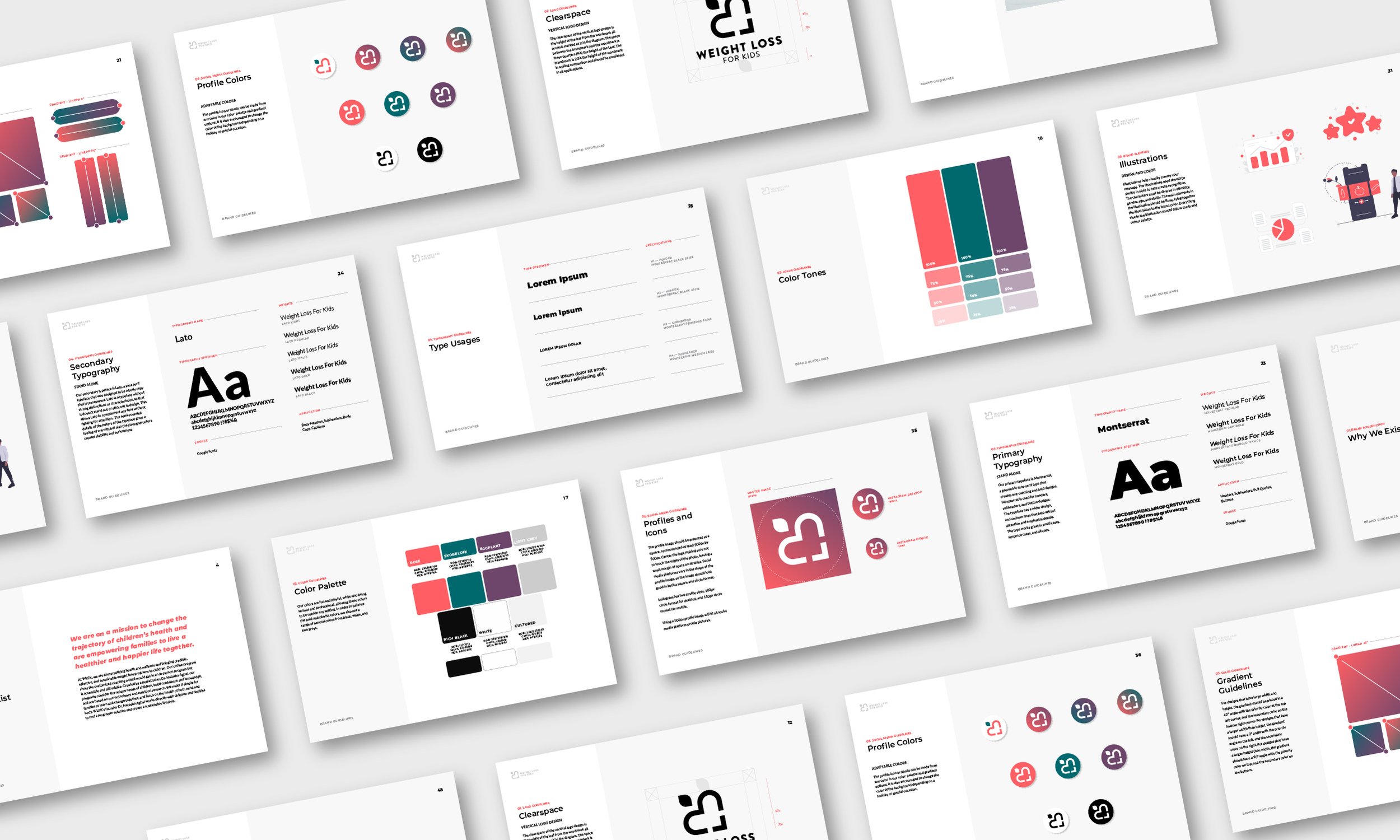
Incorporating Visual Elements to Enhance Brand Recognition
When it comes to enhancing brand recognition, visual elements can play a huge role in making sure your brand stands out amidst a sea of competitors. Here are some creative ways to incorporate visual elements into your brand strategy:
**1. Create a Memorable Logo:** Your logo is like the face of your brand, so make sure it’s one that people won’t forget. Think about some of the most iconic logos out there – Nike’s swoosh, Apple’s bitten apple – what do they all have in common? They’re simple, yet instantly recognizable. Consider working with a designer to create a unique logo that reflects your brand’s personality.
**2. Use Consistent Brand Colors:** Consistency is key when it comes to brand recognition. Choose a color palette that aligns with your brand’s identity and stick to it across all your visual assets – from your website to your social media accounts. This will help create a cohesive look that makes your brand easily identifiable.
**3. Tell Your Brand Story Through Visuals:** Use images and videos to tell the story of your brand in a compelling way. Show behind-the-scenes glimpses of your team at work, showcase customer testimonials through video interviews, or create visually stunning infographics that highlight your brand’s values and mission. Visual storytelling can be a powerful tool for building a connection with your audience and increasing brand recognition.
By incorporating these visual elements into your brand strategy, you can create a strong visual identity that resonates with your audience and helps your brand stand out in a crowded marketplace. Remember, in a world where attention spans are shorter than ever, a picture really is worth a thousand words!
Exploring Trends and Innovation in Logo Design Techniques
Logos are like the tattoos of the branding world – they should be unique, meaningful, and not regretted after a few years. With new trends and innovations constantly emerging, it’s important to stay on top of the latest logo design techniques to ensure your brand stays fresh and eye-catching.
One trend that has been taking the design world by storm is the use of negative space in logos. This clever technique involves using the space around and between elements in a logo to create hidden images or messages. It’s like finding a hidden Easter egg in a logo – except instead of candy, you get a deeper connection with the brand. **Talk about a sweet surprise!**
Another innovative technique that is gaining popularity is the use of gradients in logos. Gone are the days of flat, boring colors – now, logos are bursting with depth and dimension thanks to the use of gradients. It’s like giving your logo a makeover – who knew a little color blending could make such a big impact? **Move over, Picasso!**
And let’s not forget the power of animation in logo design! Thanks to advancements in technology, logos can now come to life with movement and interaction. A logo that dances? **That’s sure to make your brand the life of the party!** So whether you’re a fan of negative space, gradients, or animation, there’s no shortage of innovative logo design techniques to explore and incorporate into your branding strategy.
FAQs
How can I make my logo stand out from the competition?
Well, darling, forget about blending in like a wallflower at a high school dance! Get bold, get daring, and throw some glitter on that logo! Okay, maybe not literal glitter, but add some personality, uniqueness, and flair to make your logo pop amongst a sea of snooze-worthy designs.
What colors should I use to evoke certain emotions or send a message through my logo?
Ah, colors, the spice of life! Each hue has its own superpower – red for passion, blue for trust, yellow for joy, and so on. Mix and match colors like a culinary maestro to stir up the perfect emotions or convey your brand’s message with flair!
Should I follow trends or stick to a timeless design for my logo?
Trends come and go faster than a Kardashian marriage, so be careful not to get caught up in the latest fad. Instead, aim for a design that will withstand the test of time like a timeless classic novel or a fine bottle of wine. Trust me, your logo will thank you later.
What are some common mistakes to avoid when designing a logo?
Oh, honey, I’ve seen more logo disasters than a five-car pileup on the highway! Stay clear of cliches, overcomplicated designs, illegible fonts, and anything that makes your brand look like a hot mess. Keep it simple, classy, and unforgettable!
How can I incorporate my brand’s personality into my logo design?
Think of your brand as a sassy best friend – what makes it unique, memorable, and lovable? Infuse those qualities into your logo design like a shot of espresso into a decadent tiramisu! Whether it’s playful, sophisticated, quirky, or badass, let your brand’s personality shine through like a beacon of fabulousness!
Unleash Your Inner Logo Designer!
So there you have it, folks! With these dynamic logo design insights, you are well on your way to unleashing your creativity and creating memorable logos that leave a lasting impression. Remember, the possibilities are endless, so let your imagination run wild and have fun with your designs. Happy creating!


