
Have you ever looked at a logo and wondered, “What’s the deal with that random swoosh?” Well, it turns out, there’s a whole world of history and symbolism behind those iconic designs. From hidden messages to legendary origins, the stories behind some of the most recognizable logos are as fascinating as they are unexpected. So buckle up, because we’re about to take you on a journey through the quirky, the puzzling, and the downright bizarre tales of the logos you know and love.
The Evolution of the Nike Swoosh Logo
Let’s take a trip down memory lane and explore the fascinating evolution of the iconic Nike swoosh logo. From its humble beginnings to its current status as a global symbol of athleticism and style, the swoosh has come a long way.
**The Birth of the Swoosh:** Created by graphic design student Carolyn Davidson in 1971, the swoosh was originally inspired by the Greek goddess of victory, Nike. Legend has it that Davidson was paid a whopping $35 for her design which, in hindsight, seems like a steal of a deal for Nike.
**From Plain to Pizzazz:** Over the years, the swoosh underwent various transformations to keep up with the times. What started as a simple, unfussy design eventually evolved into a sleek and modern symbol that embodies the essence of Nike’s brand.
**The Swoosh in Pop Culture:** Today, the swoosh is not just a logo but a cultural phenomenon. From legendary athletes to everyday sneakerheads, everyone recognizes the swoosh as a mark of quality and coolness. It’s safe to say that the swoosh has transcended its original purpose and become a true icon in its own right.
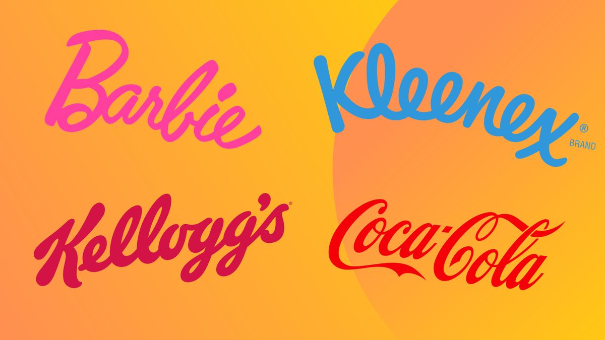
The Coca-Cola Logo: A Symbol of Timelessness
When you take a sip of a Coca-Cola, you’re not just drinking a soda – you’re experiencing a piece of history. And what better way to symbolize this than with their iconic logo? Let’s dive into why the Coca-Cola logo truly stands the test of time.
First off, the Coca-Cola logo is instantly recognizable. It’s like spotting a celebrity in a crowded room – you know exactly who they are. The logo has remained virtually unchanged since its creation in 1887, a testament to its timeless design. It’s like the Brad Pitt of logos – always relevant and swoon-worthy.
Not only is the Coca-Cola logo easily identifiable, but it’s also a symbol of consistency. Just like a trusty best friend who’s always there for you, the Coca-Cola logo has stood by the brand through thick and thin. It’s seen wars, economic downturns, and fad diets come and go, but it remains steadfast.
And let’s not forget the emotional connection the logo evokes. It’s not just a bunch of fancy letters – it’s a symbol of good times, great memories, and childhood dreams. When you see that familiar cursive script, you can almost taste the fizzy drink and feel the warmth of a summer day. That’s the power of a truly timeless logo.

Apple’s Bite: Unpacking the Meaning Behind the Logo
Have you ever stopped to think about the hidden meanings behind Apple’s iconic logo? Well, buckle up because we’re about to take a deep dive into the juicy world of fruit symbolism.
First off, let’s talk about the apple itself. It’s no coincidence that Apple chose this particular fruit for their logo. The apple has long been associated with knowledge, temptation, and of course, the infamous story of Adam and Eve. So, every time you glance at your iPhone, just remember that you’re holding a little piece of forbidden fruit in your hands.
But wait, there’s more! The bite taken out of the apple in the logo isn’t just a nod to the company’s name. It’s also a clever play on words, symbolizing taking a “byte” out of technology. Mind blown, right? And let’s not forget the rainbow colors in the logo, representing diversity and inclusion, because who doesn’t love a good rainbow?
So, the next time you see that familiar bitten apple logo, remember that there’s a whole world of meaning tucked away behind its sleek design. It’s not just a fruit, it’s a symbol of knowledge, temptation, innovation, and a whole lot of byte-sized fun.
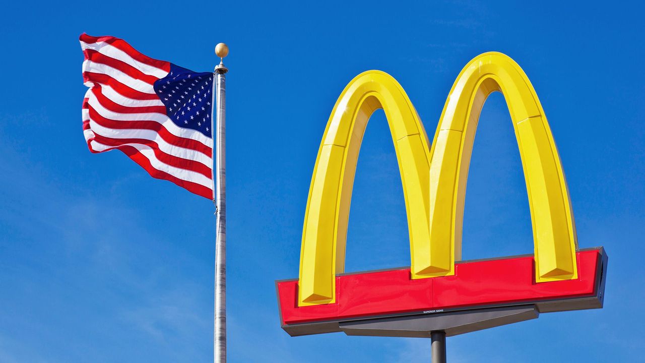
The Golden Arches: How McDonald’s Logo Became a Global Icon
Have you ever stopped to consider the power of the Golden Arches? McDonald’s iconic logo has graced our streets for decades, beckoning hungry patrons to enter its fast food kingdom. But how did two simple yellow arches become a global icon? Let’s delve into the fascinating history behind the symbol that has become synonymous with burgers and fries.
It all began back in the 1960s when McDonald’s was looking to revamp its image and stand out in a crowded market. Enter Jim Schindler, a design consultant who came up with the idea of the Golden Arches. Little did he know that his creation would become one of the most recognizable logos in the world.
With its bold, golden arches reaching for the sky, the McDonald’s logo exudes a sense of grandeur and luxury. It’s no wonder that customers flock to the restaurant in droves, eager to taste the fast food delicacies that await them. The logo’s simplicity and striking design make it a standout in a sea of competition.
So the next time you see those Golden Arches shining in the distance, remember the history and ingenuity behind them. McDonald’s logo may just be a simple pair of yellow arches, but its impact on the world of fast food and branding is truly golden.

Starbucks: The Mermaid and the Symbolism Behind the Logo
Have you ever stopped to wonder about the iconic mermaid in the Starbucks logo? Well, prepare to dive into the deep waters of symbolism as we explore the hidden meanings behind this mystical creature.
Legend has it that the Starbucks mermaid, also known as the Siren, symbolizes seduction, temptation, and the allure of the unknown. In other words, she’s the ultimate wingman (or wing-mermaid) for a coffee shop that wants to lure in customers with the promise of delicious, irresistible drinks.
But don’t be fooled by her innocent face and flowing locks – this mermaid means business. With her powerful tail, she’s able to swim through the seas of competition and conquer the coffee world with her enchanting charm.
So next time you take a sip of your favorite Starbucks beverage, remember the mermaid watching over you with her hypnotic gaze, urging you to surrender to the deliciousness. After all, resistance is futile when faced with the power of the Starbucks Siren.
The Meaning Behind the FedEx Logo: A Hidden Message
So, you thought the FedEx logo was just a simple design with no hidden meaning, huh? Well, prepare to have your mind blown because there’s actually a super sneaky message hiding in plain sight!
Check out the space between the capital E and the x in the logo. Do you see it? That’s right, there’s an arrow cleverly embedded in the negative space! Mind. Blown. Now every time you see a FedEx truck driving by, you’ll be searching for that elusive arrow. It’s like a secret code just waiting to be discovered!
But wait, there’s more! The vibrant purple and orange colors in the logo aren’t just there for show. Purple is often associated with luxury and extravagance, while orange symbolizes energy and excitement. So, when you see that logo, you’re not just looking at a delivery company – you’re experiencing a burst of color psychology!
Next time you receive a package from FedEx, take a moment to appreciate the hidden message behind the logo. Who knew that a simple design could hold so much meaning? It’s like a treasure hunt every time you see that iconic logo!
FAQs
Who designed the iconic logo for Apple?
Believe it or not, the famous Apple logo was designed by arguably the most famous person associated with the company – Steve Jobs himself. Well, he didn’t exactly draw it up on a cocktail napkin, but he did have a hand in the creation process.
What do the colors in the Google logo represent?
The colors in the Google logo actually have a clever meaning behind them. Each color – blue, red, yellow, blue, green, and red – represents the six letters in the word “Google.” Mind blown, right?
Why does the Nike logo look like a swoosh?
Well, apparently the Nike swoosh represents the wing of the Greek goddess of victory, Nike. So every time you lace up your Air Jordans, you’re channeling some serious divine power. Just kidding, you might want to work on your layup first.
What inspired the famous Starbucks logo?
So, it turns out that the Starbucks logo of a siren was actually inspired by a 16th-century Norse woodcut. Who knew that your daily dose of caffeine came with a side of history?
Branding Tales: Wrapping Up the Logo Legacies
And there you have it – the secret stories behind some of the most iconic logos in history! From hidden messages to clever symbols, these brands have been keeping us hooked with their creative designs. So next time you see a famous logo, remember that there’s more to it than meets the eye. Who knew a simple image could have such a rich history and symbolism? Maybe it’s time to appreciate logos in a whole new light. Let’s give a round of applause to these masterpieces of brand identity – may they continue to inspire us for years to come!


