Have you ever stopped to think about why your favorite fast food chain’s logo is red and yellow, or why so many tech companies opt for cool blues and sleek blacks? It’s not just a random color choice – it’s all part of the sneaky, mind-controlling world of logo design psychology. Join us on a colorful journey through the wild world of hues and emotions, as we uncover the truth behind the power of color in logo design. Grab your rainbow-tinted glasses and brace yourself for a technicolor trip through the fascinating world of emotional impact and design sorcery.
branding“>Significance of color in branding
Color is more than just a visual component in branding. It plays a crucial role in conveying a brand’s personality, message, and values. Choosing the right colors can make or break a brand’s image, so it’s important to choose wisely!
Here are some reasons why color is so significant in branding:
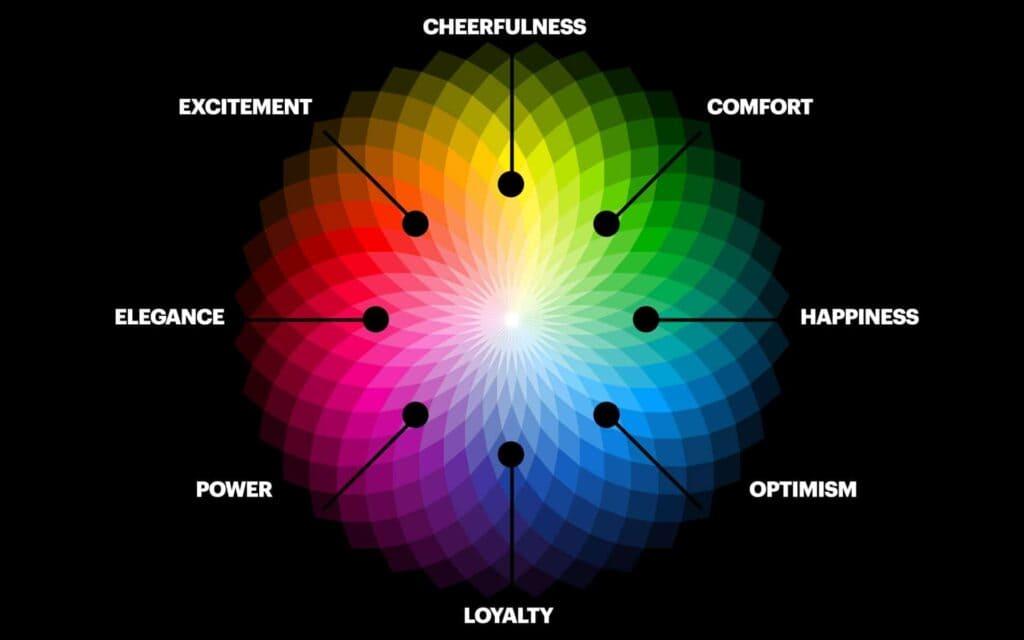
- Emotional Impact: Colors have psychological meanings, and they can evoke specific emotions and associations. For example, red can symbolize energy and passion, while blue can represent trust and stability.
- Memorability: Consistent use of color creates brand recognition and helps consumers remember and identify your brand more easily.
- Stand Out: Choosing unique colors can help your brand stand out from the competition and make a memorable impression on consumers.
In conclusion, color is a powerful tool in branding that shouldn’t be underestimated. So, next time you’re designing a logo or choosing brand colors, remember that every hue has a story to tell!

The impact of color on consumer perception
When it comes to consumer perception, color plays a crucial role in shaping how a product is perceived. Think about it, would you be more likely to buy a product packaged in a vibrant, eye-catching color or one that is dull and unappealing? Probably the former, right?
Colors can evoke different emotions and feelings in consumers. For example, the color red is often associated with passion, excitement, and urgency. So, it’s no surprise that many fast-food chains use red in their branding to create a sense of urgency and stimulate appetite (hello, golden arches).
On the other hand, blue is often associated with trust, dependability, and calmness. That’s why you see a lot of banks and tech companies using blue in their logos and branding to convey a sense of reliability and professionalism.
When it comes to marketing and branding, it’s important to choose colors that resonate with your target audience. Remember, perception is everything in the competitive world of consumer goods, so choose your colors wisely!

Color psychology in logo design
is a fascinating topic that can make or break a brand’s identity. Think about it – would McDonald’s golden arches be as recognizable if they were, say, purple? Here are some fun facts about how colors can affect consumer behavior and perception:
Red: This fiery hue is known to stimulate appetite and create a sense of urgency. That’s why fast food chains like Wendy’s and KFC use red in their logos – they want you to stop thinking and start eating!
- Orange:
Orange: This fun and energetic color is often associated with creativity and enthusiasm. Companies like Nickelodeon and Fanta use orange to appeal to a younger audience and spark curiosity.
- Blue:
Blue: The color of trust and reliability, blue is often used by tech companies (think Facebook and IBM) to instill confidence in their users. It also has a calming effect, perfect for brands like Tiffany & Co. who want to convey luxury and sophistication.
- Green:
Green: Symbolizing growth and health, green is often used by eco-friendly brands like Whole Foods and Starbucks. It’s also associated with wealth and prosperity, making it a popular choice for financial institutions like Bank of America and Visa.

Choosing the right color for your brand
When it comes to , you don’t want to be seeing red because you made a bad decision. With so many colors in the rainbow to choose from, it can be overwhelming trying to pick the perfect hue that will represent your brand in the best light. Here are a few tips to help you color your branding canvas with confidence:
- Color psychology: Consider how different colors evoke different emotions and meanings. For example, red can stimulate appetite and create a sense of urgency, while blue can convey trust and dependability.
- Competitor analysis: Take a look at what colors your competitors are using in their branding. You don’t want to blend in with the crowd, but you also don’t want to clash with their color schemes.
- Target audience: Think about who your target market is and what colors will appeal to them. Are you targeting children? Maybe go for bright, playful colors. Are you targeting a more professional audience? Stick with more subdued, sophisticated hues.
Remember, the color you choose for your brand will be with you for the long haul, so don’t be green with envy over someone else’s color choice. Trust your gut and pick a color that makes you feel as happy as a rainbow after a storm!

Creating emotional connections through color
So you want to create emotional connections through color, huh? Well, you’ve come to the right place! Let me tell you, color is a powerful thing. It can evoke all sorts of emotions – happiness, sadness, excitement, you name it. And if you use it right, you can really make people feel things.
First off, let’s talk about red. Red is a fiery color that screams passion and energy. When you use red, you’re telling people to pay attention! It’s bold, it’s powerful, it’s in your face. Red is like that friend who always knows how to get a party started.
Now, on the other end of the spectrum, we have blue. Blue is calm, cool, collected. It’s like that friend who’s always there to lend a shoulder to cry on. When you use blue, you’re telling people to relax and chill out. It’s a soothing color that instantly puts people at ease.
And let’s not forget yellow. Yellow is like a burst of sunshine on a cloudy day. It’s bright, it’s cheerful, it’s impossible to ignore. When you use yellow, you’re telling people to smile and be happy. It’s a color that just makes everything feel a little bit brighter.
Utilizing color theory in logo design
When it comes to designing a logo, color theory can make or break the success of your brand image. By understanding how different colors evoke specific emotions, you can create a logo that truly resonates with your target audience.
For example, did you know that the color red is associated with passion, excitement, and energy? This makes it perfect for brands looking to make a bold statement. On the other hand, blue is known for its calming and trustworthy qualities, making it a popular choice for corporate logos.
When choosing colors for your logo, consider the following:
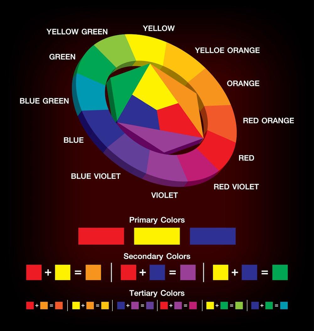
- Contrast: Make sure the colors you choose complement each other and create a visually appealing logo.
- Harmony: Use colors that work well together to create a cohesive and professional look.
Remember, the colors you choose for your logo can say a lot about your brand, so make sure you choose wisely. With the right color palette, your logo will not only look great but also effectively convey the essence of your brand.
FAQs
Why is color important in logo design?
Color is like the seasoning of a logo design dish - it adds flavor and can make all the difference in how it is perceived.
How do different colors impact emotions?
Think of colors like a mood ring for your brain. Red can make you hungry (or angry), blue can calm you down, and yellow can make you feel happy.
Can color in a logo affect consumer behavior?
Absolutely! Just like a siren song, colors can lure consumers in or scare them away, depending on the emotional response they elicit.
What are some examples of successful logo designs using color psychology?
Think about the golden arches of McDonald’s – red and yellow are known to stimulate appetite, making you crave those delicious fries.
How can businesses use color psychology to their advantage in logo design?
By understanding the emotional impact of different colors, businesses can strategically choose colors that align with their brand message and appeal to their target audience. It’s like a Jedi mind trick with paint swatches.
Wrapping It Up: The Colorful Conclusion
And there you have it, folks! A deep dive into the world of color psychology in logo design. We hope you’ve enjoyed this colorful journey as much as we have. Remember, colors aren’t just pretty hues – they’re powerful tools that can evoke all sorts of emotions in your audience. So next time you’re designing a logo, think twice about your color choices. Who knows, maybe a splash of yellow will make your brand the talk of the town! Happy designing, and may your logos be as vibrant as a rainbow on a sunny day.


