Ever wondered why you feel an uncontrollable urge to buy things in a certain color? Or why looking at a particular logo makes you feel unexpectedly happy (or perhaps, inexplicably angry)? Well, buckle up, because we’re about to dive deep into the colorful world of logo design and the crazy rollercoaster of emotions it can elicit. Get ready to decode the mysteries of the Psychology of Color and discover just how those sneaky little logos are manipulating your feelings without you even realizing it. Let the mind-bending journey begin!
psychology-the-basics”>Color Psychology: The Basics
Have you ever wondered why certain colors make you feel a certain way? Well, that’s where color psychology comes in! It’s the study of how different colors can affect our emotions, moods, and behavior. So, if you’ve ever felt calm in a blue room or energized in a yellow one, you can thank color psychology for that.
Here are some basics to get you started on understanding the wonderful world of color psychology:
- Red: This bold color is often associated with passion, energy, and danger. It can raise your heart rate and make you feel excited or even a little stressed out.
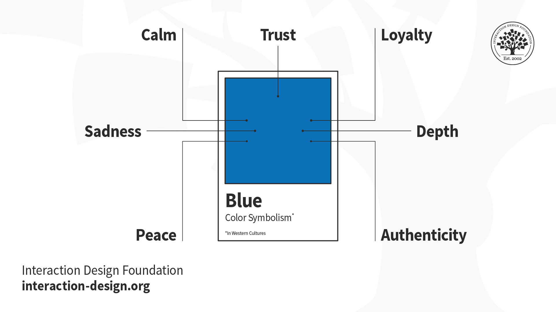
- Blue: Ah, the color of calm and serenity. Blue is known to lower blood pressure and promote relaxation. So, next time you need to unwind, surround yourself with shades of blue.
- Yellow: This cheerful color is all about happiness and positivity. It can boost your mood and give you a much-needed dose of optimism. So, if you’re feeling down, throw on some yellow and watch your spirits lift!
Remember, everyone reacts to colors differently, so what works for one person may not work for another. The key is to experiment and see which colors make you feel your best. Happy color exploring!

The Impact of Color on Emotional Responses
Picture this: you walk into a room painted a bright, sunny yellow. Instantly, you feel a burst of energy and happiness wash over you. Or imagine stepping into a space adorned in calming shades of blue, feeling instantly soothed and relaxed. It’s no secret that colors have a powerful impact on our emotional responses!
**So, what is it about colors that makes us feel a certain way?**
Well, psychologists have long studied the relationship between color and emotions, and it turns out that different colors can evoke specific feelings. For example:
- Red: Passionate, energetic, and maybe just a little bit angry.
- Green: Calm, connected to nature, and a little bit envious (thanks a lot, Kermit).
- Purple: Regal, mysterious, and the color of your Grandma’s favorite muumuu.
**But wait, there’s more!**
Not only do colors influence our emotions, but they can also affect our behavior. Ever wonder why fast-food restaurants use red and yellow in their logos? Because those colors are believed to increase appetite and encourage impulse decisions. So, next time you find yourself craving a Big Mac, you can blame it on the color scheme!

Choosing the Right Colors for Logo Design
When it comes to choosing the perfect colors for your logo design, it’s important to remember that colors speak louder than words! Here are some fun tips to help you nail the perfect color scheme for your brand:
- Consider the psychology behind colors – red is bold and passionate, yellow is cheerful and energetic, and green is calming and natural. Choose colors that reflect the personality of your brand.
- Don’t be afraid to get creative with your color combinations – mix and match different hues to create a unique and eye-catching logo!
- Remember that simplicity is key – too many colors can confuse and overwhelm your audience. Stick to a maximum of three colors to keep your logo clean and impactful.
And finally, when in doubt, remember the old saying: “When in doubt, go for the rainbow!” Just kidding, please don’t do that. But seriously, have fun experimenting with different color palettes until you find the perfect one that captures the essence of your brand!

The Relationship Between Color and Brand Perception
Have you ever wondered why certain brands use specific colors in their logos and branding? Well, it’s not just by chance – there’s actually a whole science behind !
When it comes to choosing the right color for a brand, companies have to consider how they want their customers to perceive them. Here are some ways in which color can impact brand perception:
- Red: Often associated with energy and passion, red can make a brand seem bold and exciting.
- Blue: A calming and trustworthy color, blue is often used by brands that want to convey reliability and professionalism.
- Yellow: Cheerful and optimistic, yellow can make a brand seem friendly and approachable.
But it’s not just about the color itself – the shade of the color can also have a big impact on how a brand is perceived. For example, a dark, navy blue might give off a more serious and authoritative vibe, while a lighter, sky blue might come across as more peaceful and serene.
So next time you see a brand’s logo, pay attention to the colors they’ve chosen. You might just be able to pick up on some subtle hints about how they want to be perceived!

Understanding Cultural and Individual Differences in Color Associations
In the colorful world we live in, it’s fascinating how each individual or culture associates different meanings to various hues. Here are some intriguing insights into these cultural and individual differences:
Did you know that while red is often associated with passion and love in Western cultures, it symbolizes luck and prosperity in Chinese culture? It just goes to show that the same color can carry completely different meanings depending on where you are in the world.
Another interesting example is the color white. While in Western cultures it represents purity and innocence, it is traditionally the color of mourning in many Eastern cultures, symbolizing death and loss. Talk about a stark contrast!
Furthermore, some individuals might have personal connections to certain colors based on their own experiences or memories. For instance, someone who had a traumatic experience involving the color blue might associate it with sadness or fear, whereas others might find it calming and tranquil. Our individual perceptions truly shape the way we view the world around us.
Implementing Color Psychology in Logo Design for Maximum Effect
When it comes to logo design, colors play a crucial role in conveying the right message to your audience. By implementing color psychology in your design, you can maximize the impact of your logo and create a strong visual identity for your brand.
Here are some tips to help you harness the power of color psychology in your logo design:
- Choose the right color scheme: Different colors evoke different emotions and associations. Make sure to pick a color scheme that aligns with your brand values and message.
- Consider cultural differences: Keep in mind that colors can have different meanings in different cultures. Make sure your color choices resonate with your target audience.
- Use contrasting colors: Contrast can help make your logo stand out and grab attention. Experiment with different color combinations to find the one that works best for your brand.
By applying these principles of color psychology in your logo design, you can create a visually compelling logo that resonates with your audience and leaves a lasting impression. So, next time you sit down to design a logo, remember to think about the power of color!
FAQs
Why do certain colors elicit different emotional responses?
Well, you see, colors are basically like tiny little emotion ninjas that sneak into your brain and start doing the macarena with your feelings. Each color has its own superpower - red makes you feel all fired up, blue chills you out, and yellow is like a burst of sunshine on a rainy day.
How can businesses use color psychology in logo design to influence consumer behavior?
Businesses basically use color psychology to brainwash…I mean, gently guide consumers into buying stuff. They strategically choose colors that trigger certain emotions to make you feel all warm and fuzzy inside, so you’ll whip out your wallet faster than you can say “retail therapy”.
Can the same color elicit different emotional responses in different cultures?
Absolutely! Just like how pineapple on pizza is a divisive topic, colors can be pretty polarizing across cultures. What might be considered lucky in one country could be seen as bad juju in another. It’s like a colorful game of cultural roulette.
Is it important for a logo to have a specific color scheme to be effective?
Oh, definitely! It’s like trying to rock a Hawaiian shirt at a black-tie event – it just doesn’t work. The colors in a logo create a visual mood that tells consumers whether they should trust you with their hard-earned cash or run away screaming. So, choose wisely!
Color Yourself Emotionally Intelligent
So whether you’re feeling blue, seeing red, or just feeling a little green with envy, remember that the colors in your logo design aren’t just aesthetic choices – they’re strategic tools that can evoke powerful emotional responses. So go ahead and paint your branding with all the colors of the emotional rainbow. Just make sure it doesn’t end up looking like a neon sign from the ’80s.


