Attention all font enthusiasts and design connoisseurs! Have you ever stopped to think about the power of typography in logo design and how it can influence brand perception? No? Well, prepare to have your mind blown (or at least mildly amused) as we delve into the fascinating world of fonts, curves, and serifs. Because when it comes to creating a killer logo, it’s not just about looking pretty – it’s about making a statement. So grab your favorite typeface and let’s get ready to font-splode!
The Importance of Typography in Logo Design
Typography in logo design may seem like a trivial matter, but it actually plays a crucial role in how a brand is perceived. Imagine if Apple’s logo was in Comic Sans – it just wouldn’t have the same sleek and sophisticated vibe, would it? That’s because typography helps convey the personality and style of a brand, making it instantly recognizable to consumers.
One of the key aspects of typography in logo design is legibility. If your logo is illegible, then what’s the point of having a logo at all? You might as well just scribble your company name on a piece of paper and call it a day. Choosing the right font can make all the difference – whether you want something bold and eye-catching or elegant and refined, the typography sets the tone for your brand.
Another important factor to consider is versatility. Your logo will appear on a variety of mediums – from business cards to billboards – so it needs to be readable and impactful at any size. This means choosing a font that can scale proportionately without losing its impact. Consistency is key in branding, so make sure your typography is adaptable to different sizes and formats.
In conclusion, typography is like the unsung hero of logo design – it quietly shapes the perception of your brand without anyone really noticing. So next time you’re designing a logo, don’t just settle for any old font – choose one that truly represents the essence of your brand. And remember, with great typography comes great responsibility (and hopefully, great success!)
Choosing the Right Typeface for Brand Identity
When it comes to choosing the perfect typeface for your brand identity, it’s like finding the perfect outfit for a first date – you want something that makes a statement, reflects your personality, and leaves a lasting impression. Here are some tips to help you find the right typographic match made in heaven:
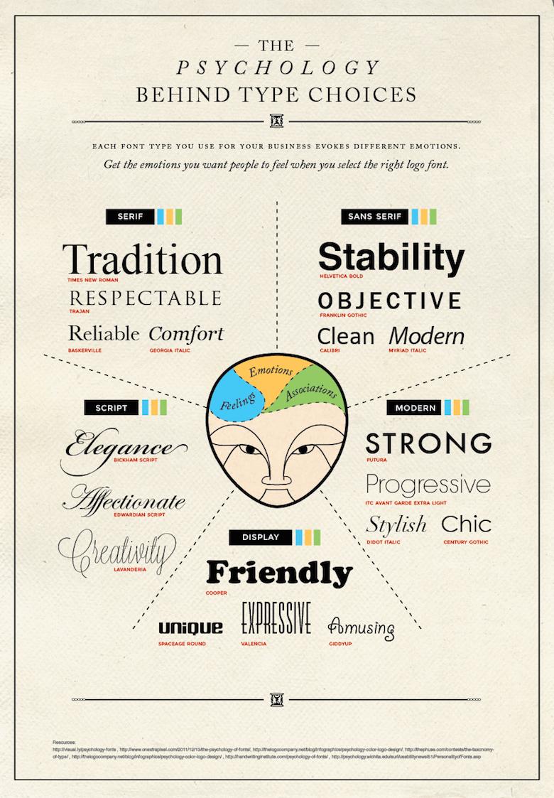
Consider your brand’s personality: Just like picking out an outfit, you want your typeface to match the vibe of your brand. Are you sleek and modern? Playful and whimsical? Classic and timeless? Choose a typeface that embodies the essence of your brand.
Think about legibility: While it’s tempting to choose a fancy, ornate typeface, remember that readability is key. Make sure your typeface is easy to read, especially in smaller sizes. You don’t want your audience squinting to decipher your messaging.
Don’t be afraid to mix and match: Who says you have to stick to just one typeface? Mix it up! Pair a bold, sans-serif headline with a sleek serif body font for a dynamic and eye-catching look. Just like mixing patterns in fashion, playing with typefaces can add visual interest to your brand.

How Typography Influences Consumer Perception
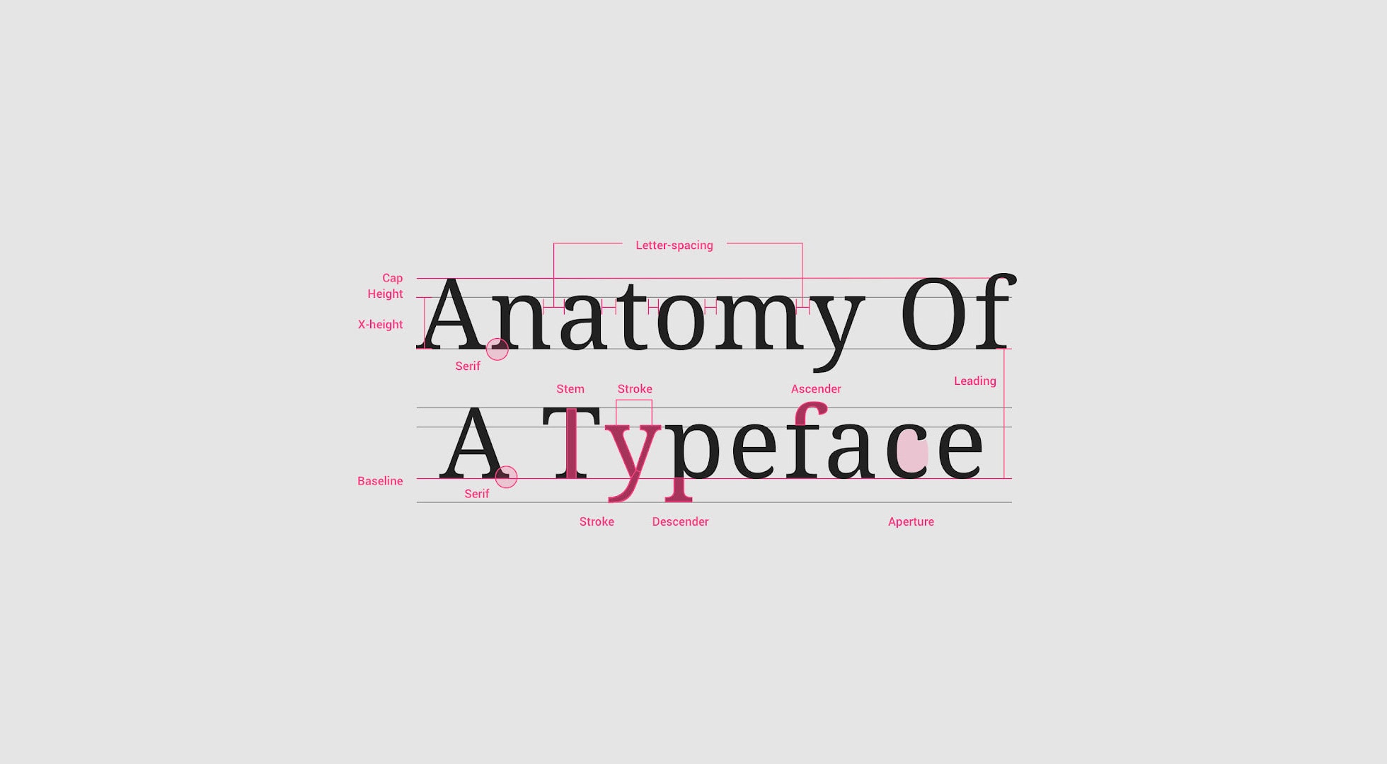
Typography plays a crucial role in shaping how consumers perceive a brand. From the font choice to the spacing between letters, every little detail can make a big difference in how a message is received. Here are a few ways typography can influence consumer perception:
- Font Choice: Picking the right font can make all the difference. A sleek, modern font might give off a more professional vibe, while a playful, whimsical font could make your brand seem more approachable. Just make sure not to use Comic Sans – nobody takes a brand seriously when they’re using Comic Sans.
- Spacing: Proper spacing between letters and lines can make text more readable and visually appealing. Plus, it can help convey a sense of organization and professionalism. Unless you’re going for the “I accidentally hit the space bar a bunch of times” look, in which case, go wild.
- Color: The color of your text can also have a big impact on consumer perception. Bright, bold colors might grab attention, while softer, muted tones could convey a sense of sophistication. Just make sure the color doesn’t clash with your background – nobody wants to strain their eyes trying to read neon green text on a hot pink background.
In the end, it’s all about finding the right balance between creativity and professionalism. Play around with different fonts, sizes, and colors to see what works best for your brand. And remember, when in doubt, you can never go wrong with a classic Helvetica – it’s like the little black dress of typography.
Creating a Distinctive Brand Voice with Typography
Typography plays a crucial role in establishing your brand’s personality and creating a distinctive brand voice. Just like your quirky uncle who always has a witty comeback, your typography should leave a lasting impression on your audience. Here’s a few tips to help you elevate your brand’s voice with typography:
1. Choose the Right Fonts: Select fonts that truly embody your brand’s essence. Whether you’re sleek and sophisticated like a martini bar in Manhattan, or playful and fun like a clown at a birthday party, the right font can convey your brand’s personality in an instant.
2. Play with Sizes and Styles: Mix and match different font sizes and styles to create visual interest and hierarchy in your design. Just like a symphony orchestra where every instrument plays a unique role, each font size and style should work together harmoniously to convey your brand message.
3. Experiment with Color: Don’t be afraid to experiment with color when it comes to typography. Whether you’re feeling bold like a superhero in a comic book, or elegant like a swan gliding on a lake, color can add a whole new dimension to your brand’s voice.
In conclusion, typography is not just about choosing pretty fonts – it’s about creating a cohesive brand voice that resonates with your audience. So go ahead, unleash your inner typographic genius and let your brand’s voice be heard loud and clear!
The Role of Typography in Establishing Brand Trust
Typography plays a crucial role in establishing brand trust. Imagine if a reputable company like Apple used Comic Sans as their official font - not exactly confidence-inspiring, right? Good typography not only looks professional, but it also helps convey a sense of reliability and credibility to consumers.
When choosing a font for your brand, consider factors like readability, consistency, and emotional impact. A well-chosen font can help communicate your brand’s personality, whether it’s playful and casual or sleek and modern. Remember, first impressions matter, and your font choice can make or break that initial connection with your audience.
Consistent typography across all marketing materials, from websites to packaging to social media posts, helps reinforce brand recognition. Think of it like your brand’s signature – it should be unique, memorable, and instantly recognizable. So, don’t be afraid to get creative with your font choices, just make sure they reflect your brand’s values and mission.
So, the next time you’re tempted to use that quirky font you found on a free website, remember the importance of typography in building brand trust. Choose wisely, stay consistent, and watch as your font helps establish a strong relationship with your audience. After all, a font is worth a thousand words!
Using Typography to Reflect Brand Personality
So you’ve got your brand personality down pat, now it’s time to let your typography do the talking. No, we’re not talking about sending secret messages through your font choices (although that could be a fun idea). We’re talking about using typography to give your brand a little extra pizazz. Here are a few ways you can amp up your brand’s personality with the power of type:
– **Choose the Right Fonts:** The fonts you choose can say a lot about your brand. Are you sophisticated and timeless? Try a classic serif font. Are you fun and quirky? Maybe a playful handwritten font is more your style. Whatever you choose, make sure it reflects the essence of your brand.
– **Play with Sizes and Spacing:** Don’t be afraid to experiment with different font sizes and spacing to add some visual interest to your text. Mix and match big bold headings with smaller, subtle body text to create a dynamic look. Just remember, less is more – you don’t want your text to look like a jumbled mess.
– **Color Me Crazy:** Adding a pop of color to your typography can really make it stand out. Choose colors that reflect your brand’s personality – bright and bold for a fun brand, muted and sophisticated for a more serious tone. Just make sure your colors are easily readable against your background.
So go ahead, have some fun with typography and let your brand’s personality shine through! Who knew that a few little letters could pack such a punch
Impact of Typography on Brand Recognition
Take a look at some of the most iconic brands out there. What do they all have in common? Their typography screams out at you. It’s like their fonts are yelling, “Look at me! I’m famous!” Think of the timeless elegance of Coca-Cola’s script or the bold confidence of the Nike swoosh. These brands have nailed it when it comes to using typography to make a lasting impression.
Typography has the power to evoke certain emotions and associations with a brand. Imagine if the Disney logo was in Comic Sans – it just wouldn’t have that same magical feel to it, would it? The right font can instantly make you feel a certain way about a brand, whether it’s playful, sophisticated, or edgy. That’s the power of typography in action.
When it comes to brand recognition, consistency is key. Your typography should be instantly recognizable across all platforms, from your website to your packaging. Just like McDonald’s golden arches or the Apple logo, your font should be so ingrained in people’s minds that they can spot your brand from a mile away.
So next time you’re choosing a font for your brand, don’t just pick the first one that catches your eye. Think about the message you want to convey and the emotions you want to evoke. Because when it comes to brand recognition, typography isn’t just a typeface - it’s a powerful tool that can make or break your brand’s image.
FAQs
How does typography influence brand perception in logo design?
Typography can make or break a logo design because different fonts can evoke different emotions in consumers. So, if you want your brand to be seen as fun and friendly, steer clear of Comic Sans (that font is the stuff of nightmares).
Can choosing the wrong font negatively impact a brand?
Oh, absolutely. Imagine a law firm with a logo in Papyrus – clients might think they’re getting legal advice from a fortune teller. The wrong font can send the wrong message and turn customers off quicker than you can say “serif catastrophe”.
How can typography be used to express brand personality?
By carefully selecting fonts that reflect the essence of your brand, you can build a visual identity that speaks to your target audience. Whether you’re aiming for sophistication, playfulness, or dependability, there’s a font out there for every personality.
What are some typography trends in logo design right now?
Typography trends come and go quicker than you can say “kerning”. As of now, minimalist sans-serif fonts are all the rage, but who knows what tomorrow will bring? The only constant in the design world is change, my typophile friends.
Why is it important for businesses to invest in good typography for their logos?
Your logo is often the first point of contact between your brand and potential customers. So, investing in good typography is like investing in a sharp outfit for a first date – it sets the tone and makes a great first impression. And as we all know, you never get a second chance to make a first impression.
In conclusion, let your type do the talking!
Now that you’ve seen how typography can greatly impact brand perception through logo design, don’t be afraid to get creative with your fonts. Remember, it’s not just about what you say, but how you say it that can truly make a statement. So, go ahead and play with different typefaces, sizes, and styles to find the perfect fit for your brand. And who knows, maybe you’ll design the next iconic logo that leaves a lasting impression on consumers everywhere. Happy designing!


