Are you feeling a little blue about your lackluster logo? Well, it’s time to paint a brighter picture with the power of design/” title=”Dental Logo Design”>color in logo design! From fiery reds that ignite passion to calming blues that exude trustworthiness, the hues you choose can speak volumes about your brand. Get ready to unleash your inner artist and learn how to craft a logo that communicates dynamically with the stroke of a color palette. Let’s turn your brand into a work of art that’s worth more than just a thousand words!
psychology-in-logo-design”>Understanding Color Psychology in Logo Design
Have you ever wondered why some logos make you feel happy and others make you feel anxious? It’s all about color psychology, my friends! Let’s take a deep dive into the colorful world of logo design and find out what those sneaky colors are really telling us.
First up, let’s talk about red. This fiery color is all about passion, power, and energy. That’s why you see it popping up in logos for fast food chains and sports teams. It’s like the logo is saying, “Hey, get ready to chow down on some burgers and kick some butt on the field!” So, if you want your logo to make a bold statement, slap some red on there and watch your brand come to life.
Next, let’s chat about blue. This cool and calming color is all about trust, reliability, and professionalism. That’s why you see it in logos for banks, tech companies, and hospitals. It’s like the logo is whispering, “Hey, I’ve got your back. You can trust me with your money, your data, and your health.” So, if you want your logo to exude confidence and competence, go ahead and paint it blue.
And last but not least, let’s not forget about yellow. This sunny color is all about optimism, happiness, and creativity. That’s why you see it in logos for kids’ brands, art studios, and ice cream shops. It’s like the logo is shouting, “Hey, life is sweet! Come on over and have some fun with us!” So, if you want your logo to spread some joy and spark some imagination, throw in a splash of yellow and watch your brand beam with positivity.
Choosing the Right Color Palette for Your Brand
When it comes to , you want to make sure you’re not just picking your favorite colors. Remember, this isn’t a middle school art project, this is serious business! Here are a few tips to help you choose the perfect colors to represent your brand:
First things first, consider the emotions you want your brand to evoke. Do you want people to feel calm and relaxed when they see your logo? Or maybe you want them to feel energized and ready to take on the world. Make sure your color choices align with the overall vibe you’re going for.
Next, think about your target audience. Are they young and hip, or are they more mature and sophisticated? Colors can have different meanings and associations across different age groups, so make sure you’re picking colors that will resonate with your target demographic.
Don’t forget about color theory! Certain colors work well together and can create a cohesive and visually pleasing brand identity. Consider using a tool like Adobe Color to help you find the perfect color combinations. And remember, less is more! Stick to a few key colors that work well together instead of going overboard with a rainbow of hues.

Creating Emotional Connections with Color in Logos
When it comes to , there are a few key things to keep in mind. Colors have a way of speaking to us on a deeper level, tapping into our emotions and making us feel things we never knew we could feel about a brand. Here are some tips to help you harness the power of color in your logo design:
Use Bold and Vibrant Colors: Bold and vibrant colors have a way of grabbing our attention and evoking strong emotions. Think bright reds, yellows, and blues that scream “look at me!” A colorful logo will make your brand stand out from the crowd and leave a lasting impression on your audience.
Consider Color Psychology: Different colors have different psychological effects on people. For example, red is often associated with passion and energy, while blue conveys trust and dependability. Consider the message you want to send with your logo and choose colors that align with that message.
Don’t Be Afraid to Experiment: Sometimes the most unexpected color combinations can create the strongest emotional connections. Don’t be afraid to step outside the box and try something new. Who knows, you might just stumble upon the perfect color scheme that resonates with your audience in ways you never imagined.
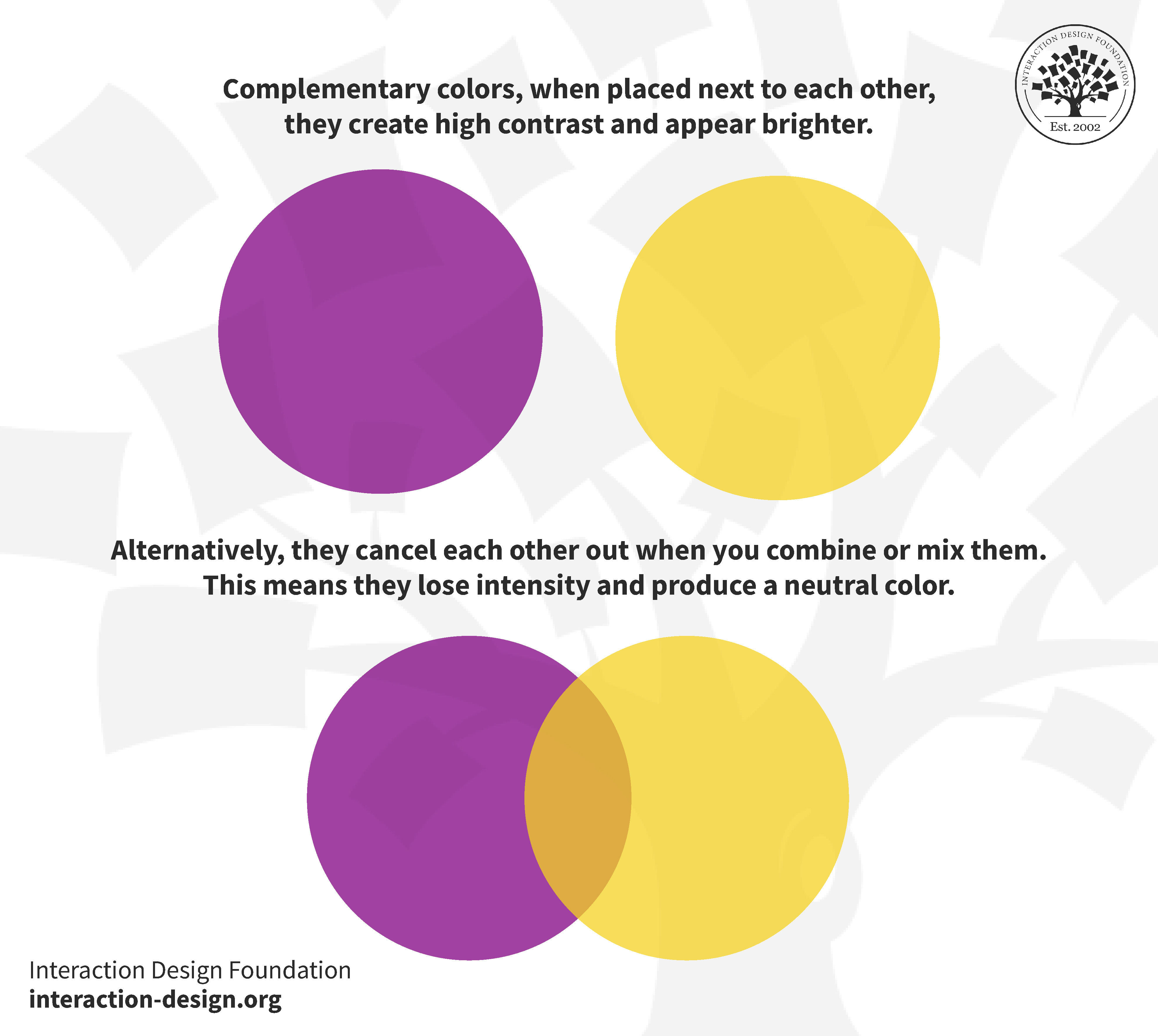
Utilizing Contrast and Complementary Colors for Impact
Color, color, color! Who knew that something as simple as contrasting and complementary colors could have such a huge impact on the overall look and feel of your designs? Well, we did, and we’re here to spill the beans on how to utilize these babies for maximum impact!
So, you want to make a statement with your design? Well, look no further than utilizing contrasting colors. Think about it – pairing colors that are on opposite ends of the color wheel creates a sense of drama and excitement that just can’t be ignored. It’s like peanut butter and jelly, macaroni and cheese, or ice cream and… well, anything. They just work together beautifully! So, don’t be afraid to mix and match those bold, contrasting colors to really make your design pop!
On the flip side, complementary colors are like the yin to the yang of contrasting colors. These colors are next to each other on the color wheel, creating a harmonious and pleasing feel. It’s like a calming sunset, a serene ocean view, or a cozy fireplace – they just make you feel warm and fuzzy inside. So, if you want to evoke a sense of balance and unity in your design, complementary colors are the way to go!
Remember, whether you’re going for bold and dramatic with contrasting colors or harmonious and pleasing with complementary colors, the key is to have fun and experiment! Don’t be afraid to think outside the box and push the boundaries of color – after all, that’s how the magic happens!
The Influence of Color on Brand Perception
Color plays a crucial role in how consumers perceive a brand. It can evoke emotions, convey messages, and even influence purchasing decisions. Let’s dive into how different colors can impact brand perception:
First up, RED. This vibrant color is often associated with passion, excitement, and energy. Brands that use red in their branding may be seen as bold and powerful. On the flip side, too much red can also come across as aggressive or overwhelming. So, if you want to grab attention and make a statement, a touch of red might be just what your brand needs.
Next, we have BLUE. This calming color is often linked to trust, reliability, and professionalism. Brands that use blue in their branding may be perceived as trustworthy and dependable. On the other hand, too much blue can also be seen as conservative or cold. So, if you want to establish credibility and build trust with your audience, consider adding some blue to your brand palette.
And last but not least, GREEN. This refreshing color is often associated with nature, growth, and health. Brands that use green in their branding may be viewed as environmentally friendly and nurturing. However, too much green can also be seen as bland or unexciting. So, if you want to promote a sense of balance and harmony, incorporating some green into your brand identity could be the way to go.
Strategic Use of Color in Logo Design to Stand Out in a Competitive Market
Are you tired of blending in with the competition like a chameleon at a rainbow convention? It’s time to step up your game and make a statement with your logo design. Strategic use of color is the secret sauce to standing out in a crowded marketplace. Here are some tips to help you unleash the power of color in your logo:
- Know your audience: Different colors evoke different emotions and perceptions. Make sure you choose colors that resonate with your target demographic. No more confusing your audience with colors that clash like a bad outfit on prom night.
- Less is more: Don’t go overboard with a Technicolor dream logo. Keep it simple and stick to a few key colors that pack a punch. Remember, too many colors can turn your logo into a visual migraine.
- Contrast is key: If you want your logo to pop like a Hollywood celebrity at the Oscars, make sure to use contrasting colors. A bold color palette will help your logo stand out in a sea of boring black and white competitors.
So, grab your paintbrush and get ready to unleash the power of color in your logo design. With a strategic approach to color, you’ll be sure to make a splash in the competitive market and leave your competitors green with envy (or whatever color you choose).
FAQs
How does color affect the perception of a brand’s identity?
Oh, colors are like the spices in a dish – they give flavor and personality to a brand! Each color evokes a different emotion or feeling, so choosing the right combination is crucial to communicate the brand’s values and message effectively.
Can you give some examples of brands effectively using color in their logo design?
Absolutely! Think about Coca-Cola and their iconic red logo – it screams energy and excitement! Or Starbucks with their soothing green color that symbolizes growth and harmony. These brands have nailed it when it comes to using color to convey their identity.
How can small businesses leverage the power of color in their logo design?
Small businesses, listen up! You don’t need a huge budget to play with colors. Start by understanding your target audience and what feelings you want to evoke. Then, experiment with different color combinations to find the perfect match that speaks to your brand’s essence.
What are some common mistakes to avoid when choosing colors for logo design?
Avoid the rainbow effect – using too many colors can confuse your audience and dilute your brand’s message. Also, be careful with cultural implications of colors – what may symbolize luck in one country could mean something completely different in another!
How can businesses keep their logo design timeless while still incorporating color trends?
Ah, the age-old question! The key is to strike a balance between classic elements and trendy colors. Consider using a timeless font or symbol in your logo and change up the color palette to stay current. It’s like giving your brand a fresh coat of paint without losing its essence.
In conclusion, let your brand shine like a rainbow with the power of color!
Whether you’re feeling blue or seeing red, remember that color plays a crucial role in creating a dynamic and impactful logo design. So next time you’re brainstorming ideas for your brand’s visual identity, don’t be afraid to think outside the black and white box. Embrace the colors of the rainbow and watch your brand come to life in all its vibrant glory!
Now go forth, bold designers, and paint the town red (or any other color you fancy)! Your brand’s future is looking bright with the power of color leading the way. So grab your palette, unleash your creativity, and craft a brand that communicates dynamically through the wonderful world of color!


