
Welcome to the world of fonts, where the difference between Arial and Comic Sans can make or break your brand faster than you can say “kerning”. In this article, we’ll explore the magical world of typography and how it can wield some serious power in the world of branding. So buckle up, grab your favorite typeface, and get ready to embrace the power of the pen…er, keyboard. Let’s dive into the wonderful world of type, where even the lowly Times New Roman can reign supreme.
The Importance of Typography in Branding
Typography is like the unsung hero of branding. It’s the ultimate wingman, making your brand look fly and catching all the attention while your logo takes all the credit. Without the right font, your brand identity would be as bland as a saltine cracker.
Think of typography as the mood-setting soundtrack to a blockbuster movie. It sets the tone, conveys emotion, and can make or break the entire cinematic experience. Choosing the right font is like casting the perfect leading actor – it’s got to be the right fit, have charisma, and be able to carry the weight of the entire production.
With the plethora of fonts out there, it can be overwhelming to choose the perfect one for your brand. But fear not! Here are a few tips to help you navigate the vast sea of typefaces:
- Keep it simple: Less is more when it comes to typography. Stick to one or two fonts to avoid creating a visual hot mess.
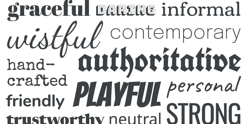
- Reflect your brand: Choose a font that embodies the personality and values of your brand. Whether you’re a quirky startup or a corporate powerhouse, there’s a font out there for you.
- Consider readability: Your font may look cool and edgy, but if people can’t read it, what’s the point? Make sure your font is legible and easy on the eyes.

Creating a Strong Visual Identity
When it comes to , it’s all about standing out like a unicorn in a sea of horses. You want your brand to be memorable, eye-catching, and totally unique. Here are some tips to help you achieve visual greatness:
1. **Color Palette Magic**: Choose your color palette wisely, my friend. You don’t want to end up looking like a clown at a funeral. Stick to a few key colors that reflect your brand’s personality and vibe. Think about how they make people feel – is it calming blues, energetic yellows, or mysterious purples?
2. **Font Frenzy**: Fonts can make or break your visual identity, so choose wisely. Just like a good wine pairing, your font should complement your brand’s personality. Are you sleek and modern? Playful and whimsical? Choose a font that speaks to your brand’s essence.
3. **Logo Lovin’**: Ah, the logo. The shining star of your visual identity. Your logo should be simple, memorable, and versatile. Think of it as your brand’s superhero cape - it should be able to adapt to any situation and look good doing it. Whether it’s stamped on a business card or plastered on a billboard, your logo should be instantly recognizable.
Choosing the Right Typeface for Your Brand
When it comes to choosing the perfect typeface for your brand, it’s like trying to find the perfect pair of shoes – you want something that is stylish, comfortable, and will make you stand out in a crowd. But unlike shoes, you can’t just return a typeface if it doesn’t fit quite right.
Before you start scrolling through endless font libraries, take a moment to consider the personality of your brand. Are you fun and quirky? Sleek and professional? Bold and adventurous? Your typeface should reflect these qualities to truly capture the essence of your brand.
Next, consider the readability of the typeface. You don’t want your customers squinting at your website or promotional materials trying to decipher what it says. Make sure the typeface is legible at various sizes and on different backgrounds.
Lastly, don’t be afraid to mix and match different typefaces to create a unique visual identity for your brand. Just like mixing patterns in fashion, combining different typefaces can add visual interest and personality to your brand. Play around with different combinations until you find the perfect match that makes your brand truly shine.
How Typography Impacts Consumer Perception
Typography is more than just picking a fancy font for your brand. It can make or break how your consumers perceive your products or services. Let’s dive into how these curvy, bold, and italicized letters can sway consumer opinions:
**1. Brand Identity:** The typography you choose speaks volumes about your brand. Are you fun and playful? Go for a quirky, handwritten font. Want to convey elegance and sophistication? Opt for a sleek, modern typeface. Just remember, Comic Sans is never the answer.
**2. Readability:** Imagine trying to read a book printed in size 6 font – that’s how consumers feel when your typography is hard to decipher. Make sure your text is legible so your audience doesn’t have to squint and hold the paper up to the light like it’s a hidden message in a spy movie.
**3. Emotional Connection:** The right typography can evoke certain emotions in consumers. Whether it’s nostalgia from a retro font or excitement from a bold, vibrant typeface, your choice of typography can make consumers feel more connected to your brand. Just don’t expect them to shed tears over a well-placed exclamation point.

Consistency is Key in Typography
When it comes to typography, consistency is absolutely crucial. Nothing screams amateur more than a mishmash of different fonts, sizes, and styles all thrown together like a typography salad. Trust me, nobody wants to read a website or document that looks like it was designed by a blindfolded monkey on a sugar high.
So, how can you avoid this typography disaster? Well, for starters, try sticking to a consistent font throughout your project. Pick a font that suits the tone and purpose of your content, and then stick with it. Mixing and matching fonts like a crazy font hoarder is a surefire way to turn your design into a chaotic mess.
Next up, make sure your font sizes are consistent too. You don’t want your headings to be jumping all over the place like a hyperactive toddler on a trampoline. Choose a size that works well for your content and stick to it for a more cohesive and professional look.
Lastly, pay attention to your line spacing and line length. Nobody wants to read a wall of text that feels like a never-ending slog. Give your content some room to breathe and break up long paragraphs into shorter, more digestible chunks. Trust me, your readers will thank you.
The Role of Typography in Brand Recognition
Typography plays a crucial role in brand recognition. The right font can make or break a brand’s image, setting the tone for how it is perceived by consumers. Think about it – would Coca-Cola be as iconic if it were written in Comic Sans? I think not.
When choosing a font for your brand, consider these important factors:
- Legibility: Make sure your font is easy to read, unless you want your brand to be known as the one that gives everyone a headache.
- Consistency: Stick to one or two fonts to create a cohesive brand identity. Mixing too many fonts is like wearing polka dots, stripes, and plaid all at once – a fashion disaster.
- Personality: Your font should reflect the personality of your brand. If your brand is fun and quirky, go for a playful font. If it’s more serious and professional, opt for something more classic.
Remember, typography is more than just words on a page – it’s a powerful tool that can help your brand stand out in a sea of competitors. So choose wisely, my friends, and may the font be ever in your favor.
FAQs
Why is typography important in branding?
Well, let me tell you a little secret – words matter. And how those words are presented can make a huge impact on how your brand is perceived. Typography sets the tone, conveys your brand’s personality, and helps to make a memorable impression on your audience.
How can typography help a brand stand out?
Think of typography as your brand’s wardrobe – it’s what helps you stand out in a crowd full of basic fonts. By choosing the right typography, you can create a unique look that sets you apart from your competitors and catches the eye of your target audience.
What should a company consider when choosing typography for their branding?
When it comes to choosing typography for your branding, you want to consider things like legibility, scalability, and compatibility with your brand’s aesthetic. Also, think about the message you want to convey – are you fun and funky, or sleek and professional? Your typography should reflect that.
Can typography change how customers perceive a brand?
Absolutely! Imagine if Apple used Comic Sans instead of their sleek, minimalist typography – the horror! Typography can instantly convey professionalism, creativity, or even playfulness, helping to shape how customers perceive and connect with your brand.
How often should a brand update its typography?
Like a fine wine, typography can get better with age - but that doesn’t mean you should stick with the same old fonts forever. A little refresh every now and then can keep your brand looking current and relevant. Just don’t go changing your typography every other week – that’s just indecisive.
Now go forth and conquer with your type!
Remember, the font is mightier than the sword! Use your newfound knowledge of typography to create powerful branding that will leave your competition quaking in their Comic Sans. Play with serifs, experiment with sans-serifs, and always remember that the spacing between letters can make all the difference.
So go ahead, unleash the power of type and watch your brand soar to new heights. And when in doubt, just remember: when it comes to typography, there’s no such thing as too much kerning!


